Vignelli’s Ambiguity

Vignelli’s Ambiguity
We are most familiar with Massimo Vignelli's linguistic analogy of good design. The highest form of design, he says, must be semantically meaningful, syntactically ordered, and pragmatically understood. The right mix of these principles results in design that is clear. However, clarity can run into problems, not in an objective sense but in how these principles come at odds against the entropy of human behavior. RIT's branding guidelines shadow Vignelli's ideas closely, but how quick is the mind to bore of an objective good? Does the gallery attendant at the Louvre marvel at the works he guards day in and day out in the same manner as the doe-eyed art lover? The answer is, most likely, that for the attendant, these master pieces have become part of the quotidian.
When tasked to design a poster for the Vignelli Center Lectures, we are faced with the challenge of standing out among an already strong and clear brand, where an attempt for clarity is consistently present, even in the smallest of club fliers. The temptation is to give way to the opposite, that is, disorder and chaos. This is anathema! Instead, Vignelli gives another tool, the lesser-known principle of Ambiguity.
Ambiguity, according to Vignelli is, "intended as a plurality of meanings, or the ability to confer to an object or a design the possibility of being read in different ways—each one complementary to the other to enrich the subject and give more depth."
It is with the principle of Ambiguity in mind that we can make a deeper parallel with the narrative theories of comic book theorist Scott McCloud.
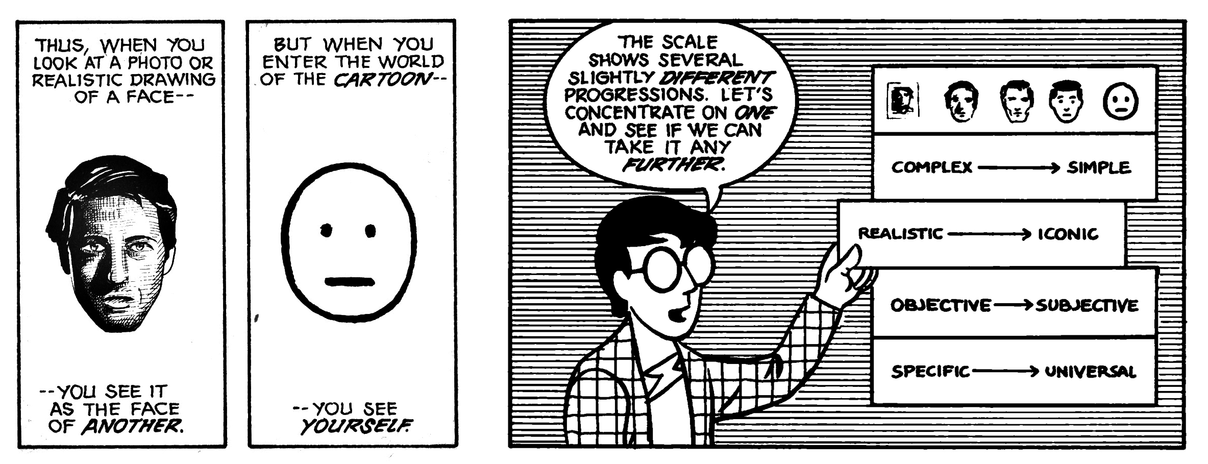
The diagram above from McCloud’s, Understanding Comics: The Invisible Art, shows a relationship between the ambiguous and the specific (fig. 1). To a certain degree, the more abstract something becomes, the potential to create a deeper subjective experience grows. Complexity gives way to simplicity, realism turns iconic, objectivity becomes subjectivity, and specificity transforms to universality.
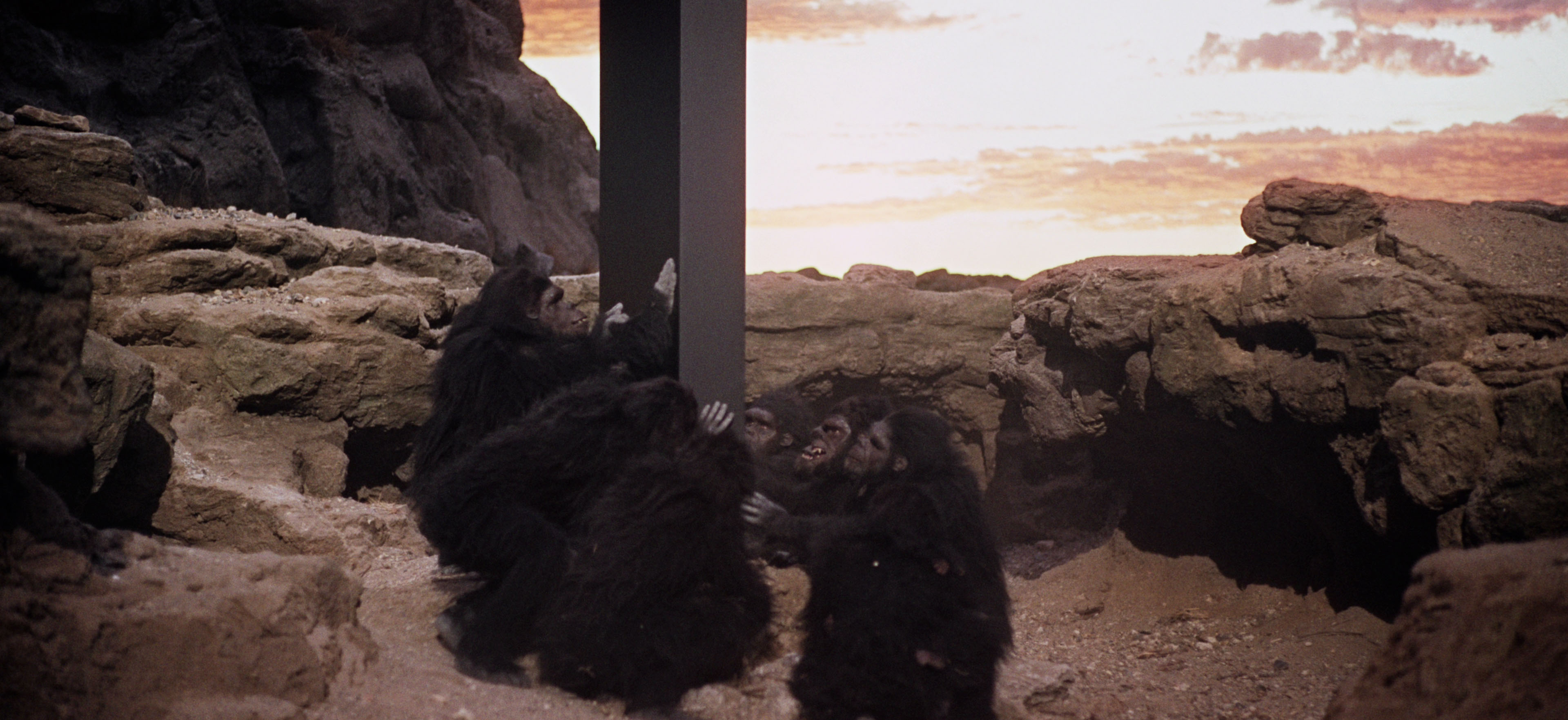
A good example of this theory would be the iconic Dawn of Man opening sequence from Stanley Kubrick's 2001: A Space Odyssey. In this sequence, we begin with a troop of hominids get pushed out of a watering hole by a stronger troop. In the following scene, we see one of the defeated hominids sleeping; as it wakes up it is met by a bizarre sight—a smooth black monolith stands amidst the natural desert landscape (see fig. 2).
(fig. 2)
The scene is iconic because of its narrative and formal ambiguity. The viewer contends with the formal incoherence, between an intelligent geometric form and untamed imperfection of the natural landscape. Not accounting for the supernatural forces at play, we see the once defeated troop override their despondency, with an extasy of curiosity and the wild extasy of discovery (see fig. 3).With this supernatural encounter, the hominids enter a new era of evolution.

(fig. 3)
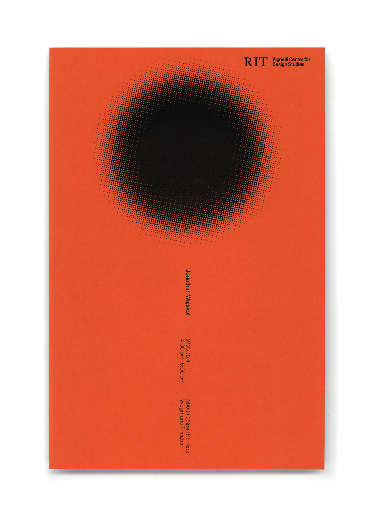
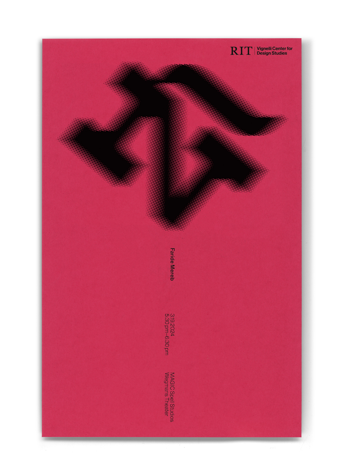
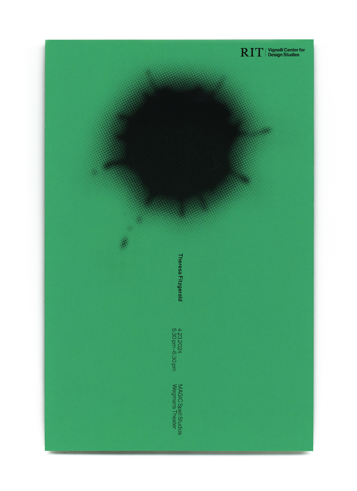
It is thus with this Ambiguity principle in mind that we designed a poster series to act as a set of color monoliths, to act as ambiguous, yet formally disciplined means of communication. The simple execution stands out against "clearer" messaging. The design follows Vignelli's spirit of simplicity, but gives us something extra, something ambiguous to ponder over, to delight on with bit of mystery and wonder.
Work by Javier Viramontes.
Massimo Vignelli. The Vignelli Canon. Zürich, Lars Müller Publishers, 2015, p. 20, link.
Fig. 1. McCloud, Scott. Understanding Comics: The Invisible Art. William Morrow Paperbacks, 1994. pp. 36–46
Fig. 2–3. 2001: A Space Odyssey. Directed by Stanely Kubric, Stanley Kubrick Productions, 1968. YouTube, uploaded by Art History, Apr 4, 2015, link.