2011 Metaproject 01, Wilsonart
Each student was required to select and research a specific object typology (seating object: chair, stool, bench, etc.) and a specific cultural / situational context (i.e. sitting by a pool and eating, perching on a stool while pivoting to retrieve a suture kit to stitch a patient wound in an ER) and respond with an inventive proposal that blended gestural reference, typology or language, with a utilitarian service in a specified cultural / situational context. The gestural reference had to form an interesting dialogue with the utility – that is, consider the reference and the utility as text that inform/contrast/transform each other in order to suggest a dialectic transformation within the object category.
This workshop challenged the student to create a utilitarian product that argued for a new interplay between user and object to expand and challenge our collective understanding of the way behaviors influence outcomes in the physical landscape. The objects had to be specifically designed in response and in reaction to the contemporary conditions of their object classifications. They had to be clad in Wilsonart laminate to make use of its time-tested qualities, giving their objects the qualities of a modern heirloom.
Photography: Elizabeth Lamark, Clint Blowers (winner only)
The Hub
Brian Madden
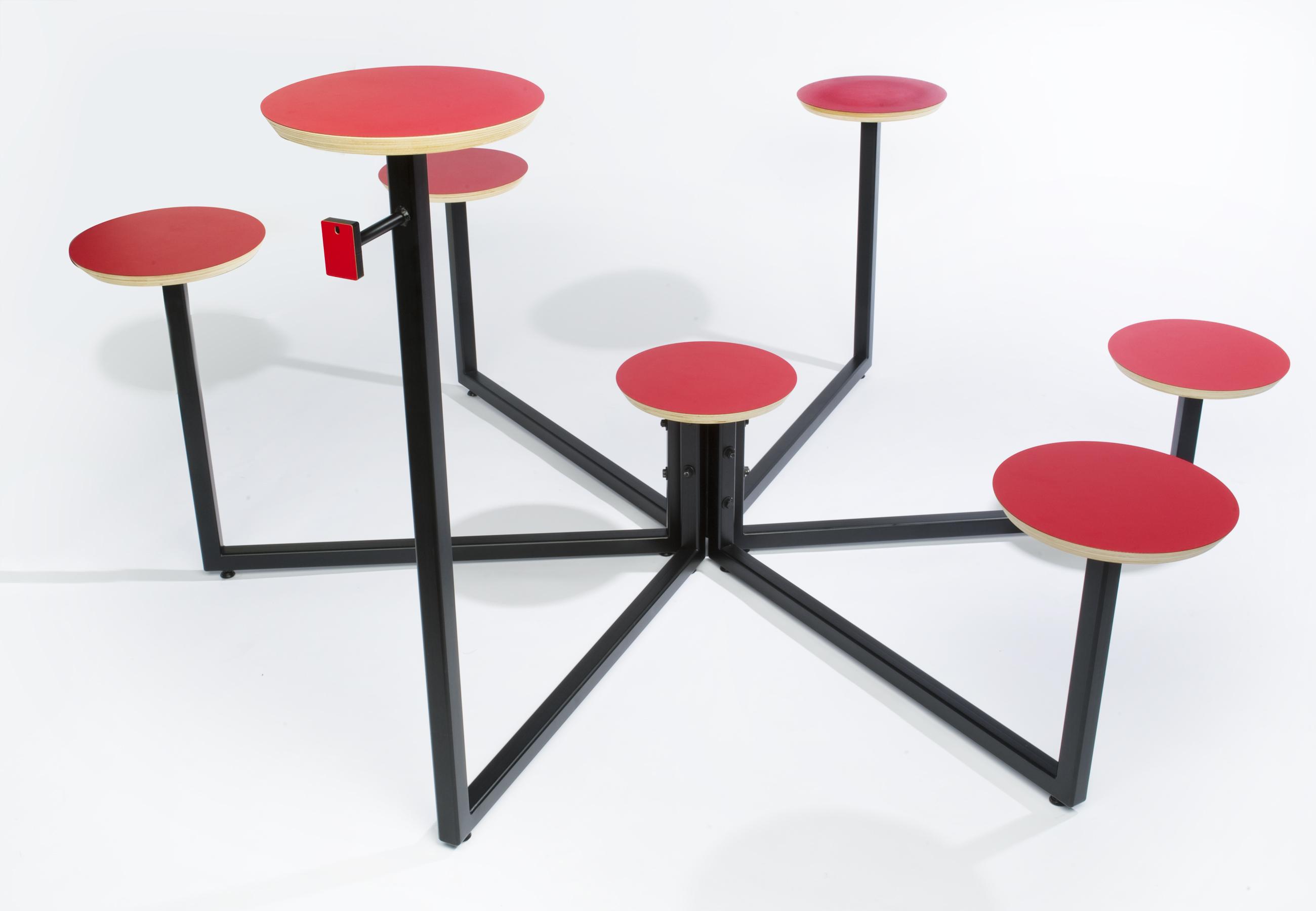
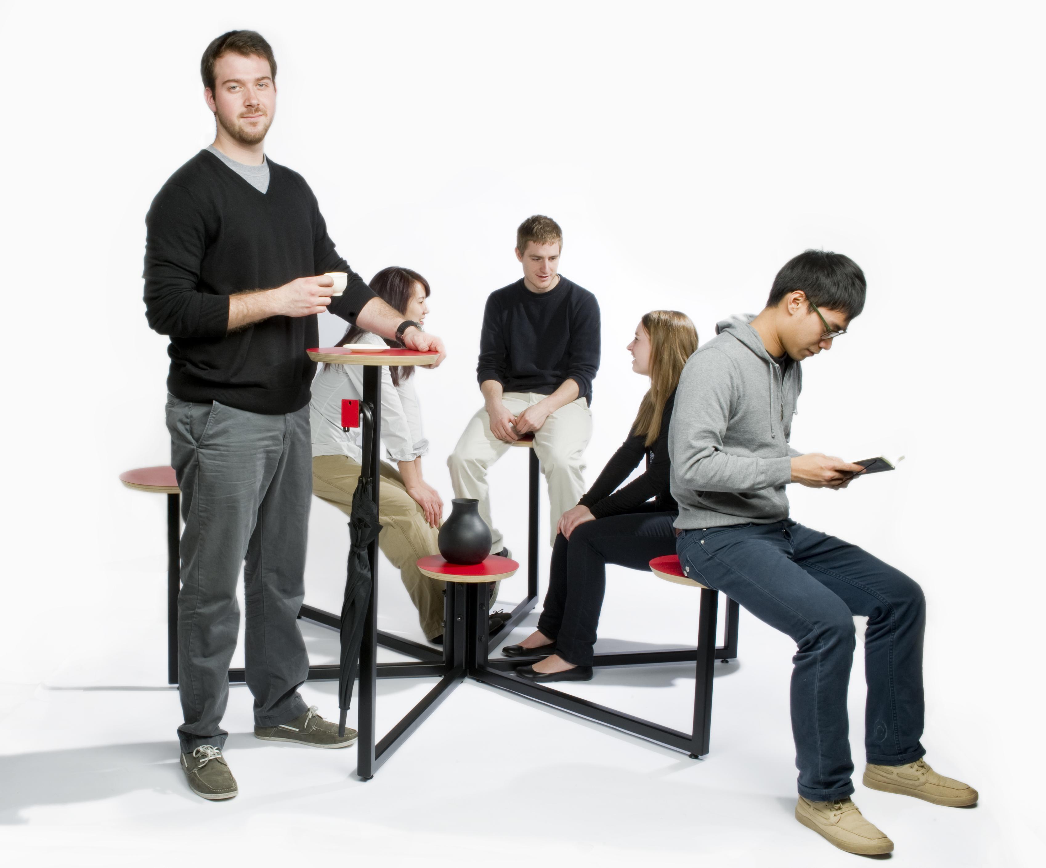
Context: Any collaborative environment where brainstorming, working, playing or socializing happens. Problem: Create a dynamic seating hub around which groups converge to talk, ponder, work or play together. Solution: The Hub promotes dynamic social interactions through the deliberate assortment of surface heights. Brand Strategy: The sample chip icon hanger is a constant reminder of the functionality and reliability of Wilsonart products.
Cathy Min
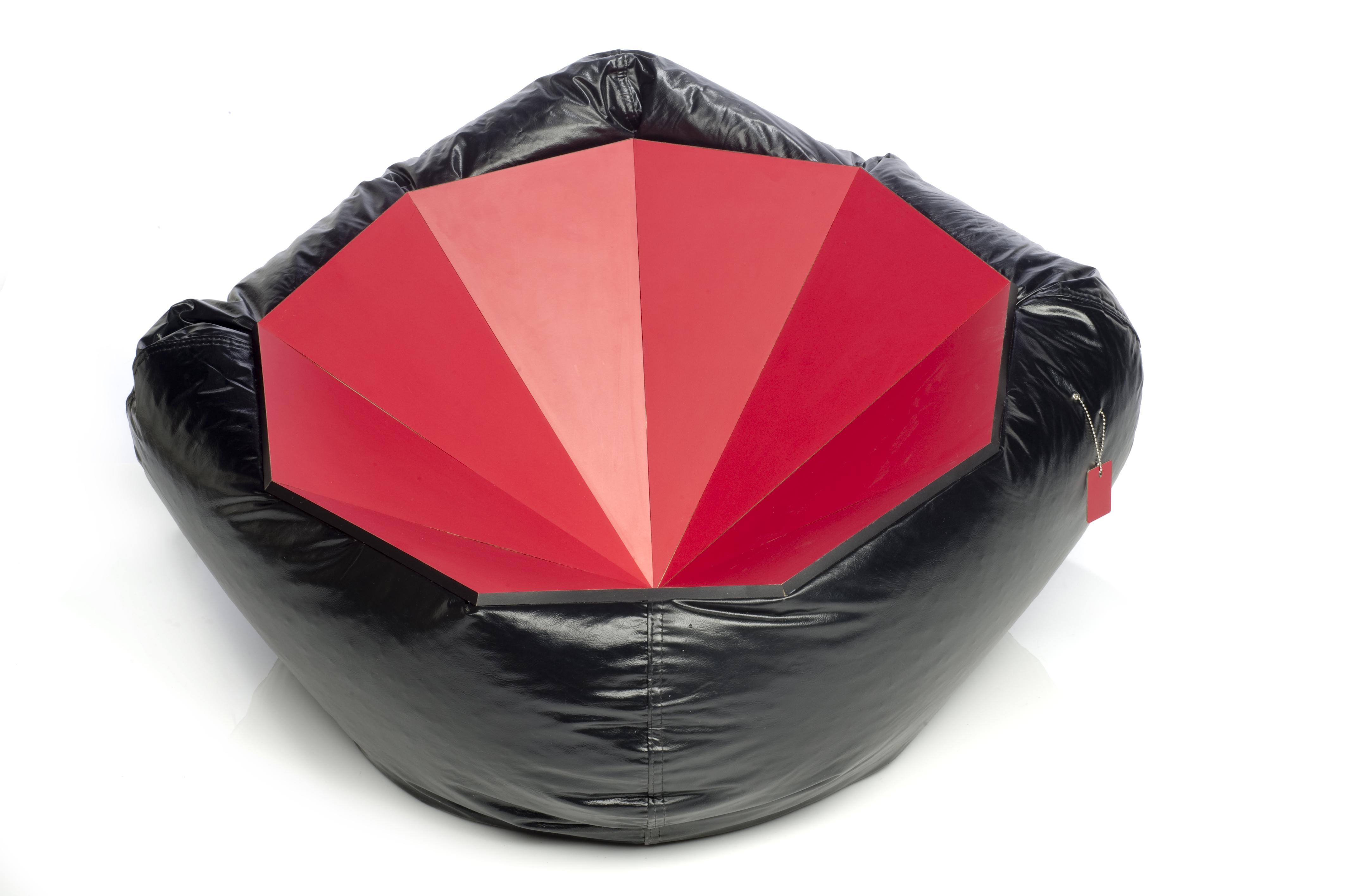
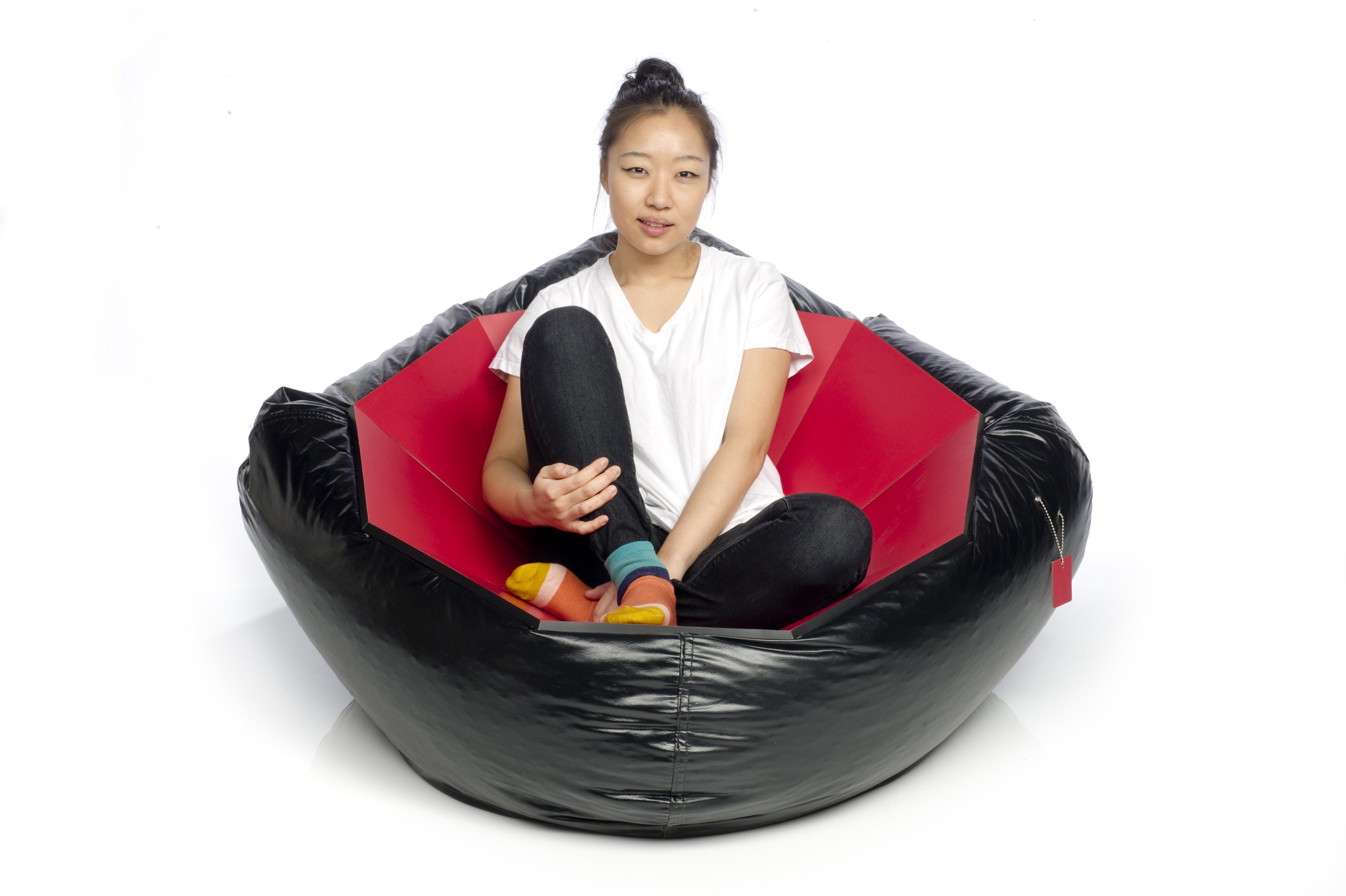
Papasan Chair
Context: Time flies so quickly, as an adult we are caught up in the world of complexity and seriousness and we recall the fun and adventurous times we had when we were kids. My context is to help encourage the user to embrace their inner child and rediscover your childhood memories. Problem: We don't allow ourselves to have fun as much as we use to when we were kids. Solution: Resembling the shape of a geode, the vivid color and hard surface of the Wilsonart's Hollyberry Red and the softness of the beanbag make a remarkable juxtaposition. The unity relates to our adulthood shell protecting our soft innocent childlike memories. The two distinctive elements offer an enigmatic sight and it is also unexpectedly comfortable. The chair even offers a user a stimulation of being "cupped." By learning to embrace our inner child the possibilities of sensations are endless. Brand Strategy: The Wilsonart chip holds a metal engraved description on the back. The chip is bobbing down like a shiny earring representing an ornamental element to the chair. Along with two grommets on the beanbag resembling a piercing, is to create character and a fun decorative component showing defiance and personality.
Christalyn Snyder
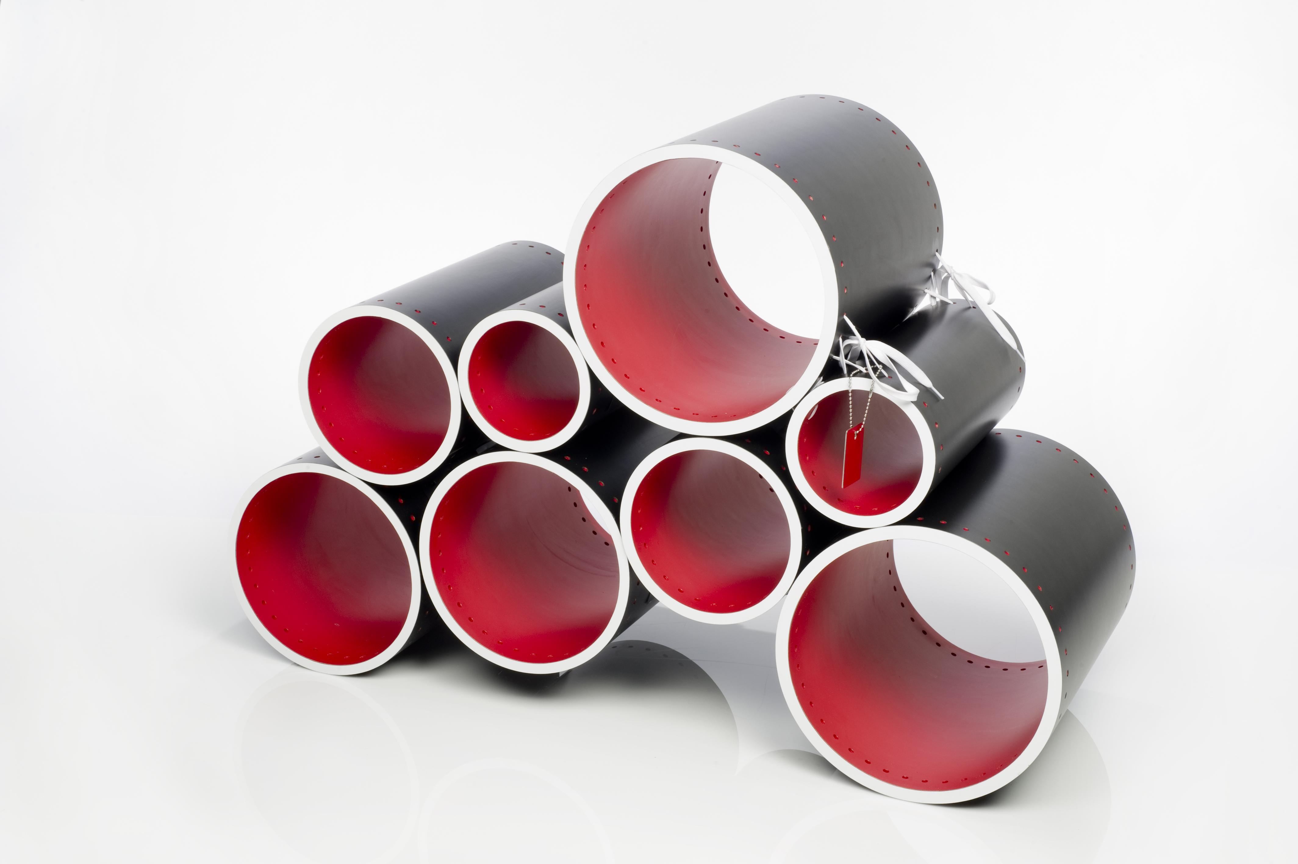
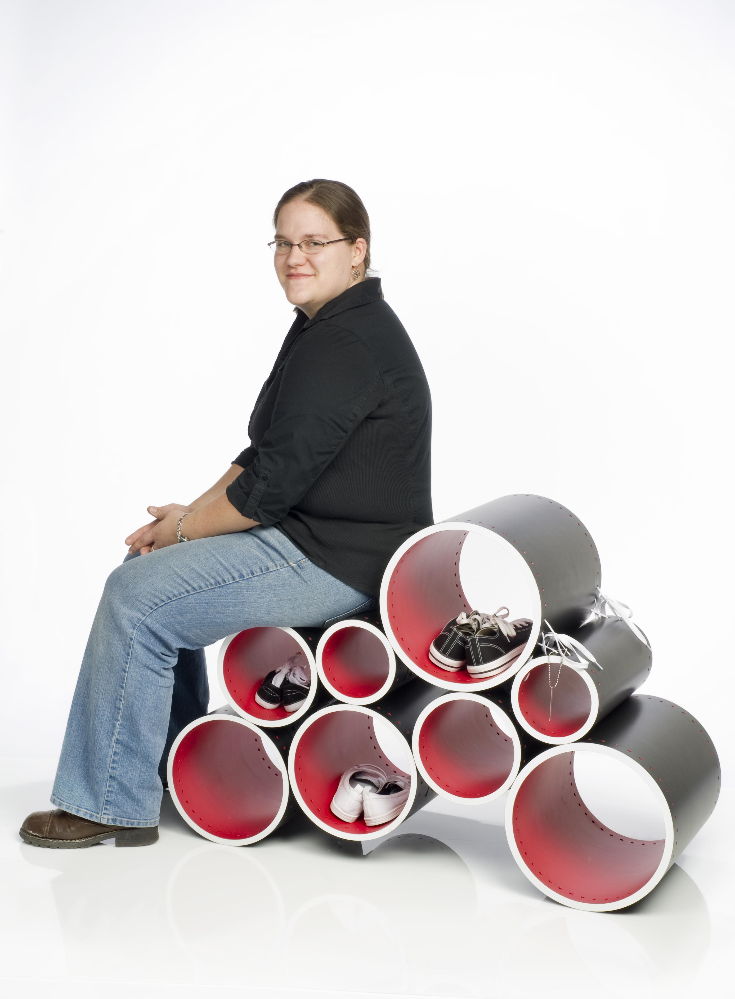
Shoe Bench
Context: Shoes are a part of the daily ritual that is shared by both adults and children. The act, frequently preformed in the chaos of an entryway, requires reaching the foot to put on the shoe and balancing the body throughout the process. Surrounding concerns are shoe storage, shoe care, and space constraints. Problem: Create an ergonomic seating device that allows the user to put on footwear in a variety of positions and space for shoe storage. Solution: A multi-level bench was created which allows for storage within the seating device. The compartments provided by the tubes help maintain a sense of organization when multiple pairs of shoes are within the bench. Brand Strategy: Details, like the holes and the shoelaces are incorporated to reflect shoe design. This commentary allows Wilsonart’s chip to become the pristine tag on this bench, similar to the tag on a new pair of shoes. The chip represents the brand and contains information about its name, designer and project sponsor on the back.
David Allen Nicholson
Play Bench
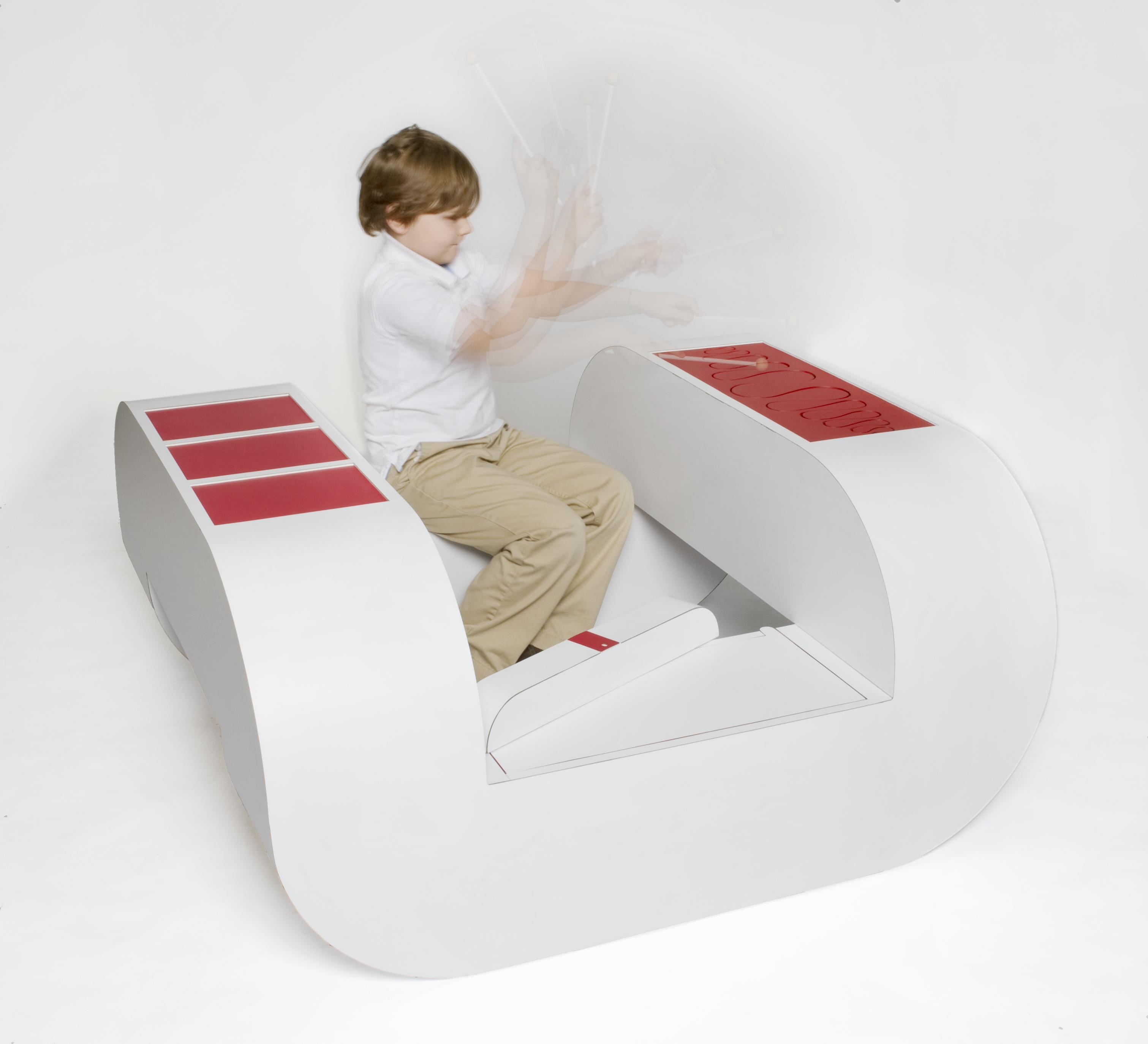
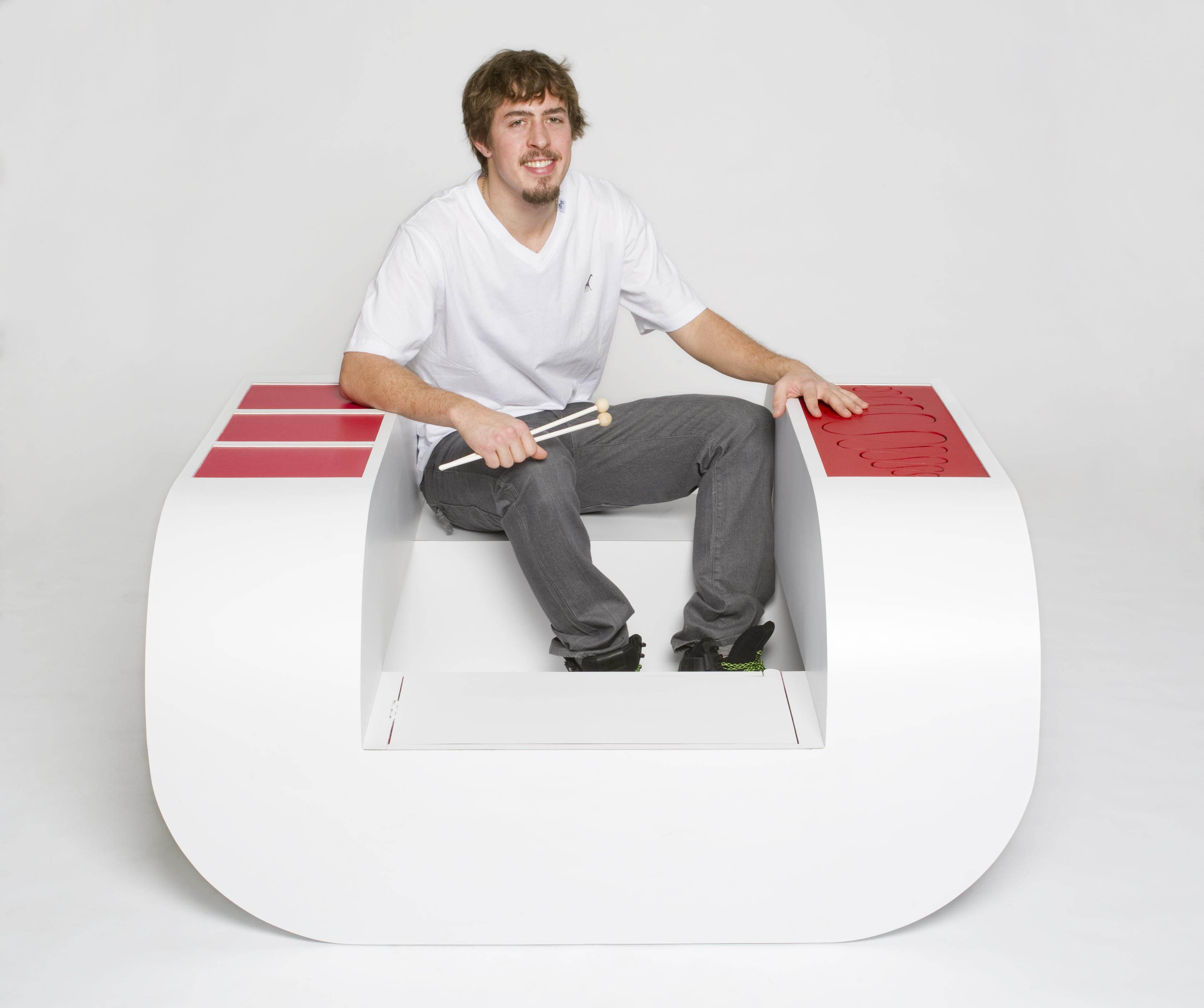
Context: Located in the main entrance to a public space with a population of children such as a school, community center, or hospital. Problem: Attending school and following the daily structure of their parents, a child’s playtime and their creative thinking are greatly limited to the environment they are in. Solution: This chair combines multiple instruments into a central gathering area that promotes unstructured play and creativity among children. On one of the two resonating chambers there is stretched red laminate acting as the drumhead to three individual sounding drums. On the second chamber there is a steel tongue drum played with mallets. Inside of the storage compartment there is a rain stick and maracas that can be removed and played by more children. Brand Strategy: The Wilsonart sample chip icon cannot be seen from the outside of the chair, users must interact with the chair to experience the connection the chip has with the chair. Inside of the storage compartment or what I’d like to call the “heart” of the chair lies the chip mounted to a rain stick. As one holistic chair these instruments play an important role in the way the chair is used and the chip captures this idea.
Jason Yi
High Chair
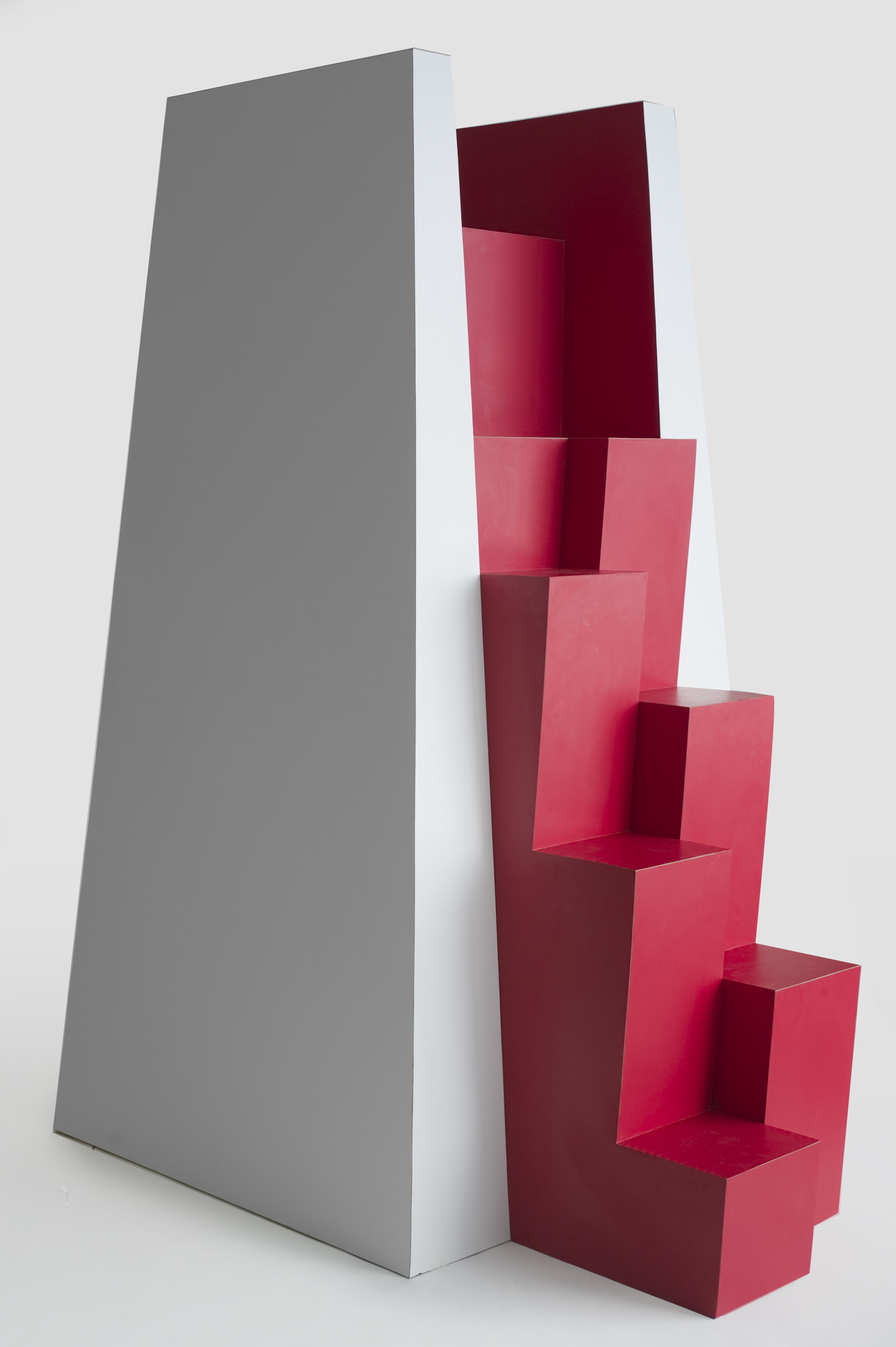
Context: In crowded, highly diverse, and fast-paced work environments we often need totake breaks to get back in touch with ourselves because when you have diversity with enough pressure, “heads will butt.” Problem: In this working style, if it’s too much of a hassle to find a quiet and peaceful space in a short period of time, we may continue on with our day depriving our bodies and minds of the essential need of true rest. Solution: Instead of having to go away to find some peace, we stay. And this chair brings you up, utilizing vertical space. This idea was inspired by the Zen philosophy of finding “peace within everyday chaos.” The form, resembling a Ziggurat or a Mayan pyramid, implies the intended use as a personal temple that’s left open as a communal entity – where everyone has access to the experience. This is high enough to provide the user with a wide field of vision, giving the effect of having a large area of personal breathing room – much like the feeling of being at the top of a mountain, or viewing an urban landscape from a rooftop. Brand Strategy: To carry on the Spirit of the concept, the Wilsonart Sample Chip is integrated into a visual tuning device much like a mandala or yantra. Presented on the back rest is a delicate, spiraling gesture - like a falling leaf – it provides the user with a pleasant and calming visual cue in starting their session.
Mary Kolber
The Anchor
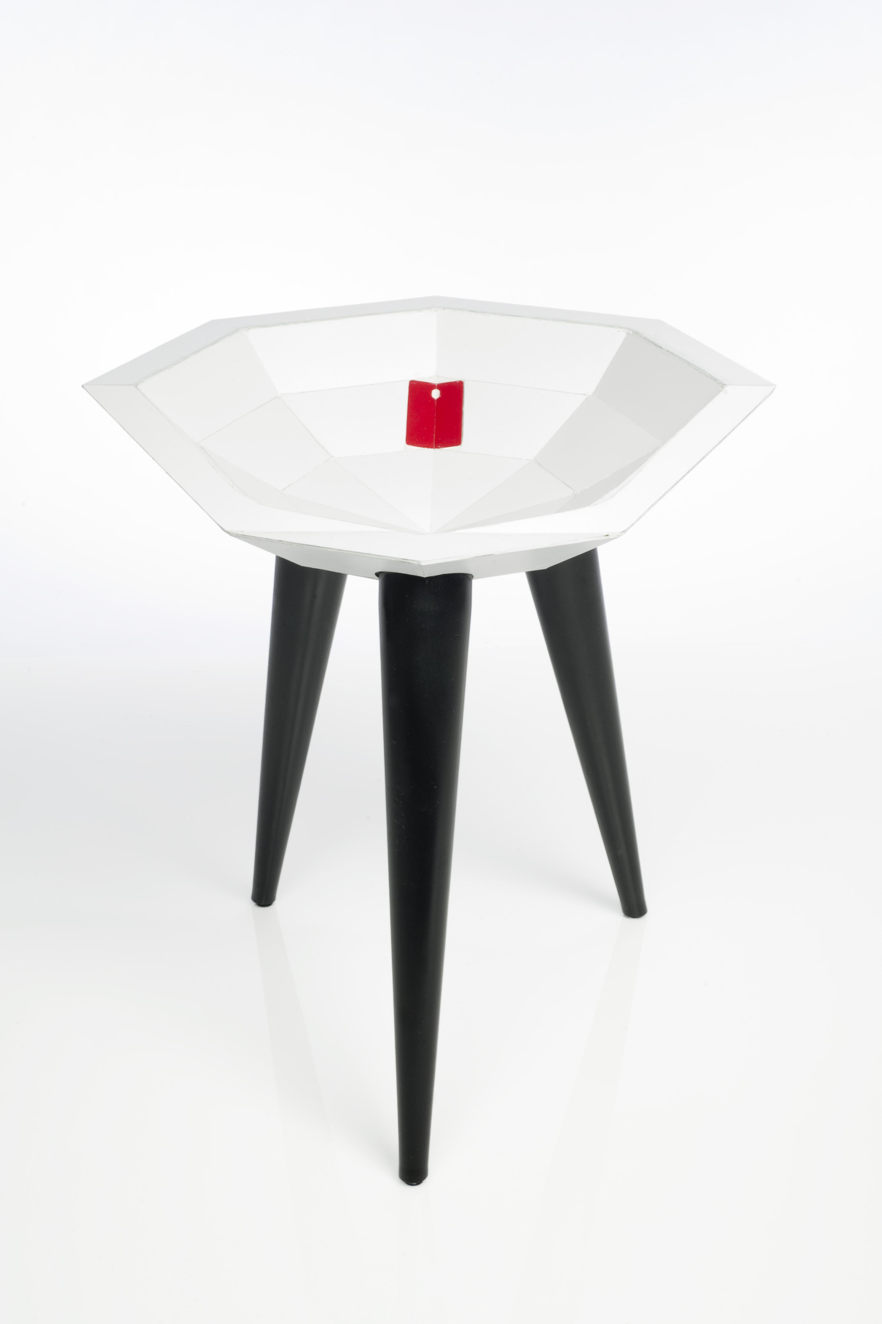
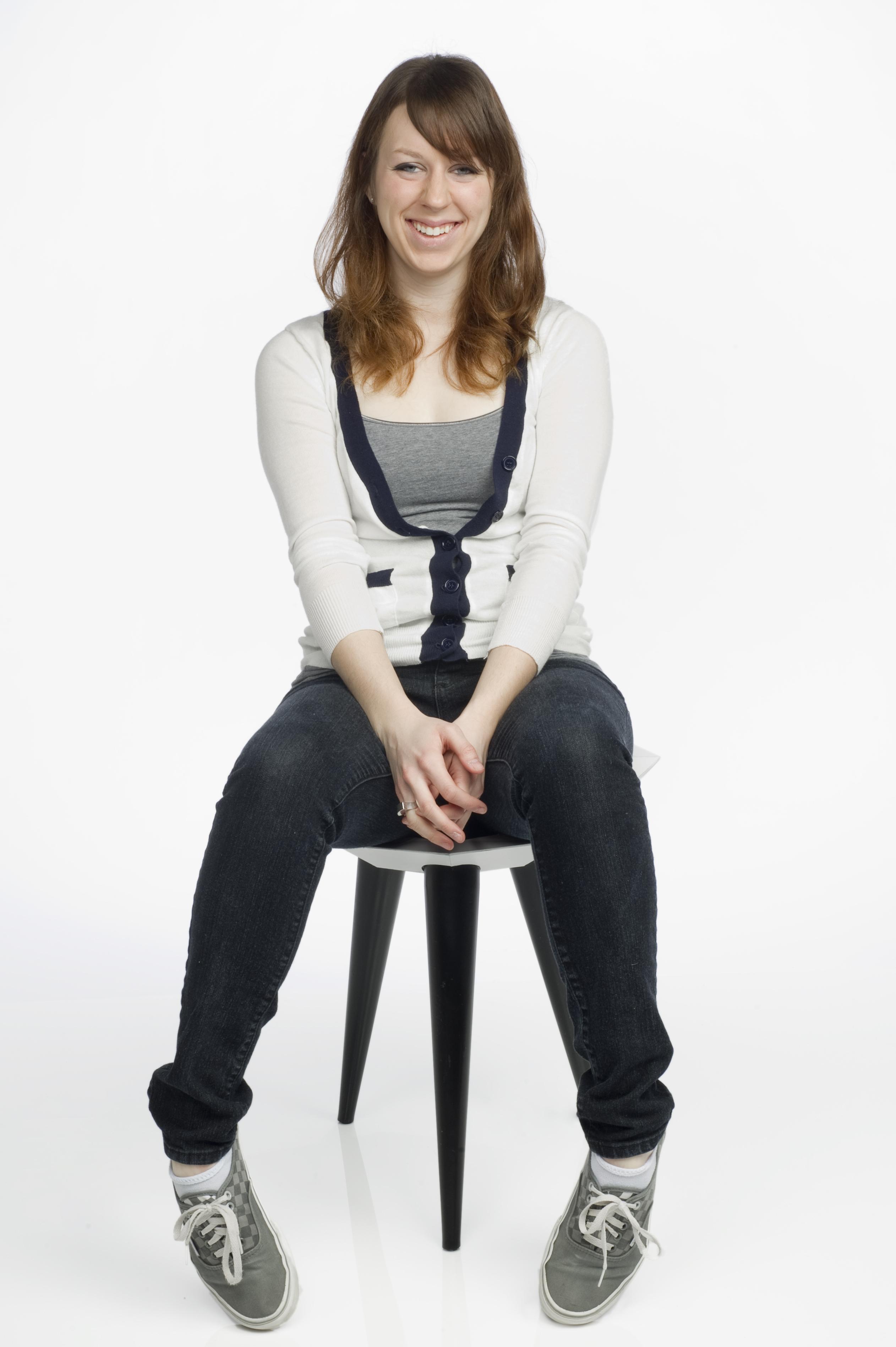
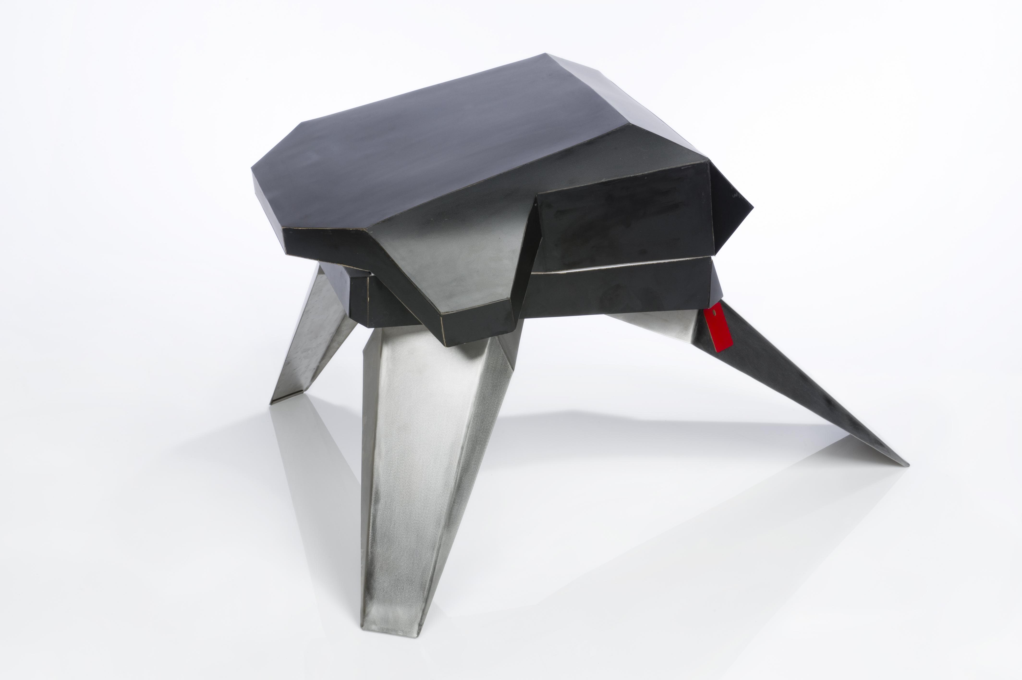
Context: Some individuals have a tendency to slip out of their position in seating devices. Often times, stools do not provide a sense of physical security/stability. Problem: Design a seating device that securely holds a user in position. Solution: A bowl-shape is employed to prevent the user from ‘spilling’ out. A tripod based is used to create the most stable condition, and a low center of gravity offers additional insurance. Brand Strategy: The Wilsonart sample chip icon is placed as a seating target and focal point in the stool, reinforcing the central role of the laminate surfacing. The chip is ‘folded’ to highlight the faceted visual identity of the bowl-shaped seat.
Megan Searle
The Reader
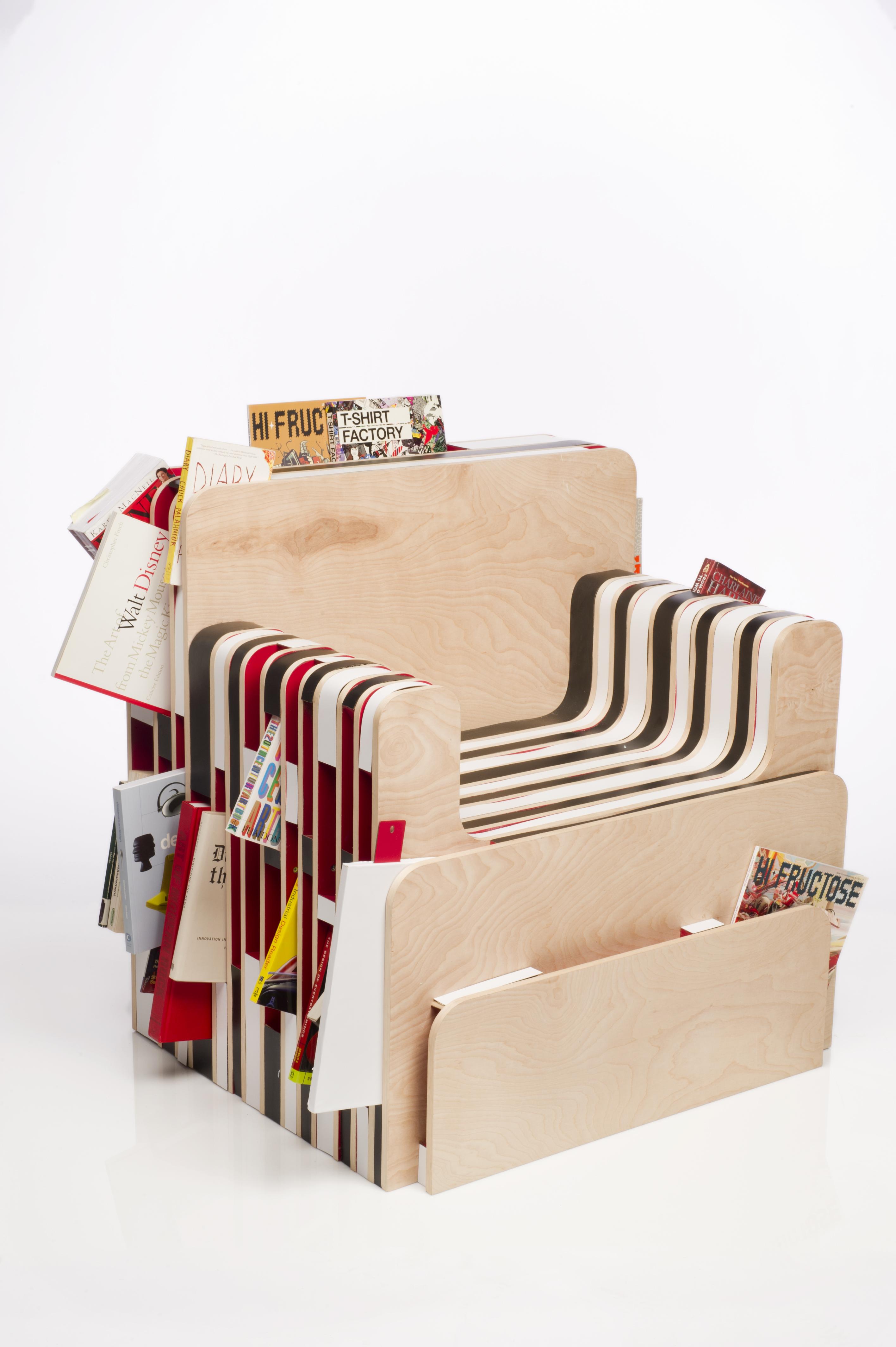
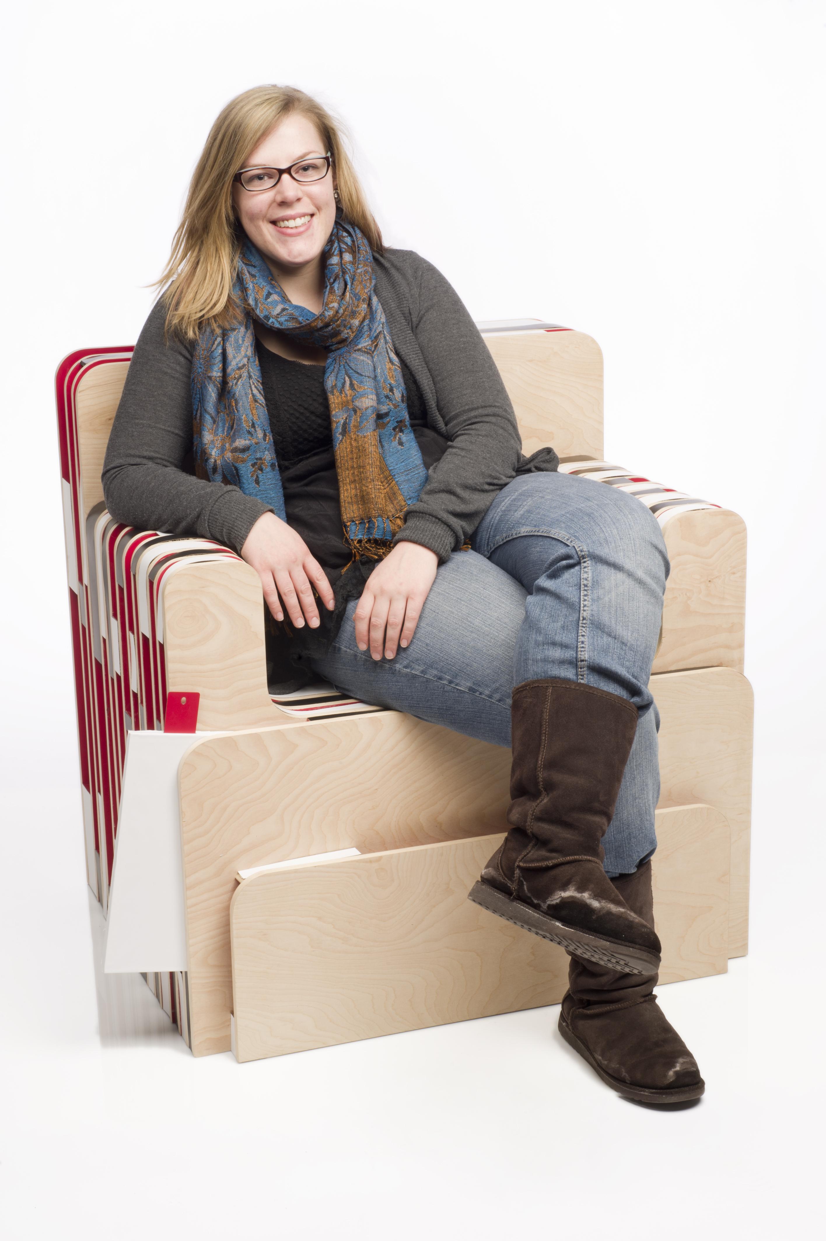
Context: The storage of excess reading material is traditionally solved with a book shelf. However, people do the majority of their reading in chairs. This results in an excess of furniture, and piles of books that either are in the process of being read or do not fit in a standard book shelf. Problem: Create a reading chair that also considers storage opportunities for various reading materials. Solution: An armchair with shelves incorporated for storing reading material of varying sizes. Brand Strategy: The Wilsonart sample chip icon is a bookmark emerging from a faux laminate book. The logo becomes a functional piece of the chair while reinforcing the overall function and subtlety highlighting the brand.
Richard Laustrup
The Companion
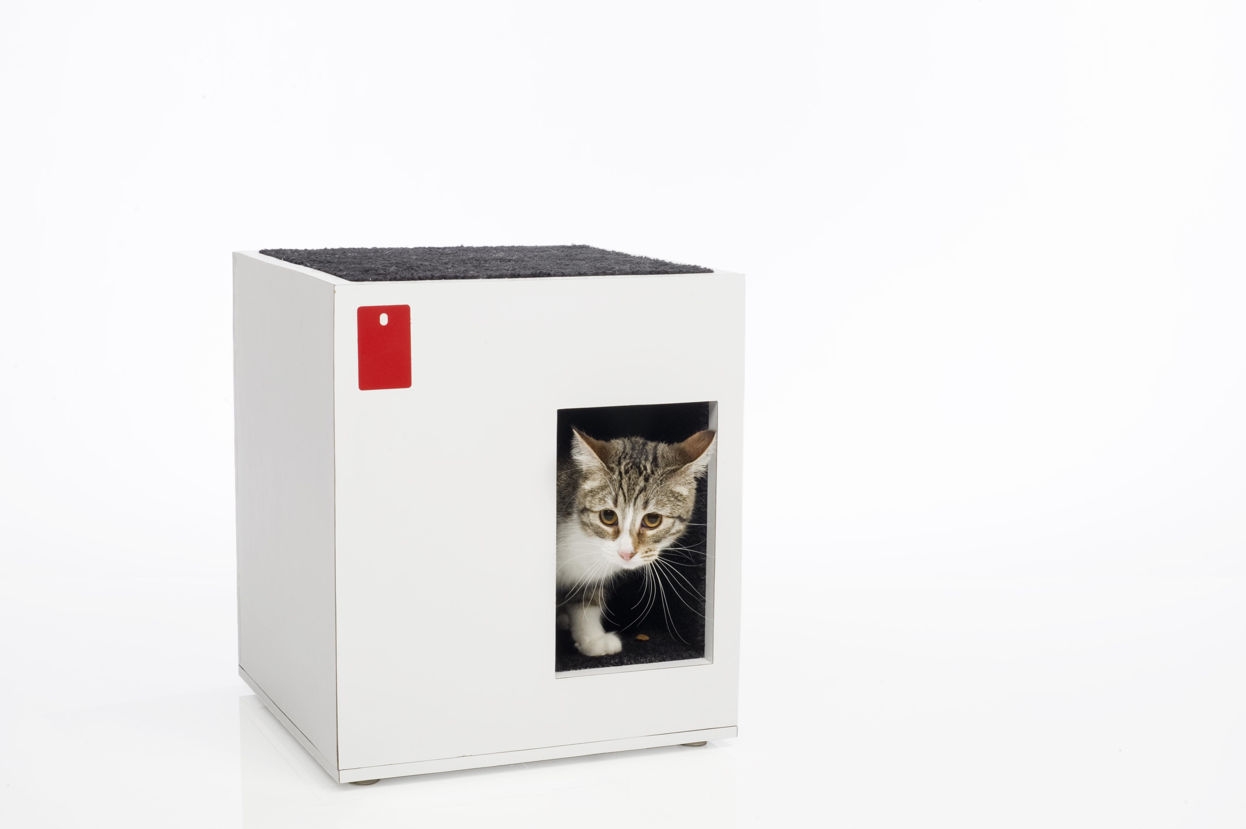
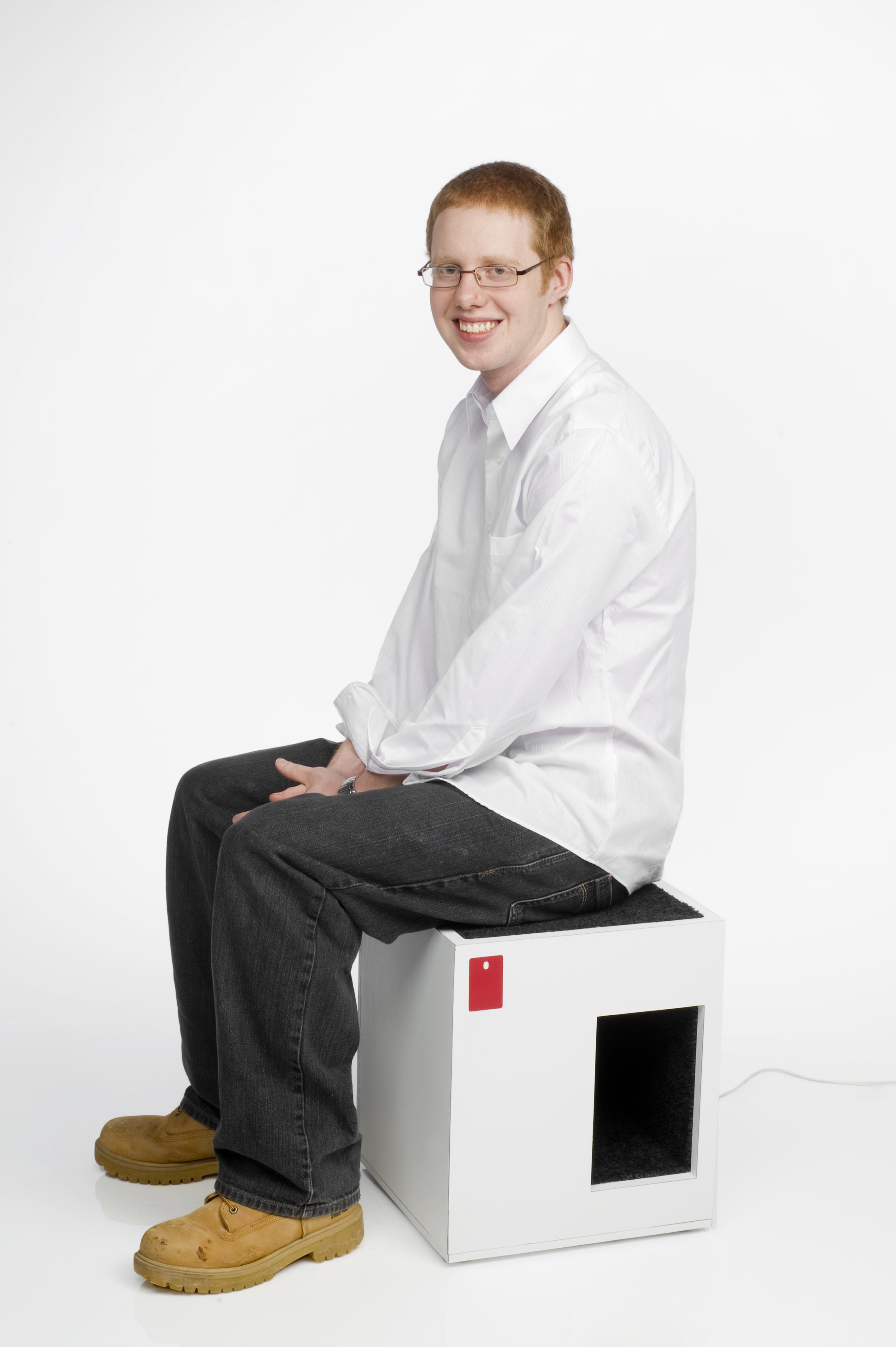
Context: The stool is a nomad within the home. Giving it a new function finds its place. Problem: Stools are lonely; they need a purpose when they are not in use. Solution: Turning the stool into a home for an animal it creates a symbiotic relationship between the two, giving the stool a purpose to stay in one place. Brand Strategy: The holly berry red Wilsonart sample chip icon is recessed into the white laminate on the front, in the upper left corner. The front is where the chip would be most visible. As for the top left corner, I searched for where Wilsonart normally placed their red logo which was in that location.
Robert Seymour
The Snowboard Seat
Context: This chair is an outside seat for winter use which offers a dry comfortable place to sit even when it has snowed .The fold-down back is lifted to push off accumulated snow. It is very versatile and comfortable, either placed outside the ski lodge, or on the mountain. Problem: As the snow falls it builds up on a normal bench or chair creating a very wet and awkwardly slippery seating accommodation. Sitting outside in these kinds of conditions can dampen pants and will make it uncomfortable to sit down when one returns to a warm interior setting. Solution: A chair that will keep the snow off by allowing the back of the chair to fold forward and cover the seat. Brand Strategy: To keep the seat itself as clean as possible, the Wilsonart sample chip icon was placed on the outside on the back leg. This not only keeps the logo visible at all times, but also makes it stick out against the stainless steel, while keeping the seat colors clean and flowing.
Steve Caruso
The Superlow : a furnishing
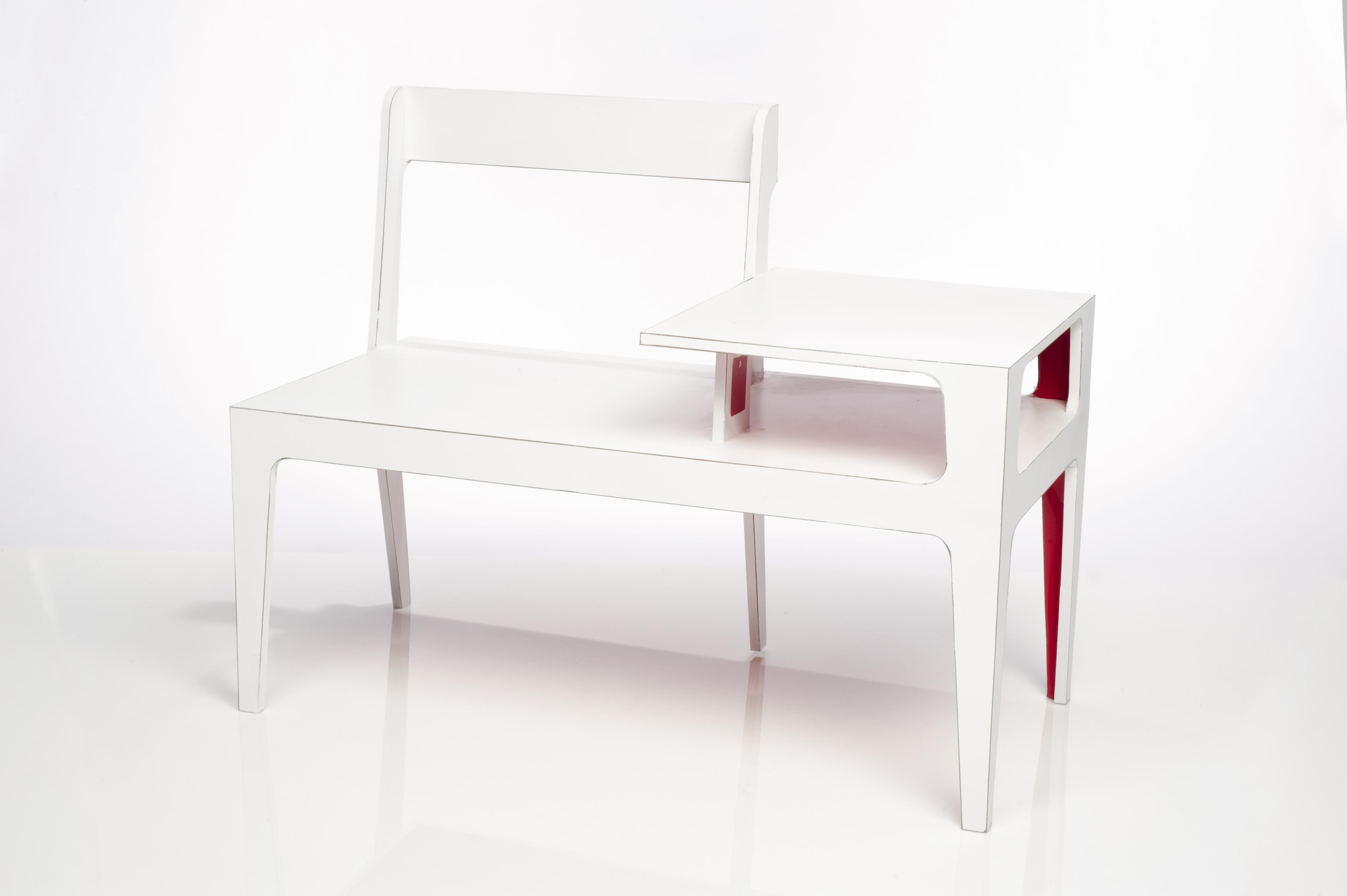
Context: The moments of daily life occupy a continuum of formality, often breaching work and leisure paradigms. Without combining the two, drudgery and decadence emerge. Problem: Create a seating opportunity that is a platform for potential, with the largest possible set of affordances and fewest possible instructional semantics. Solution: Two chairs organized into a bench with an occasional table. Brand Strategy: The Wilsonart sample chip icon is shown flush laminated in a subtle reveal. This placement puts the mark in a position where, like the design of the object, discovery is intuitive.
Taylor A. Farone
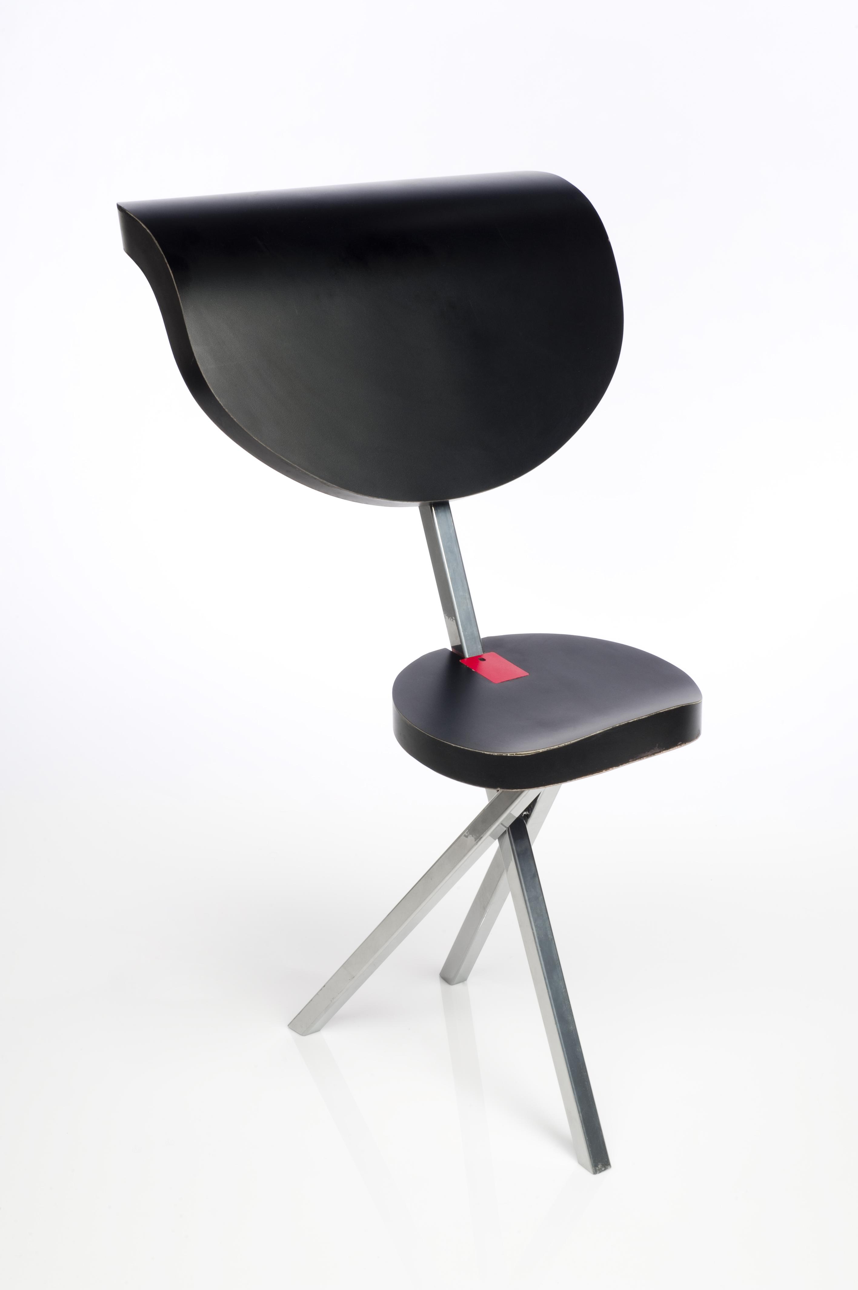
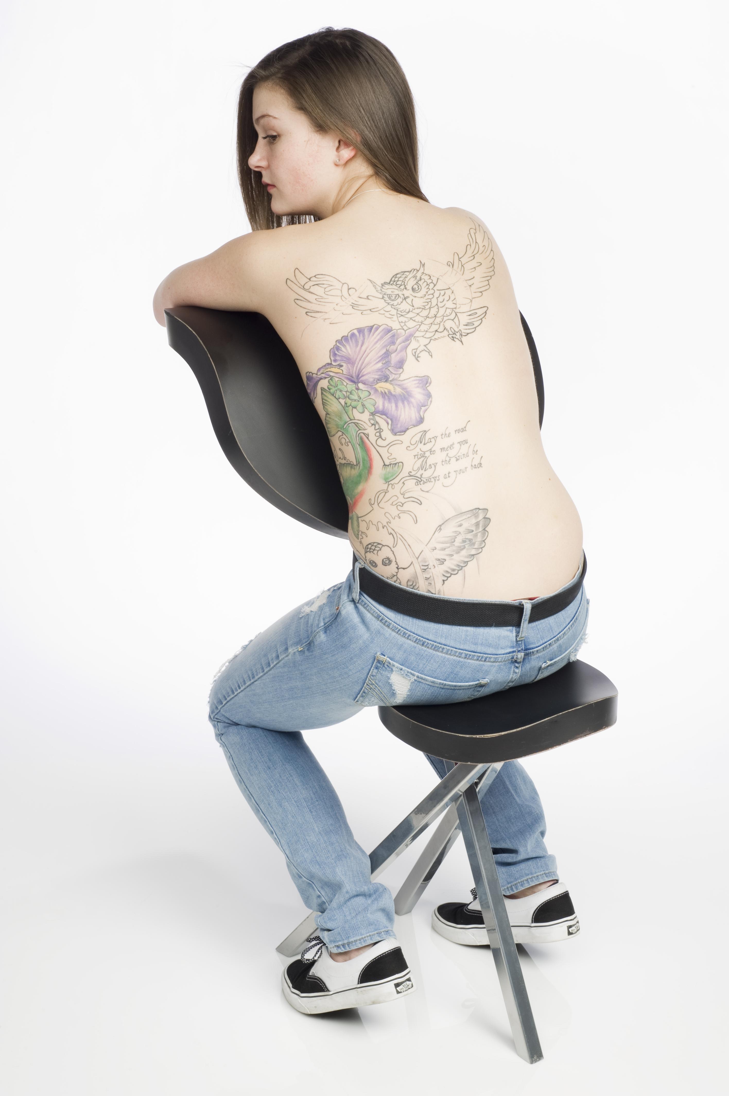
Tattoo Chair
Context: Tattooing is an uncomfortable, intimate experience between artist, client and chair. As the artist is engaged with the client‚ the client’s body is fully engaged with the seating device in use. Problem: Create a seating device that allows the client to brace themselves, holding onto the chair, while giving full access of the client’s back and/or torso to the artist. Solution: A seating device that allows the client to hold onto the chair back while resting their chest or torso on a comfortable, curved surface. The three-legged design provides stability for the chair and the users. Brand Strategy: Implementation of red Wilsonart sample chip icon inlaid into the center rear of the seat. The objective is for it to exist as a powerful physical marker ‘tattooed’ against a black background.
Tom Frobish
The Reverie
Context: An idea starts off as a hunch, a tickling thought that needs to float around in your head before it matures. Ideas need time to incubate before actual realization occurs. Problem: When a creative team works, they share their hunches until “the one” idea is formed. Often, before the hunches assimilate, ideas need to float around before becoming relevant. The idea grows, whether you are thinking about it or not. How do you make it grow faster? Solution: A chair that allows its user to zone out comfortably without the risk of falling asleep. If the user starts to fall asleep, the chair moves, causing a slight falling sensation. The chair takes the user below the height at which people usually work, helping to put the mind in a different state of awareness. Brand Strategy: The Wilsonart sample chip icon is inset into the back rest. The chip and the back have the same color, drawing a subtle connection.
Tiffany Hwang
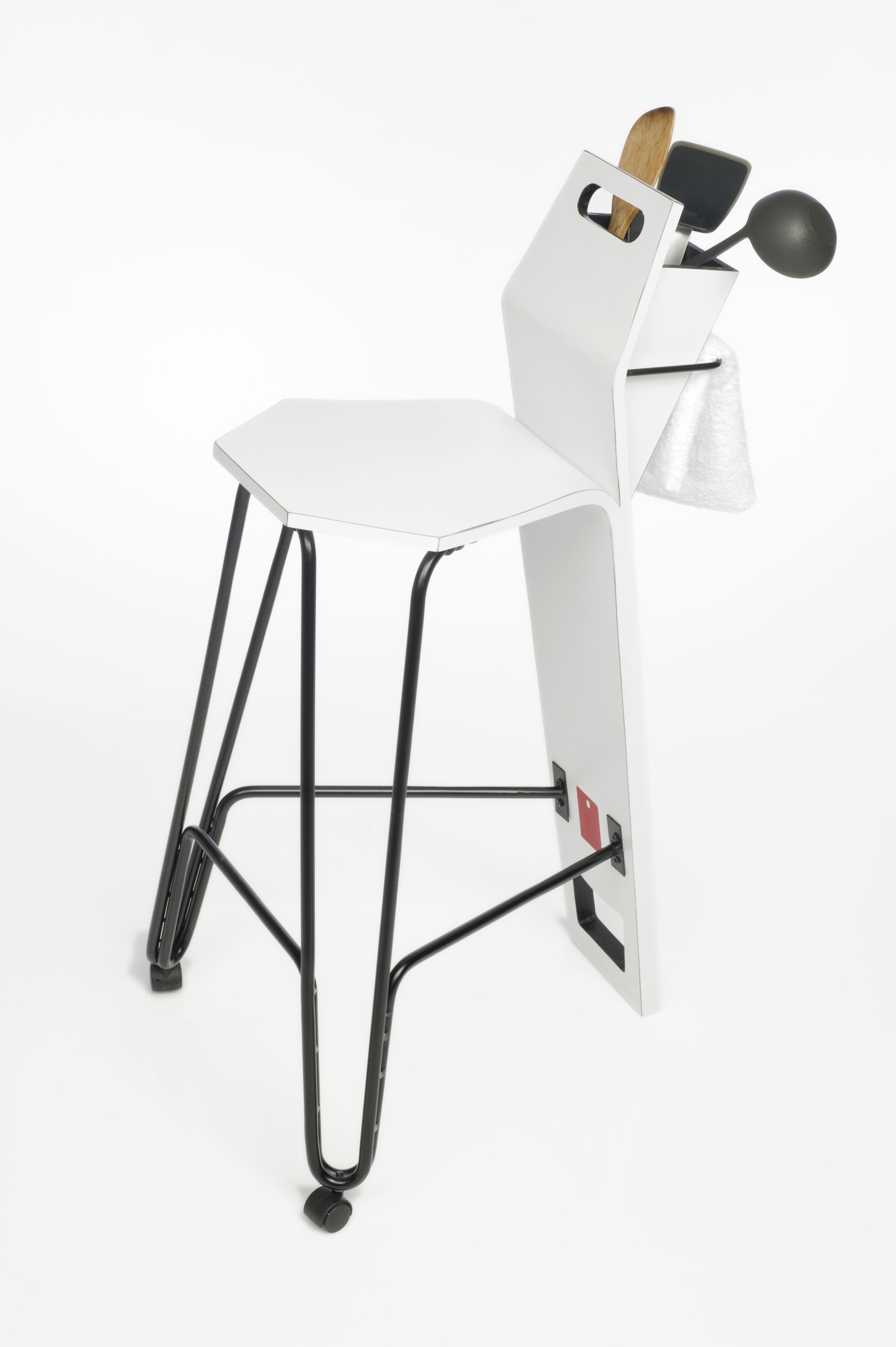
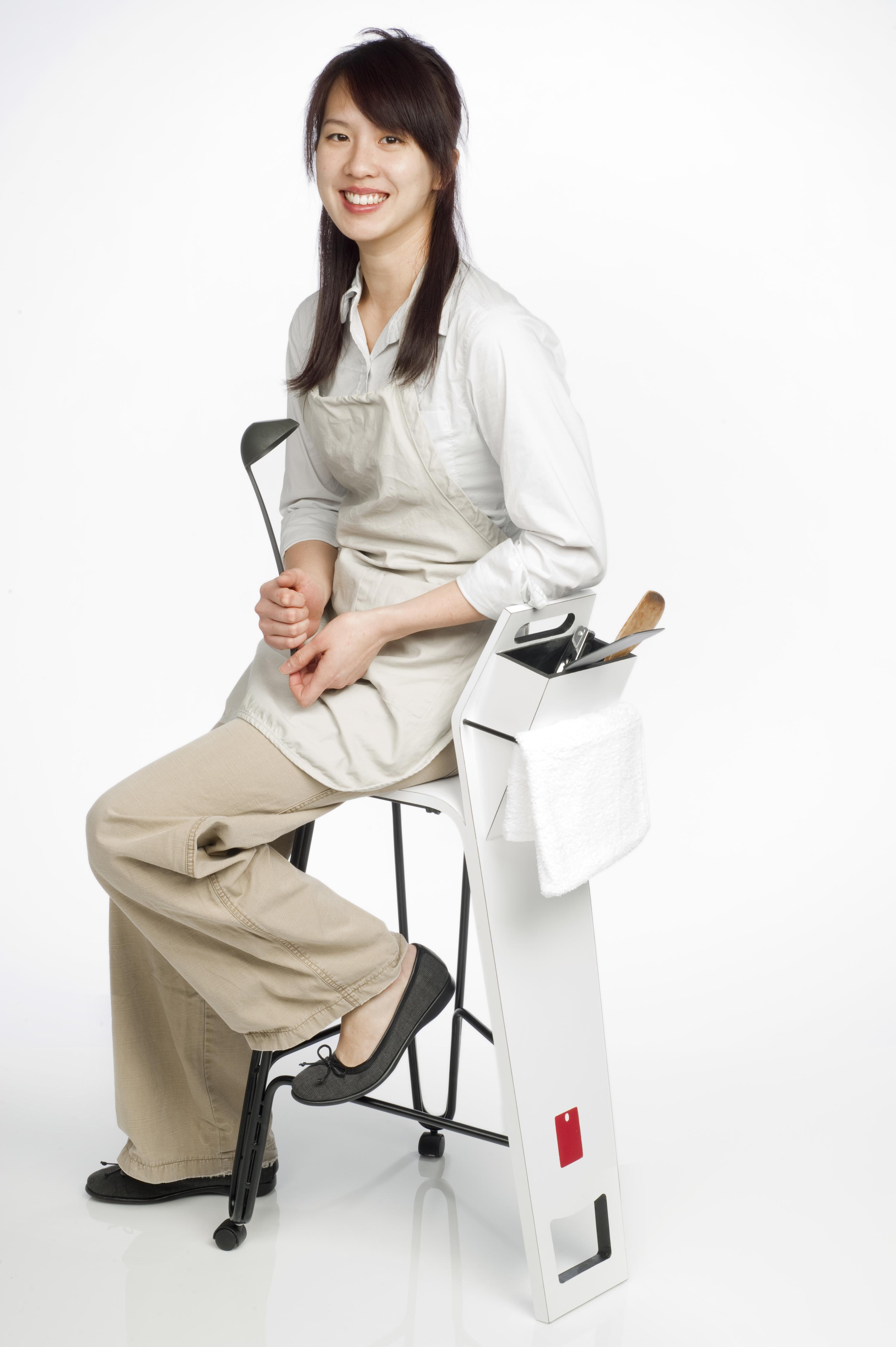
The Tool Stool
Context: In the kitchen, the cook is usually standing or moving about in a relatively controlled space. It would be useful to have something for them to lean or sit on temporarily. There is a limited amount of space in the kitchen, so the size of such a device should be small and easy to move. Problems: Bring added convenience to people in the kitchen. The seating device should be easy to clean, easy to move around, offer some storage and not be dangerous. Solution: A stool for leaning, and possibly for sitting, for a short amount of time. Wheels on the feet with a corresponding handle on top and foothold on the bottom allow easy mobility. A mid-size container on the back of the stool holds utensils, recipes, towels, spices, etc. Brand Strategy: The placement of the Wilsonart sample chip icon on both the front and the back of the back support catches the user’s attention from various perspectives. The foot rests converge to the font chip becomes a focal point; the back is located right on top of the foothold becomes a target for moving the stool.
Vito Morbidini
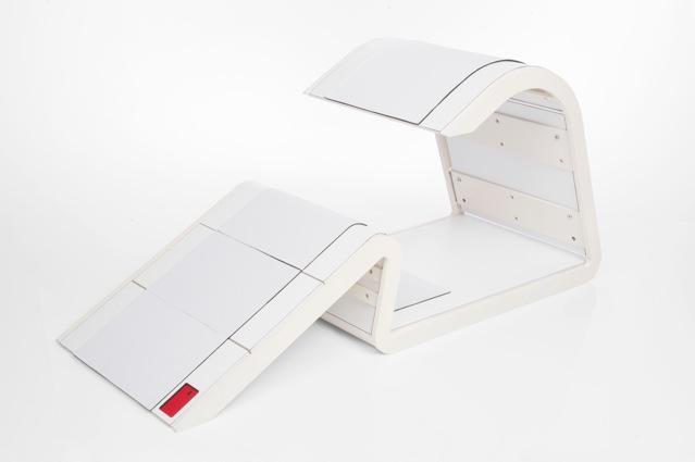
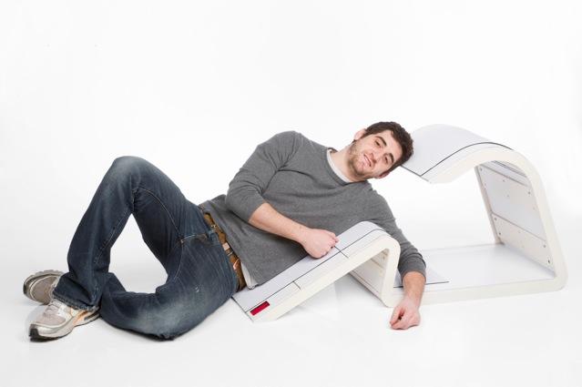
The Recline
Context: In some cases, falling asleep could be seen as a kind of burden. Rolling in bed, searching for a comfortable position can cause frustration and stress. Problem: Create a seating device which accommodates the need for a transitional position between being awake and falling asleep. Solution: A body-support device where a user can rest, reclining on their side while waiting to fall asleep. Brand Strategy: The Wilsonart sample chip icon is placed on the base of the seating device to further strengthen its’ physical and philosophical connection to the ground which supports and enhances its function and design.
Andy Clark
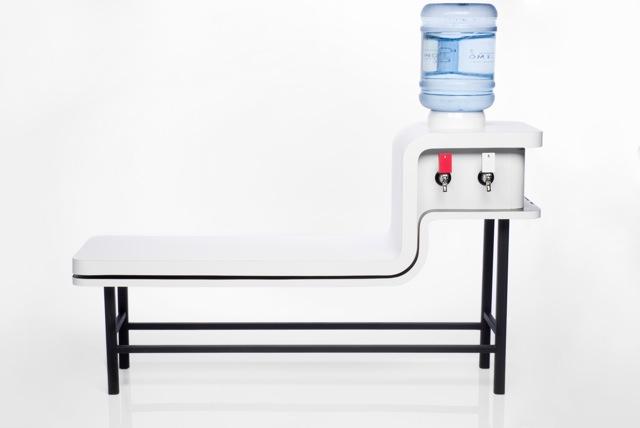
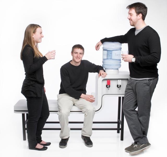
The Cooler Bench, Runner Up
Context: In an office environment, water coolers are the traditional place for quick breaks, office gossip and informal idea sharing. People benefit from social interaction with co-workers, and the chance to step back from the more controlled aspects of office life. Problem: Create a seating device which challenges the office space and allows for more personal and less formal conversation. Solution: Introducing a bench with a built in water cooler, to the office break scene. Brand Strategy: The Wilsonart sample chip icon is placed where it has a high contrast against the rest of the bench. As a tap or switch to initiate the flow of water, it also becomes a key element of the function and forces the user to interact with it. This reinforces the Wilsonart brand in a visceral way.
Tim Kuo
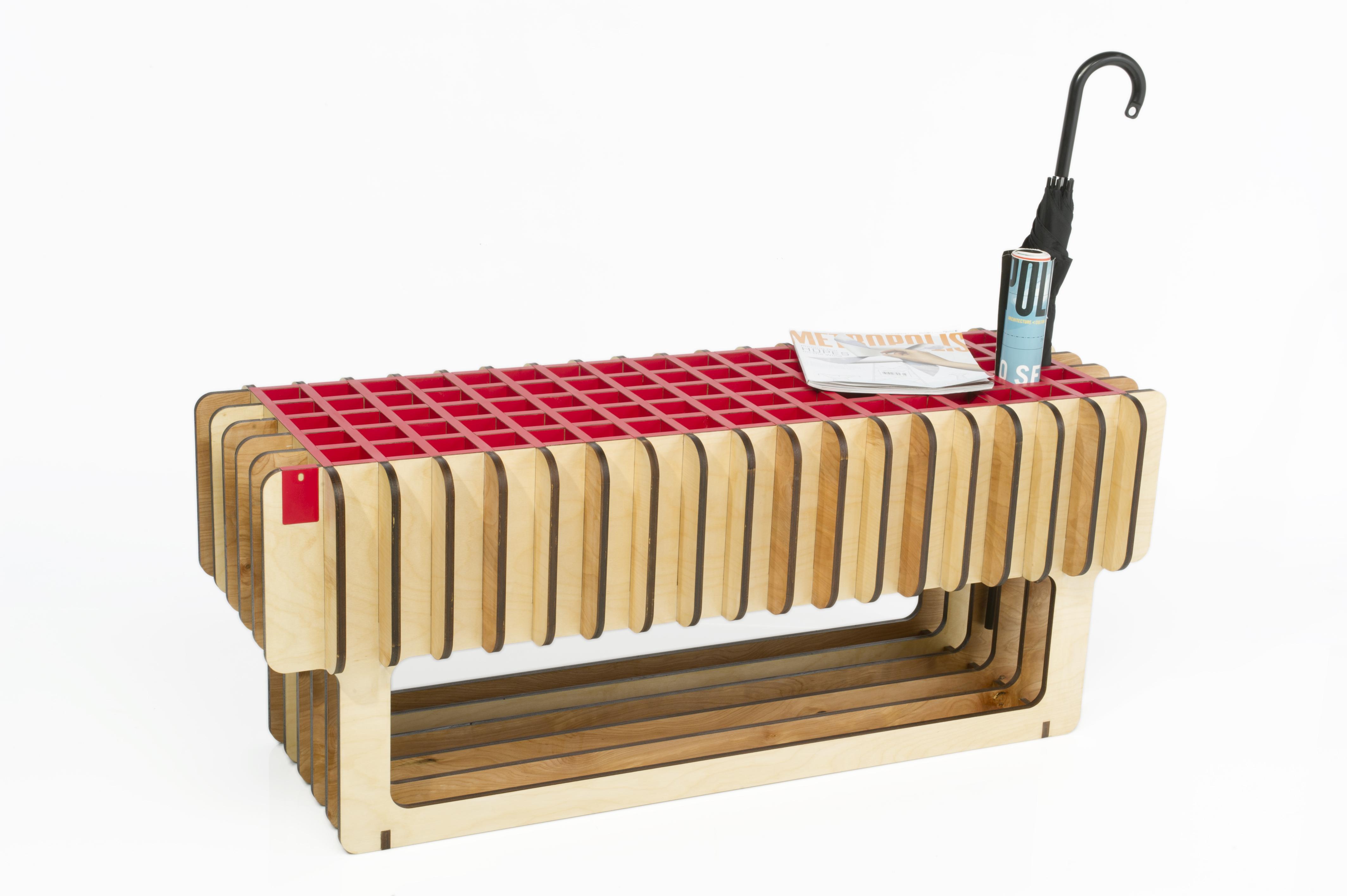
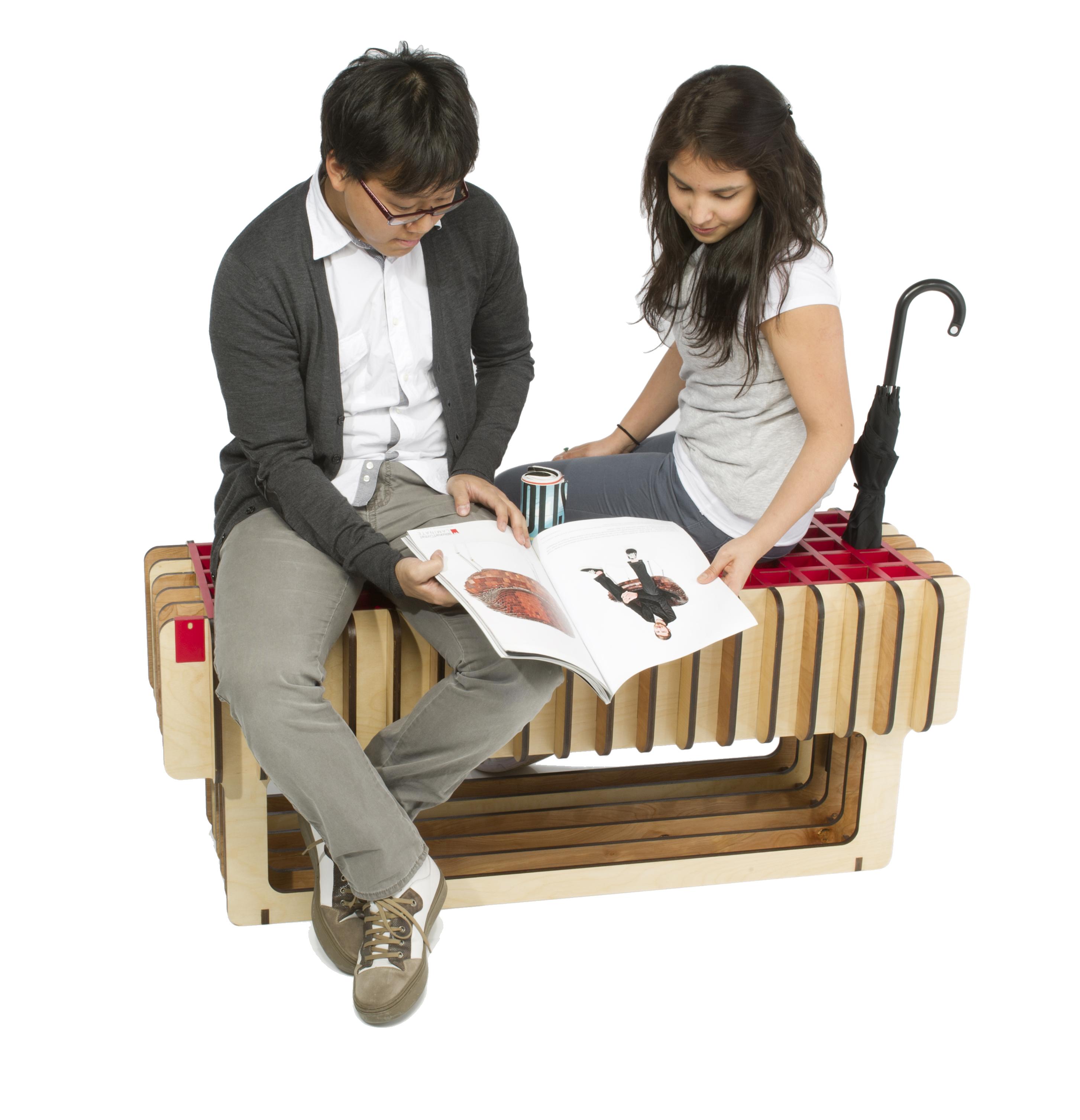
The Encounter, Runner Up
Context: In today’s modern society, people often avoid unnecessary conversation with strangers. This creates a psychological wall that prevents chance social interactions. Problem: Create a seating device which can enhance the exchange of information between strangers in a public setting. Solution: A seat for two to three people which provides a temporary respite with an affordance for certain reading materials (newspapers, magazines) and for umbrellas, walking sticks etc. Brand Strategy: Because the Wilsonart sample chip icon is the same red as all the functional surface areas of the bench and inlayed in the same manner, the brand will be associated with solving meaningful social as well as practical problems.
Francesca Pezze
The Nodule, Runner Up
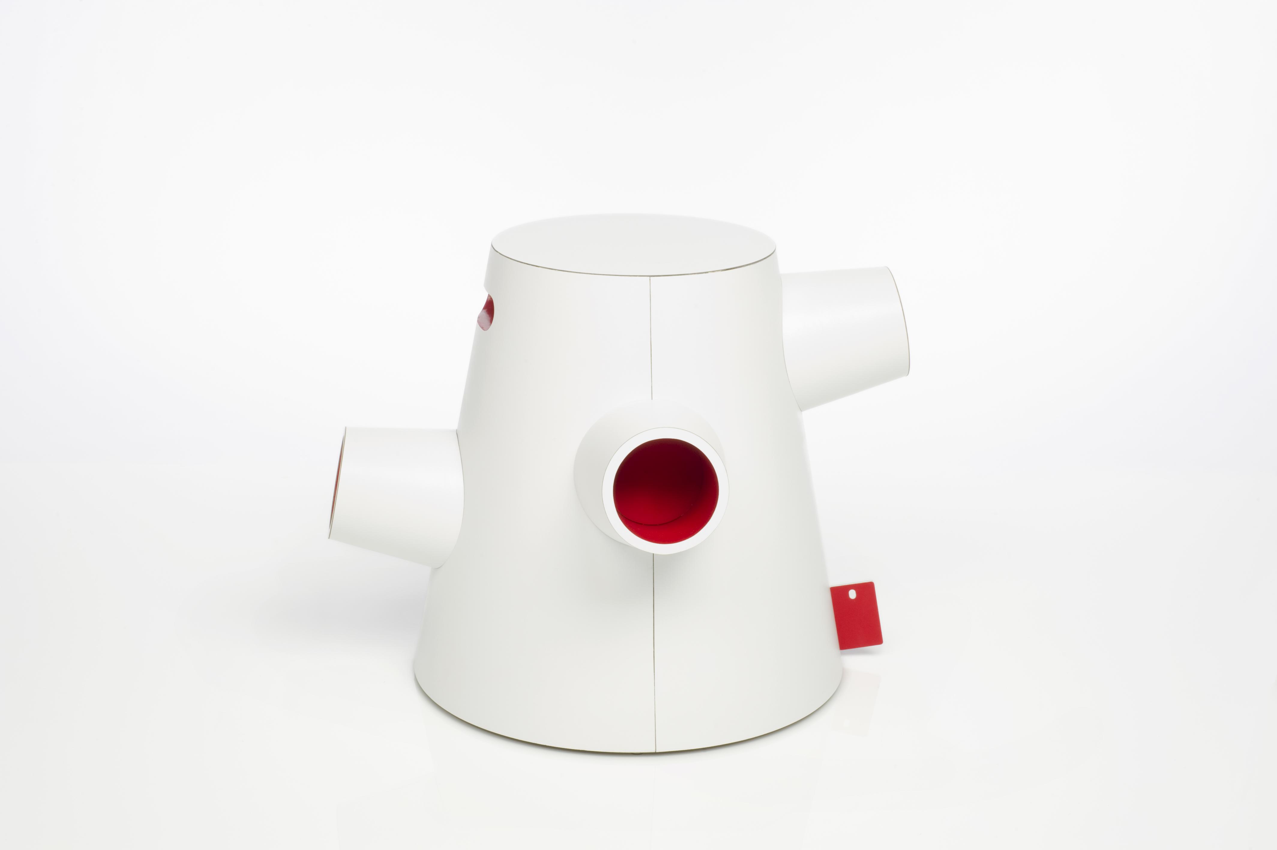
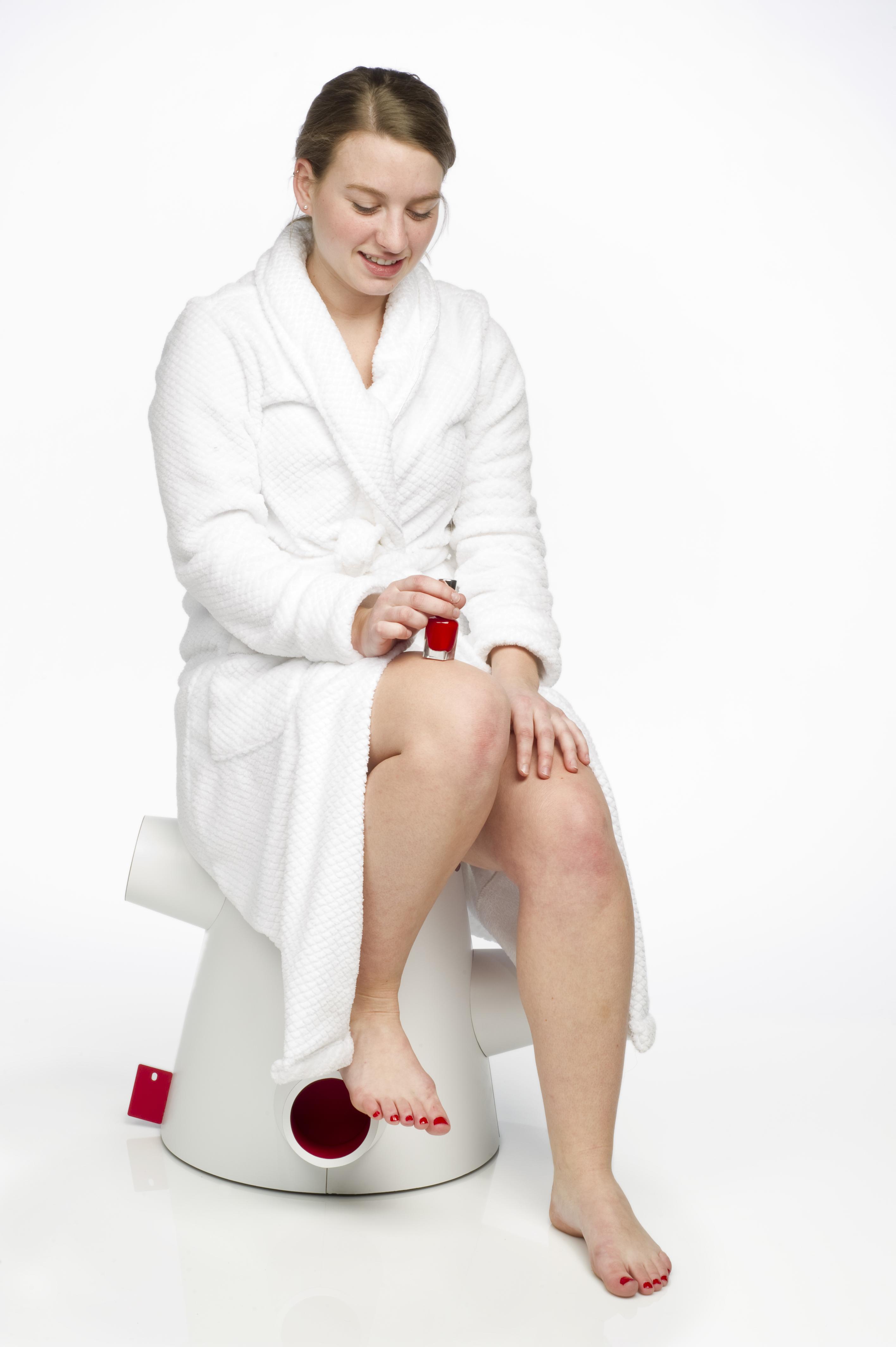
Context: Awkward personal grooming habits never seem to be discussed. Toenail clipping, shaving legs, applying lotion, painting toenails etc. not only are they uncomfortable to talk about they are uncomfortable to perform. Problem: Create a bathroom apparatus to ease the process of tending to personal grooming habits that fits multiple sizes and doubles as storage. Solution: A bathroom stool with varying height supports and storage compartments. Brand Strategy: Like a branding tag on a towel, the red Wilsonart sample chip icon appears on a seam of the stool. It is set in white silicone so it doesn’t cut anyone’s feet and flexes if bumped into. The chip placement catches the eye without being too distracting and reinforces the red treatment in the other useful areas of the object.
Dan Kestler
The Union, Runner Up
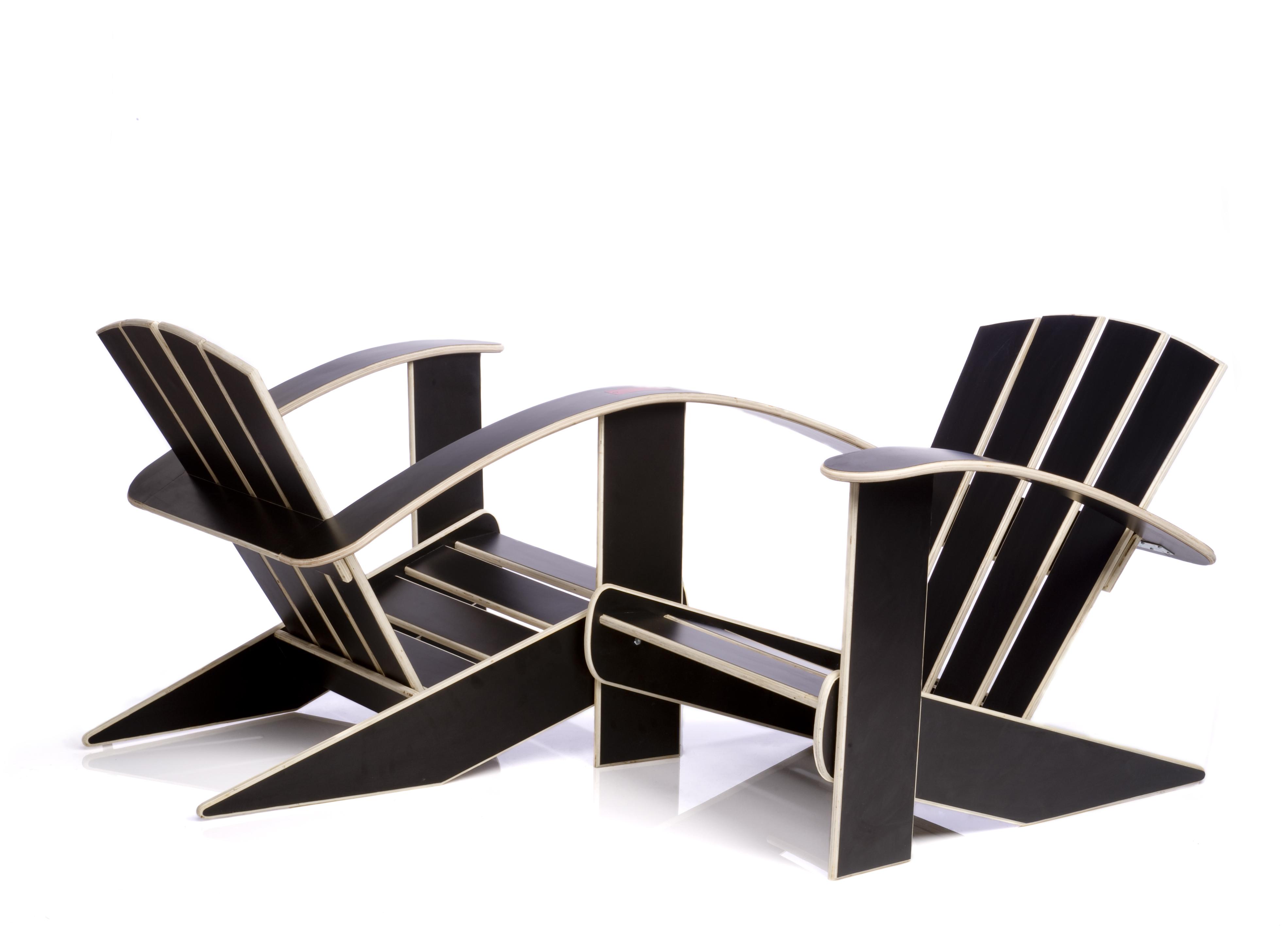
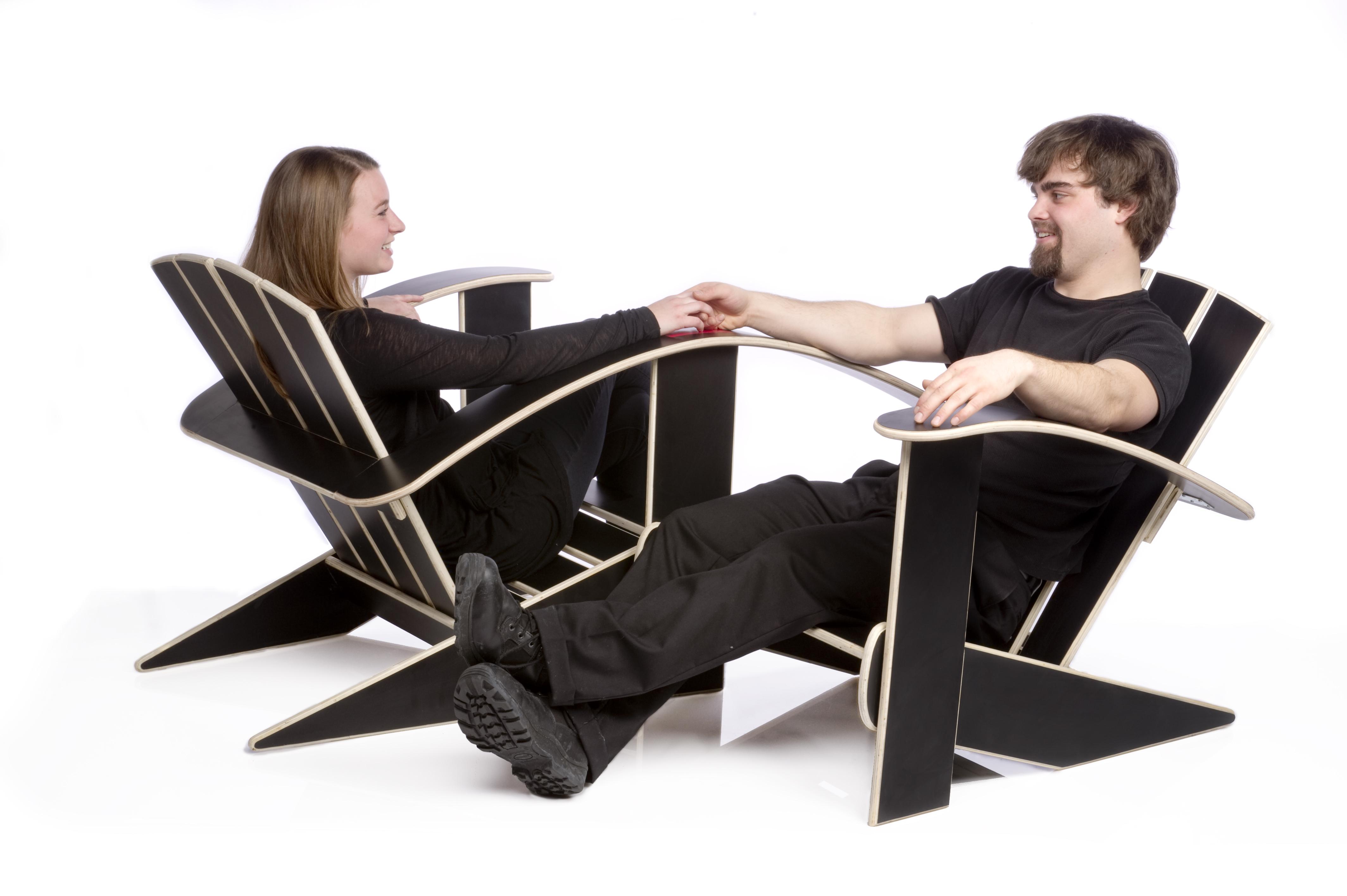
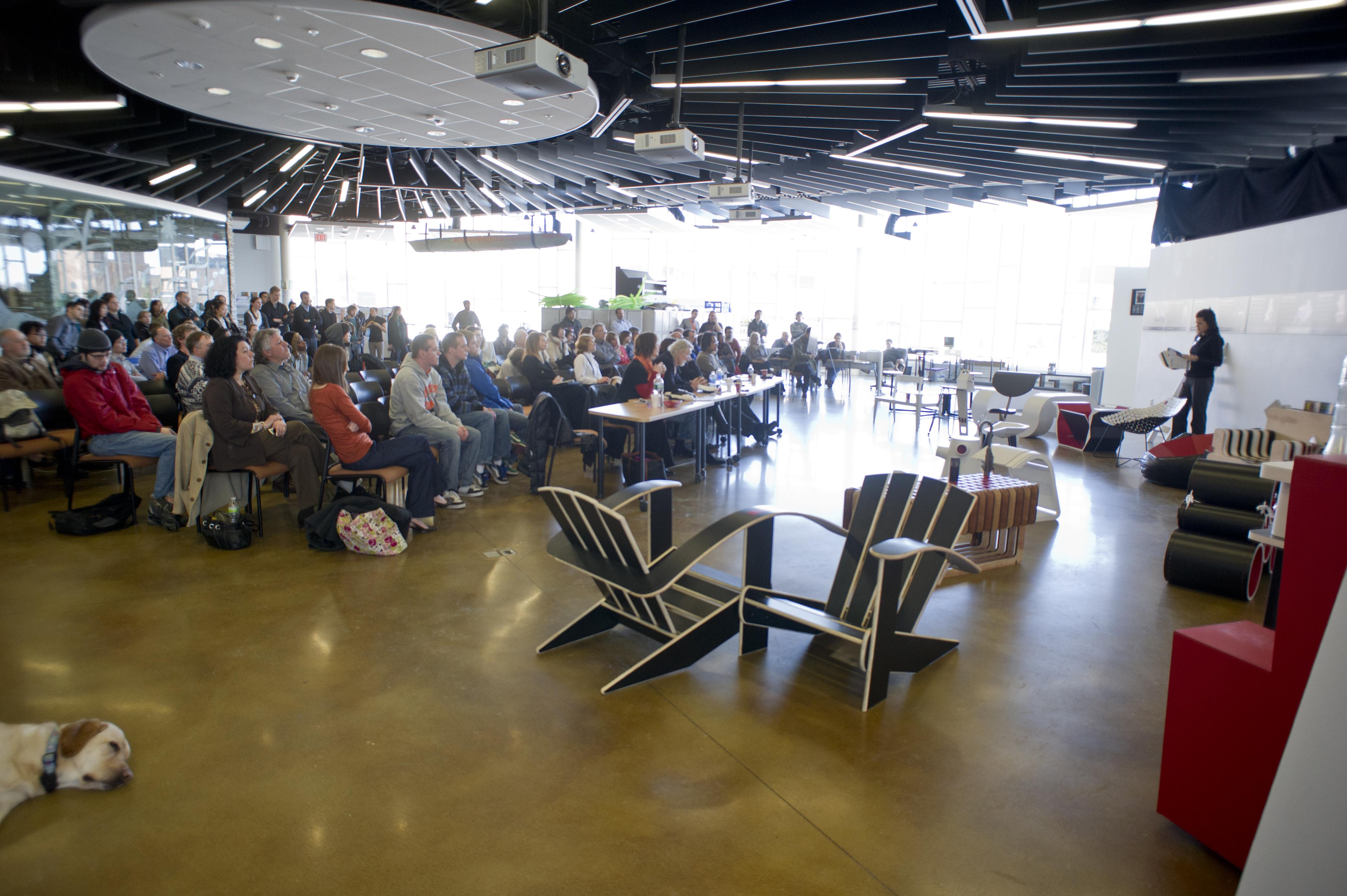
Context: New advancements in both communication and media technology have forced people to spend inordinate amounts of time sitting and looking at digital displays. This has caused a major decrease in daily physical / social interaction. Problem: Create a design for a seating system which would cultivate a shared experience of relaxation and promote social interaction. Solution: Two Adirondack-style chairs oriented towards each other that share a common armrest allowing shared relaxation for two individuals, seated across from one another in close proximity. Brand Strategy: The Wilsonart sample chip icon placement is in the center of the shared armrest because it is the focal point of the context which inspired the chair’s design. The chip is also doubled in length to express the duality of how the two chairs are joined together as one.
Colleen MacKenzie
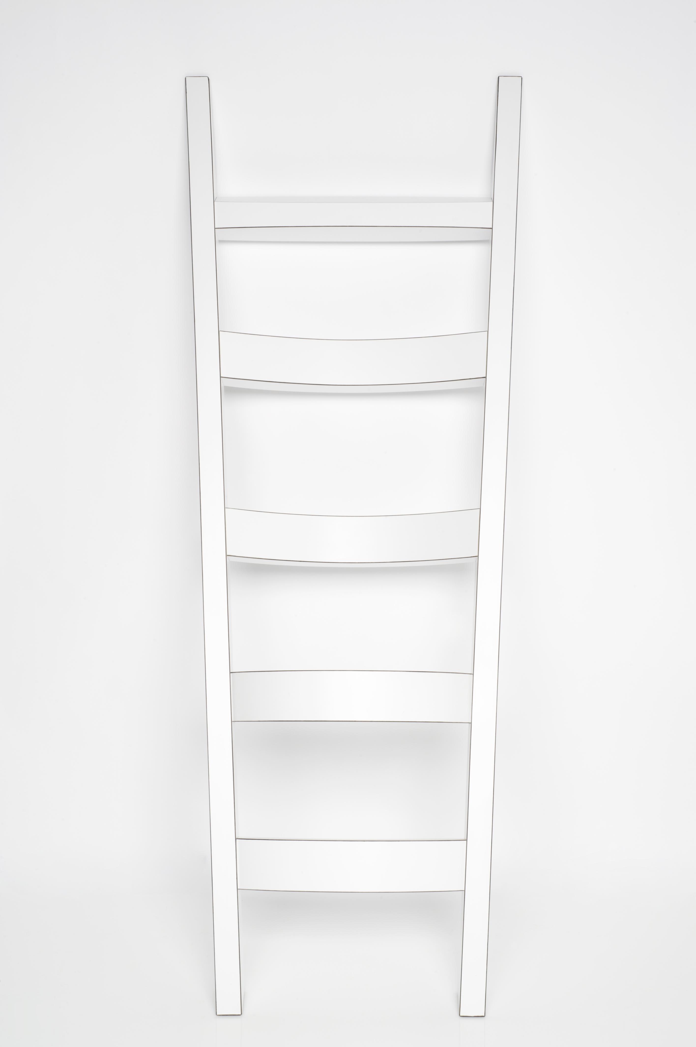
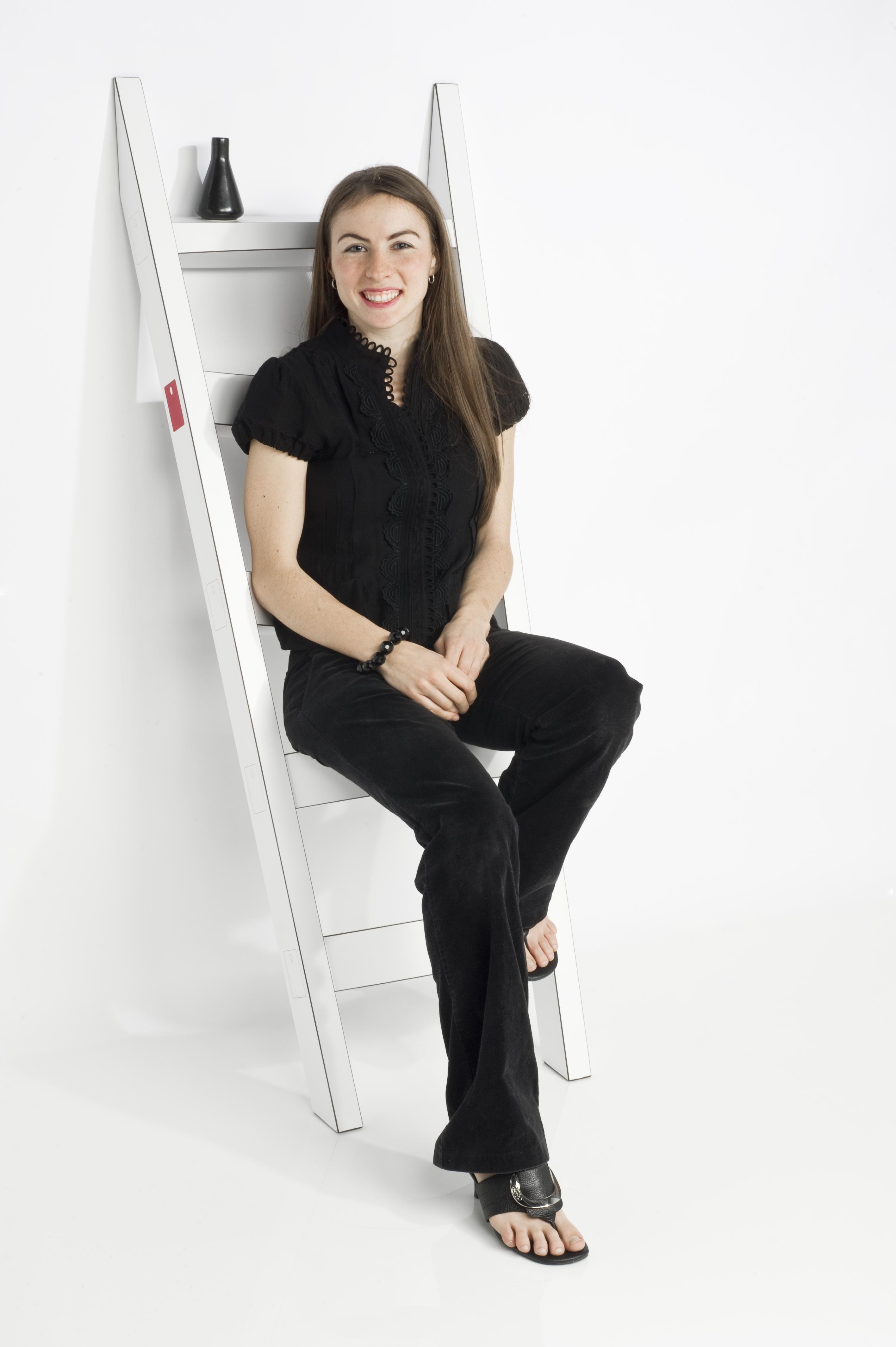
The Stanchion, Second Place
Context: People fall into settings, often becoming comfortable to the point of missing the impact of notable objects in the scene. There is an opportunity to shock people into the reality of their surroundings by mixing functional object categories in meaningful ways. Problem: Chairs take up significant space when standing alone and can often be hard to stow away efficiently. Chairs are not always effortless to move around between rooms and spaces unless they are more in the stool classification. Solution: Create a seating device which accommodates temporary or occasional comfort as a perch and limited storage by offering a location for a drink, wallet, keys, glasses etc. Brand Strategy: Graphic outlines of the Wilsonart sample chip icon shape are articulated as joints in details along the outside of each of the rungs of the seat’s ladder shape. One of those details is fully defined by the Holly Berry Red chip itself. This link between the brand and the design shows the intimate connection between Wilsonart and innovative thinking.
Dan Fritz
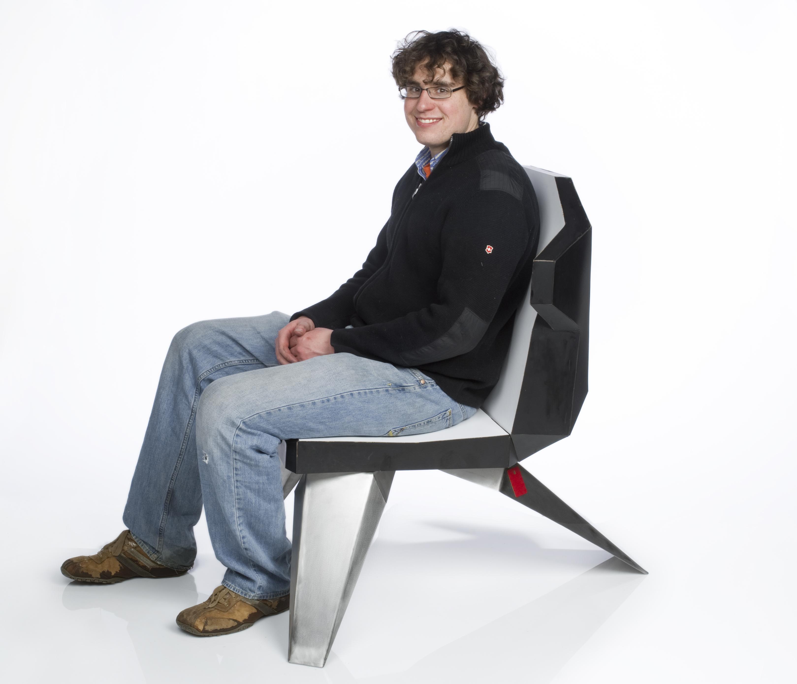
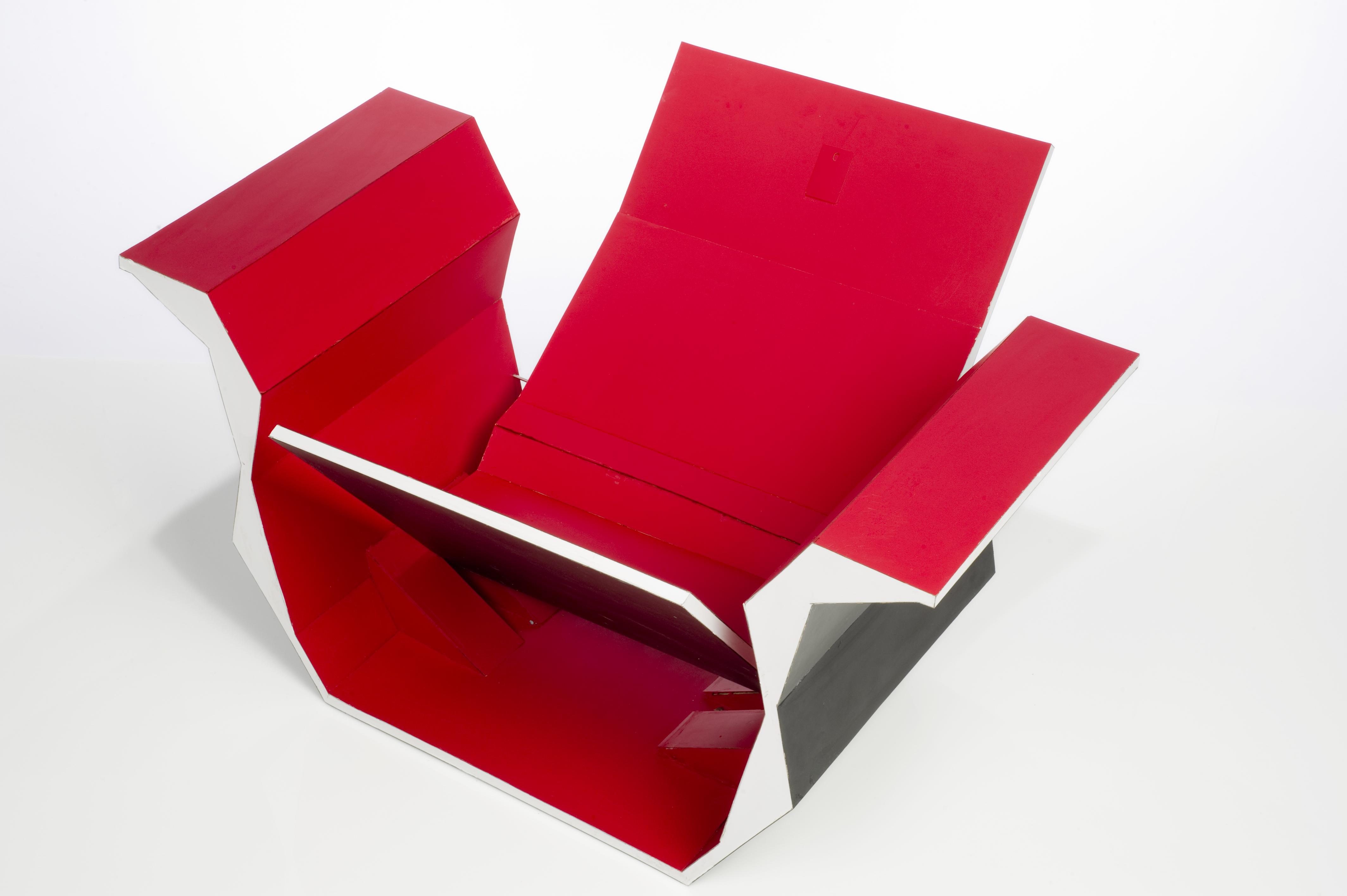
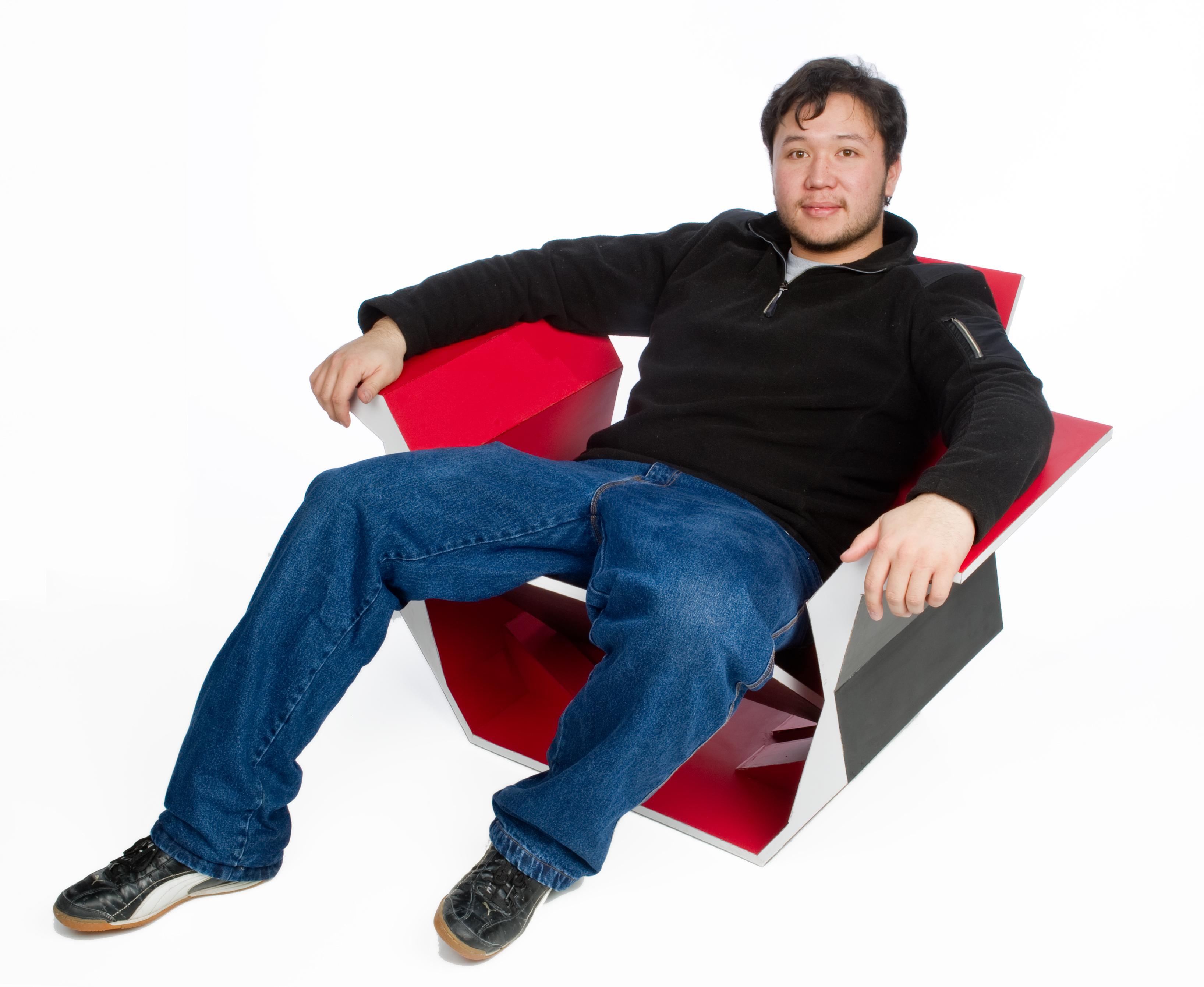
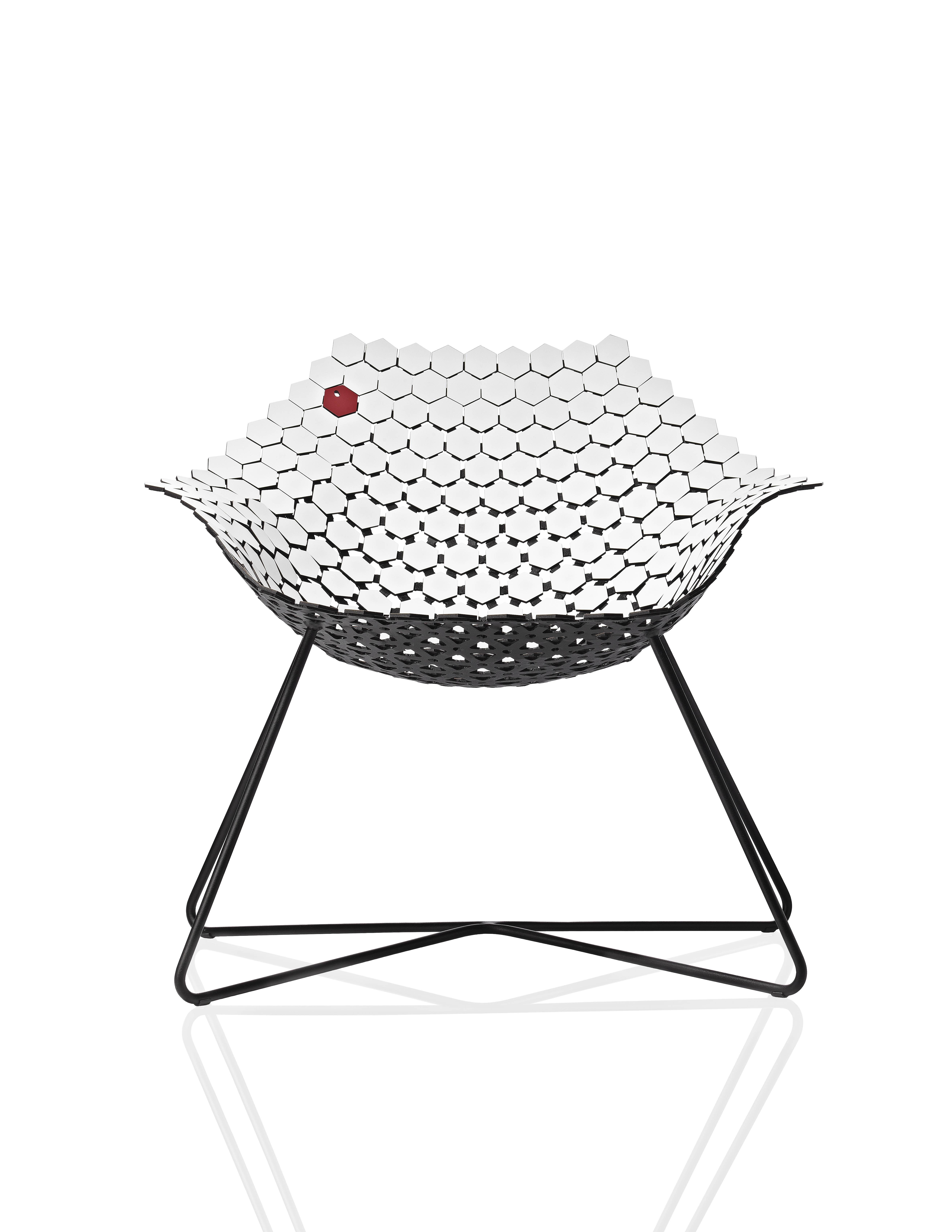
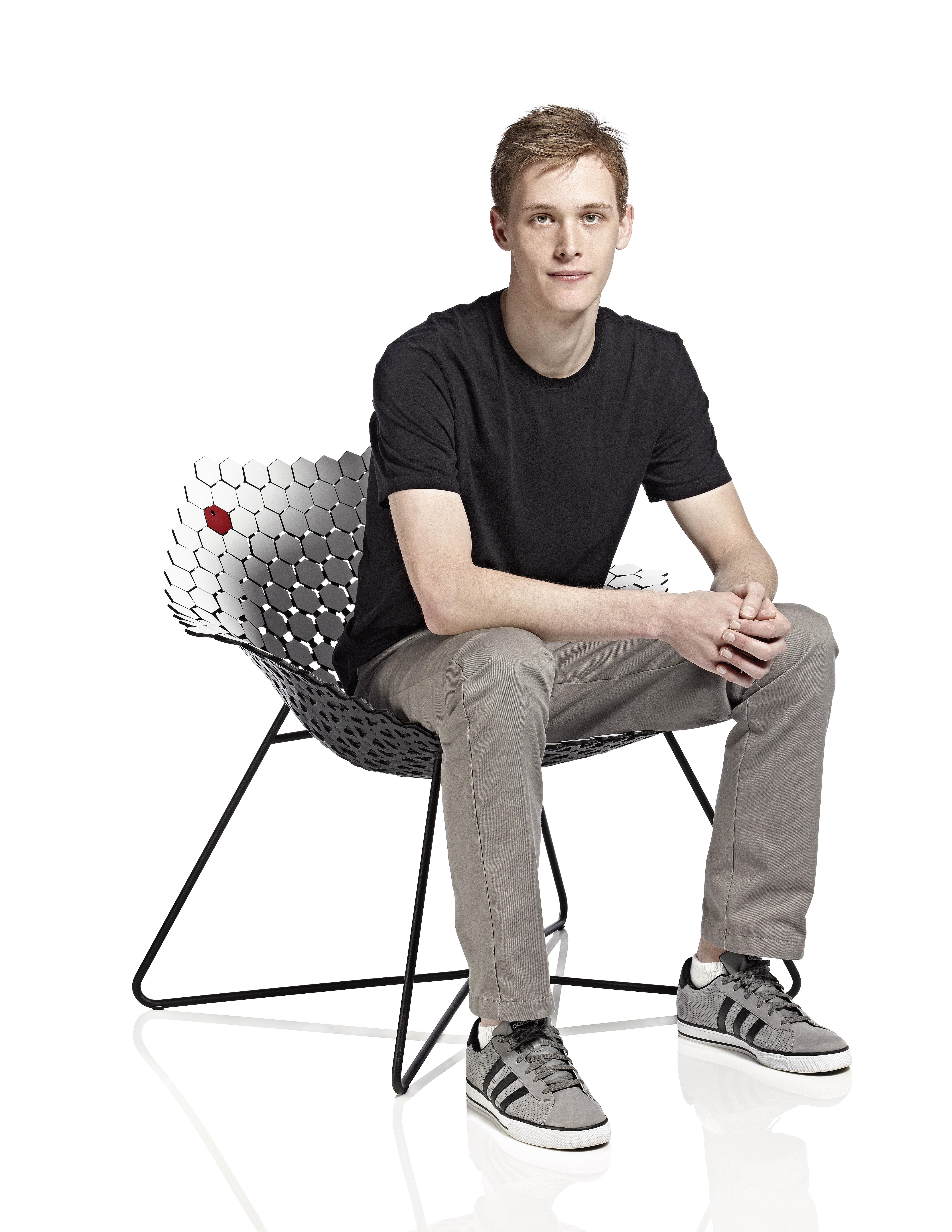
The Trance, First Place
Context: People tend to lose themselves in the rushed life they live in. A simple act of meditation is one of many methods for slowing down a hectic life and restoring focus and creativity. Problem: Creating a seating device that encourages the act of sitting down and removing oneself from the distractions of daily living. Solution: A lounge- type seat, which evokes the feelings of meditation through visual cues such as hypnotic repetition and slight separation of shapes. Brand Strategy: The sample chip is a hexagon because like Wisonart laminates, it fits into its surroundings yet still stands out as its own. The exploration of the laminate’s potential celebrates Wisonart’s capability to retain its functionality even in unconventional applications.
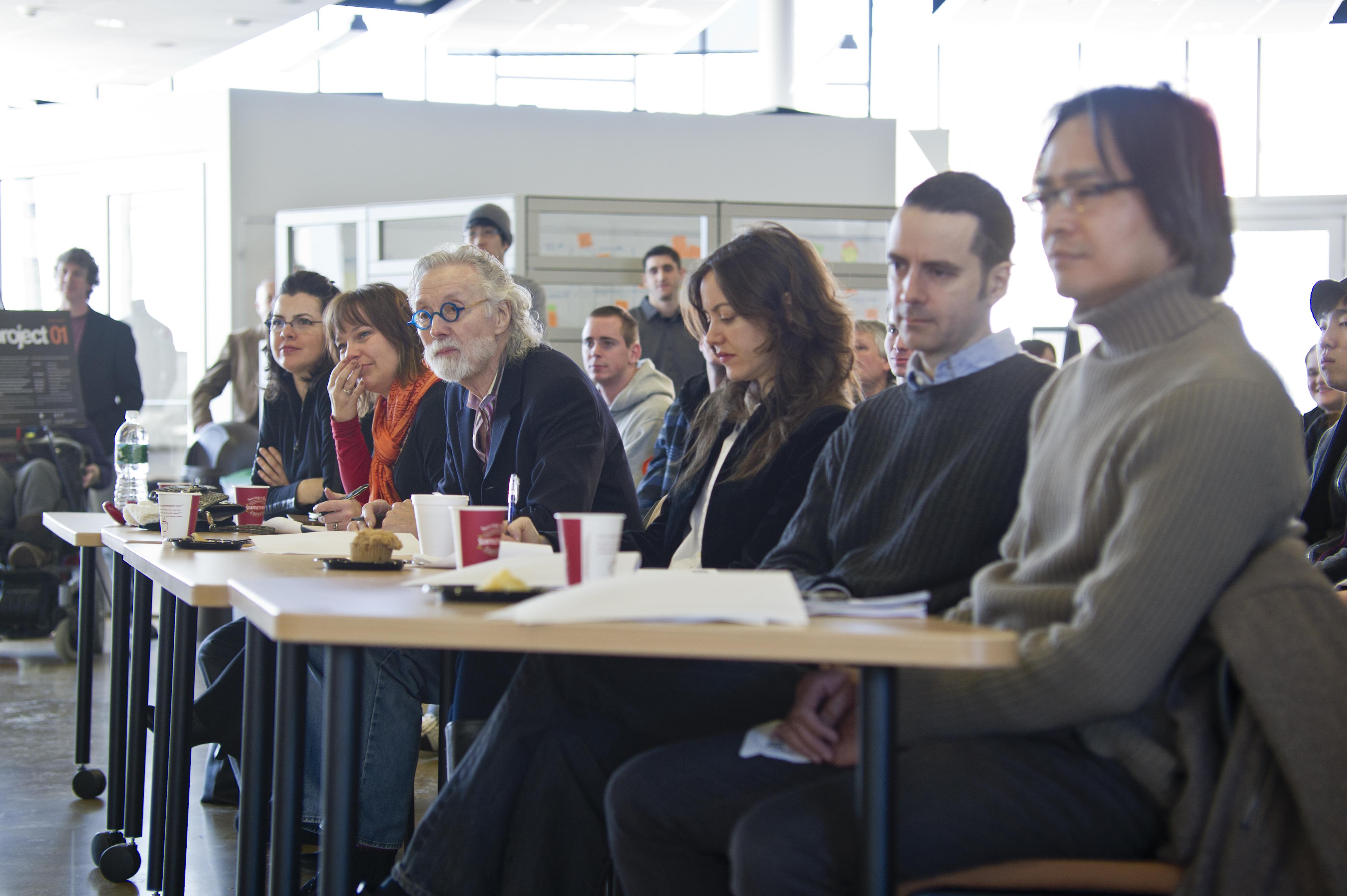
Invited panel of experts judging project at Center for Student Innovation, RIT, from left to right: Grace Jeffers, Design Historian, Organizer of Wilsonart Project; Alison DeMartino, Marketing Director, Wilsonart; Wendell Castle, Furniture Designer, Artist-in-resident at RIT; Belinda Lanks, Managing Editor, Metropolis Magazine; Allan Chochinov, Principal of Core77; Ron Labaco, Senior Curator, Museum of Arts and Design, New York City.


