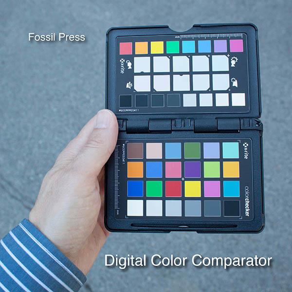
Digital Color Comparator
By comparing this printed book with the free downloadable PDF file that was used to make it, you can quickly determine how the colors you see on your computer monitor will appear when printed.
This document was produced using Adobe InDesign and output to PDF using the standard High Quality Print settings. All solid color values were created using the Adobe color picker to select either RGB or CMYK values. The color samples on the back cover of the book and on the left side of the second page spread are the same. The differences you see are a result of the different paper grades and finishing method used for the cover and interior of the book. This chart will give you valuable insight into problem colors to avoid in your book designs.
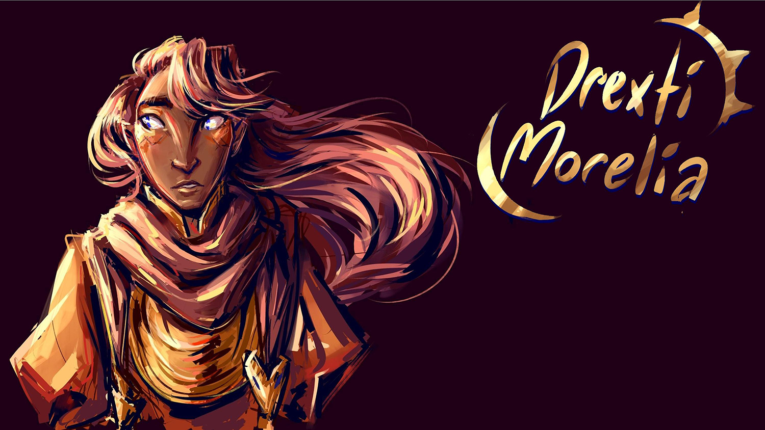
The images in this book were selected because they present a wide range of challenges for any printing process. The images were optimized for pleasing appearance on your computer monitor. The last two-page spreads in the book show the same reference image with three levels of increased saturation and three levels of increased midtone lightness. These can be used to help you adjust your screen images to achieve the best combination of printed color saturation and tone reproduction.
As you gain a better sense of the way printed color deviates from what you see on the monitor, you will become a more effective book designer. This book provides a first step toward your quest to optimize digital color books.
You can download the PDF by scanning the QR code to the left, or typing in the following URL: https://artdesign.rit.edu/faculty-staff/2/faculty/1104


