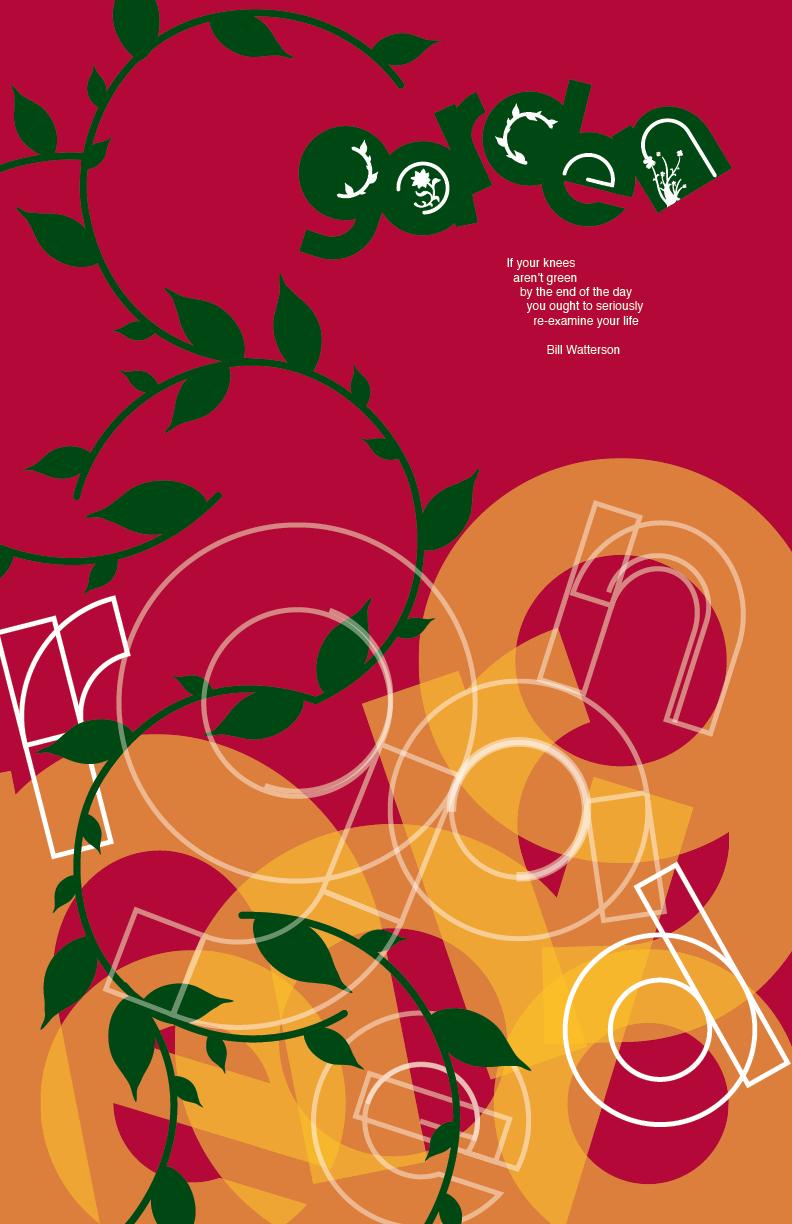
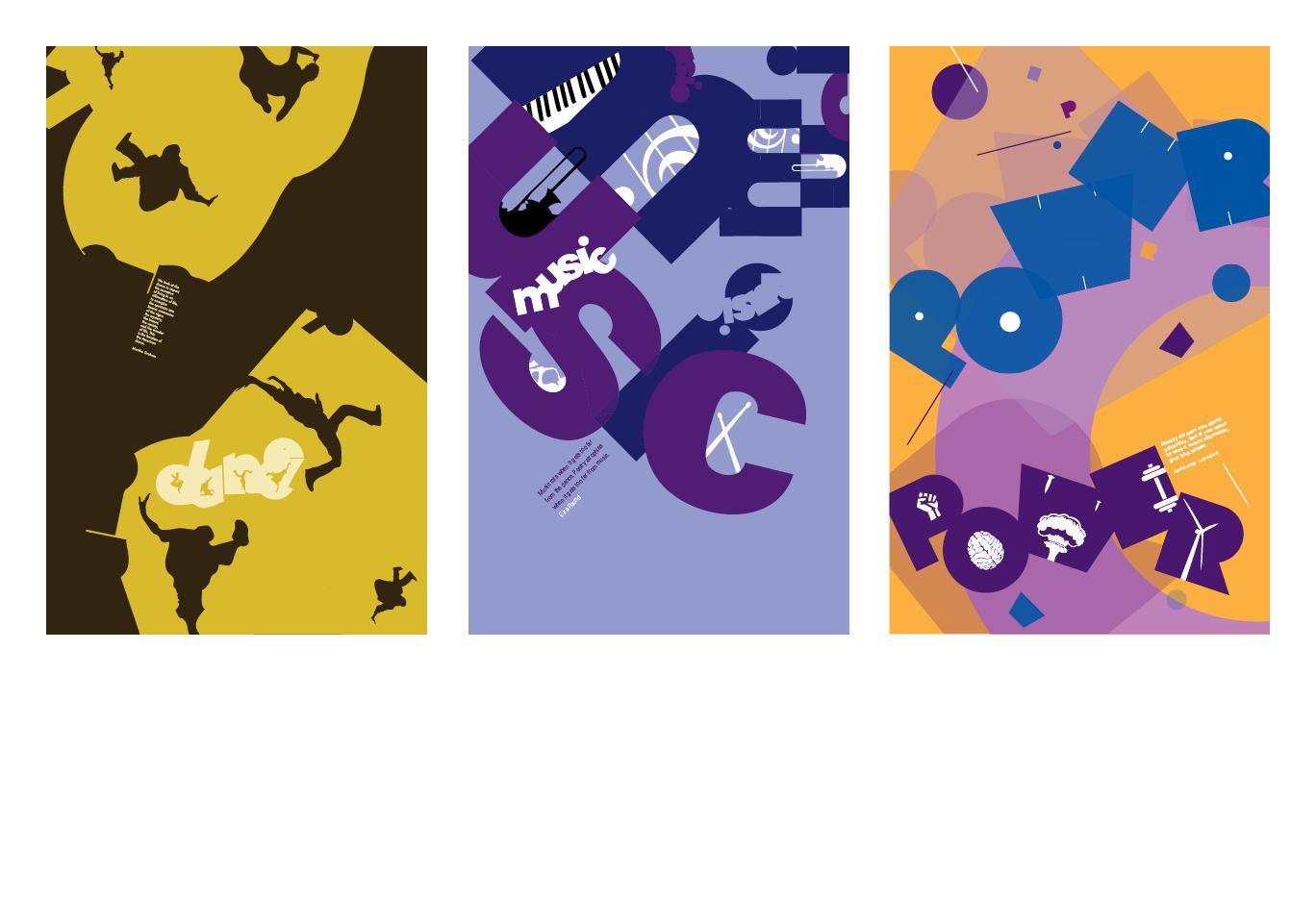
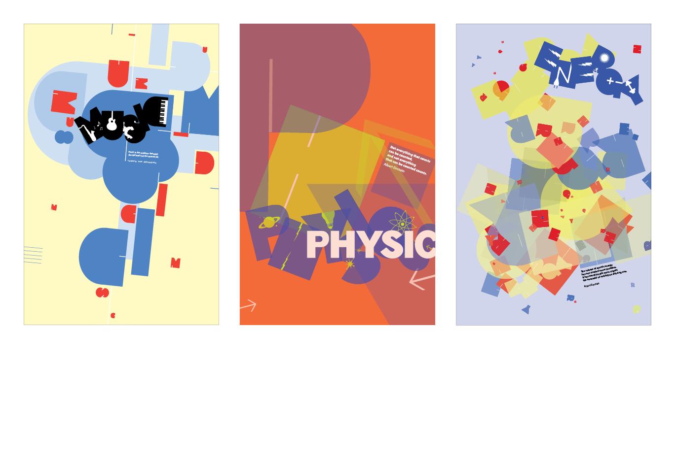
Typographic Form
Word shapes are developed and integrated harmoniously with non-typographic imagery. Value and color are explored and incorporated into poster design solutions.
Typography II
Nathan Pacelli
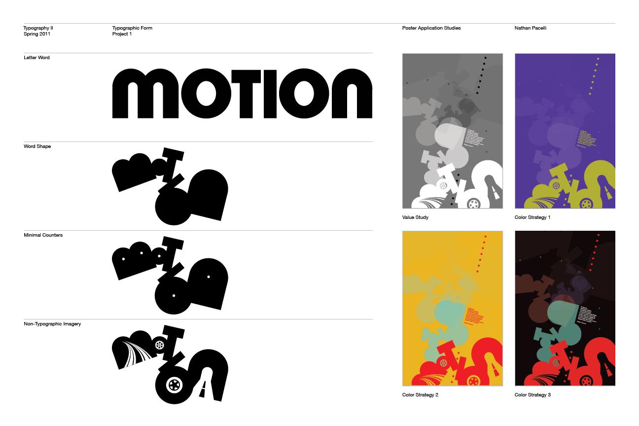
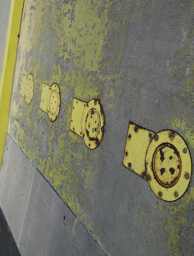
This presentation panel shows the 4 steps of the project. Step 1: a simple, extra-bold sans serif sequence of letters is developed to understand letter shape, proportion and syntactic unity. Step 2: the internal counter spaces are removed and a word shape is developed by manipulating letter position, orientation and scale. Step 3: the counter spaces are reintroduced as minimally as possible. Step 4: The counter spaces are replaced by non-typographic imagery.
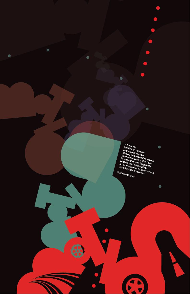
A poster application uses any or all of the 4 step elements to develop a dynamic typographic composition. Value is first explored, and then the 6 main color strategies are explored: Complimentary, Split-Complimentary, Analogous, Triad, Tetrad, and Monochromatic.

More Featured Profiles and Work
Jennifer Schaffer

Deborah Beardslee
Deborah Beardslee