Visual Exhibition 2025

The College of Art and Design's Visual Exhibition is a juried showcase of creativity for RIT's Graduate Showcase! It represents exemplary work by students from our renowned graduate programs.
Best in Show
Farah Ahmad (visual communication design)
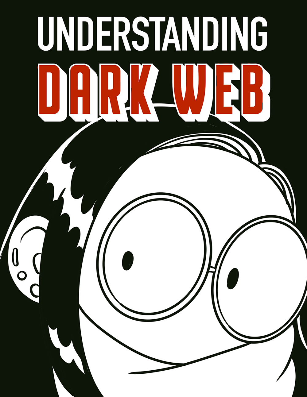
Understanding Dark Web
"This project is a comic book exploration of the dark web and internet hacktivism, created as the final assignment for the Information Design course taken in fall 2024, taught by Lecturer Joel Rosen. The comic takes a deep dive into the hidden layers of the internet — detailing how the dark web functions, its dual role in empowering activism and enabling criminality, and real-life examples like Silk Road and Anonymous. Inspired by Scott McCloud's storytelling style, the work translates complex technical concepts into engaging, accessible narratives that invite viewers to reflect on the ethical dimensions of digital anonymity."
Jessica FitzGerald (glass)
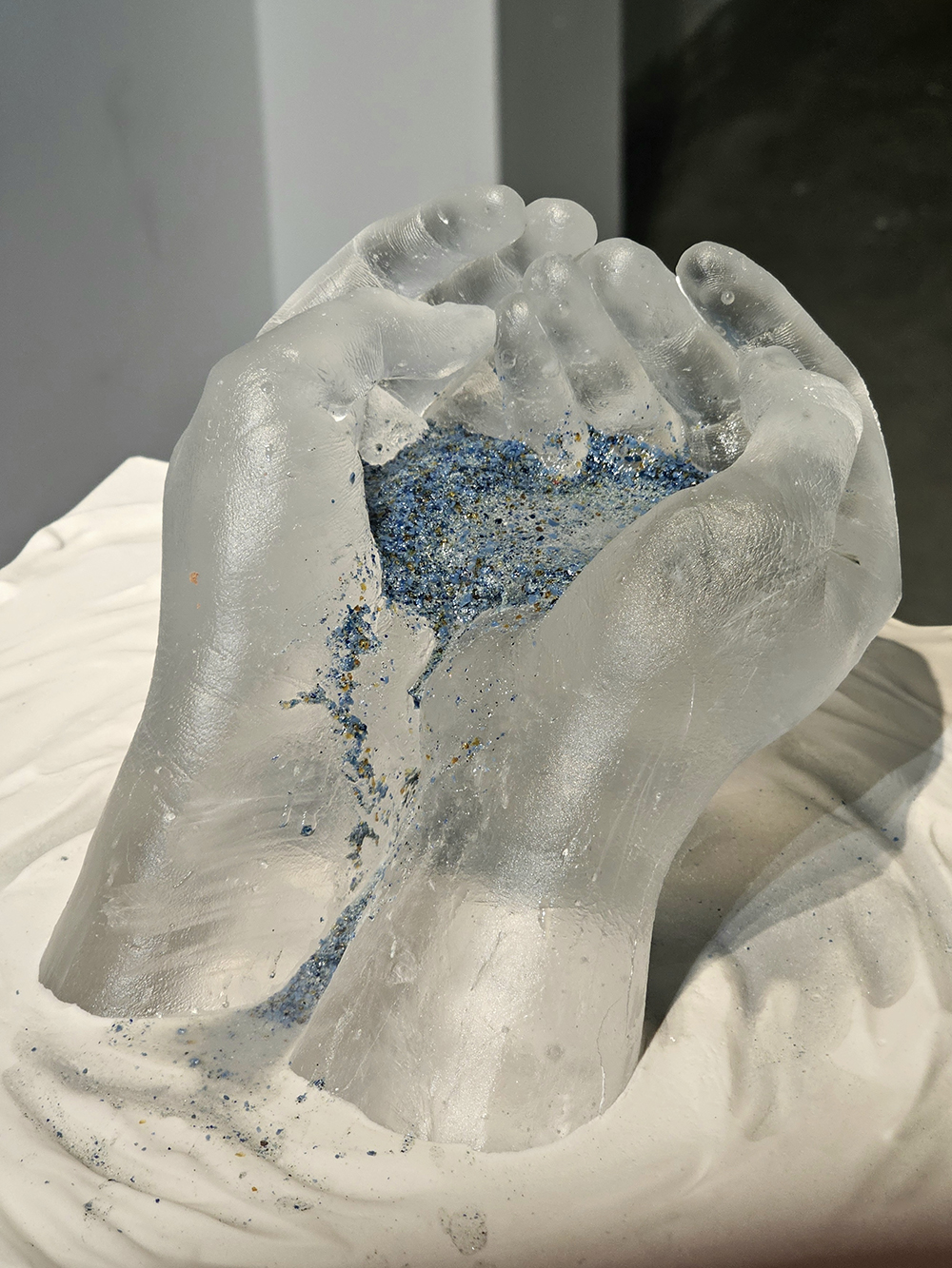
Inevitability
"Kiln cast glass hands are cupped, attempting to hold glass frit/powder. The piece works to capture the inevitable passage of time and the way it changes people. The color is held in place with sugar, fixed until water reactivates it, and the flow of time continues once more."
Bryona Hamilton (medical illustration)
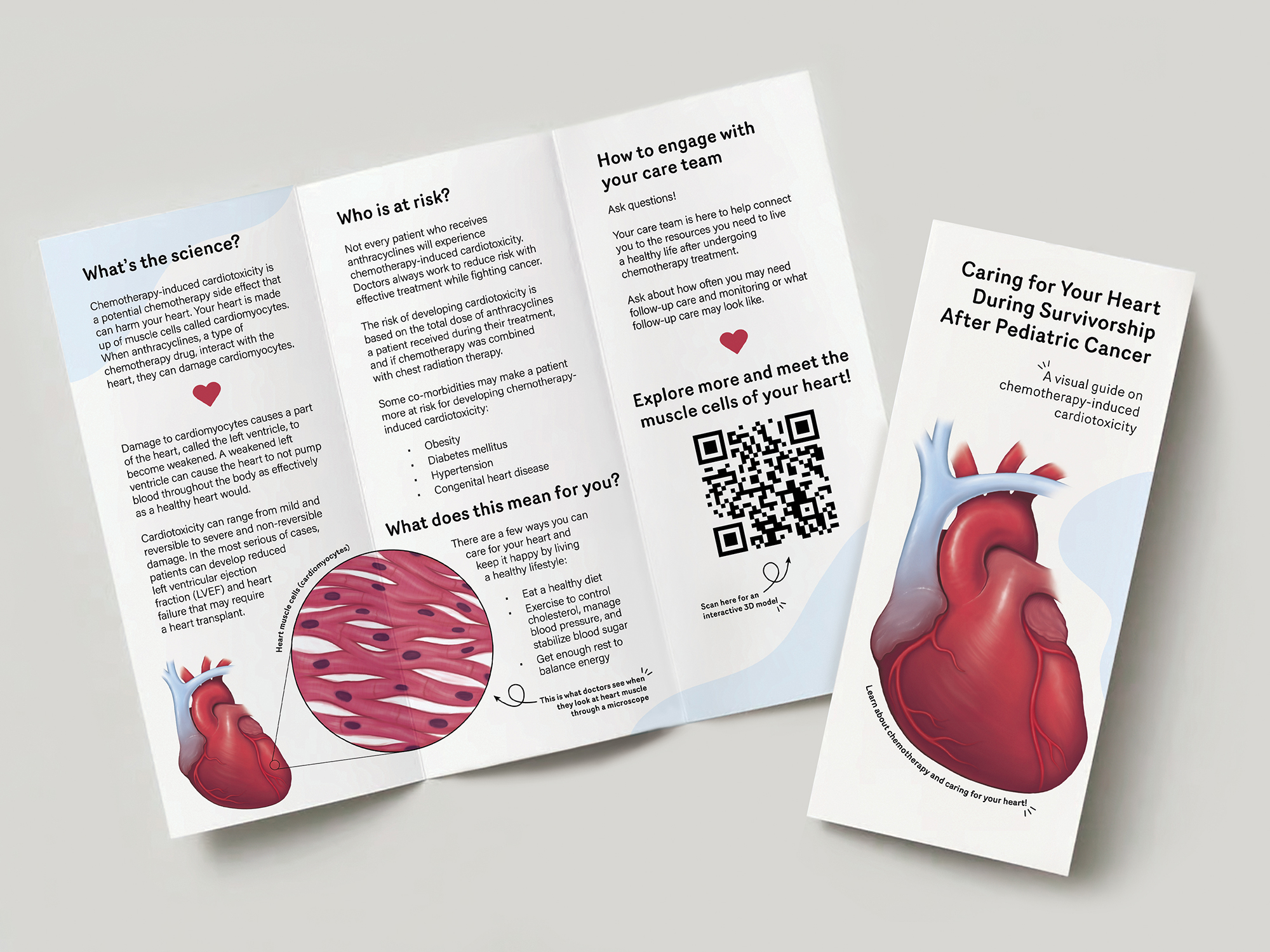
Caring for Your Heart During Survivorship After Pediatric Cancer
"Although chemotherapy is an effective weapon in the fight against childhood cancer, treatment can lead to side effects that last long after a patient finishes their last round of chemotherapy. The combination of a visually illustrated education guide with access to supporting interactive 3D media was created to educate childhood cancer survivors and their families on how Anthracyclines, a type of chemotherapy drug, can damage the heart. Patient education through visual media aims to enhance audience engagement and anatomical understanding of complex medical topics. The education guide will teach the audience about the heart, explain the damage caused by Anthracyclines, and guide patients on how they can talk with their doctor to care for their heart after chemotherapy treatment."
Jatin Joshi (visual communication design)
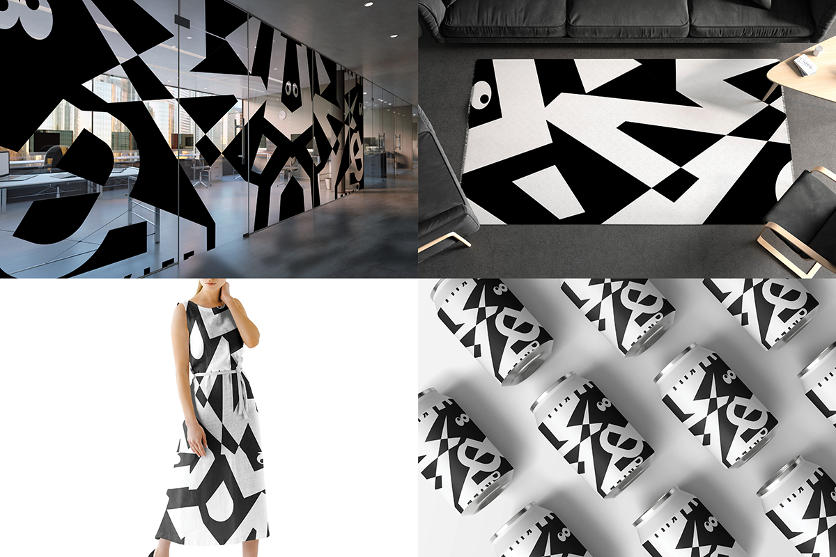
Abstract Pattern Through Type
"The 'Abstract Pattern through Type' project reimagines typography as a tool for creating abstract, seamless patterns, merging traditional craft with modern digital refinement. The primary goal was to explore the creative potential of type beyond its functional purpose by transforming it into an artistic medium for pattern design. This project focuses on the tactile and experimental aspects of type, emphasizing the beauty of handcrafted processes while showcasing the versatility of digital tools to elevate the final outcome. The ultimate objective was to create a visually engaging and seamlessly repeating pattern that could be applied across various design contexts, such as textiles, packaging, and digital interfaces."
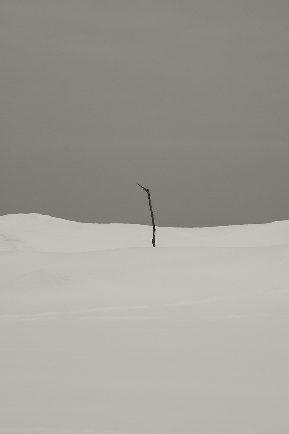
George Meng (photography and related media)
Stick
"My work tackles the idea of home and the sense of belonging. It addresses my pain from displacement and not having a place to call home. To me, this photograph of a lone stick in the snow is a self-portrait. It is seemingly alone and out of place. What is beyond the horizon line cannot be seen, indicating the uncertainty of my future. I use photography to document and understand the world around me. It is also a way for me to communicate with myself and others, especially things that cannot be described in words."
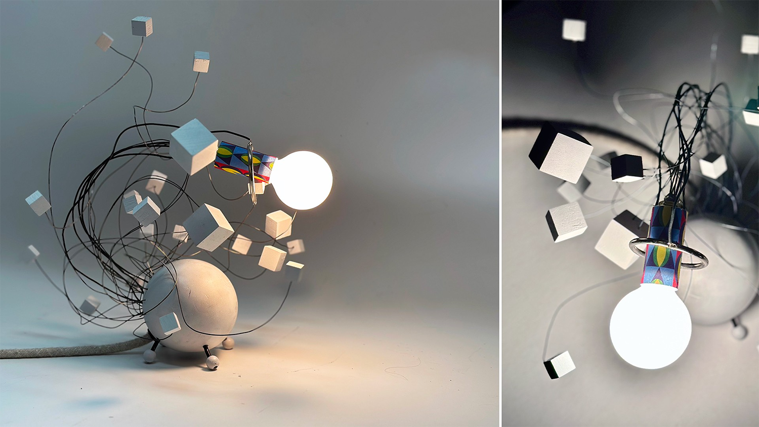
Mike Minerva (industrial design)
Harold, a Lamp
"A whimsical experiment with light, shadow, form, and movement."

Melson Miranda (visual communication design)
Yves Saint Laurent Persuasion Piece
"A visually striking 3D motion design project capturing the elegance and modernity of the popular luxury brand, Yves Saint Laurent (YSL). Using rose gold and black aluminum, this piece employs dynamic animations, clones, and cinematic effects to evoke depth, sophistication, and luxury. The motion graphics seamlessly blend technical precision with artistic persuasion to reflect the brand’s timeless identity."
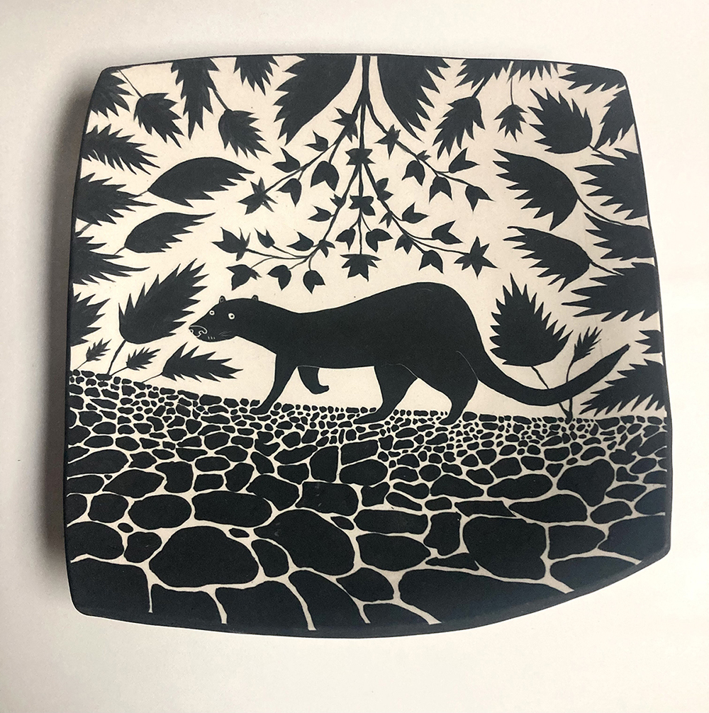
Chatham Monk (visual arts-all grades)
Ceramics/Porcelain Plates
"These plates hang on the wall with a wire that goes across the back. Unglazed and not intended for food use. They are fired in an electric kiln to cone 6. They are porcelain clay (the dancing dogs are a cream stoneware) and black underglaze."

Jill Smith (film and animation)
Regents
"Regents is a 3D/2D hybrid comedic short film made for the purpose of being silly and to make people laugh. Middle-schooler Dimmie Hexahead struggles to take the NYS Regents Exam, and while she panics to finish the test, not to mention trying to navigate her feelings for another classmate, her friend Tetro Pyraman tries to motivate her to finish it."

Troy Tedeschi (film and animation)
Evenly Matched
"Evenly Matched is a documentary film that explores the culture and community of competitive Yu-Gi-Oh!, a trading card game. However it explores it through the perspective of seven people who have never played being thrown into learning what is arguably the most overly complicated and confusing card game on the market. Rather than be a film that tries to teach people how to play the game, the film is about what its like to learn something new and the importance of community in how we learn new skills. film is rated R for language."
Schools of Art and American Crafts
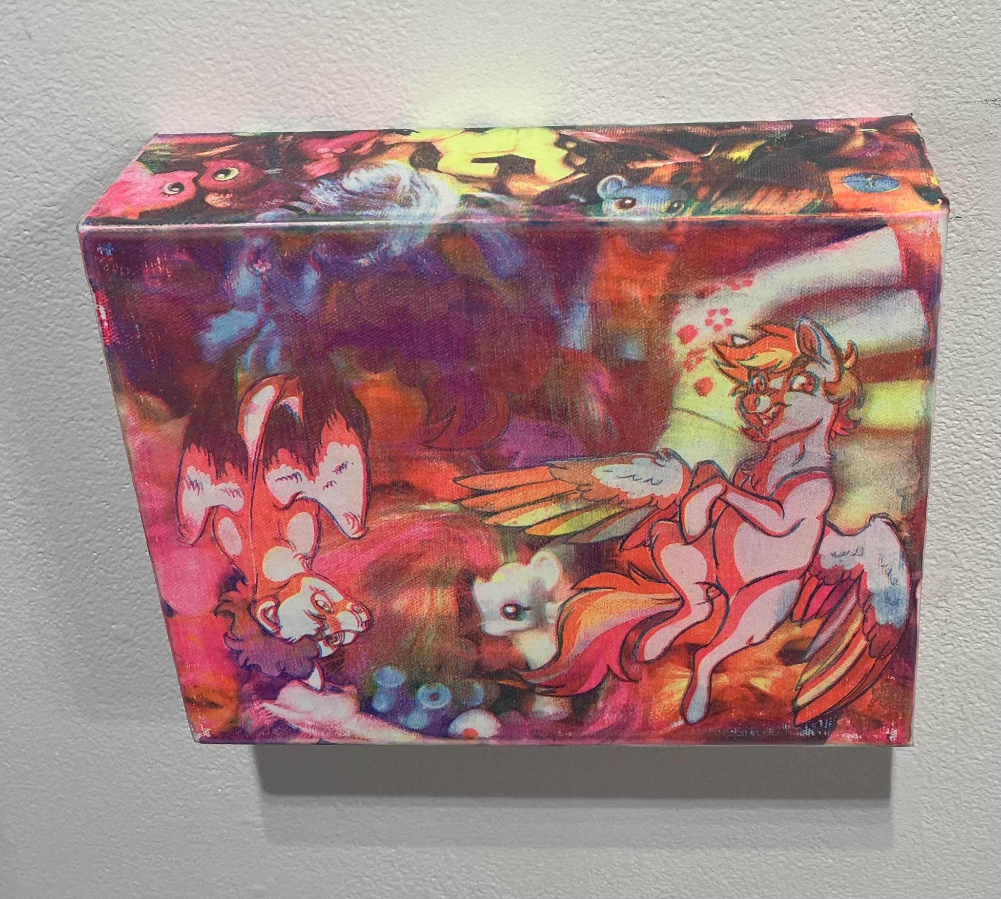
David Rose Kunisch (fine arts studio)
Surfeit
"This scene reflects excessive and mindless overconsumption of media. There are two digital drawings of ponies superimposed on top of an image of 'My Little Pony' figurines. The bright, overwhelming colors, and layout of the surplus of toys bleeding over the sides of the canvas reflect the experience of chasing a nostalgic high to the point of disregard for the present moment."
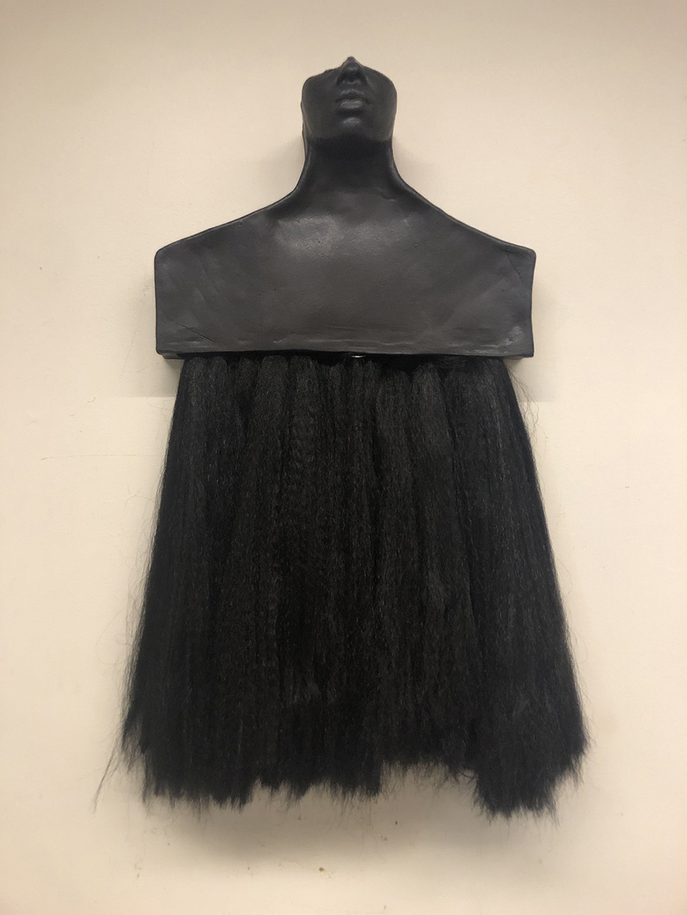
Cortlynne Waters (visual arts-all grades)
Pick Out the Past
"This piece was centered around finding myself. It captures my personal journey of struggling with my natural hair and the complicated feelings that ties into my heritage, identity, and how the world sees me."
Jamie Westermeyer (ceramics)
Bearing Silence
"This sculpture explores the complex interplay between self-imposed and societal silencing of women's voices. Through carefully chosen feminist symbols the piece speaks to reproductive rights and bodily autonomy."
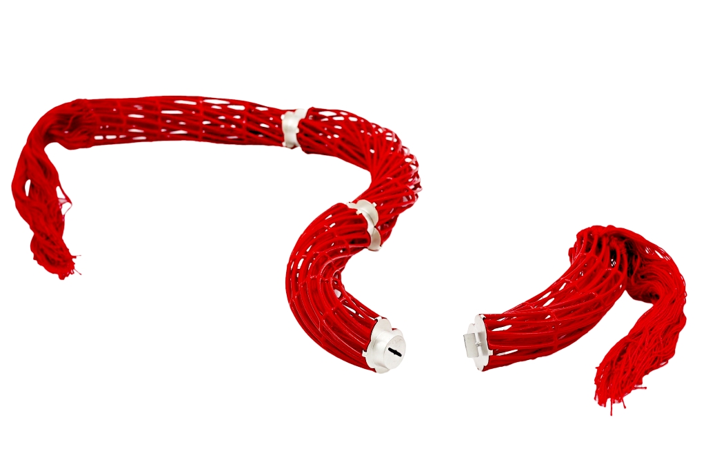
Yayan Zhang (metals and jewelry design)
Red Scarf
"This design not only captures the struggle between confinement and liberation but also reflects the deeper symbolism of the red scarf. By segmenting the ring-like structure into four parts and linking them with precise metal craftsmanship, the piece embodies movement, transformation, and the ability to break free from imposed limitations. The detachable and rotatable nature of the structure further reinforces the dynamic tension between restriction and freedom. The use of a red layer and red lines bridges the transition between materials, creating a visual and tactile contrast between softness and rigidity. This interplay highlights the coexistence of resilience and adaptability within the artwork. To ensure both practicality and aesthetic refinement, SLA and silver are chosen as the primary materials. The silver’s matte finish lends a sense of depth and sophistication. This piece serves as a powerful metaphor for breaking barriers and embracing personal liberation."
School of Design

Janki Akbari (visual communication design)
Save Water, Save Life: Generations to Come!
"In today's world, conserving water is essential due to growing challenges like population increase, climate change, and unsustainable practices. The awareness motion piece, 'Save Water, Save Life,' highlights the critical need to ensure equitable access to water for future generations. It emphasizes the urgency of water conservation for a sustainable future and calls for united action to protect our planet's most precious resource. Through this project, I aim to inspire collective efforts and raise awareness about the vital role everyone plays in preserving water for generations to come."

Beatrice Min Fa (visual communication design)
Recipe Reveal
"'Recipe Reveal' is an innovative app designed to revolutionize meal planning and cooking experiences. By efficiently managing your food inventory, it effortlessly generates recipes tailored to what you already have on hand. With a focus on convenience, the app not only suggests recipes but also highlights any missing ingredients, ensuring you're fully prepared. What sets it apart is its intuitive interface, presenting cooking instructions step by step, accompanied by the necessary ingredients for each stage. This method makes cooking simpler for users, guiding them step by step and helping them find exactly what they need, making the kitchen experience more efficient and enjoyable."
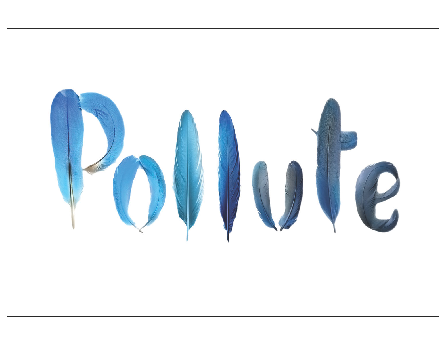
Lo Fasano (visual communication design)
Pollute - NYT Editorial Illustration
"The assignment was to pick an article from the month of September from The New York Times and design an editorial illustration for it using only typography, limited to one to two words. My chosen article is about how urban birds are losing their vibrant colors in comparison to rural birds due to urban pollution. The image needed to communicate the idea of pollution affecting plumage in a simple yet striking way while still having an organic feel. I chose words that seemed the most important and made a compilation of rough sketches, deciding on the word ‘Pollute.' Playing with shape, color and the idea of a feather, I developed three refined images. After some group feedback, I switched from a hand-drawn to a realistic effect. I looked for feather typefaces and sketched out my own, but the most successful approach was individually generating letters using Adobe Firefly and manually kerning them. The final editorial illustration features the word on a white background at a 3:2 ratio. The final work uses a minimal amount of realistic looking feathers that smoothly transition from a light blue to a less-saturated blue-gray, reflecting the transition that the urban bird’s feathers undergo over time. The white background makes the word stand out to catch the audience’s attention and entice them to read the article without giving away too much."

Allison McClary-Corbin (visual communication design)
How Do 3D Printers Work?
"Discover how a 3D printer works in this easy-to-follow format. From creating your design to the final print, this video breaks down the entire process in a simple and clear way."
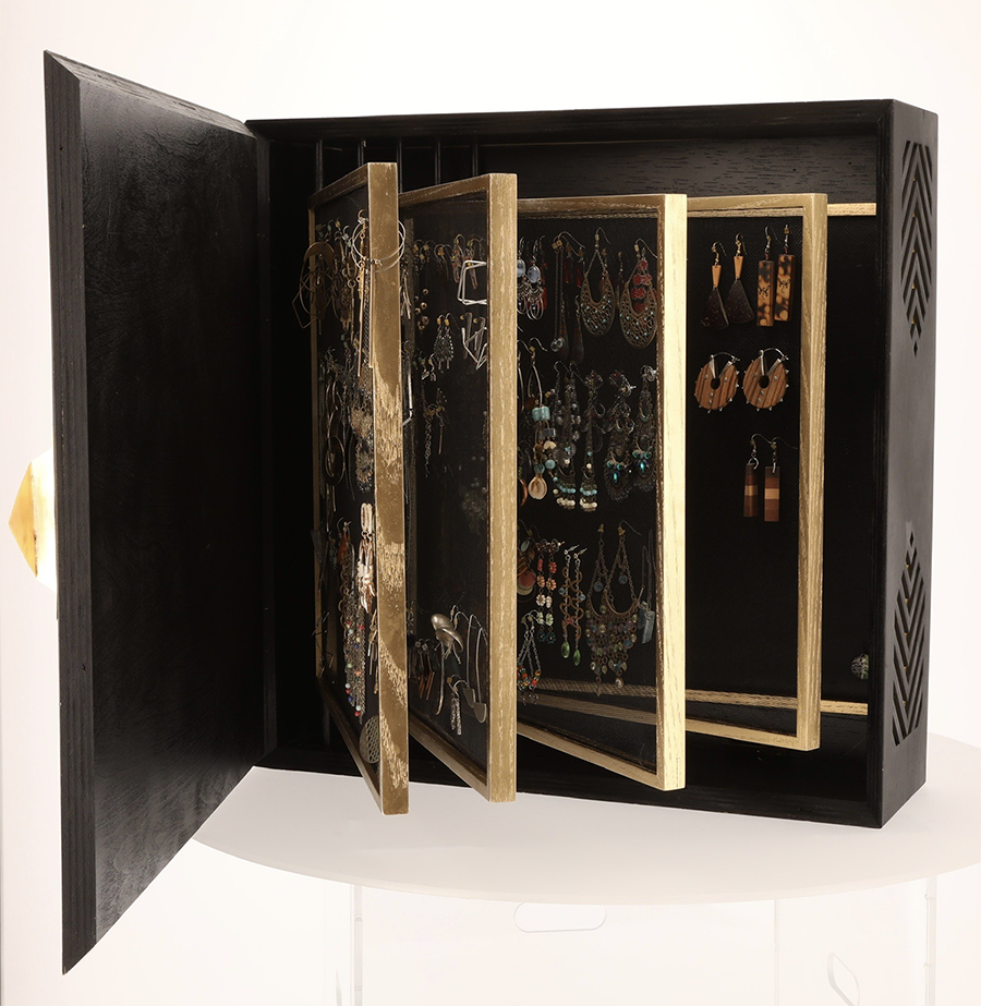
Elise Miller (industrial design)
Dazzle Dex Jewelry Organizer
"The 'Dazzle Dex' jewelry organizer opens like a book with screen 'pages' that flip for easy access earring storage, organization, and display."
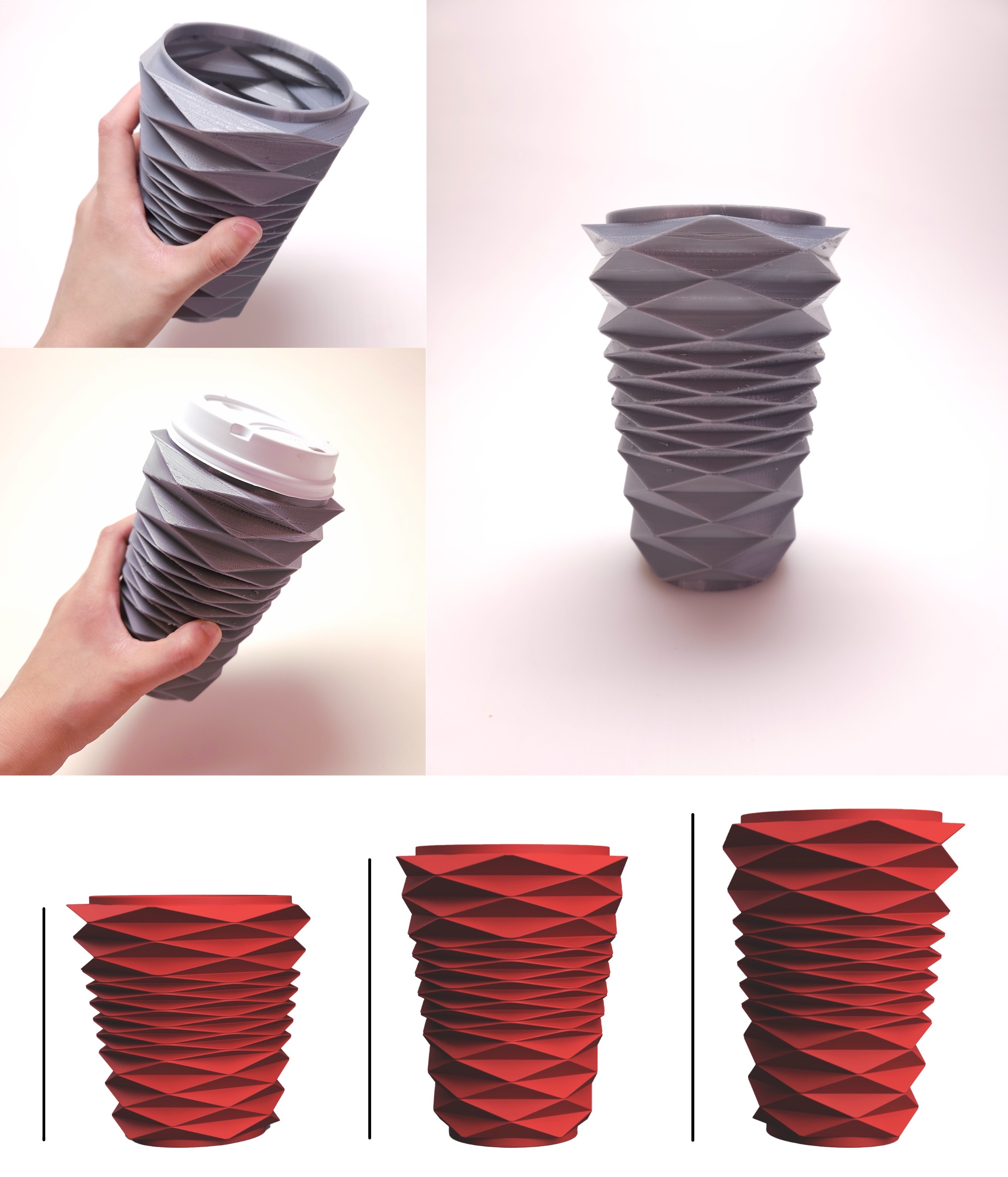
Kajal Shah (industrial design)
Cozy Cups
"Introducing 'Cozy Cups' — the ultimate cup cozy that makes carrying disposable cups effortless. How often have you grabbed a drink, only to struggle with spills, stains, or condensation? With 'Cozy Cups,' those problems are a thing of the past. Designed for better insulation, it traps air to keep your drink hotter or colder for longer. Its ergonomic design enhances grip, preventing slips and protecting your fingers from burns. Best of all, its stretchy, compressible material adapts to almost any cup size, ensuring a perfect fit every time. Stay cozy, stay hassle-free!"
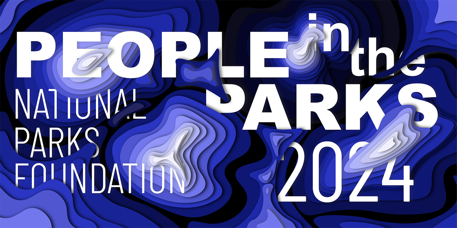
Emma Woerle (visual communication design)
The National Parks Foundation
"This triptych poster series was developed as part of the Design Systems course exploring large-scale outdoor advertising. The project began with a collage mining exercise, where inspiration imagery guided the direction of each student’s campaign. My chosen collage evoked themes of water, natural landscapes, and topography, which led me to create an imagined conservation fundraiser for the National Parks Foundation titled 'People in the Parks.' Rooted in the language of topographic maps and the textures of natural environments, the campaign centers around ideas of layering — both visually and conceptually. The final design combines elements from multiple early sketches to achieve a cut-paper, dimensional effect. The posters were created in Adobe Illustrator and visualized in context using LiveSurface mockups."
School of Photographic Arts and Sciences
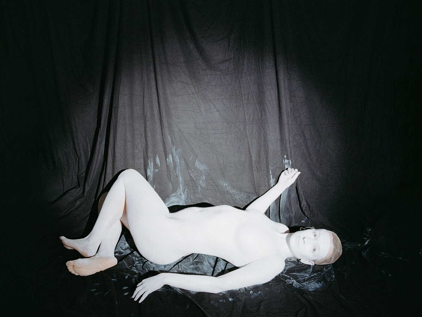
Fiona Veronique (photography and related media)
Entrée des convives
"The image, 'Entrée des Convives' is part of my ongoing project, 'The Summer-Land,' which explores my connection to my great-grandfather — a renowned classical music composer who found solace in the presence of taboo and darkness.
School of Film and Animation

Ren Norris (film and animation)
Ghost Cat
"A music video detailing the adventures of a ghost cat and the many things he gets up to in his house."

Amandeep Singh (film and animation)
Baking Bad
"Baking Bad showcases a new kind of cake mix containing a very special ingredient ... presented by the beloved Chef Cow!"
