Alumnus completes ASL typeface after 42 years
RIT alumnus refines his work over 42 years
Mark Benjamin, NTID
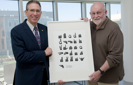
RIT alumnus Peter Blacksberg, left, displays his American Sign Language modern typeface with Professor R. Roger Remington, the Massimo and Lella Vignelli Distinguished Professor of Design at RIT. Blacksberg has been refining the typeface for 42 years.
Peter A. Blacksberg’s passion for a project involving American Sign Language culminated this year using digital font creation and management tools, 42 years after he began it using traditional pen and ink design techniques.
The 1975 alumnus from the School of Photography has created a modern typeface for American Sign Language, officially named “ASL Manutype Black.” ™
“As a photography student in 1972, I became fascinated by the visual aspects of fingerspelling and the challenge of representing hand shapes as graphical forms,” said Blacksberg. “I proposed an independent study project and developed a complete typeface along the lines of the international signage that I had seen in Europe. I spent hours reducing visual complexity while retaining and enhancing elements which made each letter shape identifiable.”
The 1973 version of the typeface and poster was created using pen and ink, high contrast film and silkscreen. Copies were made and posters were sold at the RIT and Gallaudet University bookstores.
In 2000, Blacksberg took another step toward refining the typeface by recreating each letter as vector computer graphics using Adobe Illustrator. “This allowed for greater precision and refinement,” he said. He completed the final version recently using Glyphs font management software.
“Now, 42 years after I began, it’s possible to type fluidly with the typeface,” said Blacksberg, who also attended an NTID summer interpreter program in 1973. The typeface can be used for signage, art or other suitable applications.
Blacksberg’s ASL typeface is now being sold at Shop One² and has been added to the Vignelli Center for Design Studies collections, which along with the Vignelli papers is home to 15 additional collections of contemporary designers, photographers and videographers.
R. Roger Remington, the Massimo and Lella Vignelli Distinguished Professor of Design, recently met with Blacksberg to view the typeface and give some final pointers.
“It’s a challenge to develop a system of symbols in a related family,” said Remington. “This demonstration alphabet is graphically powerful. Peter has done a terrific job.”
“Perfecting this has been a long satisfying process,” said Blacksberg. “Some projects are worth starting. Others worth finishing; it may take years. Then again, getting something precisely right is worth the time.”


