Graduate works to educate through her artwork
Photos by Adam Howarter and Anna Zorn
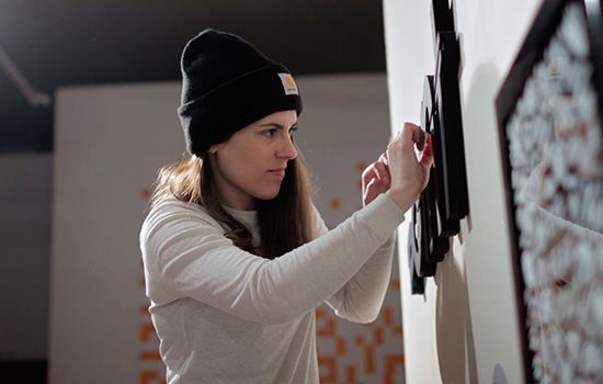
Remy Glock ’11 installs Point, one of seven pieces from her project Deaf-iculties for the “Typeforce 7” exhibition.
In the fall of 2008, Remy Glock ’11 (graphic design) made the bold decision to transfer more than 2,000 miles from her hometown in Reno, Nev., to RIT/NTID—a choice she said helped to shape her perception of community.
Five years later, the Chicago-based designer is using typography as a medium to educate people on the overlooked challenges of the deaf community, particularly those that arise in professional environments.
Glock excelled in the classroom, but after graduating in just three years, she found herself navigating the challenges of life outside of RIT—something that proved to be a difficult adjustment.
“I took a job in Chicago following graduation, where I didn’t know anybody,” said Glock, who was born deaf. “It took me a while to adjust back to life without an interpreter or a note taker. I felt kind of alone, and I didn’t have anyone to relate to. It was frustrating and consumed a lot of my energy.”
Over time, Glock was able to hone in on her design background and channel her challenges into a personal project. In February 2016, she was selected as one of the featured artists for “Typeforce 7” and her work captured the attention of the Chicago community.
“Typeforce,” a highly recognized and competitive typography exhibition held annually in Chicago, gives emerging typographic artists a chance to showcase a typography-based installation on a 10-by-10-foot wall in a well-trafficked gallery. The exhibition, which showcases a mere 20 installations out of more than 200 submissions, prompts artists to conceptualize a thought-provoking display that can be assembled in just two nights and remain up for about two weeks.
“I was accepted to ‘Typeforce’ on my third application,” said Glock, whose installation, called Deaf-iculties, included seven individual pieces, each intended to shed light on difficulties experienced in common situations. “It gave me a chance to turn something personal into something educational.”
The seven pieces—Trim, Vibes, Eye Hear You, Cocktails, Point, Repeat, and May the Fort Be With You—each cleverly communicates an individual aspect of deaf culture.
Vibes, which was assembled out of guitar picks, plays on the fact that music is limited to the vibrations felt and less about the lyrics. Cocktails, which features an intricate design laid on a dark background, is about the difficulty of lip-reading under dim lighting in bars, where much of post-work socializing takes place. Repeat is composed of multiple layers—starting out cloudy but getting increasingly clearer.
“‘Typeforce’ allowed me to capture the attention of the community and to create awareness through my work,” she said. “It was an incredibly rewarding opportunity.”
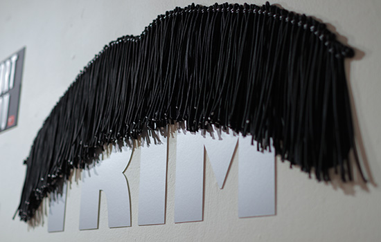 Trim, by Remy Glock
Photos by Adam Howarter and Anna Zorn
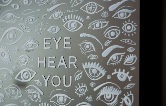 Eye Hear You, by Remy Glock
Photos by Adam Howarter and Anna Zorn
