Students shine like silver and gold at advertising awards
RIT’s College of Art and Design was well represented at the Rochester chapter of the American Advertising Awards.
Numerous CAD students won honors at the March 16 event at the Rochester Riverside Convention Center.
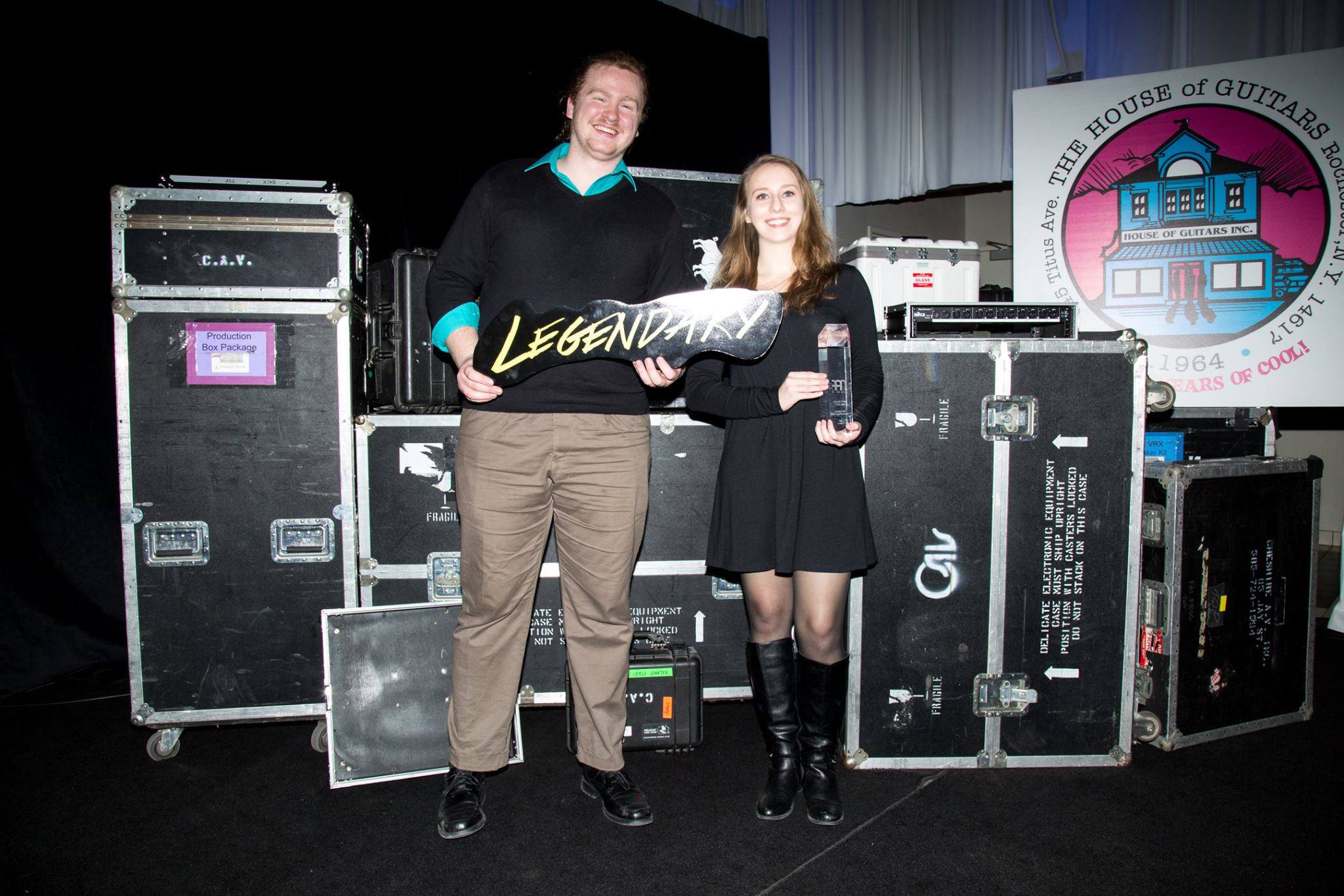
The local awards show — or ADDYs, as they’re commonly referred to as — was the first stage of a three-tier national competition conducted annually by the American Advertising Federation, with local winners advancing to regional, and possibly national judging.
While the ADDYs recognize professionals in the industry, they also provide a platform for students to showcase their work and get awarded for it.
The AAF Student American Advertising Awards competition is a division designed for college students, and RIT’s CAD dominated that portion of the event. The student winners list was packed with talent from the school.
Gold ADDYs recognized the highest level of creative excellence while Silver ADDYs were also considered outstanding. Below are the RIT students who were rewarded for their work.
• Kelly Hurlburt (new media design) and Wei-Wei Huang (new media design): EY Scholarship winner — Thought at Work title sequence; Gold — Thought at Work title sequence.
• Adam Antalek (advertising photography), Chris Coe (advertising photography) and Fontaine Rittelmann (advertising photography): EY Scholarship winner — Death Wish Coffee/Mock Campaign; Silver — Death Wish Coffee/Mock Campaign.
• Sarah Cipro (graphic design): RAF Scholarship Winner — FLIP for Dye Hard Colorists; Gold — FLIP for Dye Hard Colorists.
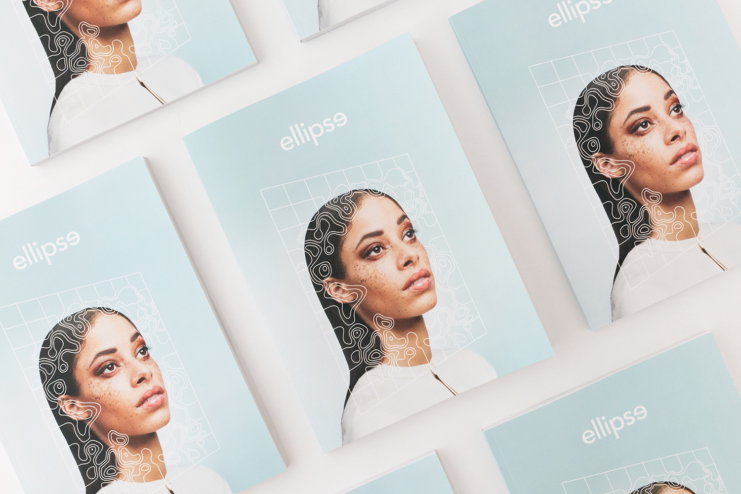
• RIT editorial photo and design class: Gold — Cover from ellipse magazine (Sol Ji Park, advertising photography, and Hanna Tangeman, graphic design); Gold — Intertwined from ellipse magazine (Julie Campbell, graphic design); Gold — ellipse magazine.
• Garrett Chase (fine art photography), Will Kelly (advertising photography) and Kelsey Hinkel (photography): Silver — Fresh Tests: LUSH Concept.
Additionally, a visual communication design graduate student, Maria Gabriela Sanchez, was part of Eastman Kodak Company’s team that captured a Gold ADDY in the professional division. Sanchez's design work contributed to Kodak’s winning brand revitalization campaign.
ellipse magazine
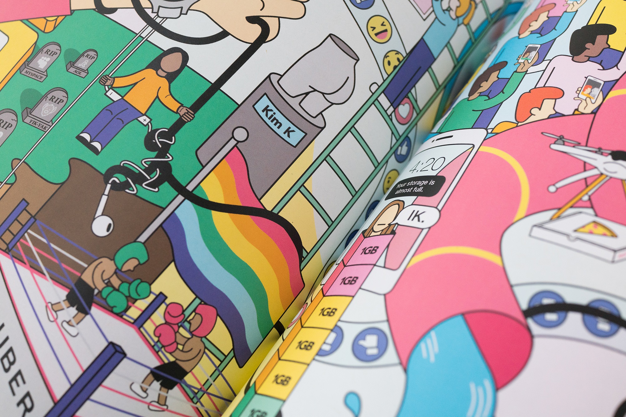
The fall 2016 editorial photo and design class co-taught by Lorrie Frear and Rachel Jerome Ferraro cleaned up at this year’s local ADDYs. The digital and print publication it designed and created, ellipse magazine, was a tri-Gold winner.
The 2016 class, consisting of 36 seniors majoring in either graphic design or photography, produced ellipse as the first of a new series after many years of the course generating different award-winning volumes of the Positive/Negative magazine.
ellipse was made with the future in mind, with the topics in it befitting today’s evolving, technological society. The students and executive editors — Frear, Ferraro and teaching assistant Emily Baker — explored subjects that are pertinent in an ever-changing social landscape.
The intertwined from ellipse that won a gold ADDY is pictured on the right and was designed by Julie Campbell. The student team behind the development of ellipseincludes:
Garrett Chase and Dennae Makel (art directors); Lauren Mays and Hanna Tangeman (design directors); Chris Coe and Fontaine Rittelmann (photo editors); Kiara McDade, Sol Ji Park and Kimberly Stager (feature editors); Crystal Follansbee, Catherine Sharp and Colin Turner (production team); Michael Burpoe and Megan Barrette (copy editors); Julie Campbell, Emma Echols, Desmond French, Kelsey Howard, Aaron Tran and Dongni Yang (social media engagement); Samuel Kettell and Rebecca Tomasello (assistant art directors); Jessica Arevalo, Yi Chen, Eliza Tehan and Paula Piedrahita (assistant design directors); Yu Jiang and Laura Randall (assistant photo editors); William Kelly (assistant photo and post production editor); David Hampton, Brittney Maue, Rob Rauchwerger and Claudia Schultz (assistant production team); Adam Antalek, Abby Horrmann and Julia Prisaznuk (assistant copy editors).
Thought at Work title sequence
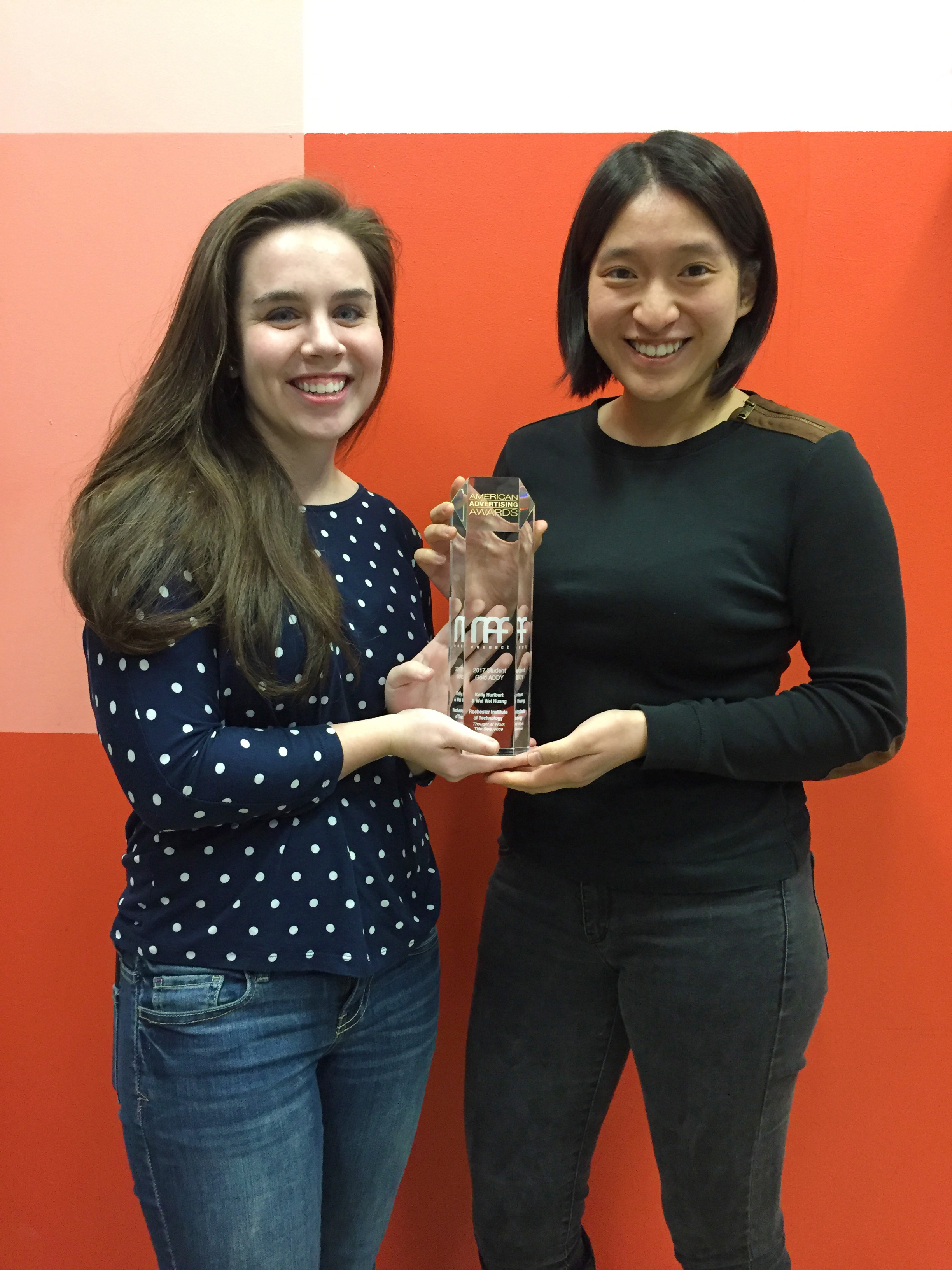
The Gold- and scholarship-winning project by Hurlburt (left in the photo) and Huang (right), both fourth-year new media design students, involved creating a title sequence for Thought at Work, a three-day design conference run for and by students.
Each year, student volunteers bring together some of the best industry professionals for a series of inspiring talks and educational workshops held at RIT. Two students are tasked with generating a title sequence that is shown at the opening and closing ceremonies of the conference. It is intended to introduce the audience to the weekend’s speakers and generate excitement for the next few days ahead.
Hurlburt and Huang’s title sequence was used for the October 2016 event. It exemplified the Thought at Work values of creativity and inventiveness by depicting a dream sequence of futuristic and surreal technological innovations.
The students explored techniques of 2D cell animation and liquid motion and introduced a storyline to the sequence. While past title sequences had loose and figurative but cohesive narratives, the pair wanted its story to be more straightforward to keep the viewer engaged and integrate speaker names naturally throughout.
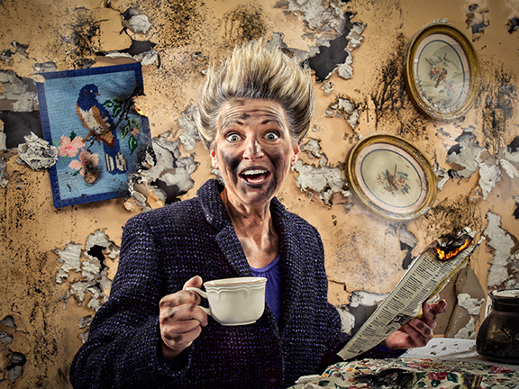
For their project that won silver, Antalek, Coe and Rittelmann aimed to create charged, well-produced imagery that captured the over-caffeinated nature of Death Wish Coffee, a brand that bills itself as “the strongest coffee in the world.”
Here is a fun, energetic behind-the-scenes look at the making of the mock campaign.
