2012 Metaproject 02, Corning
Developed by RIT associate professor Josh Owen in 2010 as an industrial design course with an industry partnership placing student output into a global venue, “Metaproject” is now running in its second generation. This year, the partnership is with the world-renowned Corning Museum of Glass (CMoG). Moving the nature of the project to a new level, industrial design students are working together with RIT glass program students to explore design concepts that take advantage of glass as the primary material. RIT Glass faculty members Michael Rogers and Robin Cass have developed the content together with Owen and CMoG. The course results will be juried and then shown during design week in New York City in May of 2012. RIT will publish a case study book which chronicles the methodology and output from the course, shedding light on the design process. The “Design is One” philosophy exposed by the Vignelli Center for Design Studies will be overlaid into the conversation, linking the work thematically to the Vignelli Center.
Photography: Elizabeth Lamark
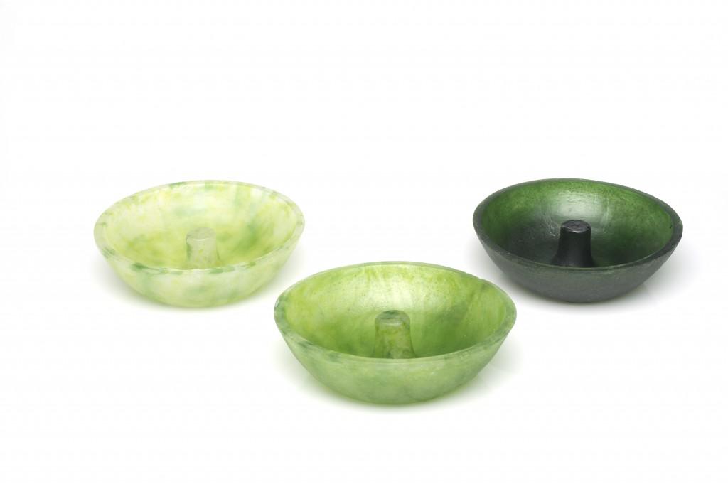
Cast Glass Ashtray
Alexander Demmerle
Context: A simple and elegant form that will bring beauty into something that is often overlooked in terms of aesthetic quality. Problem: Most modern ashtrays are strictly utilitarian and disposable. They are built with only their function in mind. Solution: My product is designed to be not only an ashtray and incense holder, but is designed to be a centerpiece for social gatherings, whether indoor or outdoor. Brand Strategy: These pieces were created using melted down glass frit, a byproduct of colored glass manufacturing that is crushed up and used for coloration. This allows for an almost endless amount of various color schemes.
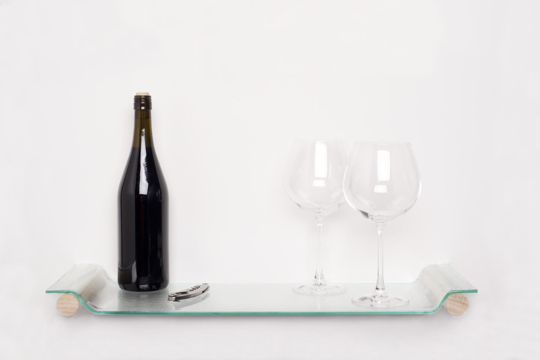
The Shelf Tray
Allyson Klopp
Context: While hosting parties, people tend to rush in and out of the kitchen and living room, serving their guest with little to no time to enjoy themselves or their company. Problem: Hosting guests at your home for a dinner or cocktail party can be stressful. Serving food and drinks at the appropriate time while still having enough time to enjoy yourself and your company can be difficult. Solution: Produce a product that will help you organize and prepare food and drinks prior to the start of a dinner or cocktail party. The tray can be stored out of the way on the wall as a shelf. Holding wine glasses and wine or hors d-oeuvre and then easily removed and carried to the desired area to be served. The glass can easily be cleaned with a quick rinse to prevent wasted fresh water and personal time. The wooden detail allows the tray to sit up and off the table protecting the glass and eliminating sound when setting it down. Brand Strategy: The simplicity of a multifunctional product produced with all recyclable material is a resourceful use of time and material in this wasteful rushed world. Recycled window glass is ideal because it can easily be cut by hand and then slumped in a kiln within a day. This process uses very little energy and effort compared to other glass blowing and kiln casting processes.
Desktop White Noise Generator
Andrew Miller
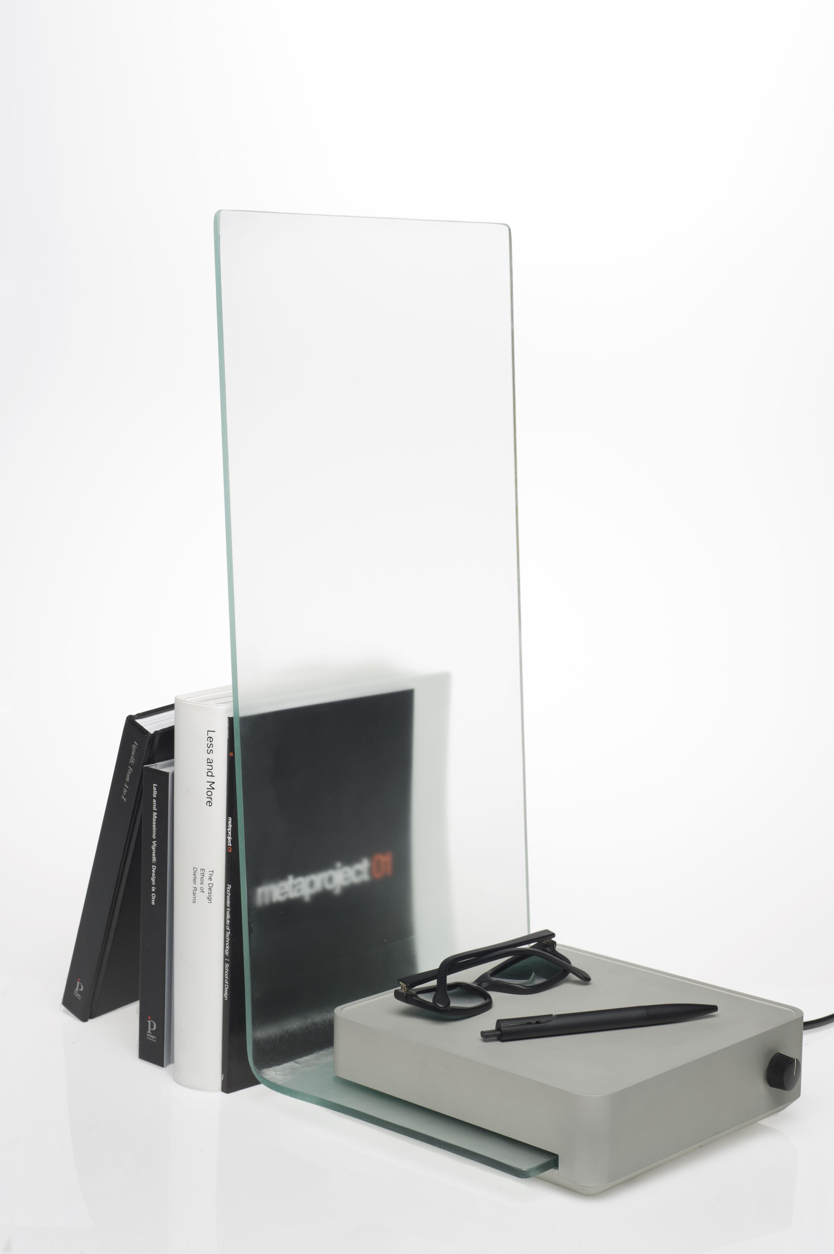
Context: There is plenty of ambient noise and distraction while working on a project in a studio environment. At times, these distractions can be detrimental to production and progress. Problem: Create a desk fixture that will allow the user to feel a sense of calm, thus focusing their attention to the task at hand while giving space for personal belongings. Solution: A desktop white noise generator that masks ambient sounds, creating a mental barrier to the outside world, while still allowing some visual perception for inspiration. This product also offers simple solutions for placement of various desktop items. Brand Strategy: This unit is easily noticed as a recyclable product by exclusively using aluminum and glass. The glass acts as a speaker cone, resonating and generating the white noise tone necessary for the user to overcome ambient distractions.
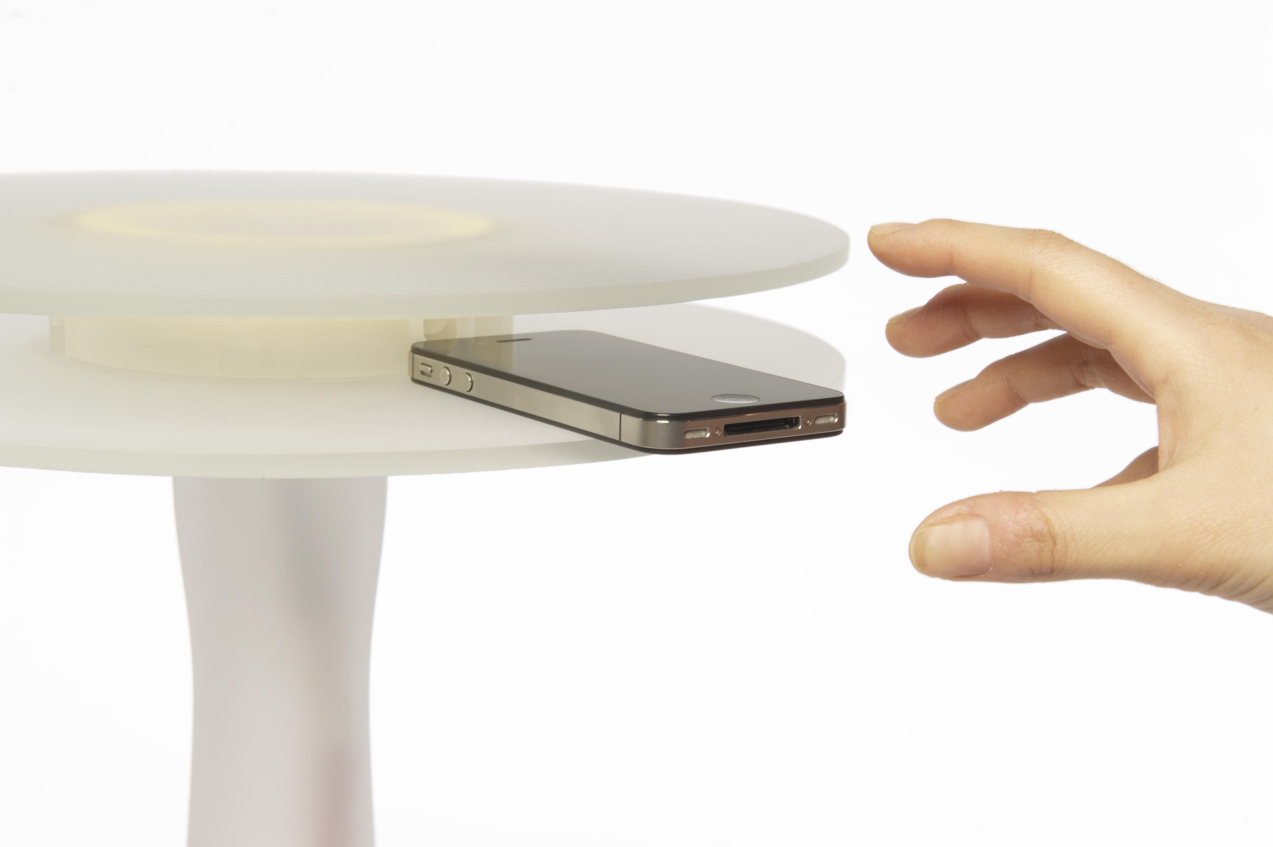
The Receiver
August Kawski
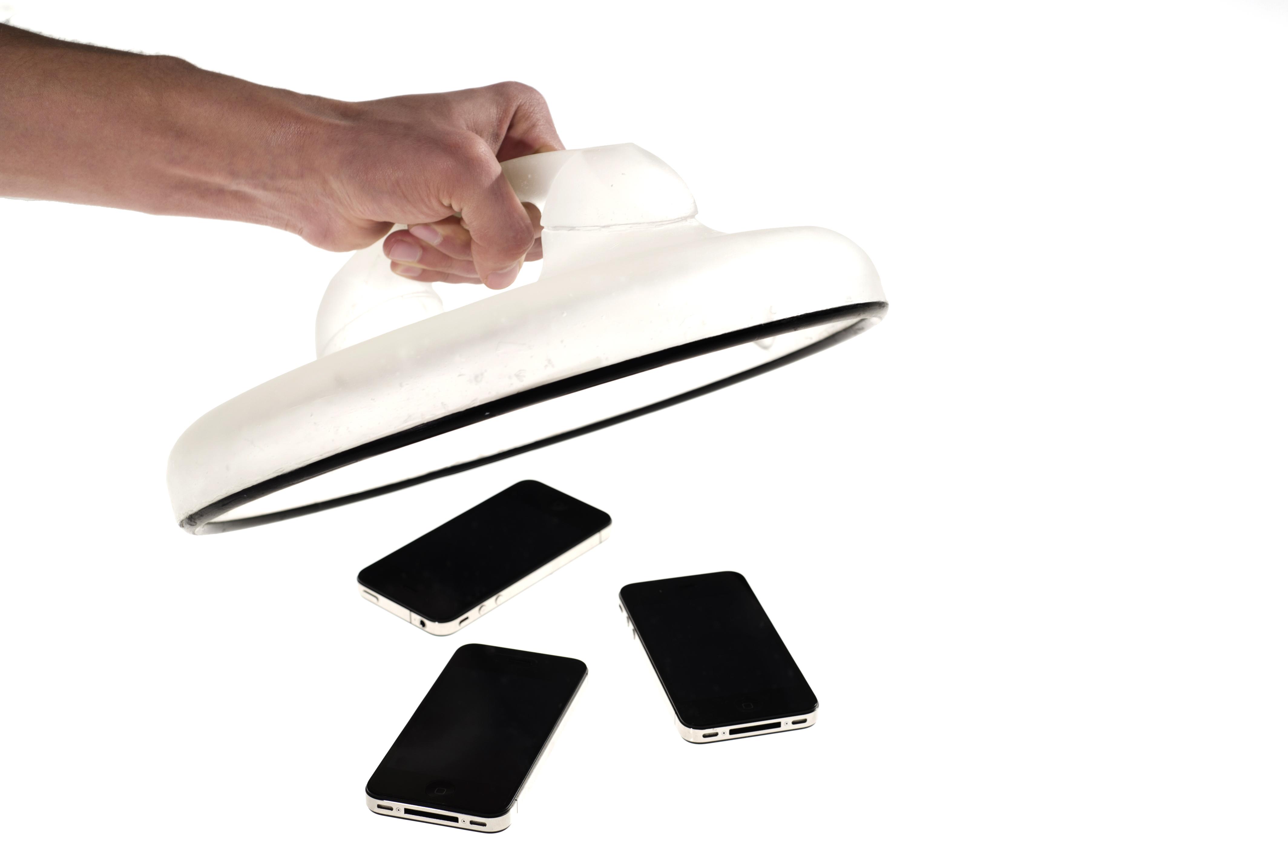
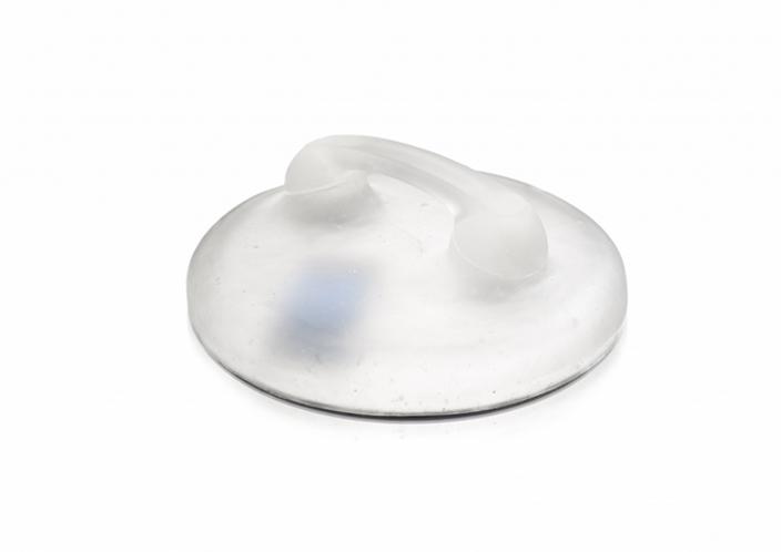
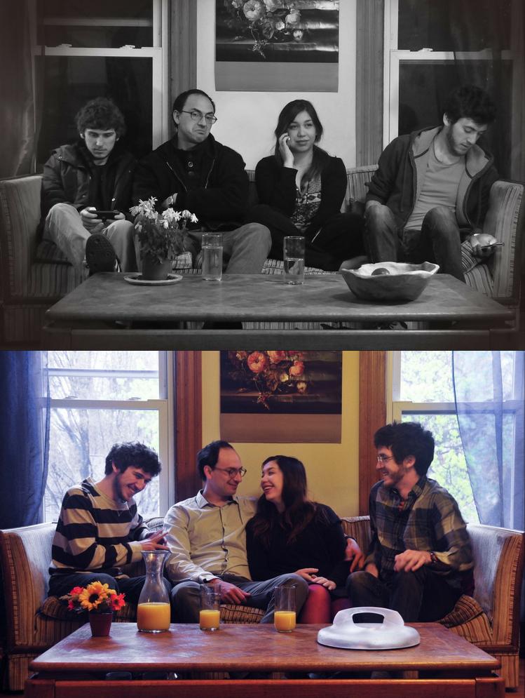
Context: The cell phone is an integral extension of human communication. For many, there is a habitual reliance on this technology that has transformed it into an indispensable item. Problem: Cell phone usage creates detachment from a group. Face to face communication is often interrupted because of the cell phone, diminishing the personal experience. Solution: The Receiver invites cell phones to be temporarily collected in a communal location; creating a physical, visual, and auditory barrier. Freeing oneself from the responsibilities and burdens of the cell phone encourages a return to physical communication. Brand Strategy: The reference to Dreyfuss’ iconic telephone form will dictate the intent of the piece while also establishing a connection to the past. There is general encouragement to reuse and repurpose.
The Memory Node
Ben Hudson
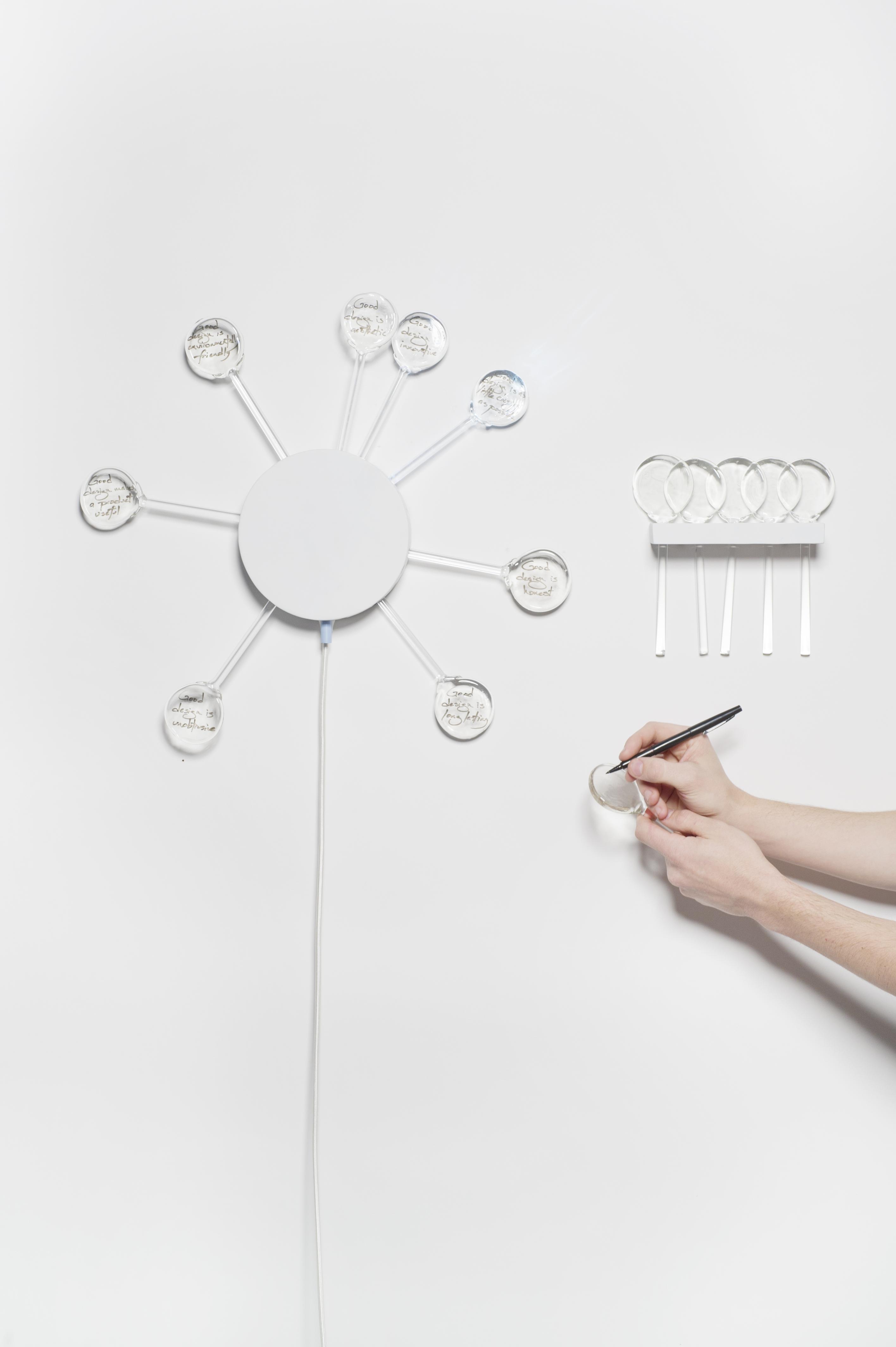
Context: Given the quantity of thoughts that run through one’s head every day, it’s easy to understand why so many things are quickly forgotten. Problem: Planners, to-do lists, and calendars all allow people to efficiently keep track of upcoming deadlines for events and tasks. However, there aren’t many products that help the user to remember personal thoughts, such as goals, ideas, and guidelines. Solution: The Memory Node offers gentle, non-time specific reminders to the user. Each node illuminates briefly to emphasize its inscribed message. The blue knob on the underside of the hub controls the illumination cycles, which vary between an hour and a month. Nodes that aren’t in use are stored in a holder to the side. Brand Strategy: In lampworking studios, small scraps of borosilicate glass leftover from various projects are usually disposed of. Those scraps can be melted down and flattened to create the disc portion of each node.
Hanger with Light Source
Brendon Maryou
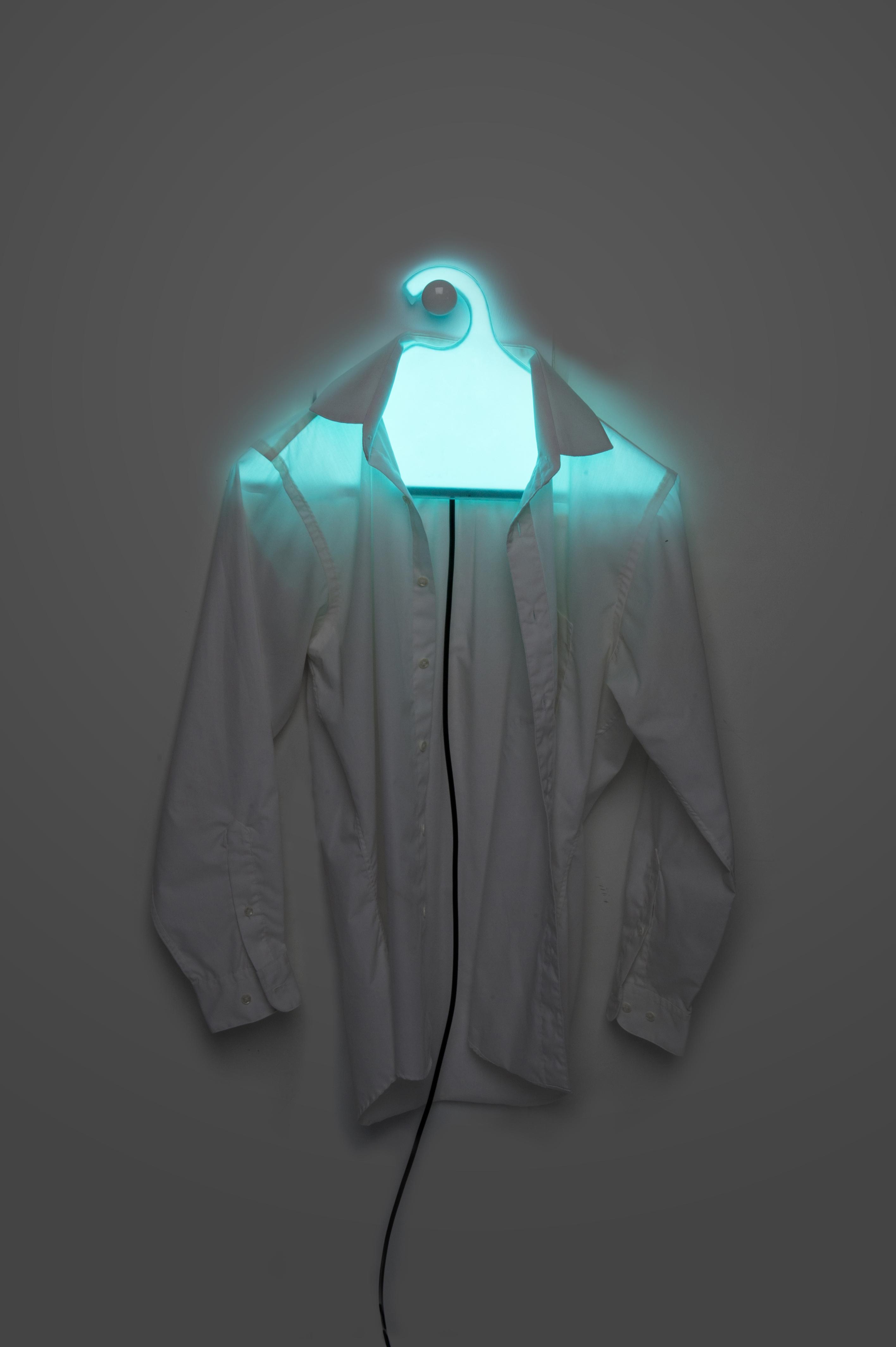
Context: In the closet, clothes hangers are strictly utilitarian objects. They are understated and often overlooked. The hangers environment is dark and unwelcoming, despite the fact that we must use it everyday. Problem: With traditional hangers, the emphasis is on functionality and visual appeal is neglected. Solution: Construct a clothes hanger that integrtes a light source into the closet, providing a more aesthetic space. Brand Strategy: Glass is a highly recyclable material. When the clothes hanger's life cycel is over, it can easily be repurposed rather than ending up in a landfill. By elevating the coat hanger to a designer status, people are less likely to be wasteful.
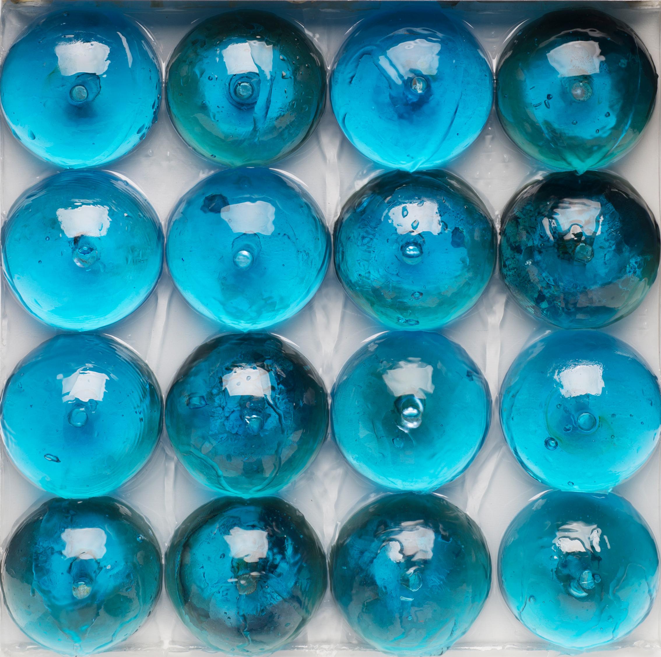
Plant Watering Rocks
Casey Schneider
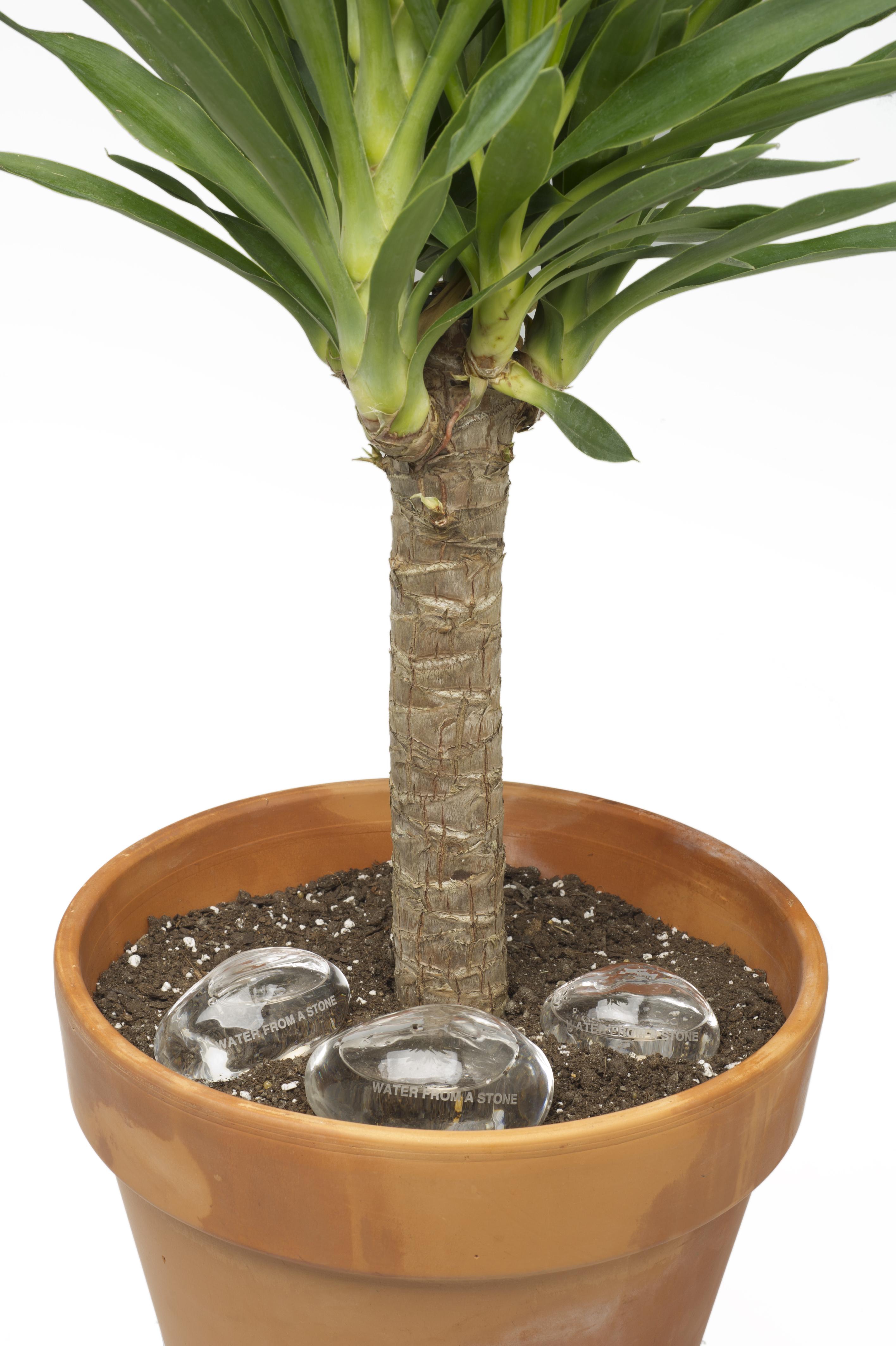
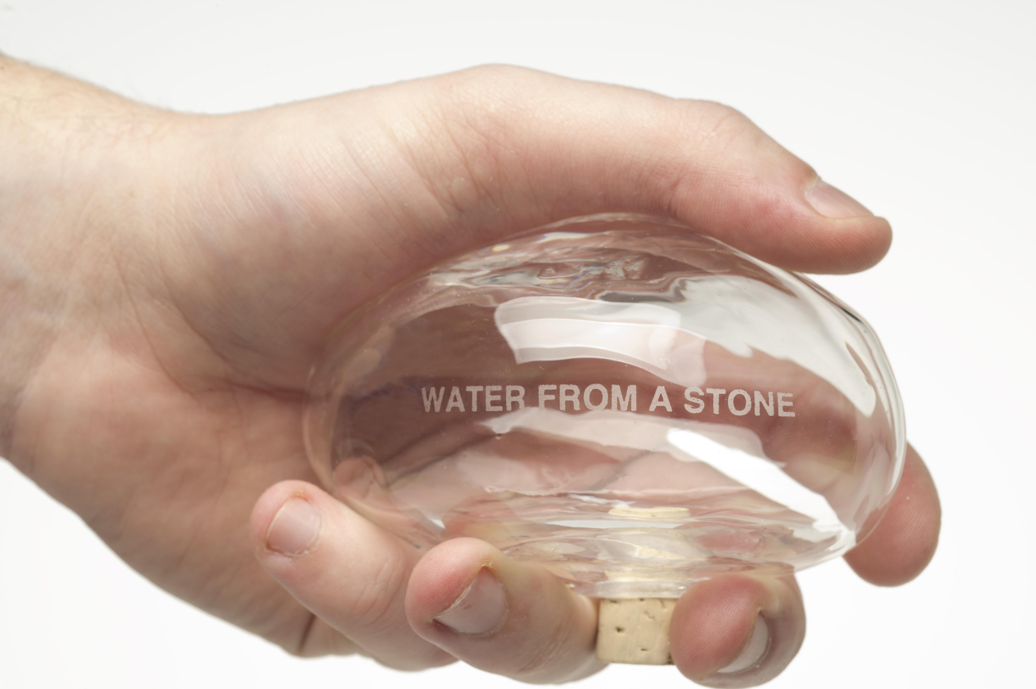
Context: Every household plant needs to be watered regularly to survive. While self-watereing exist, making the plant and the watering vessel work visually together in harmony has not yet been achieved. Problem: Creating a proxy object that looks more harmonious and incorporating it into the plant's landscape while also functioning as a water feeder. Current watering solution distract from the beauty of the plant. Solution: Create multiple sizes of glass rocks that can be filled with water to fit in a variety of plant pots and corresponding plants. The glass rocks are designed to release water slowly into the plant. Rocks and plants naturally fit together. By blending them together they look more like what we see in nature, are visually less distracting, and become easy to use because of their fit in the human hand. Brand Strategy: Placement of a quote on the glass rocks "Water From A Stone" on the side of the glass rocks to reference a common saying repurposed into a functional object.
A Vessel for Sound
Celia Garland
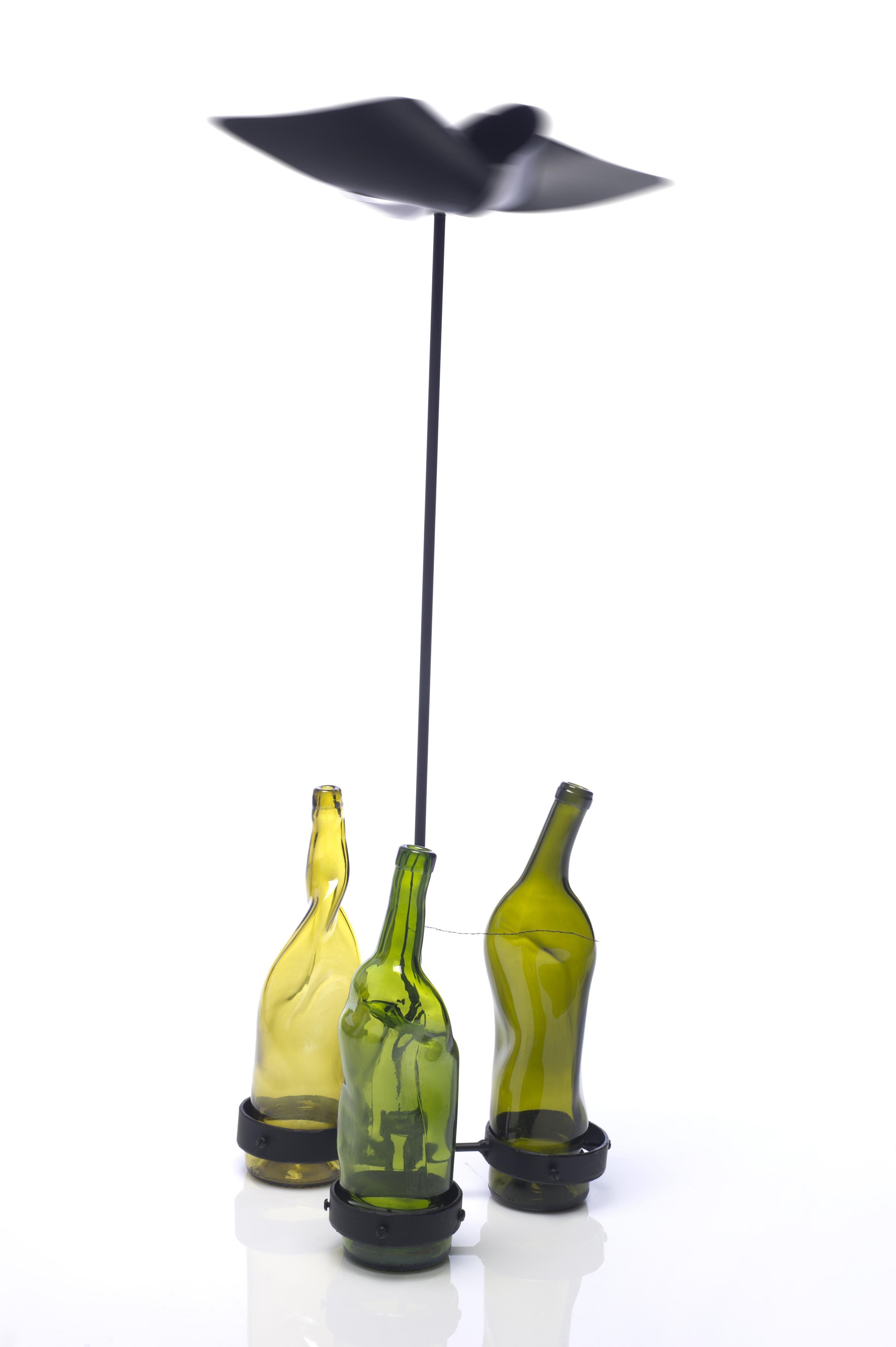
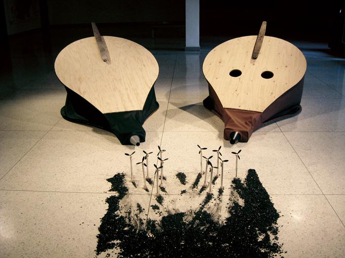
Context: In this technology driven world it’s rare to take time to appreciate the world around us. It is important to realize that our natural world is something beautiful. People today get so worried about the slightest bit of weather that it’s hard to realize the beauty in a storm. Problem: Create an object that makes storms exciting, as well as anticipated. Something that adds to the ambiance of the weather and makes it exceptional. Solution: A wind powered vessel for sound that interacts with the weather. A three toned piece that changes tone as the rain fills the bottles and chimes even faster as the wind blows harder. Brand Strategy: To convey the fact that this piece uses recycled elements I went with a triangle base pattern to mimic the “Reduce, Reuse, Recycle” symbol. By using the slightly manipulated yet still recognizable image of the wine bottles that support a windmill it conveys an image of sophisticated sustainability.
Fireflies: Lights of Nostalgia
Guo Wei Chen
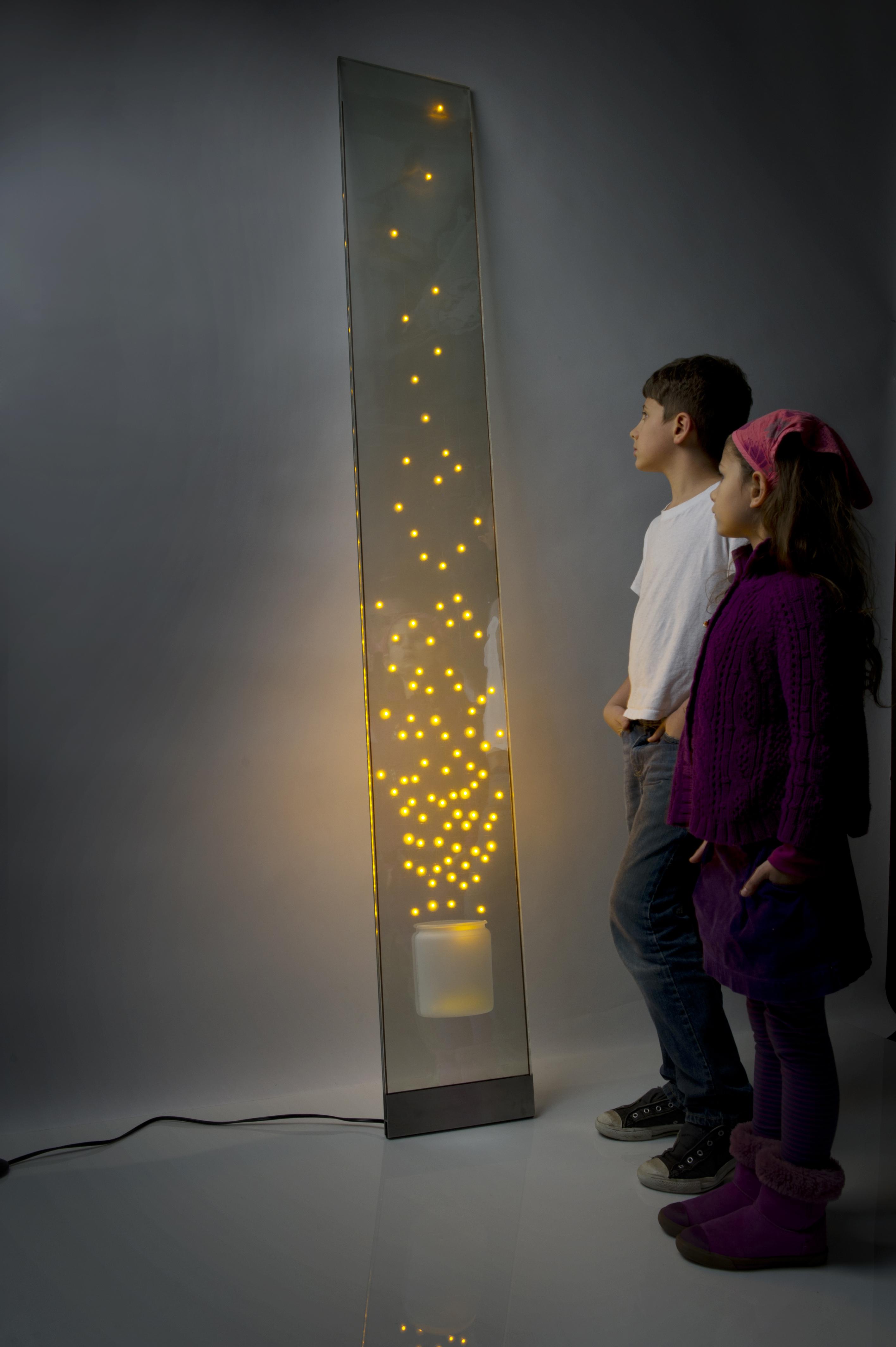
Context: The fond memories of catching fireflies on a warm summer night will always bring us back to a joyous time. But in today’s fast paced society, we have forgotten what that’s like. To run around the yard with a jar and watch as it became brighter with each firefly was always delightful as a child. Then the moment of amazement that rushes over you when you release them all and watch as they faded back into the stars. Problem: Create a light vessel that gives the viewer an emotional response, by taking them back to a simpler time where there are no worries in the world. Solution: An illuminating panel that uses the transparent aspect of glass to its advantage. Using transparent LED film laminated between two panels of glass, the LEDs create an illusion that lights are floating in the air like flying fireflies. An illuminating panel that uses the transparent aspect of glass to its advantage. Using transparent LED film laminated between two panels of glass, the LEDs create an illusion that lights are floating in the air like flying fireflies. Brand Strategy: The recycling aspect are the two repurposed glass panels that were donated. The panels are slightly different giving them each a unique characteristic, but still maintaining the structural form of the piece.
USB Glass Jewelry
Clay Amos
Context: Using electronics on an everyday basis. Easily carry valuable documents and files with you by wearing a flash drive as attractive jewelry. Problem: A USB flash drive carried loose in a pocket, purse, or backpack can accidentally get lost or damaged resulting in irretrievable data loss. Have you ever left one in your clothes and had it end up in the washing machine? Solution: Wear a flash drive as an attractive fashionable necklace or ring. The high tech designer jewelry, constructed from recycled wine glass, encases the USB in a way that protects it as well as allows it to switch back and forth, inwards to outwards, for ease of use. The necklace has smooth silicone tubing for a modern look and strong neodymium magnets for easy clasping and removal, instead of a time consuming hook. When it is plugged in, a flashing blue LED light in the ring ensures a positive feedback connection. Brand Strategy: Re-use the glass neck tips from recycled wine bottles. Be green and contribute to environmentally friendly production by giving a second life to wine bottles and decreasing glass waste.
Modular Stacking Tables
Colin Packenham
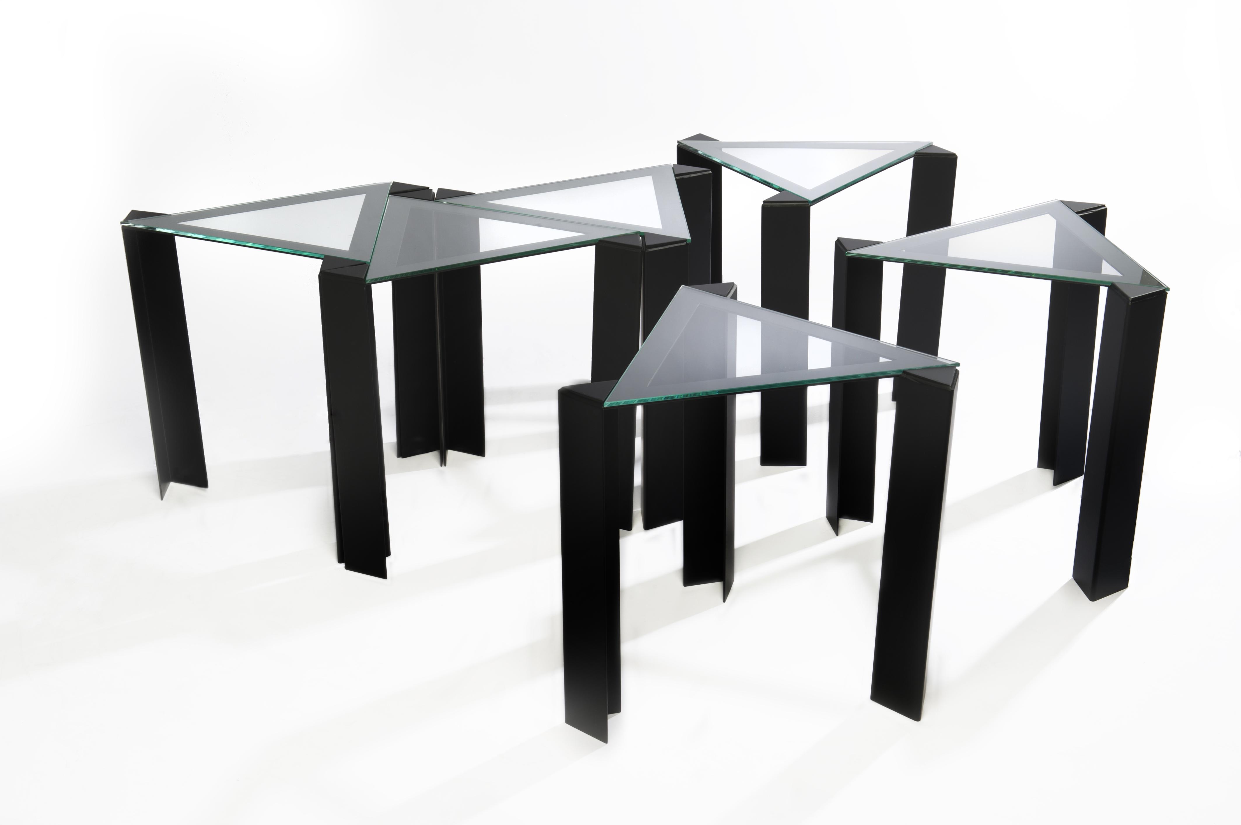
Context: The act of recreation, pure playing, is something that people often discard as they grow up from being little kids. Traditional games are often left behind, dismissed as childish and unsophisticated. Play is far from that; it’s creative and social, providing a true break from the outside world. Problem: To offer a designated apparatus for people to enjoy recreation, with the modularity to fit into many different spaces. The final apparatus should be enjoyable to play with, and able to adjust to any situation or game. Solution: A series of six stainless steel tables, with even glass tabletops. The equilateral triangle is echoed throughout the pieces, allowing easy organization into any number of different formations; while also allowing the tables to be stacked upon one another, minimizing their footprint when not in use. Brand Strategy: The glass tops of each table are made from recycled glass.
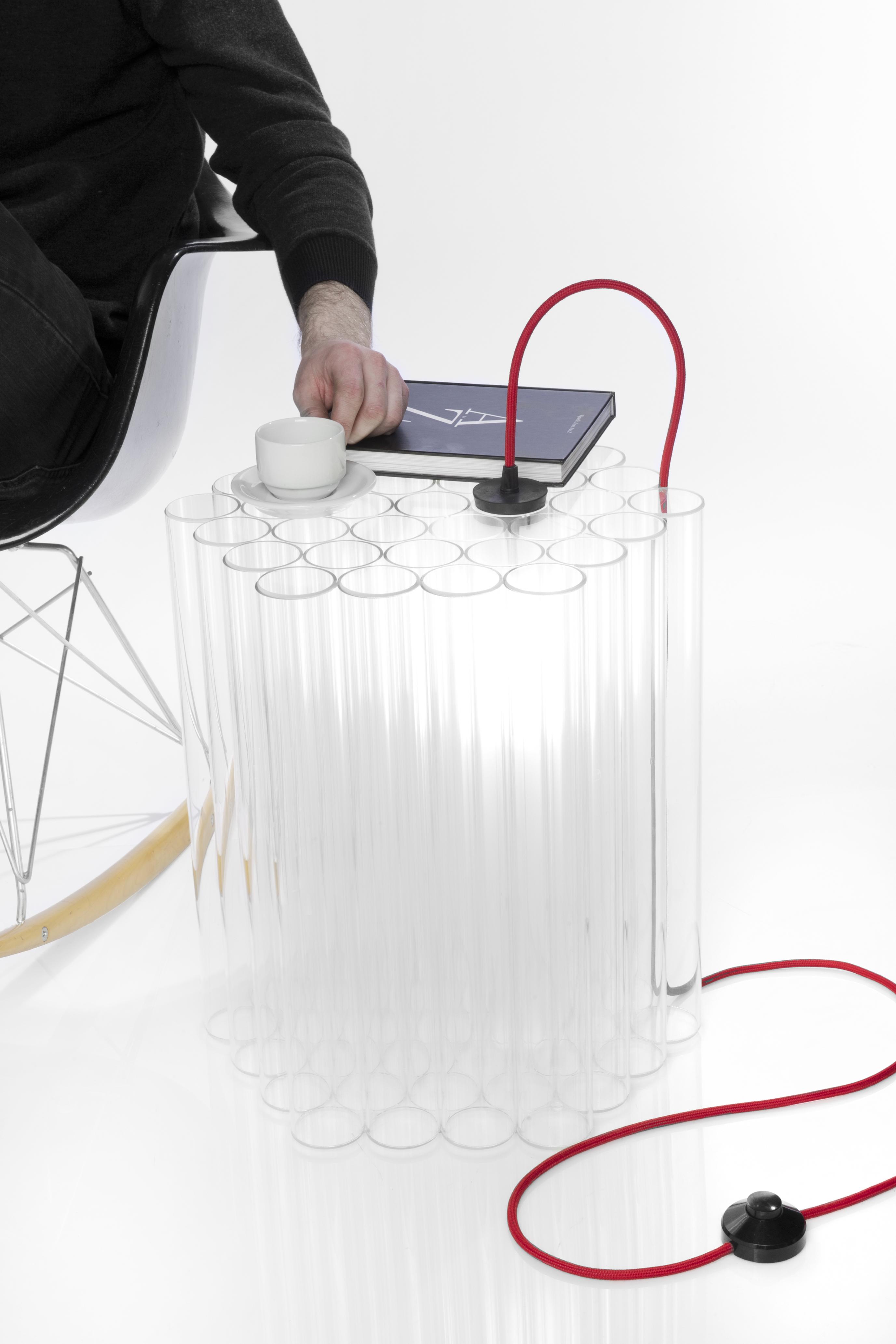
Illuminated Side Table
Dan Ipp
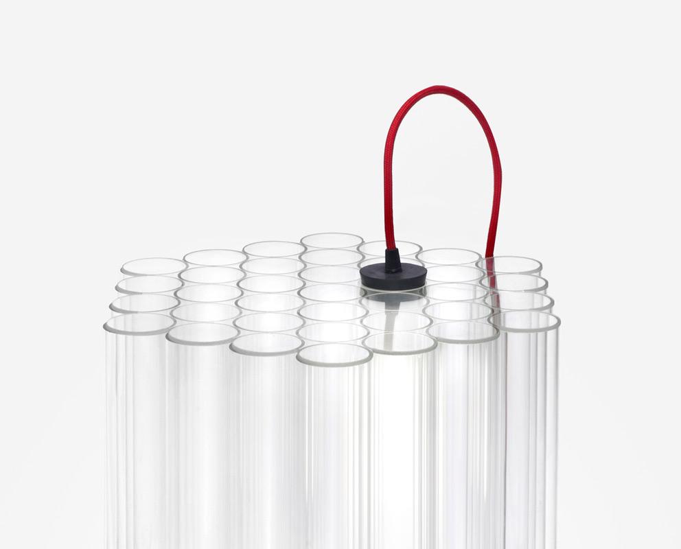
Context: Personal space in a physical sense is essential in people’s lives. People need downtime and space to regroup and catch up with their lives. Problem: Create a personal table that is attractive and creates a space for an individual. Solution: A side table that is illuminated to set an ambient mood while also allowing enough room for personal items. The lighting of the table provides an attraction that is welcoming to the user. The optical qualities of the glass tubing diffuse the light to define a personal space. Brand Strategy: This side table employs the use of readymade glass material that is customized and assembled into a unique form. The geometry is consistent with the natural principles of circle packing.
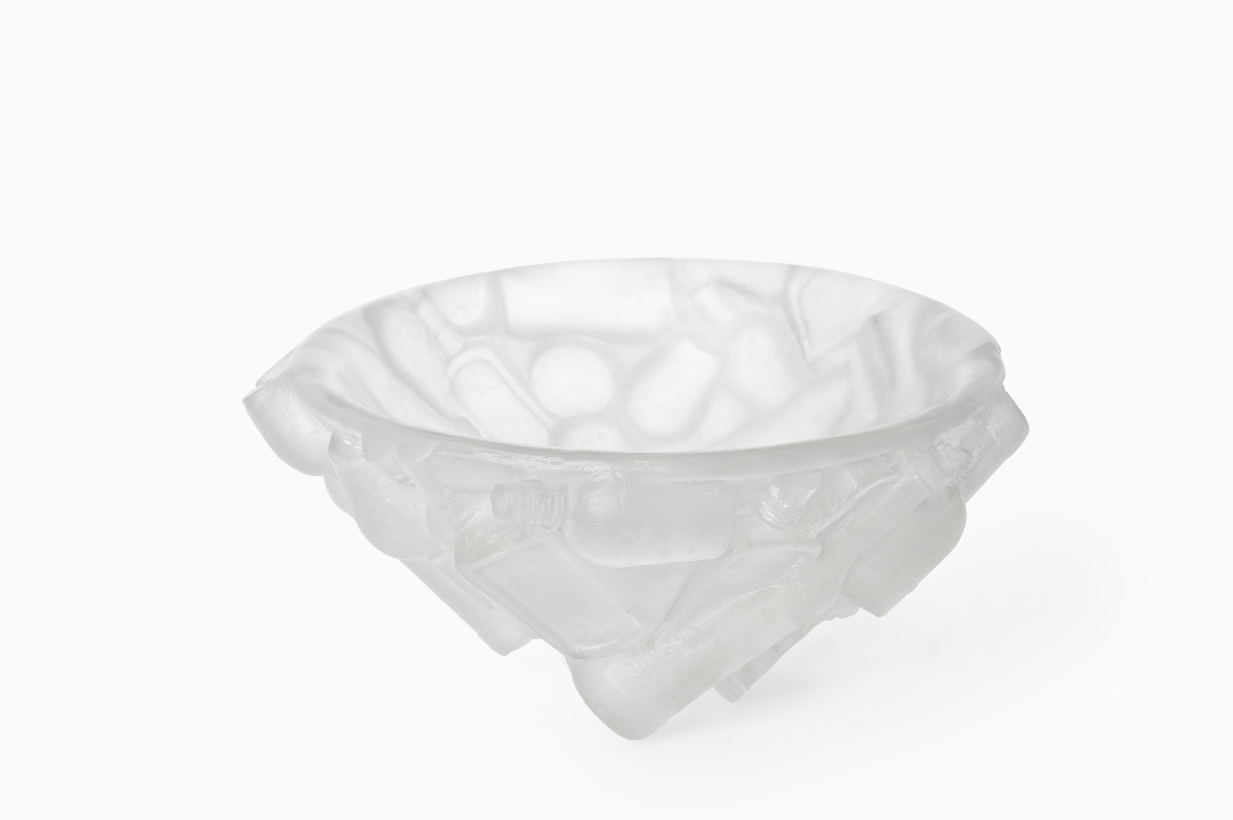
Recollect Bowl
Fahan McDonagh
Context: The living room is a place in the home where family members get together and discuss the issues we face in our daily life; our memories and challenges. A bowl is a sensitive reminder of the cycle of giving and sharing. The circle is a symbol connecting people and things. Problem: Family time has been hit hard by the 21st century. Between the use of electronics and financial responsibilities, families are left restricted to very little time for genuine conversation. Solution: The Recollect bowl takes the shape of a circle and the form of the glass bottles from which it came. It is a timeless conversation piece—a focal point to inspire family to gather and talk. Its form inherently points toward topics of collection and memory as well as recycling. Brand Strategy: The bowl is made of cast re-purposed bottle glass and the form is made by impressions of these bottles. The circle shape recalls an unbroken ring or cycle connecting all people, materials and time.
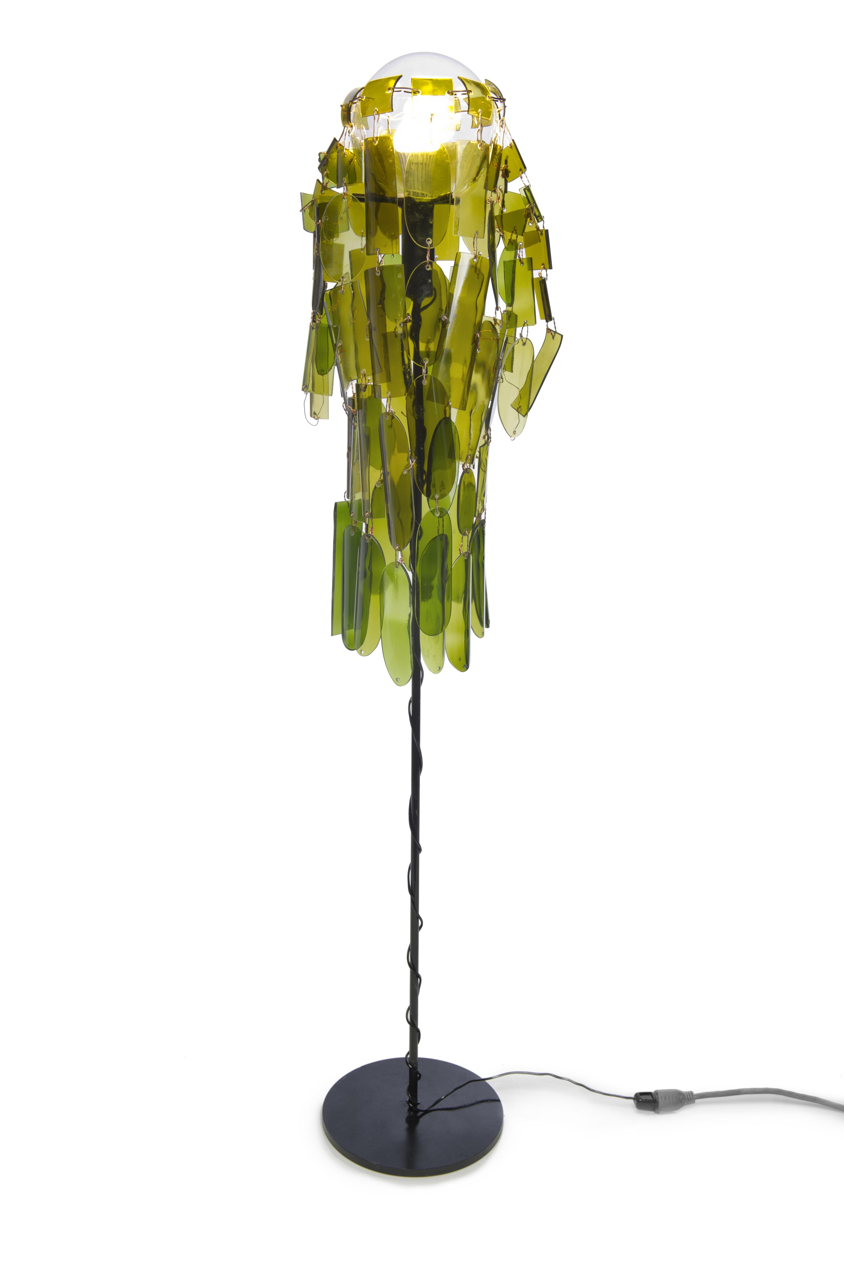
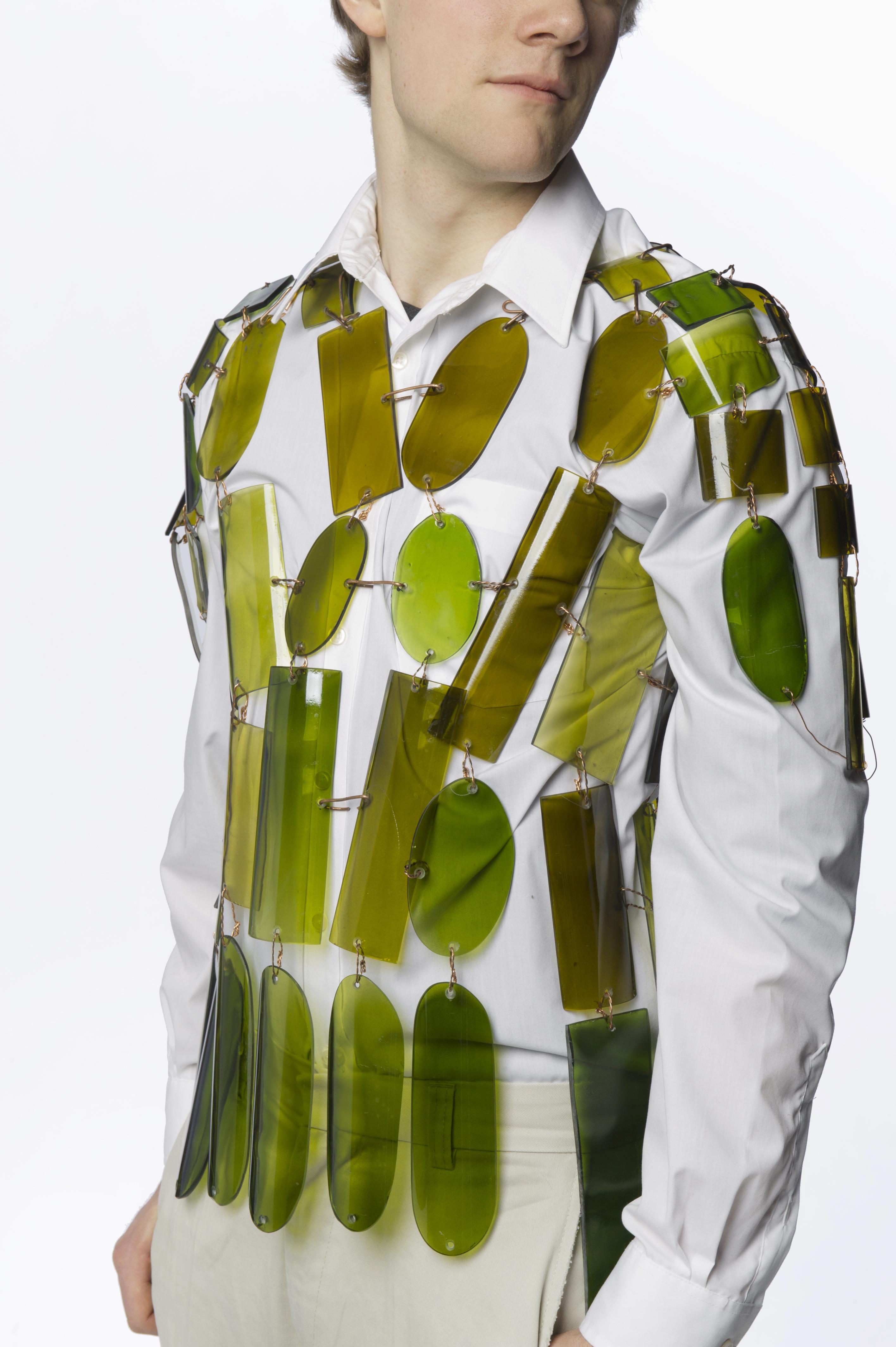
The Lampshade Coat
Gabriel Greenlaw
Context: A coat, formal or not, is often taken for granted, people wear it breifly and then hide it away in a dark closet where it never sees the light of day. Occasionally there is a rack near the entryway for the storage of coats, however they remain unnoticed and undignified until needed. Problem: Create a wearable formal coat that takes advantage of the transparent nature of glass to provide light where it rests, challenges the traditional image of a coat, and complements its surroundings. Solution: A wearable coat mde out of transparent post-consumer glass that rests on its own light post, acting as a lmpshade. No longer does the coat have to be hidden away in a dark closet. but becomes part of the environment by becoming a lampshade when not in use. Brand Strategy: Green is a color commonly associated with recycling and the color used in wine bottles is very identifiable. The coat will be easily identifiable as post-consumer because of the color variations, inpurities in the glass, and any labels that remain attached.
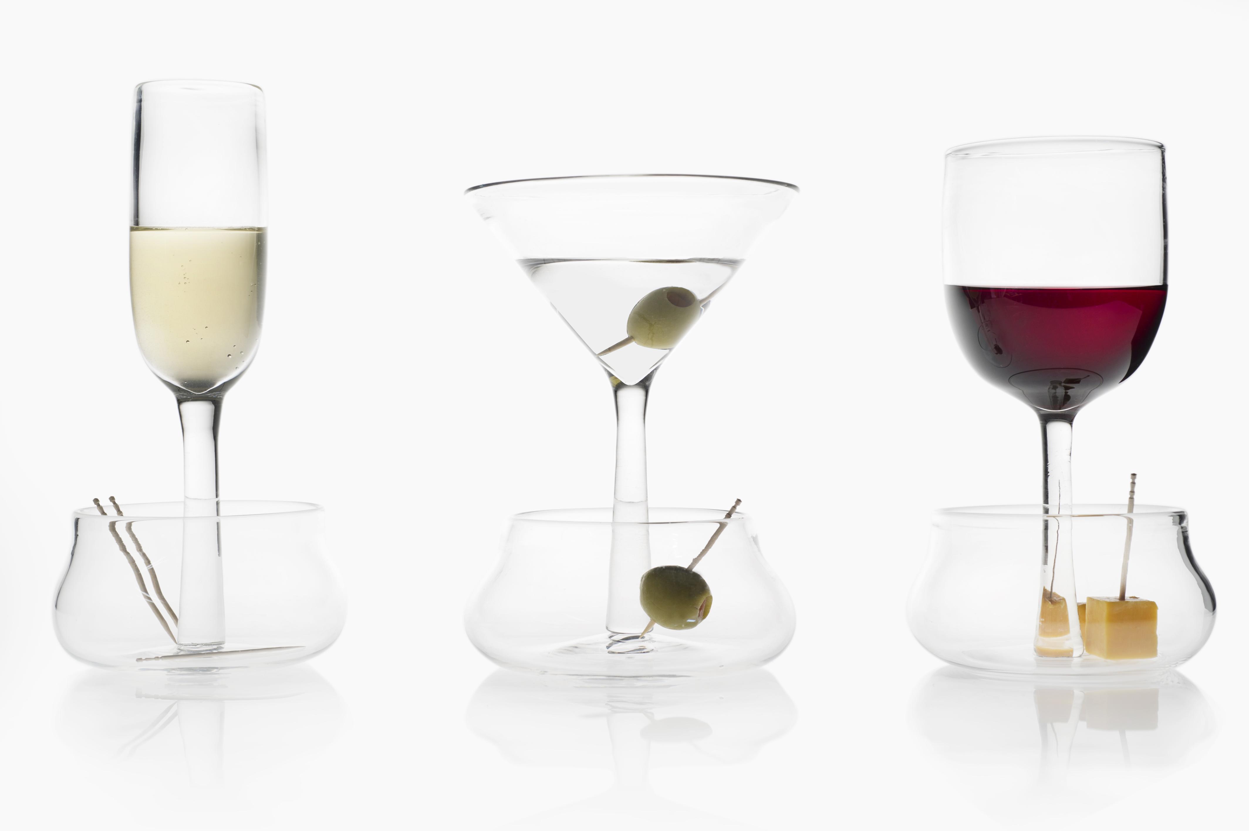
Social Stemware
Jacob Dorpfeld
Context: Social gatherings are where connections are made, friends are found, and impressions with smooth actions are important. In such an environment, social interaction is the focus, and the less complex the atmosphere, the more fluid the interaction. Problem: When mingling at a social gathering, balancing your food and drink can be difficult, almost impossible, and hinders the flow of a gathering. People attempt to hold a glass and a plate in one hand while leaving the other free to communicate or greet. One constantly needs to leave the glass with a friend, set the wine glass down, or balance the plate on top of the glass. Solution: Combining stemware with a well-shaped saucer solves this problem. The vessel for food and drink are joined together, allowing a hand to always remain free. The transition between enjoying a drink, an appetizer, and greeting is now seamless and effortless. Brand Strategy: Glass is one of the most efficiently and commonly recycled materials. The stemware vessels subtly display the elegance and purity of this abundant “green” material.
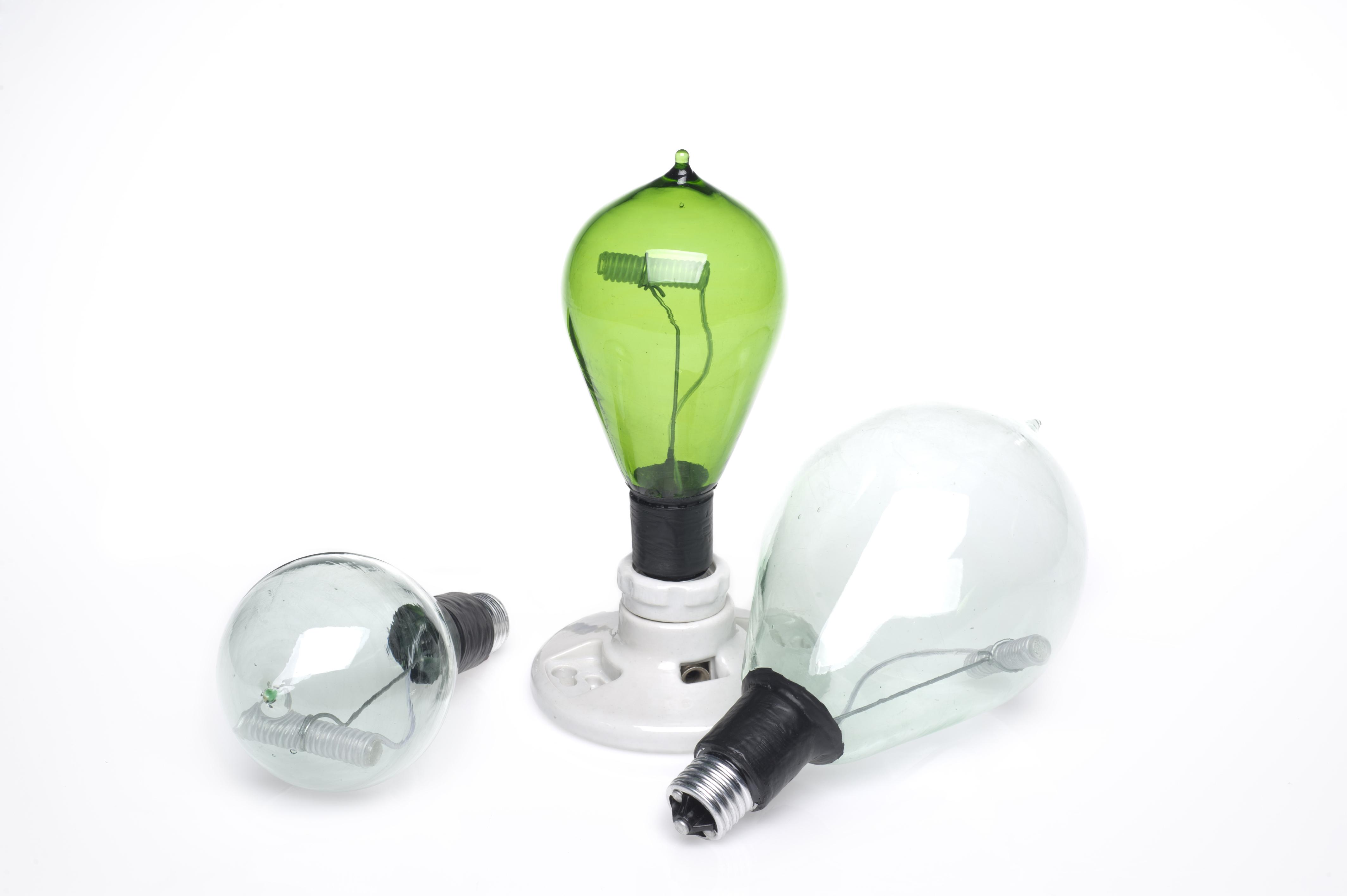
E.L. Light Bulb
Jasper Signer
Context: A decorative interpretation of incandescent light bulb design, featuring an efficient, low cost light source (i.e. electro-luminescent wire). Problem: Lighting design is mostly driven by necessity and efficiency. The consumer lacks a hand crafted, individual alternative to the C.F.L. and incandescent design that inundates the market. Solution: Creating a light bulb from recycled glass allows for the green production of alternative lighting designs that will be affordable and easily accessible for the consumer. The E.L. Bulb provides not only a new stylistic approach to a light bulb, but is easy to install and open to variation throughout the manufacturing process. Brand Strategy: The use of recycled glass serves as a sustainable branding in and of itself.
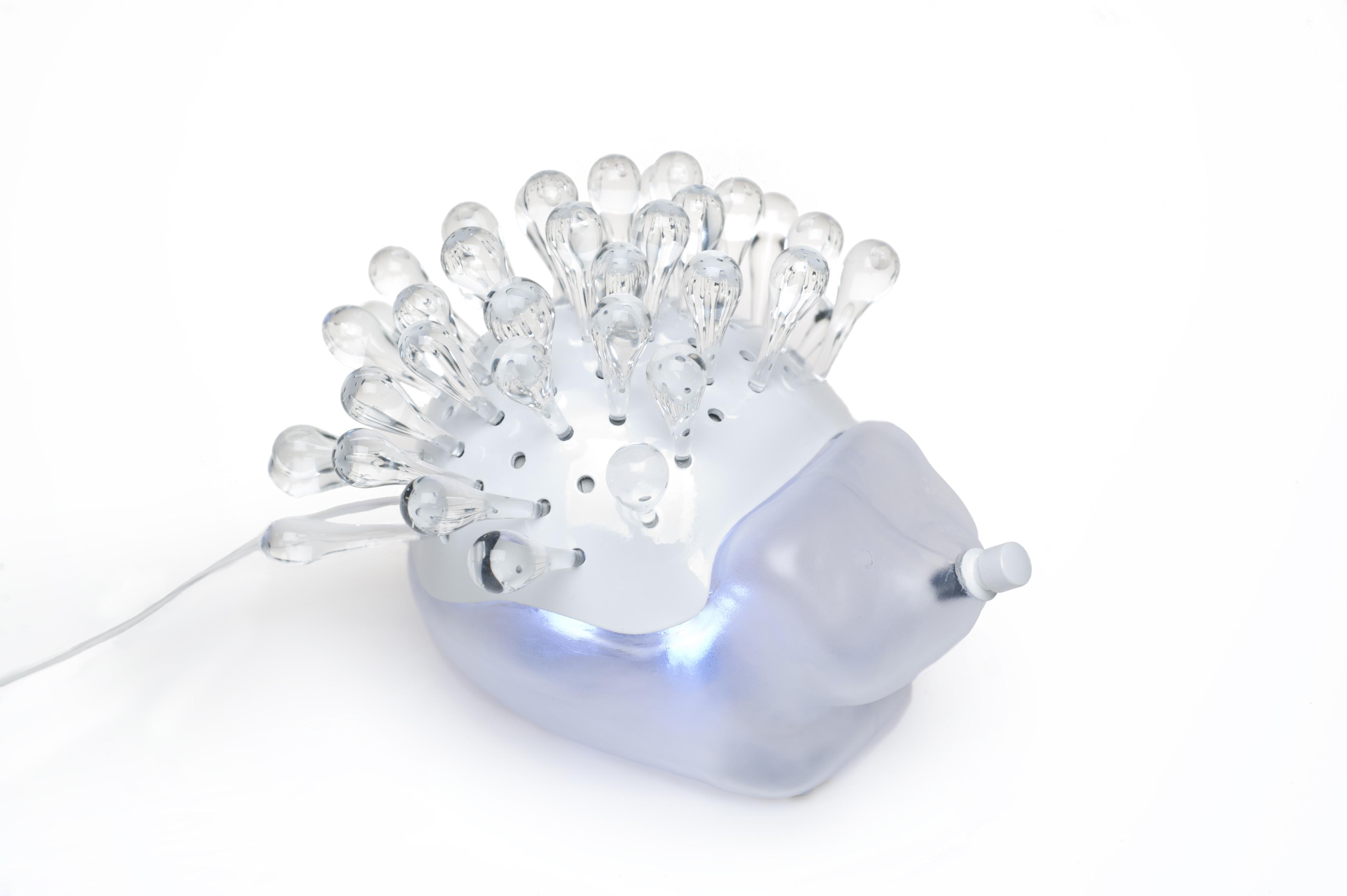
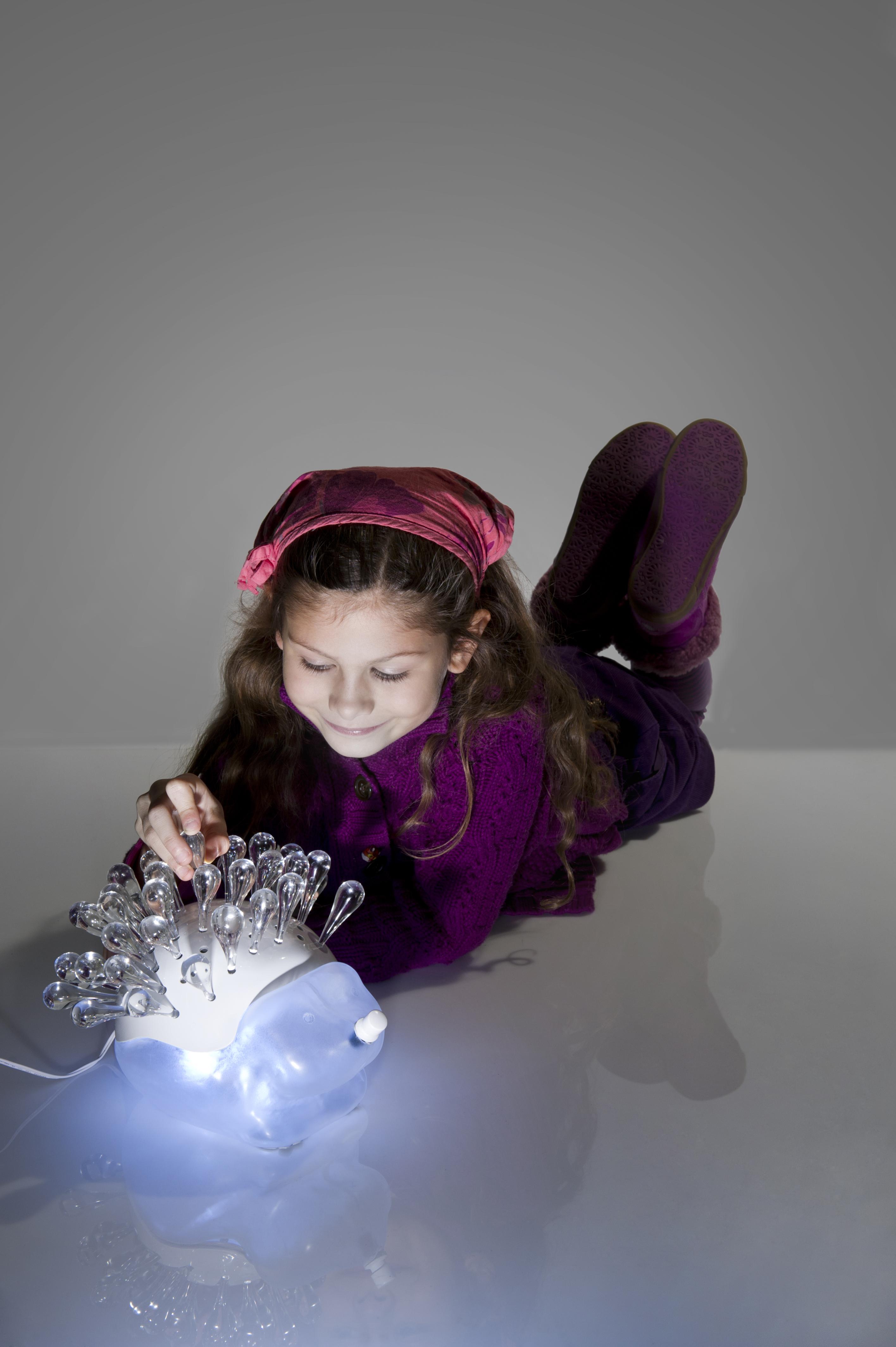
Positive Reinforcement Light
Jenna Parysek
Context: In an increasingly competitive and fast-paced world, children often feel pressure to instantly succeed at a task. Children would benefit from a product that allows them to visualize development in a simple and relatable way. Problem: Children can become frustrated when they are unable to pick up a concept quickly. However, there is not an established method to document and help them relate to the idea of progress. Solution: An engaging character in the form of a hedgehog was created to encourage interaction with the concept of development over time. The hedgehog serves as a nightlight for the child’s room, fostering feelings of warmth and security. There are holes located on his back, which are available for the child to insert quills as a reward for an accomplished task. The idea allows for the product to take shape over time. This object is meant to become a symbol of pride, and provide an image of progress in the home. Brand Strategy: The repurposed nature of the glass would be expressed in the quills, which would be made from recycled glass stretched into rods. Glass suits the spirit of the product, as the material represents trust in the child’s ability to handle a precious object.
Dry Goods Storage
Joshua Rivers
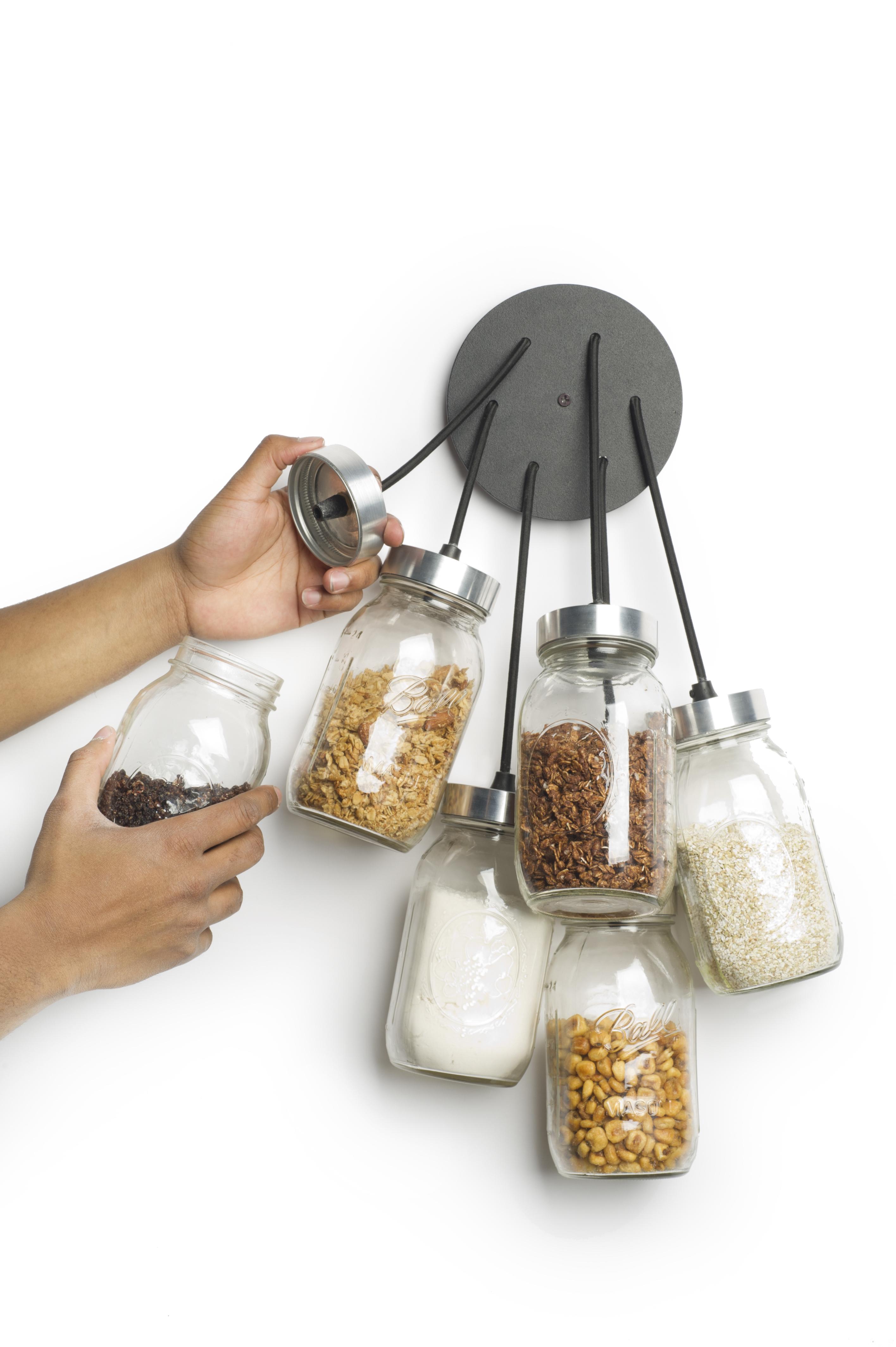
Context: Showcase and celebrate the relationship between glass and the various goods which we store in them while re-purposing post consumer glass. Problem: As technology moves forward, new materials and processes are developed to cope with the storage needs of the ever growing population. Most of these solutions overtime eventually make their way to landfills. How do you encourage users to use more sustainable materials for storage in their homes? Solution: Design a system that beautifully and cleverly organizes raw goods raw (salt, flour, baking soda, etc). We form and organizational strategy is inspired by the idea of “organized chaos”. Because there is no wrong way to reattach the separate glass containers, the object seems to always be balanced. The bi-product of this designed system is a more sustainable user lifestyle fueled by a new relationship between the user and the material glass. Brand Strategy: The concept relies solely on the use of a common post consumer glass vessel.
Privacy Booth
Julian Del Campo
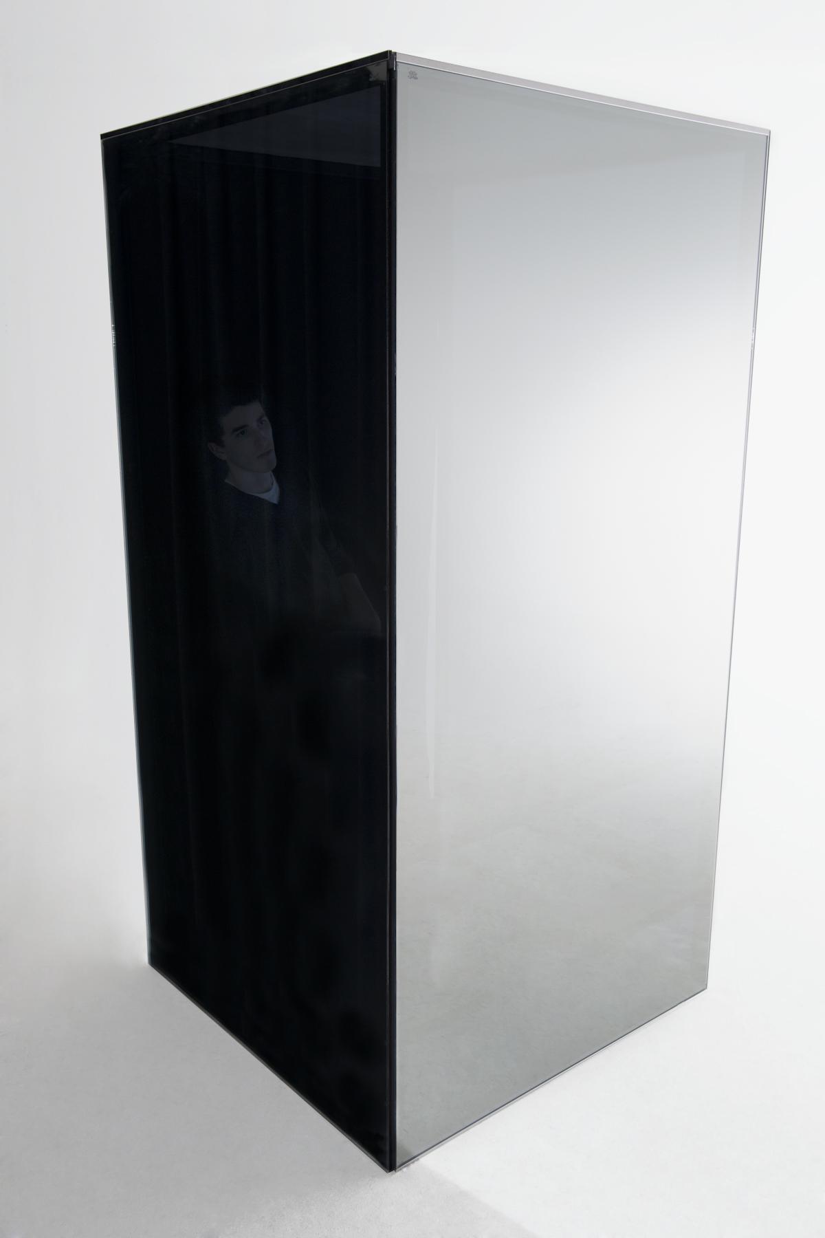
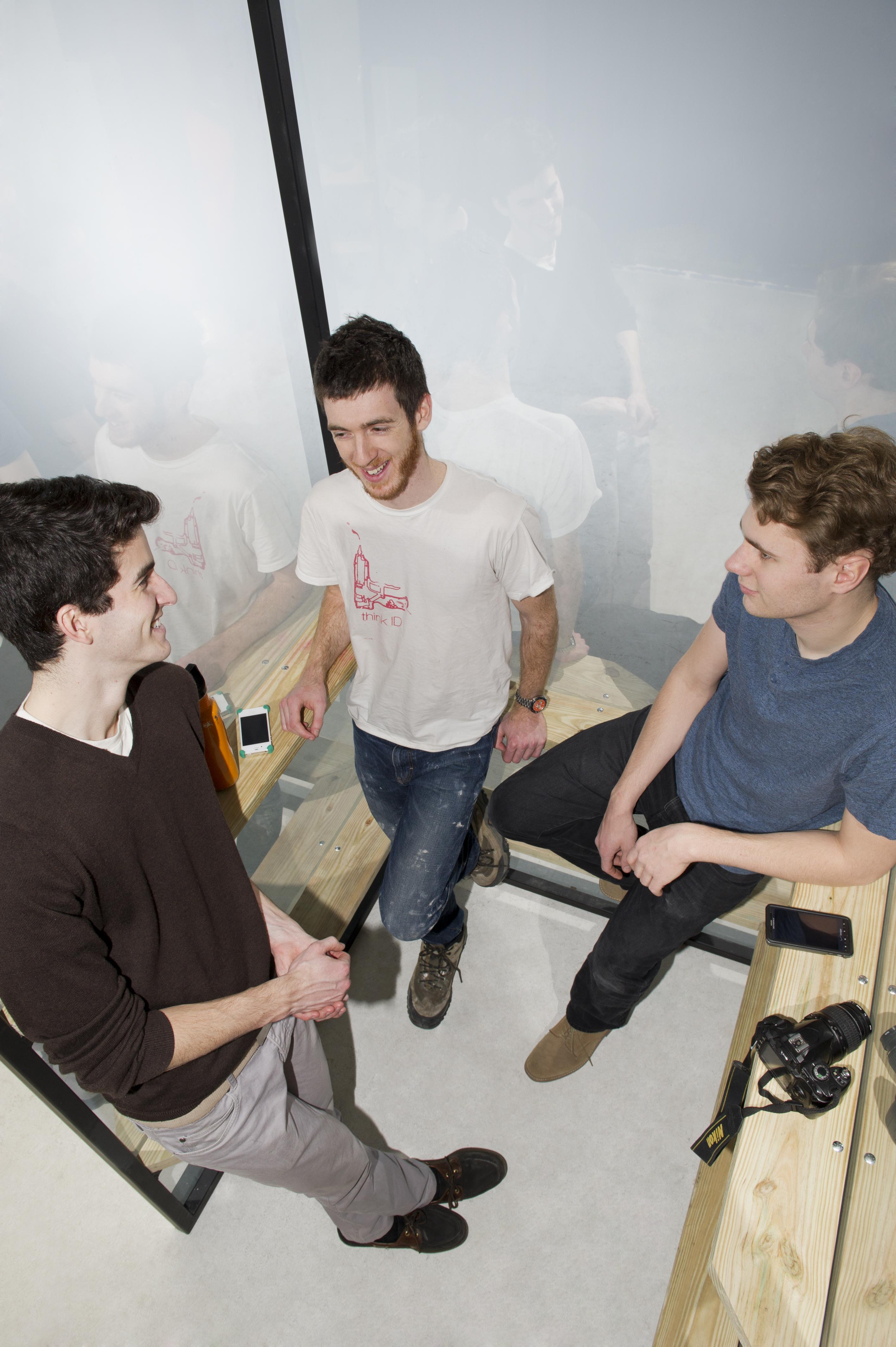
Context: The public eye is our collective gathering of information through social interactions on a daily basis between strangers and families alike. Problem: During most of the day we are in a public space. Whether it be the office, studio, classroom or just having lunch, we are constantly playing, and dealing with social interactions. Solution: This is a place to stop and be calm; a place where no one can see you but you can see everything, and everyone. This allows one to be in a rare state of comfort, whether it be alone or with a worthy friend. Brand Strategy: Large buildings often use sizable glass treated with a reflective film. As older buildings are taken down and new ones put up, the appropriate materials will be reused.
Low-profile Centerpiece
Karen Mahardy
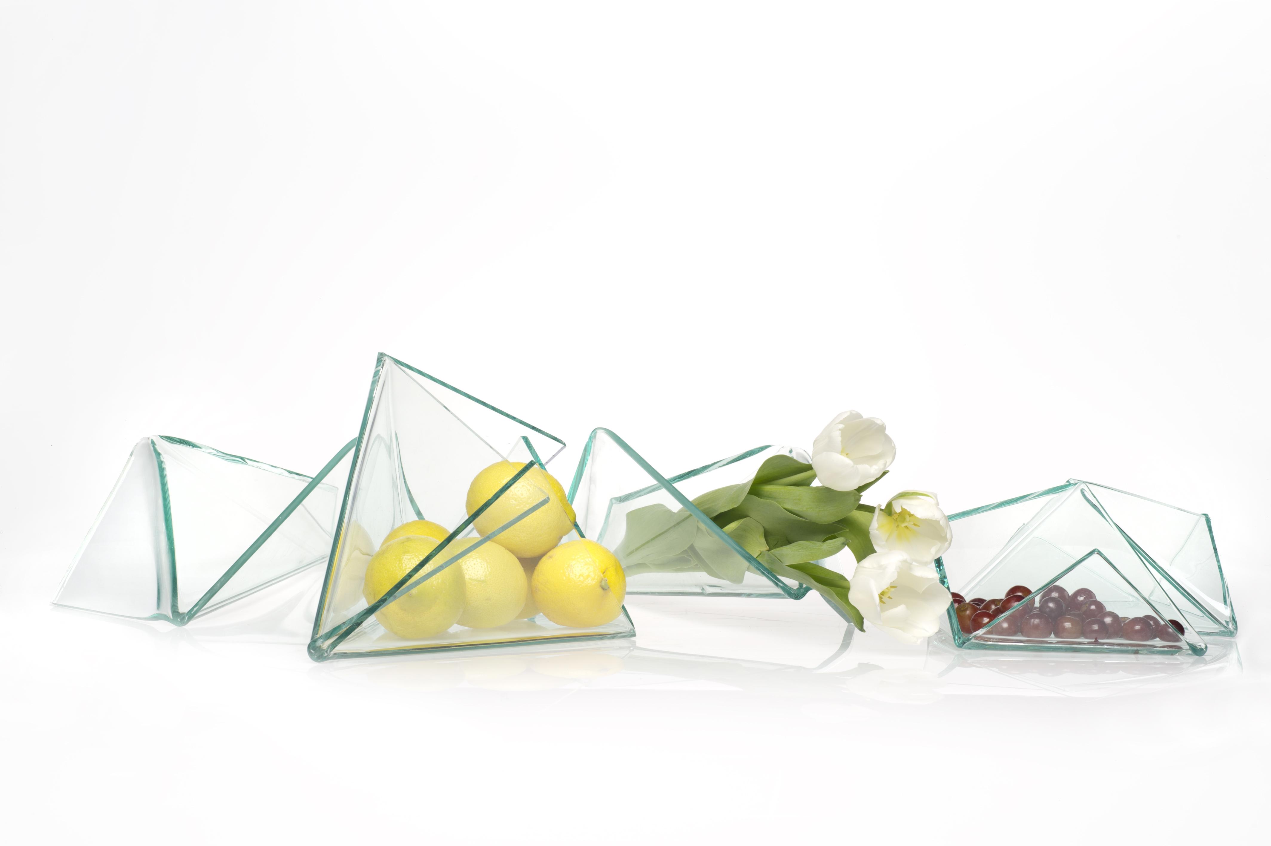
Context: How many times have you sat at a dinner party and were unable to speak to the person seated across from you because a giant overdone centerpiece was in the way? The center of the table is a place to bring art, natural beauty, light and functionality together, while making a statement and creating an environment that encourages conversation. Problem: Create a focal point for dining table that is low-profile and encourages conversation across the table. The centerpiece should function as a place to put flowers, decorative food items, or small appetizers. Solution: A sculptural, modular centerpiece that is short in height, extends horizontally and can be arranged to suit the needs of the event. The pieces that make up the centerpiece should vary in size and shape to accommodate different uses. Brand Strategy: The centerpiece will be made of recycled window glass. Window glass has a particular look and it is this that will be the only indicator that it is recycled. The focus is to be on the design first and the fact that it is made from recycled glass is secondary.
Scratched Light
Katelin Leider
Context: An entryway is the first impression of a home and is usually the most neglected area. Creating a sculptural element that utilizes light and shadow will enhance atmosphere and welcome you into the space. Problem: Expressing the concept of light and space through the integration of mirror as a re-usable material so rich in historical content. A material once widely viewed as luxurious and precious is now mass produced and taken for granted. Solution: Etching away the silver-plated surface of the mirror will emphasize the optical qualities and refract light to create the desired effect. Brand Strategy: A scratched or broken mirror would normally be discarded. My design embraces these qualities and reinterprets them into sculptural components.
Cord Organizer
Kevin Toh
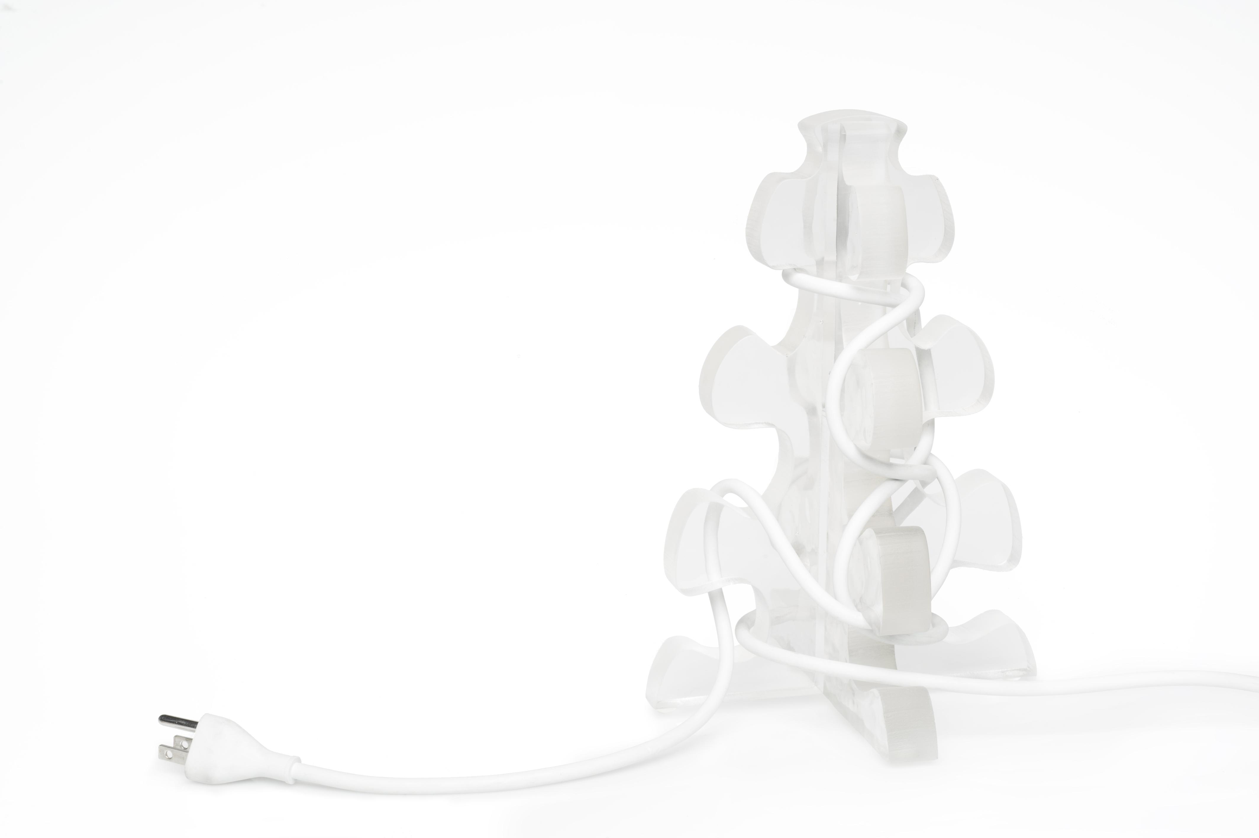
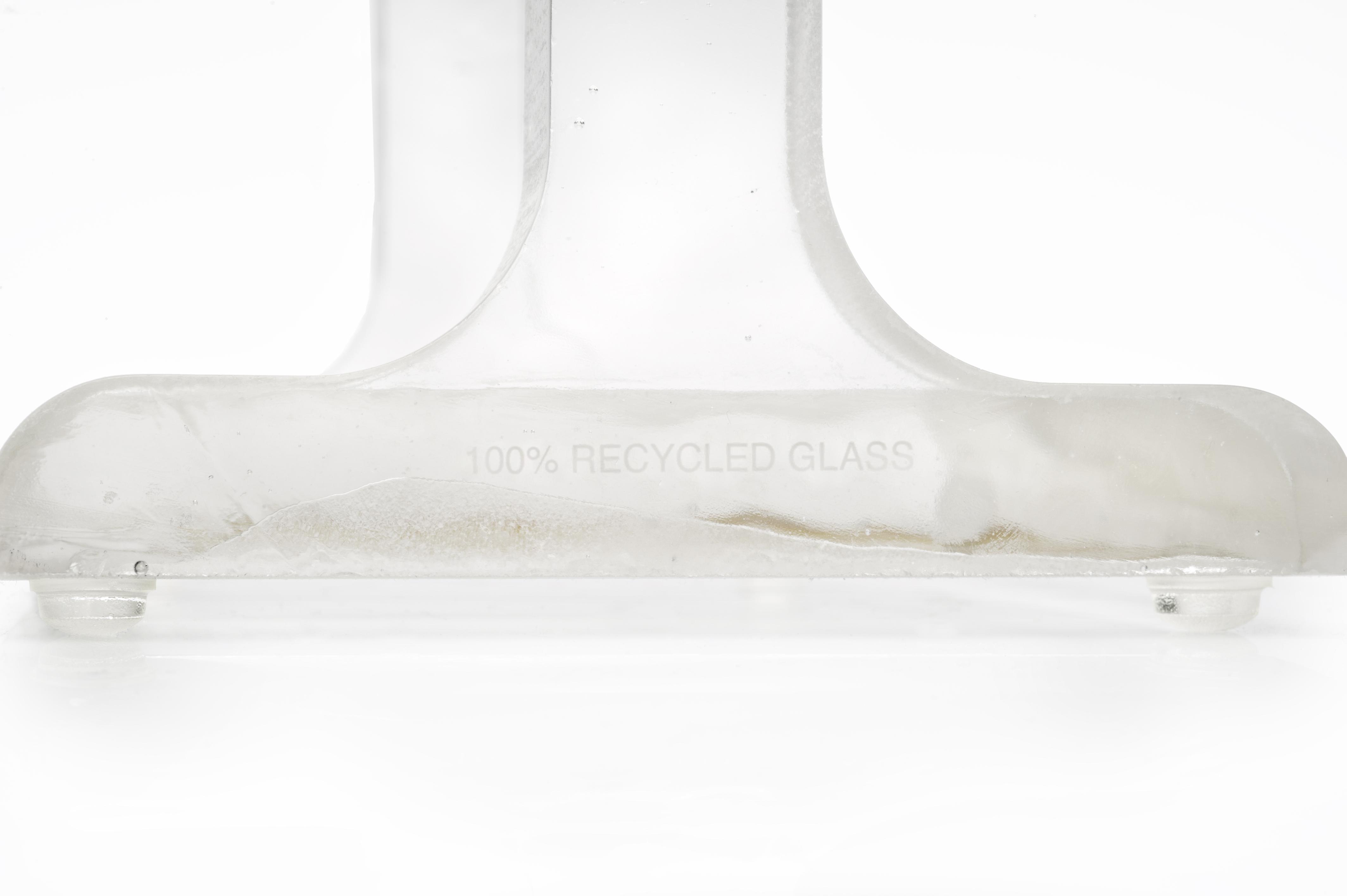
Context: There are many devices with cords that are located around the house (ex. bedroom, dorm, and office). The cords are often messy and are unorganized. Some of the devices that require a cord are computers, laptops, external hard drives, webcams, the computer mouse, speakers, wire with USBs, lamps, and the cellular phone. Problem: There are several problems with unorganized cords. Unorganized cords are usually not visually appealing. People tend to see many cords as messy and cluttered. The cords block people from finding things because they can be hidden behind or under the cords. Cords become tangled and knotted with each other very easily making it difficult to remove a device. Solution: One organizer for the desk and one organizer for the floor that the cords can be neatly wrapped around. The length of the cord can be varied depending on how many times you wrap it. When using one or both organizers, desks and floors would be cleared of clutter and tripping hazards and more space will be available for use. Brand Strategy: Both organizers are made from 100% recycled glass. Both the desk and the floor organizers are made from plate/sheet glass and cut with a water jet.
The Plastered Caps
Kyle Blemel
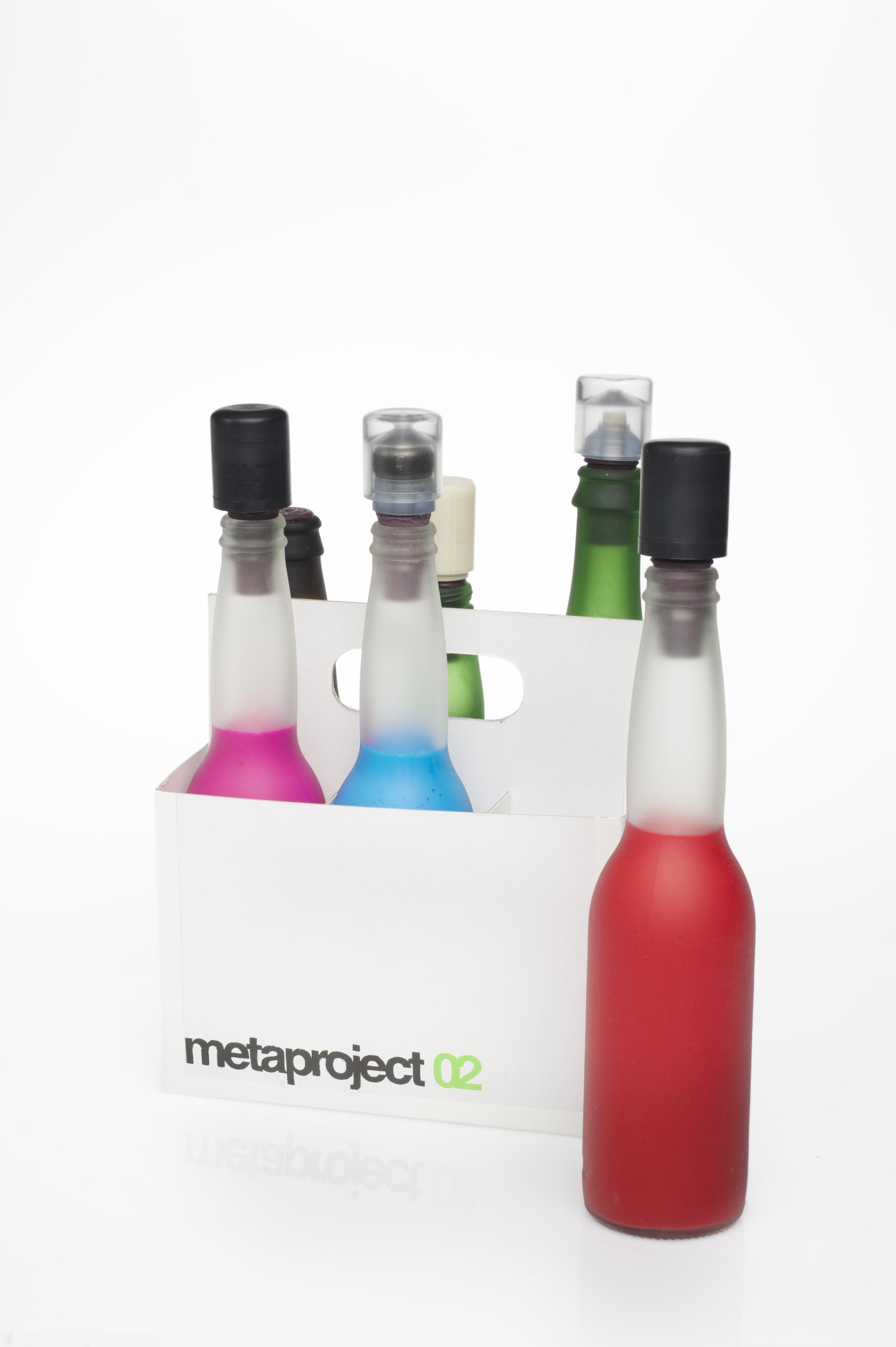
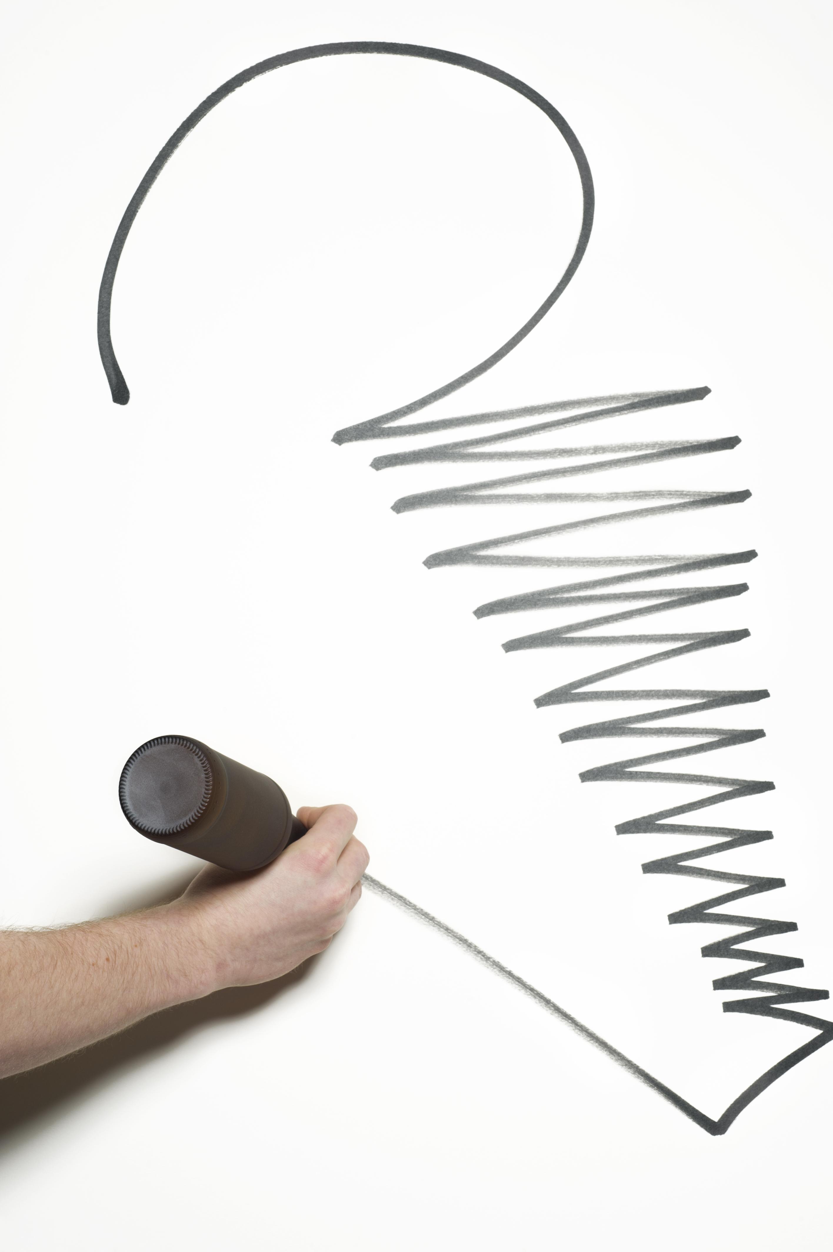
Context: People have been plastering surfaces ever since the advent of history. Without writing utensils many advances in society would not have been possible. People just want to make their mark. Problem: Design, conceptualize, and create a useful vessel made of recycled glass. Solution: The double cap system allows the user to take any beer bottle and many other glass containers with a similar interior diameter into a marker or a pen. The caps also stop the paint or ink from drying up because of it’s tight tolerances. The color of the medium is easily seen if the user decides to use a clear bottle. Brand Strategy: Glass bottles are one of the most used containers in the world and can be recycled multiple times. They are common objects with many unfound uses.
The Wine Rack Spoon Rest
Lars Lindquist
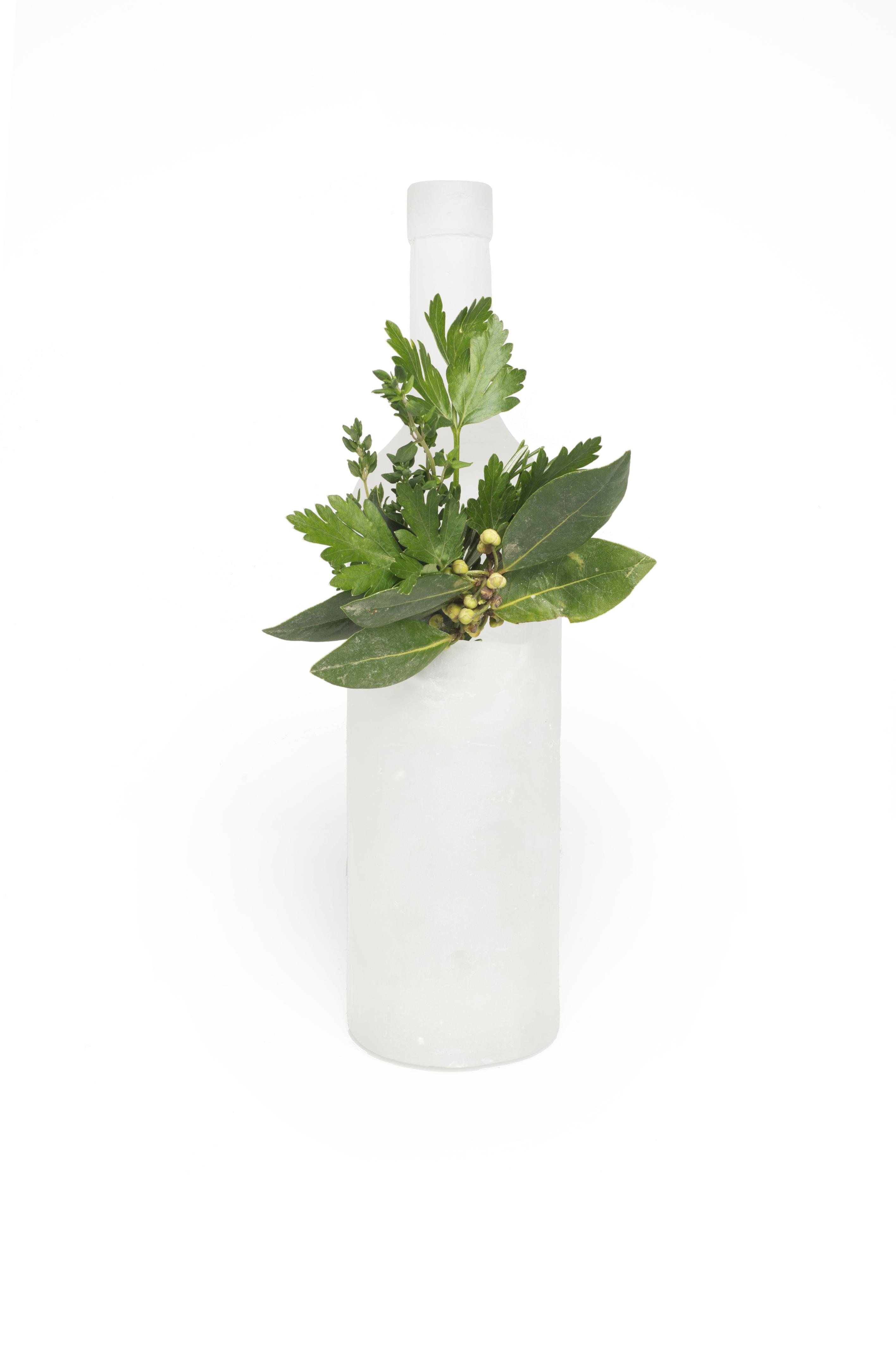
Context: Needing a place to put utensils down momentarily while cooking that won’t get the stove top or counter dirty. Problem: Create a spoon rest that blends into the kitchen environment without drawing unnecessary attention to itself, and still acts as a functional piece. Solution: Making a spoon rest in the shape of a wine bottle that has a chamber to hold utensils and contain any mess that would be created. Brand Strategy: The recycled nature of the piece is shown through the form of a wine bottle, as well as having the potential to be cast from recycled glass.
Television Writing Pad
Michael Migliorini
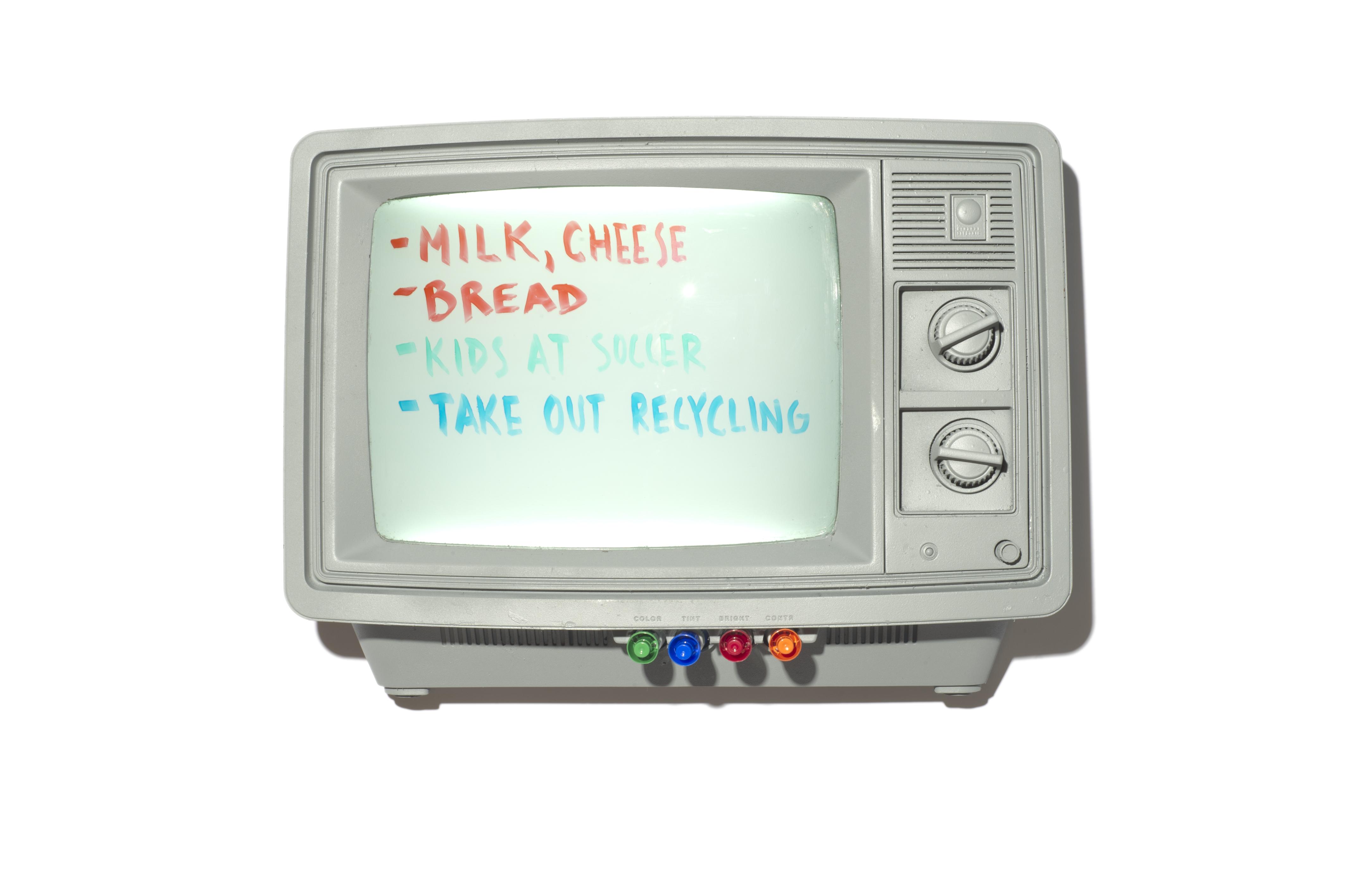
Context: People often leave notes and reminders scattered around the house to be lost or thrown out. This results in clutter both mentally and physically. Problem: Create an object that commands attention and centralizes reminders and notes. Solution: A repurposed television which illuminates all of your reminders. Brand Strategy: Televisions, especially older ones, are often thrown away when a newer, better one is acquired. By repurposing these televisions, a new life can be given to them.
A Vessel for Plants
Morganne Theobald
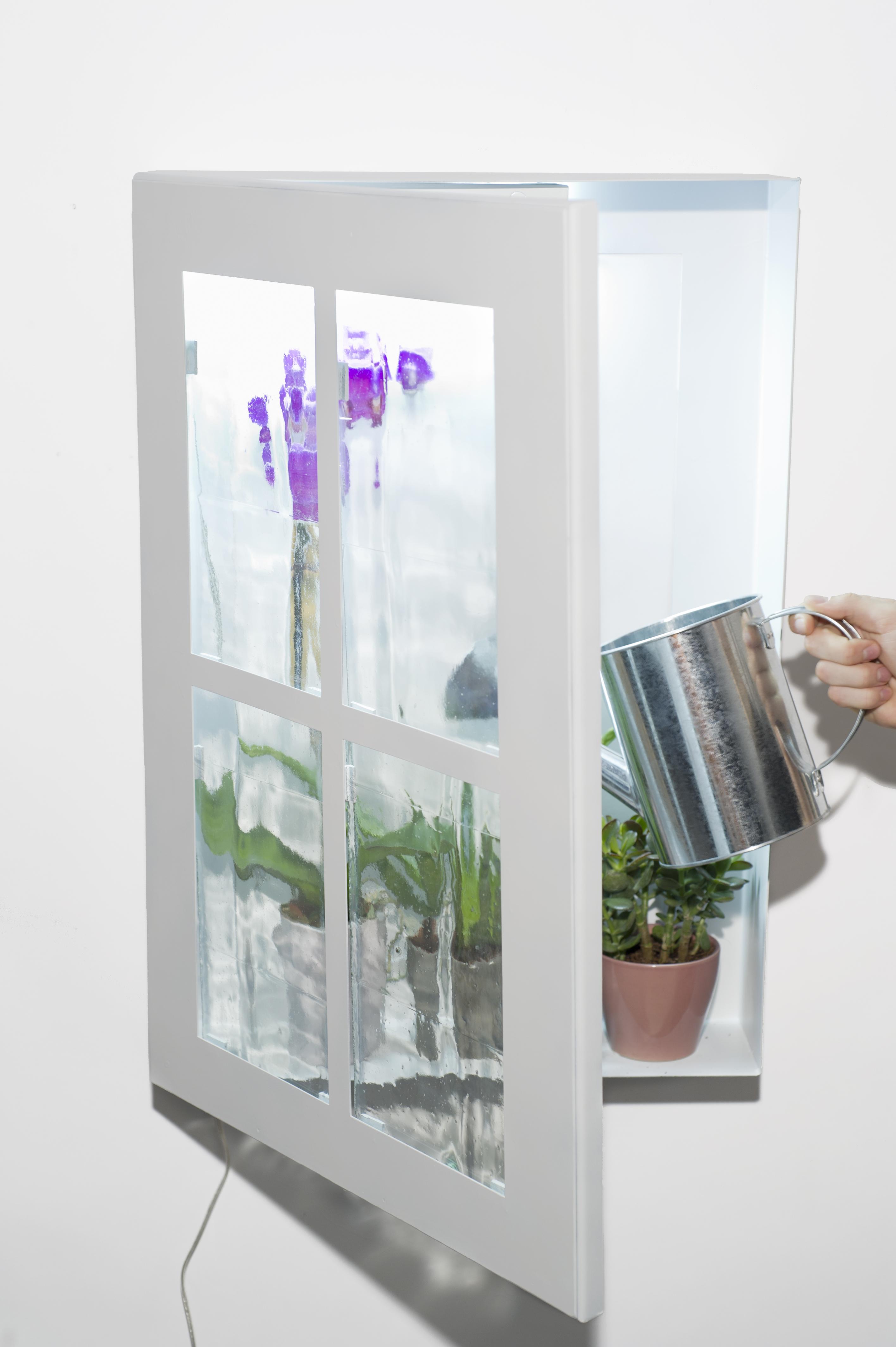
Context: A living space without a lot of flare that may not have a lot of natural light coming through to it often in the form of an interior space like a hallway or and city apartment. Problem: Many common living spaces are often over looked and passed through very quickly when there is nothing engaging to look at. These spaces are typically dull and dark and can be emotionally disconnected from the viewer. Solution: Bringing the icon of the window into an interior living space and adding light and life forms allow the user to linger in the space longer. This helps the viewer feel a more pleasant affect from passing through the space and seeing plant life and light in a space that is normally dull and boring. Brand Strategy: Using large glass wine bottles as cylinders and opening them up into flat panels in the kiln to create windows with an optic flare like the traditional glass windows seen on farm houses.
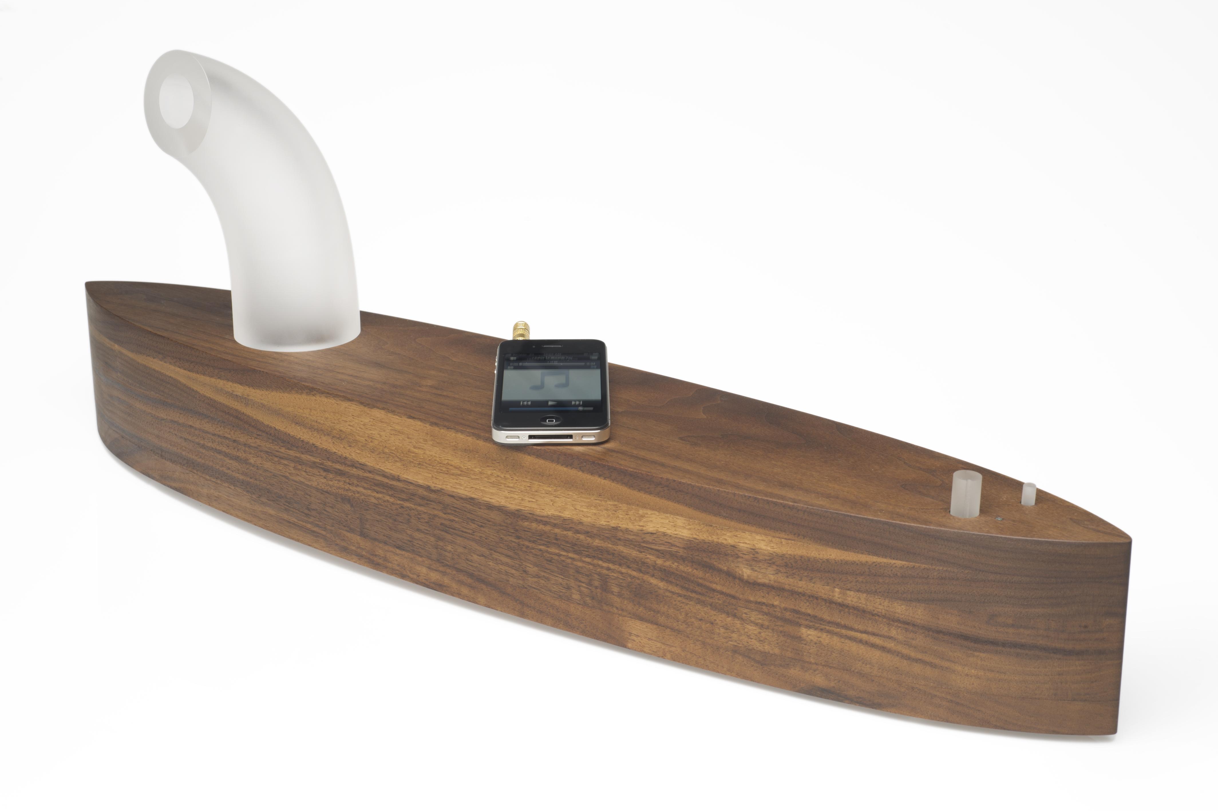
Sound Voyage
Namdoo Kim
Context: Home or working place, anywhere that you can play music. Problem: Most existing speakers are not attractive. They do not celebrate their materials. They do not reflect the home or their environment. Solution: My speaker has a modern design while utilizing natural materials that provide warmth in appearance as well as sound. Brand Strategy : The pathway of sound and the controls are made of recycled glass. In this way, the product reminds people to pay attention to recycling and the environment using haptic approach to the recycled glass and reclaimed wood (eco-friendly) materials.
Amblent Light Tile
Orion Becker
Context: The shower is one of very few common household locations where full sensory immersion can occur and the outside world is completely shut out giving us time to relax or reflect but is often only used as a quick method to clean the body. Problem: Current lighting options in the shower are stark and harsh, emphasizing only modern cleanliness and efficiency in the shower. Typical lighting fixtures are usually positioned directly overhead giving off a consistent bright light which can feel harsh in the early morning or after a long day. Solution: The other sensations of showering, the feeling water and heat, hearing the sound of water moving, are complemented by creating a lighting solution in which shower becomes a universally immersive experience which encourages complete relaxation. The twinkling effect increases this effect by simulating an underwater view of light entering from the surface. Brand Strategy: Using a blue or aqua colored glass offers the option of using recycled bottles as a source for material. Blue and green glass also are reminiscent of beach glass and under water fauna.
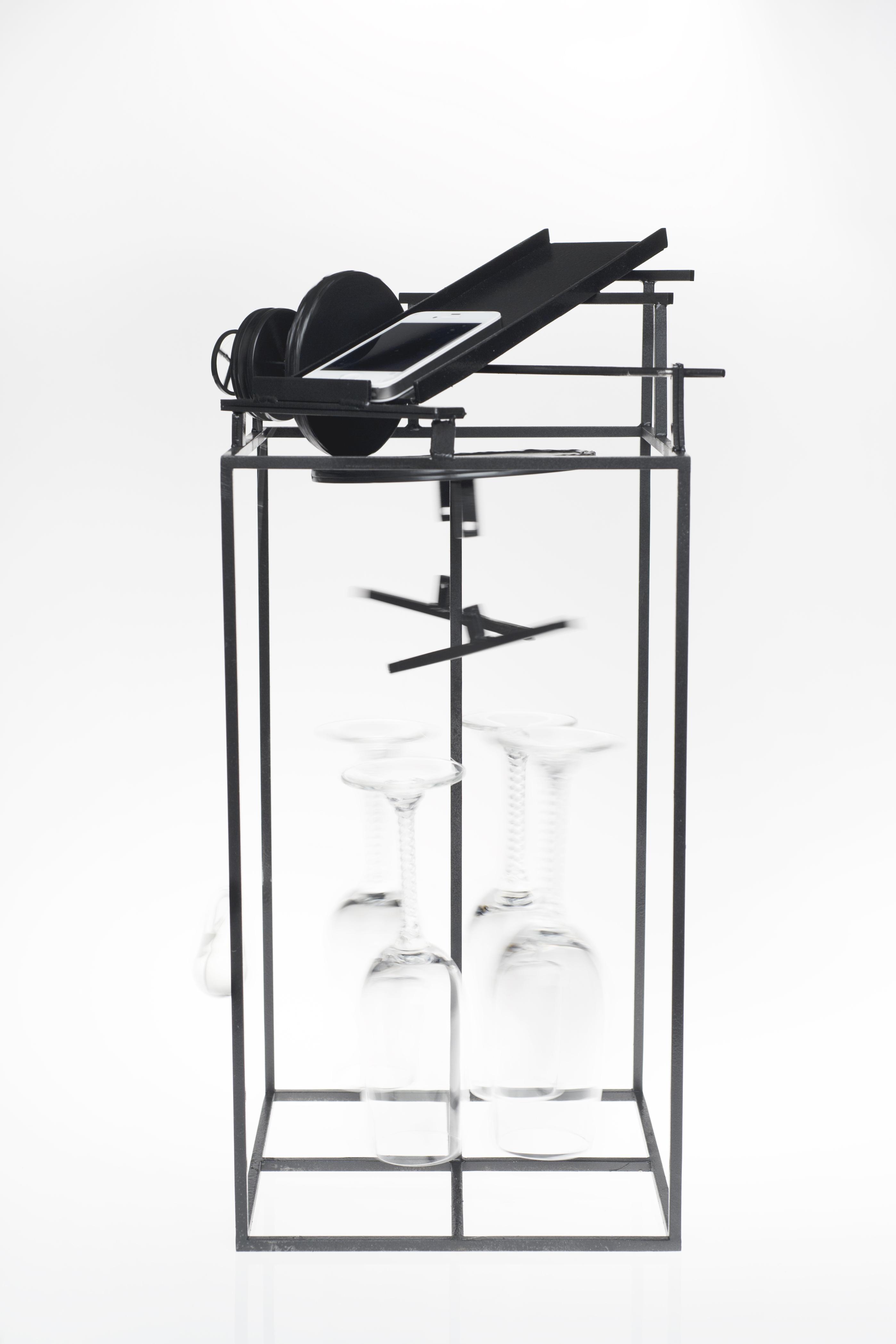
Cell Phone Alarm Amplifier
Richard Lawrence
Context: Waking up in the morning is usually a struggle for most people. Problem: Despite our best efforts to get up on time for the day, the snooze button was invented to hold us back. Thousands of people fall victim to its temptations each morning, running the risk of being tardy for the day, and feeding our lack of motivation. Solution: Comical engineers of popular movies, such as “Back to the Future” or “Chitty Chitty Bang Bang,” develop elaborate Rube Goldberg machines to help them with their morning routine. My plan was to use the same Rube Goldberg idea for a machine that makes sound triggered by the vibration of a cell phone, and fit it into a contraption small enough for the night stand. Brand Strategy: The structure of the project is made out of steel. Suspended by two pound fishing line, the drinking glasses in the center are re-used lead-crystal champagne glasses.
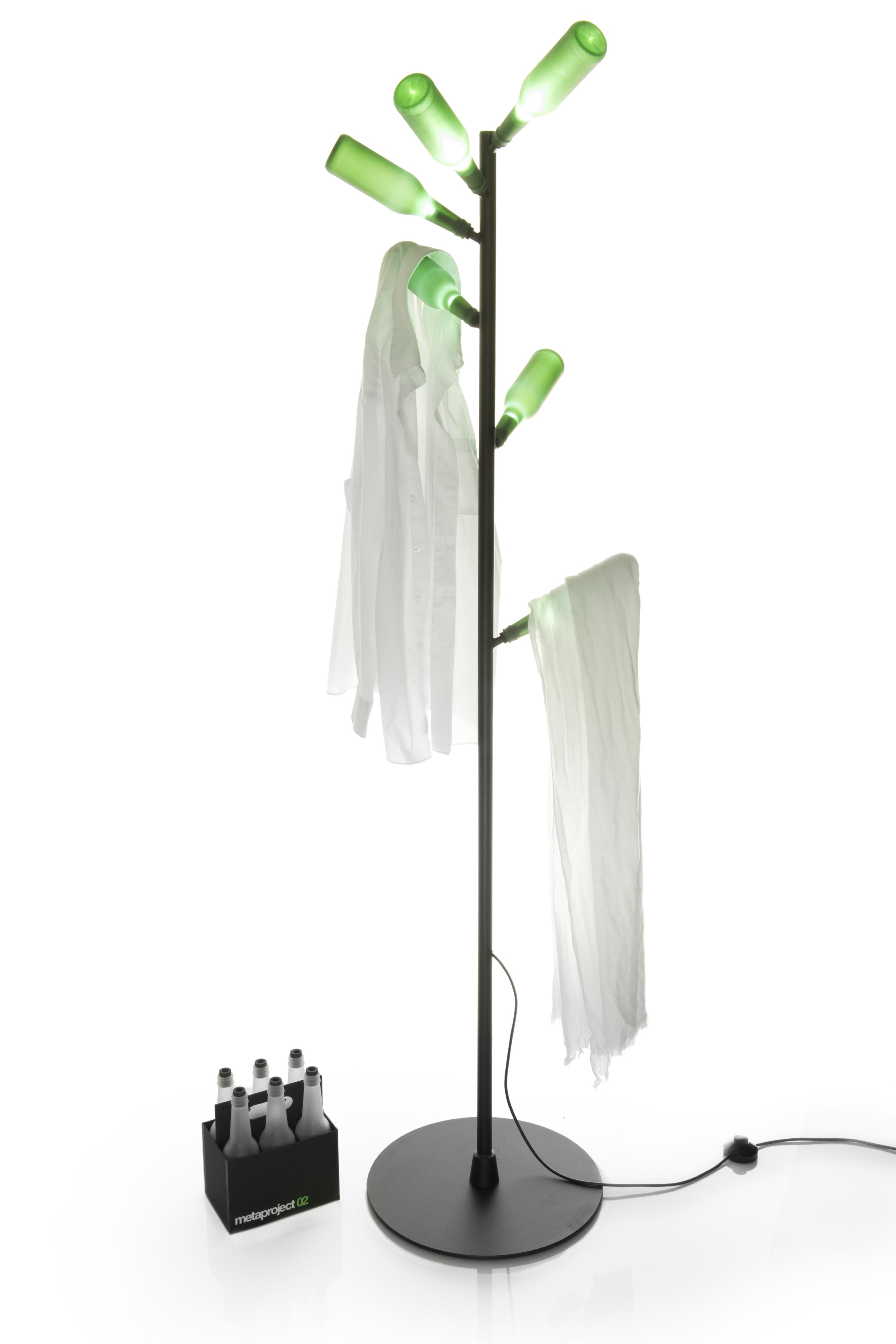
Illuminated Coat Rack
Robert Gulielmo
Context: Upon arriving home, we tend to remove the apparel from our day and settle back into our own element. Often times these garments are placed on common objects; away from the entryway where coat racks are regularly placed. Problem: Traditional coat racks blend into their surroundings and become forgettable. What if a coat rack was celebrated as a vessel which invites the user to return to their own personal comfort and identity, rather than a bland, lifeless product? Solution: A coat rack which can be placed in any room where apparel is often removed. The soft illumination of the glass bottles provides a clear visual cue of where to hang clothing. Brand Strategy: Sandblasted beverage bottles showcase the re-purposing of a commonplace glass item for another function. In addition, the entire product is made with recyclable/reusable materials.
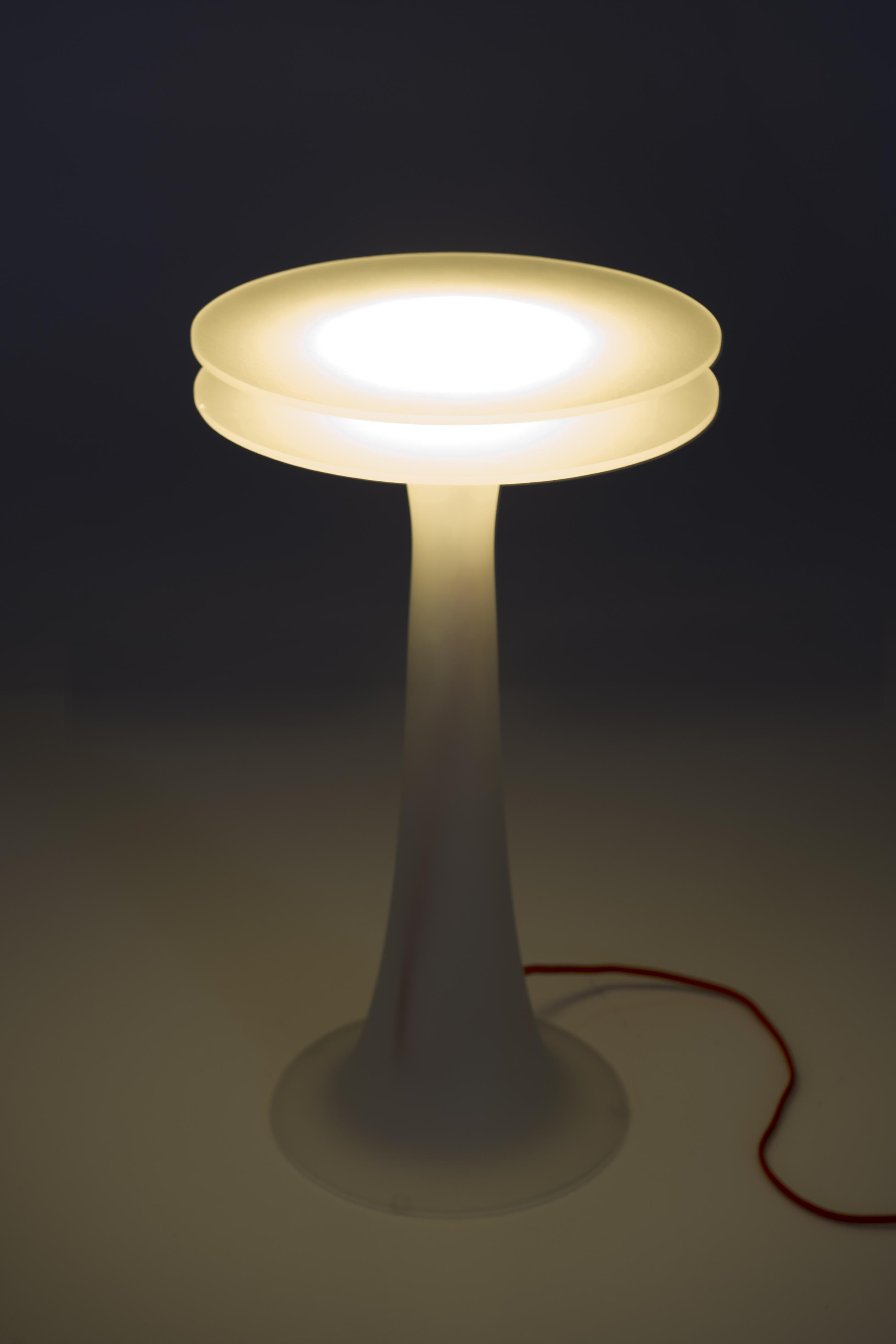
Lighted Side Table
Surim Lee
Context: Locating items during the night can be difficult when waking from sleep. Problem: Create an opportunity by unifying storage and beacon within the bedroom. Solution: Installing a light source in the side table. The top part of table is able to open, so changing the bulb is quick and easy. Around the light source/bulb is a storage space, so that the user can put items away that are easy to find if needed. Brand Strategy: The centerpiece will be made of recycled window glass. The idea is that the recycled component of the product will be conveyed by the color of the glass itself rather than a mark or tagline.
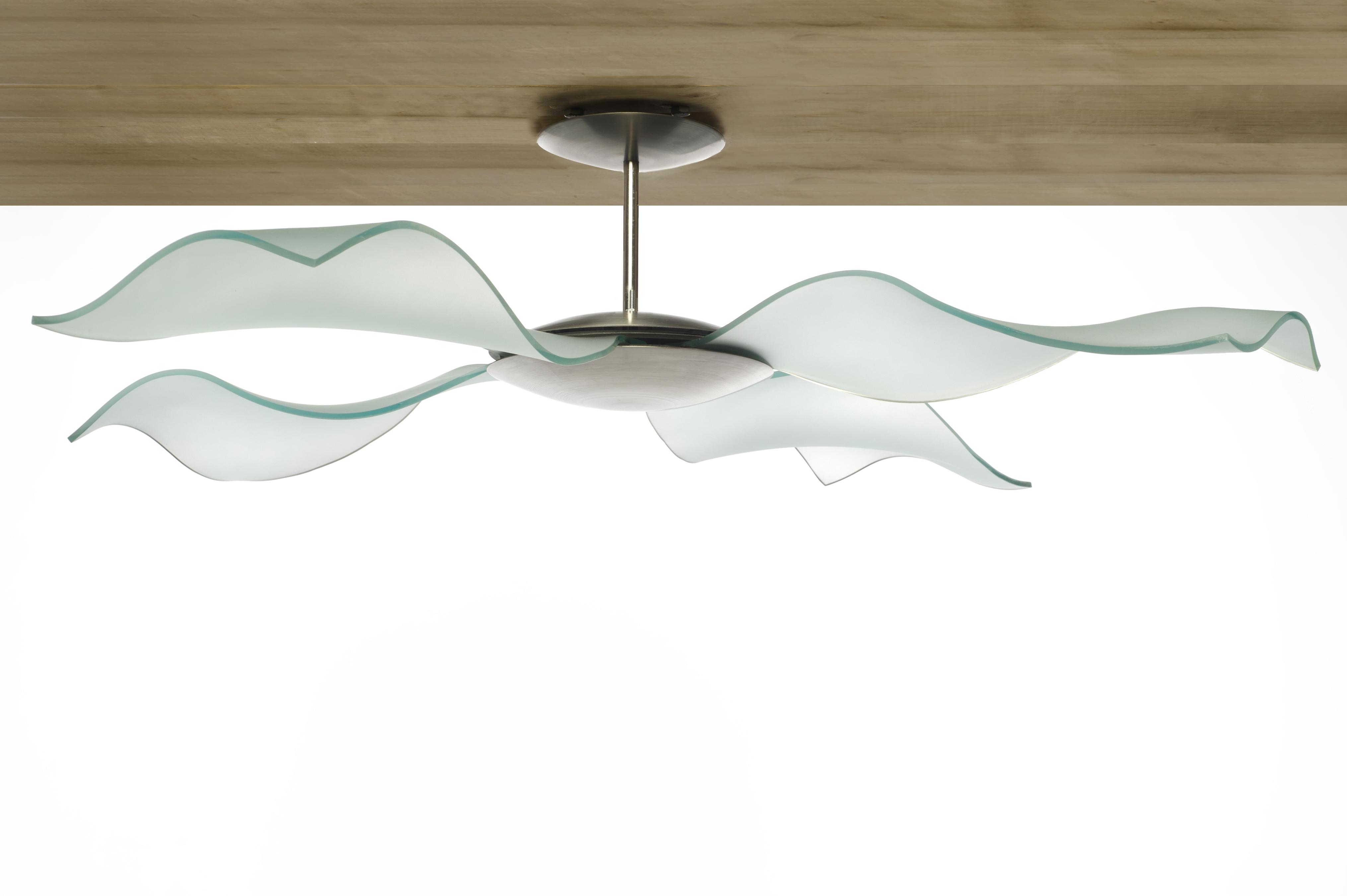
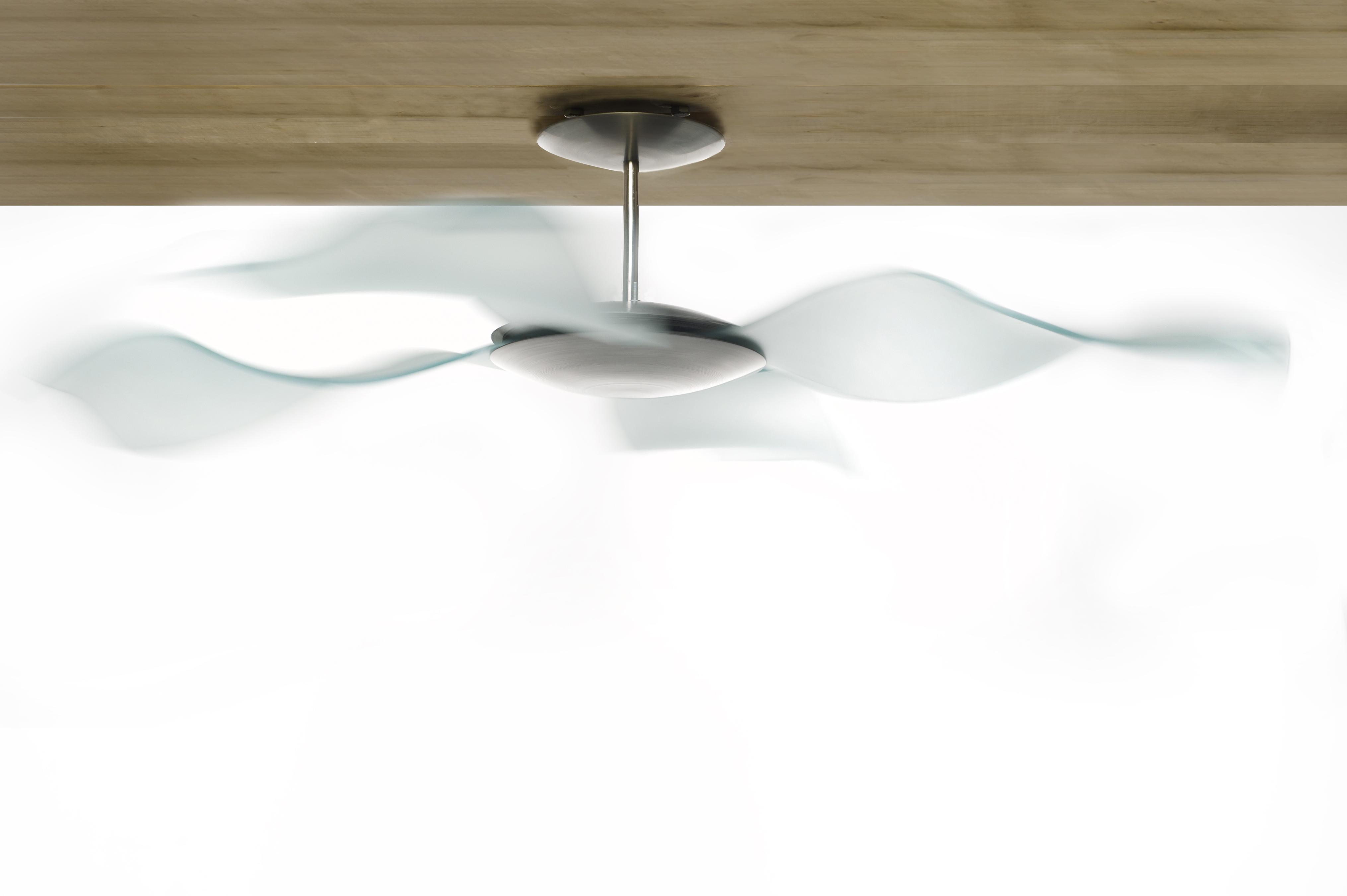
The Float Fan
Tom Zogas
Context: Ceiling fans are commonplace both in and out of the domestic setting, but occupy a gray area between being inconspicuous and obtrusive. They neither fade into the ceiling nor provide a meaningful aesthetic addition to a room. Problem: The large size, rotational movement, and projected shadows that are inherent in the function of a ceiling fan prevent it from being unnoticed, yet are not utilized with intent. Solution: To create a ceiling fan with an appearance that reflects its function. The transparency of glass blades capitalizes on the dynamic shadows thrown from the fan, and their form reflects their function as circulators of air. Brand Strategy: The fan’s blades are made from slumped float glass, a material that is ubiquitous in our surroundings due to its architectural use. As a type of glass that is readily workable and tempered, any retired windowpanes or discarded cut-offs of adequate dimension could be repurposed into the blades of a Float Fan.
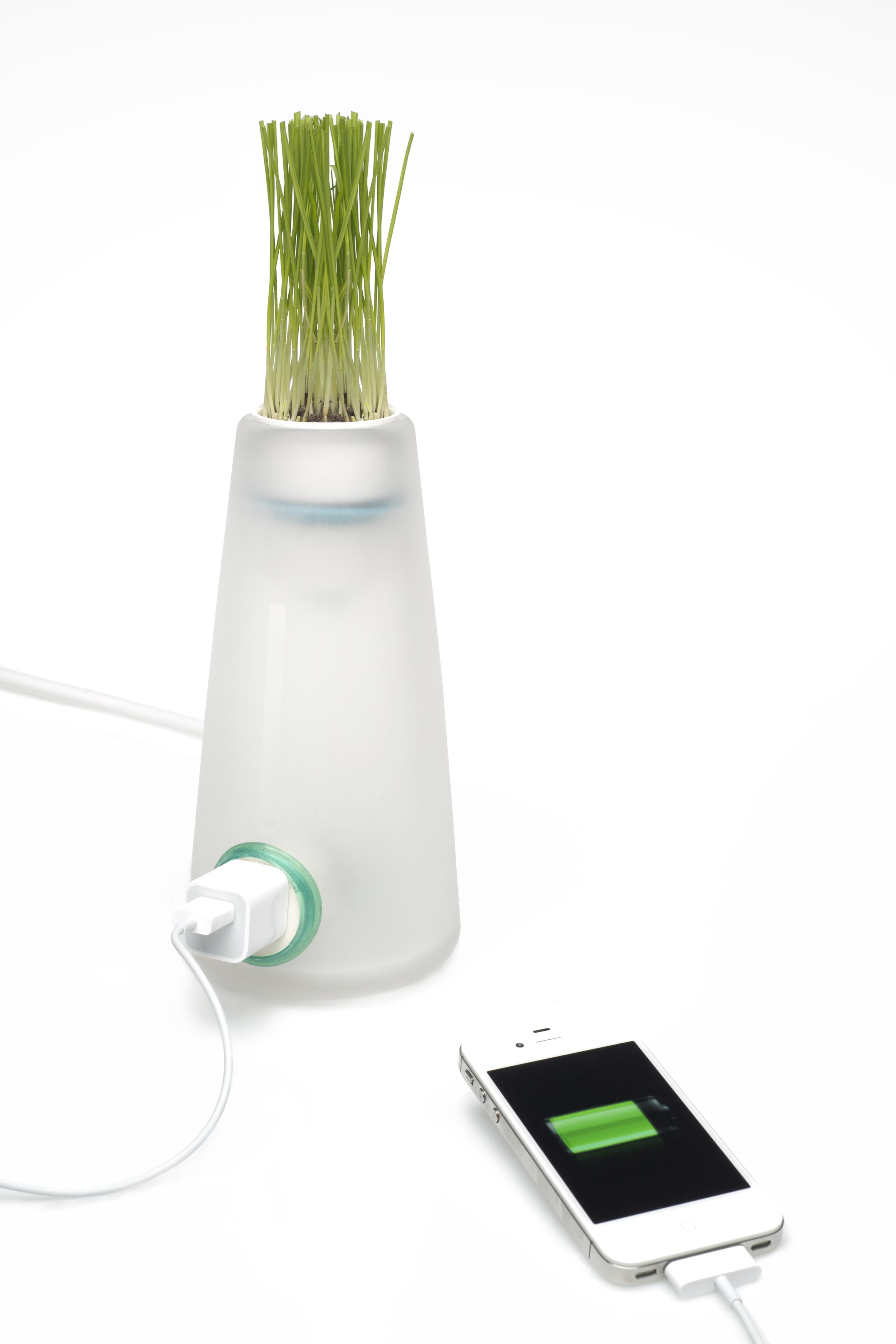
Green Power Monitor
Will Alusitz
Context: We plug our electronic devices into the wall and power strips without giving it a second thought. This ritual happens day after day. Many times electricity and electricity’s impact on the environment is dismissed, but what if one day that power just wasn’t there? Problem: People take a steady and constant flow of electricity for granted. Far too often personal electrical consumption takes a mental back seat in our everyday lives. Solution: An outlet is combined with growing plant life allowing water to act as a conductor for the electricity. All reactions will be contained safely inside glass and rubber. The concept is simple; water the plants every week and the outlet will function normally. Forget to take care of your environment by not watering the plant, and the outlet will not give off electricity. Brand Strategy: Repurposed glass is incorporated in the shell and inner workings of this desktop tool. The consumer will be constantly reminded on how advantageous recycled glass can be by recognizing glass’s insulating ability, transparency, and weight.
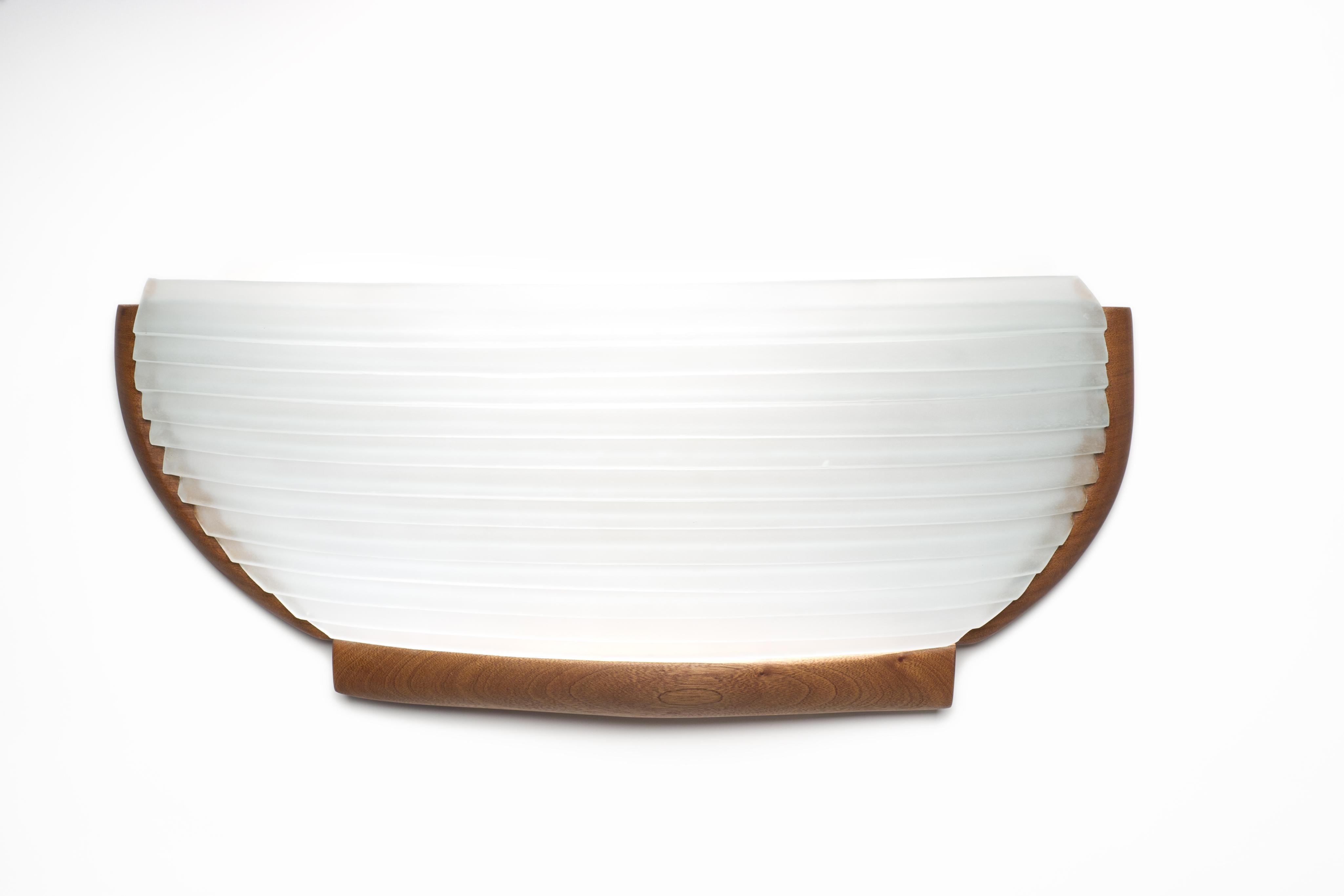
The Wall Sconce
Wil Sideman
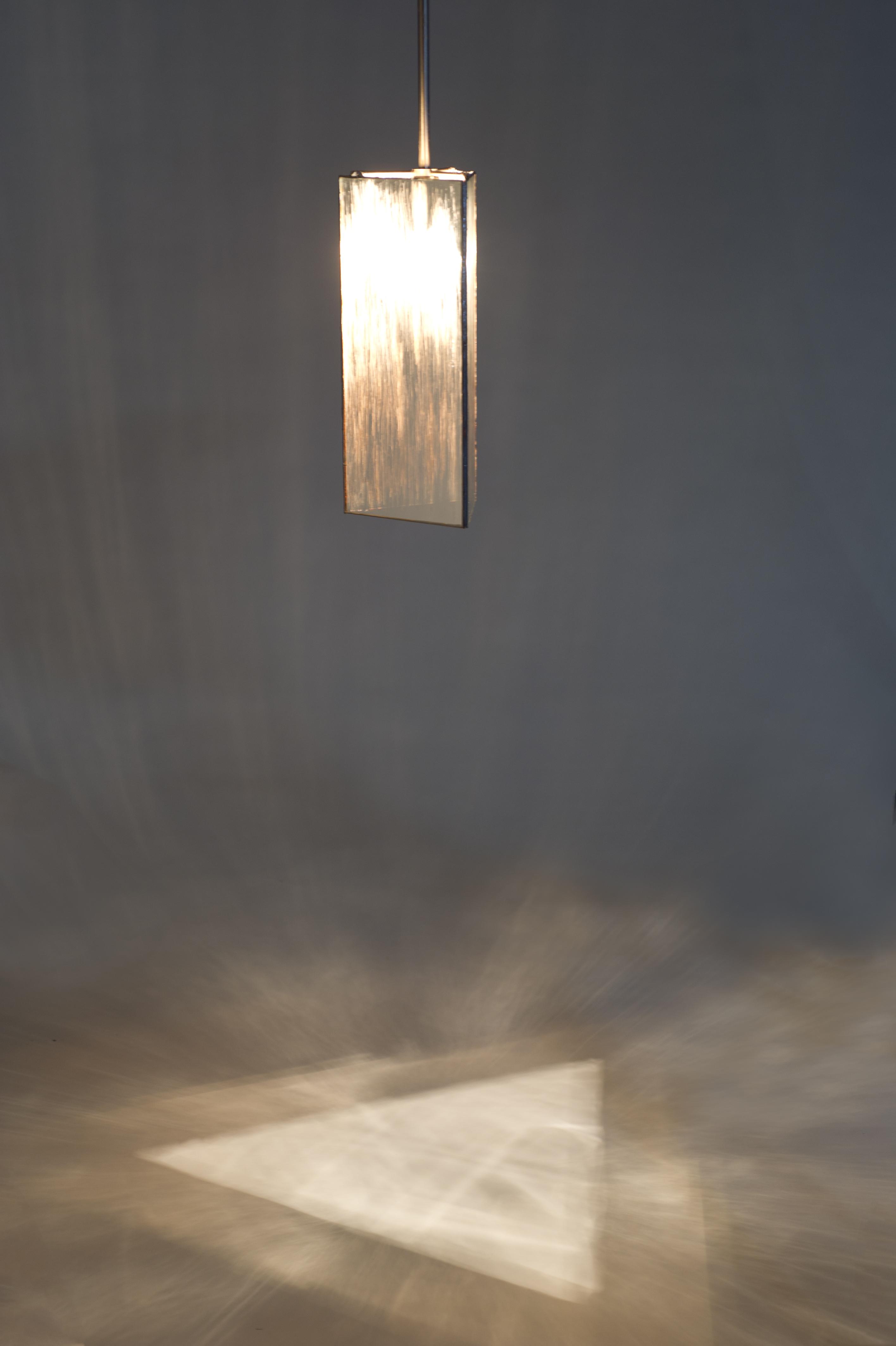
Context: For as long as humans have interacted with the sea it has created the most powerful emotional reaction with many individuals. People from all different backgrounds, when presented with the ocean or open water find themselves unexplainably attracted and intrigued by its presence. Its vastness and romantic nature allows humans to reflect on life, ponder the most challenging questions and relax. Problem: Many people have felt this connection with the sea but rarely can individuals experience it on a daily level. People often suffer a disconnect from the ocean having either moved away from the sea, no longer have the time in their daily life, or have simply never truly experienced the incredible nature that is the open water. Solution: Based off of a small rowing vessel this wall sconce presents the space with an illuminated object that brings the qualities of the ocean into the domestic environment. Whether lighting the bedroom, living room or the office this device brings the nostalgic, peaceful and reflective nature of the water into our daily lives. Brand Strategy: Using the inherent qualities found in glass this sea worthy vessel reflects light off the imperfect surface of kiln formed sheet glass. This lighting fixture uses the marks left by the material processes used in recycled glass to strengthen the desired overall effect of the object.
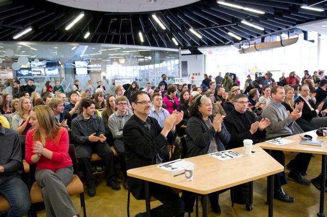
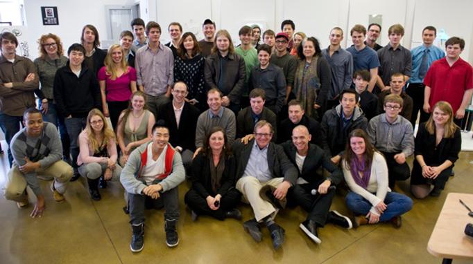
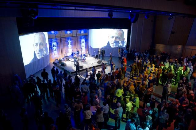
Juries with senior industrial design students at RIT (Tina Oldknow, Robert Cassetti, Eric Meek. Steve Gibbs, Massimo Vignelli)
