Data Visualization
January 7, 2021
Pranav Shinde

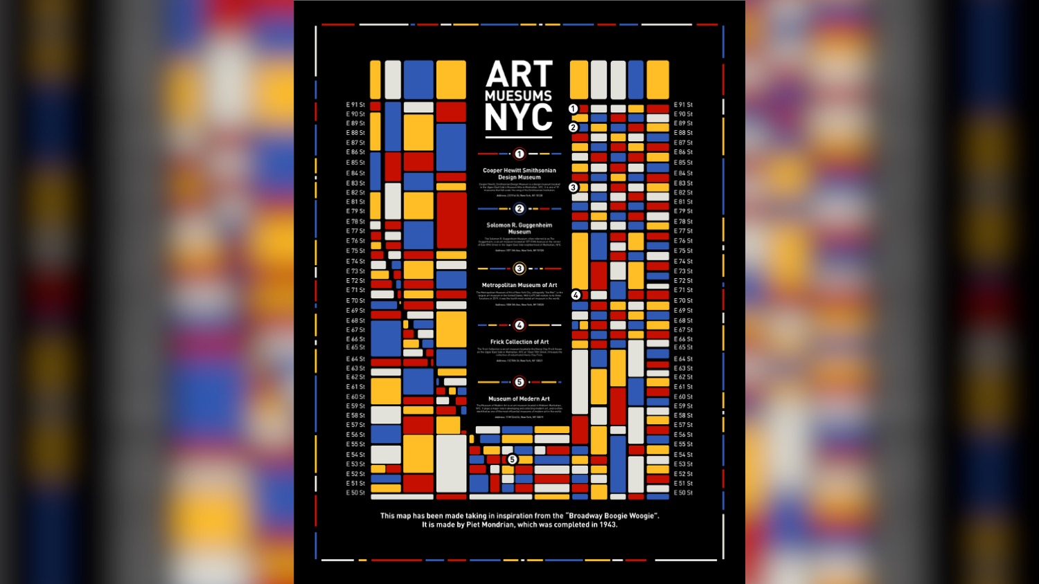
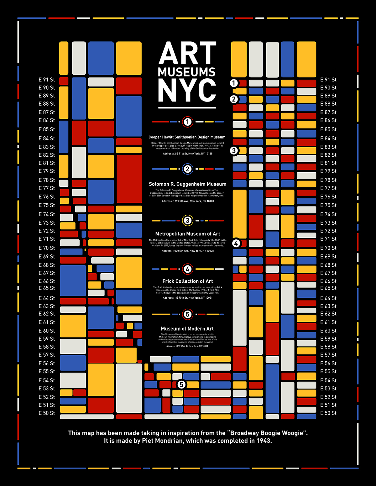
"Inspired by the iconic artist Piet Mondrian's 'Broadway Boogie Woogie,' I chose to highlight the art museums in NYC. The artwork uses iconic simplified shapes to depict the essence of the mystical forces and the color palette depicts a unique balance of primary colors. My approach highlights the style of Piet Mondrian to make a meaningful impact on data representation. Finding a fine balance between aesthetics and readability is my utmost priority."
- Pranav Shinde, Visual Communication Design MFA student


