Packaging Design / GRDE 431 Paperboard Packaging Alliance 2016 and 2017 Student Design Challenge
This packaging course includes senior graphic designers, junior industrial designers and sophomore-senior packaging science students working on teams.
Projects in the course have included folding carton packaging, set-up/rigid box design, and solutions for the annual Paperboard Packaging Alliance Student Design Challenge. This annual competition includes some of the best university packaging and design programs in the U.S.
The challenge for 2017 was to create an interactive package for a fitness tracker to appeal to a millennial audience that would be used by the consumer in the store and kept with the tracker at home.
The judging for this year's competition took place in July 2017, and the winning teams attended the awards luncheon at the PackExpo Convention in Las Vegas in September to receive their prizes. Misfit Burst won first place honors, and Misfit Wave was Third Place winner!
And Misfit DUO and Jawbone SHIFT received "Shout-outs"
from the organization for innovation.
All current and previous winners of the competition can be seen online: paperboard packaging.org/university-features.
The challenge for the 2016 Competition was to design a premium package for a dry goods product.
This class was recognized by the Paperboard Packaging Alliance Student Design Challenge with the following awards:
Shout-out to LeSel!
Runner-up for Nature Valley Wild Crunch!
Second Place Honors to L'Orto Organic Pasta!
Please scroll down to see all of the solutions.
The 2015 course is listed in a separate thumbnail on the student work page.
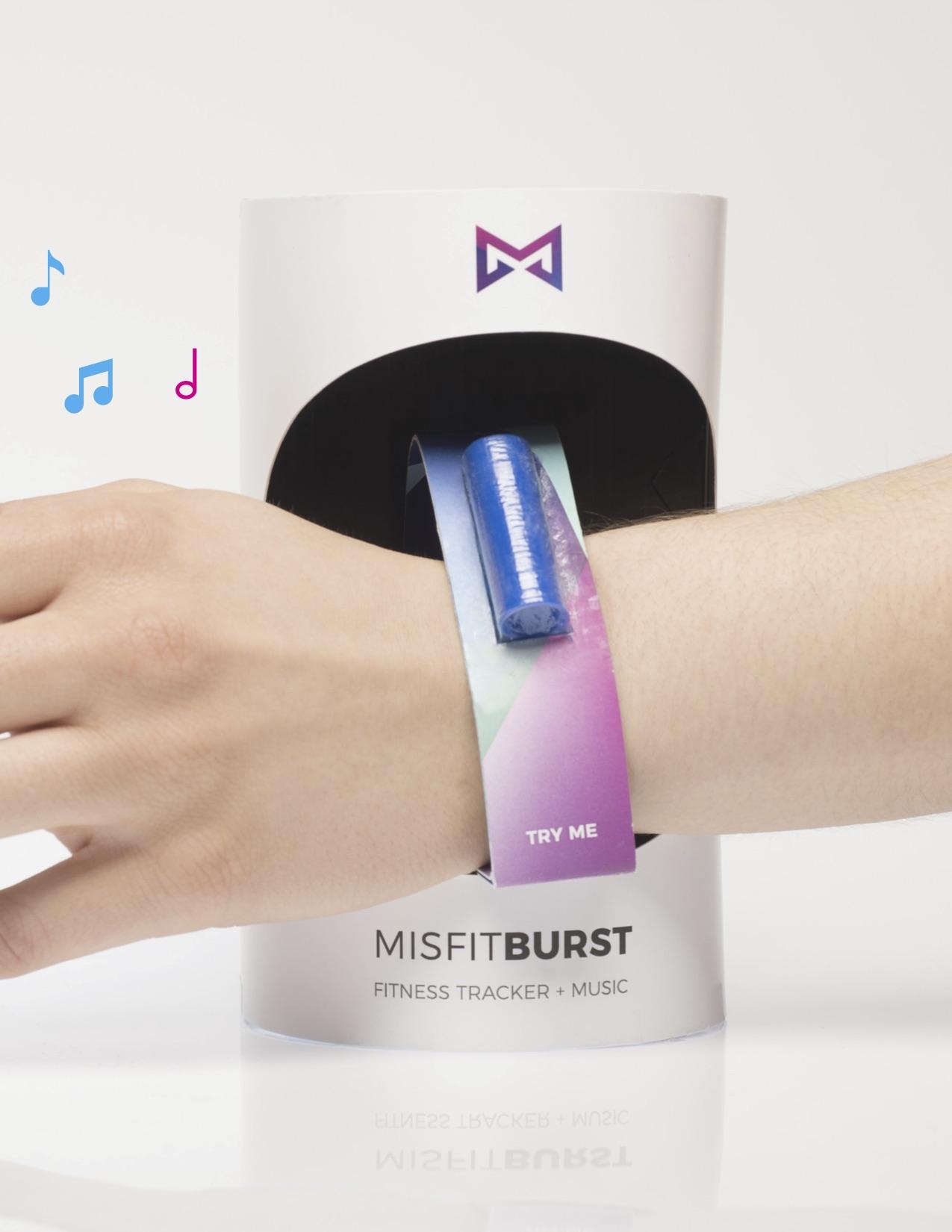
The Misfit Burst package in action in the store.
Misfit Burst
Graphic Design: Mimi Ace and Andrea Shaver
Industrial Design: Stacey Yip
Packaging Science: Diana Elias
The challenge for the Paperboard Packaging Alliance 2017 Student Design Challenge was to create an interactive package for a fitness tracker to appeal to a millennial audience that would be used by the consumer in the store and kept with the tracker at home.
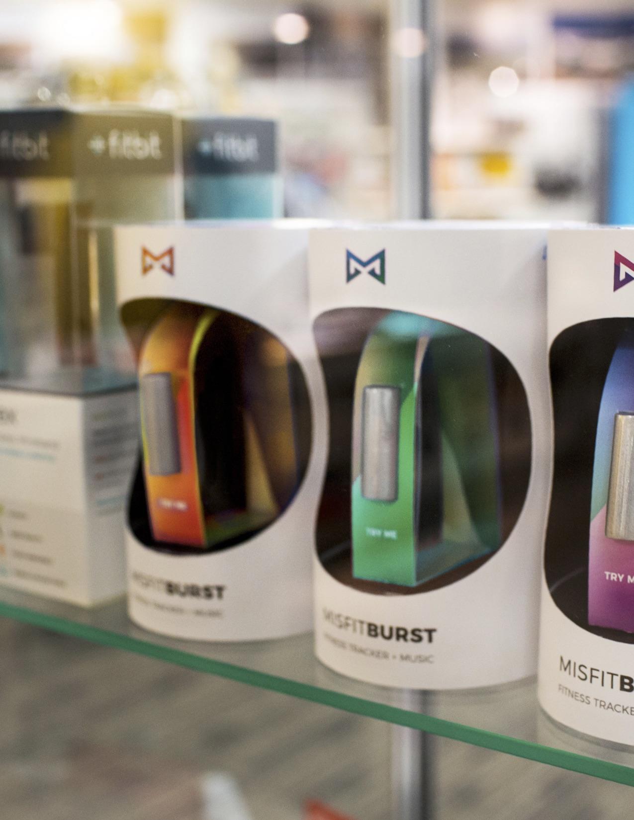
This concept provides consumers with color coding to match their music preference. Consumers can make an informed decision regarding size in the store, and when this motion is triggered, music plays!
This solution was the FIRST PLACE WINNER in the Challenge. Congratulations!!
at PACKEXPO in Las Vegas.
Misfit Burst
Graphic Design: Mimi Ace and Andrea Shaver
Industrial Design: Stacey Yip
Packaging Science: Diana Elias
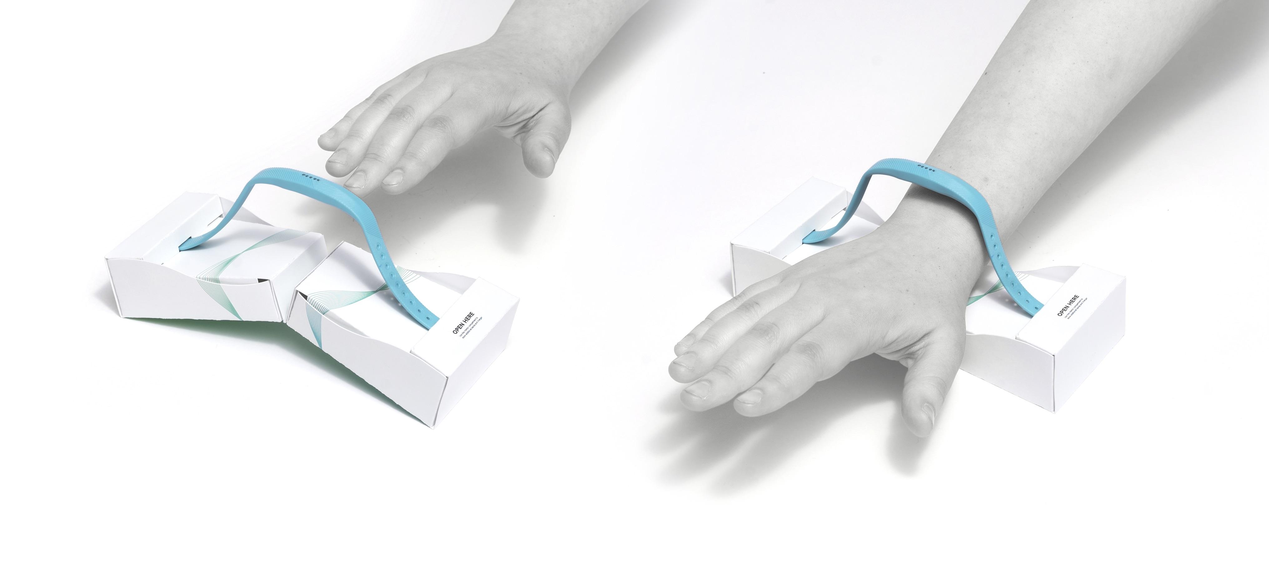
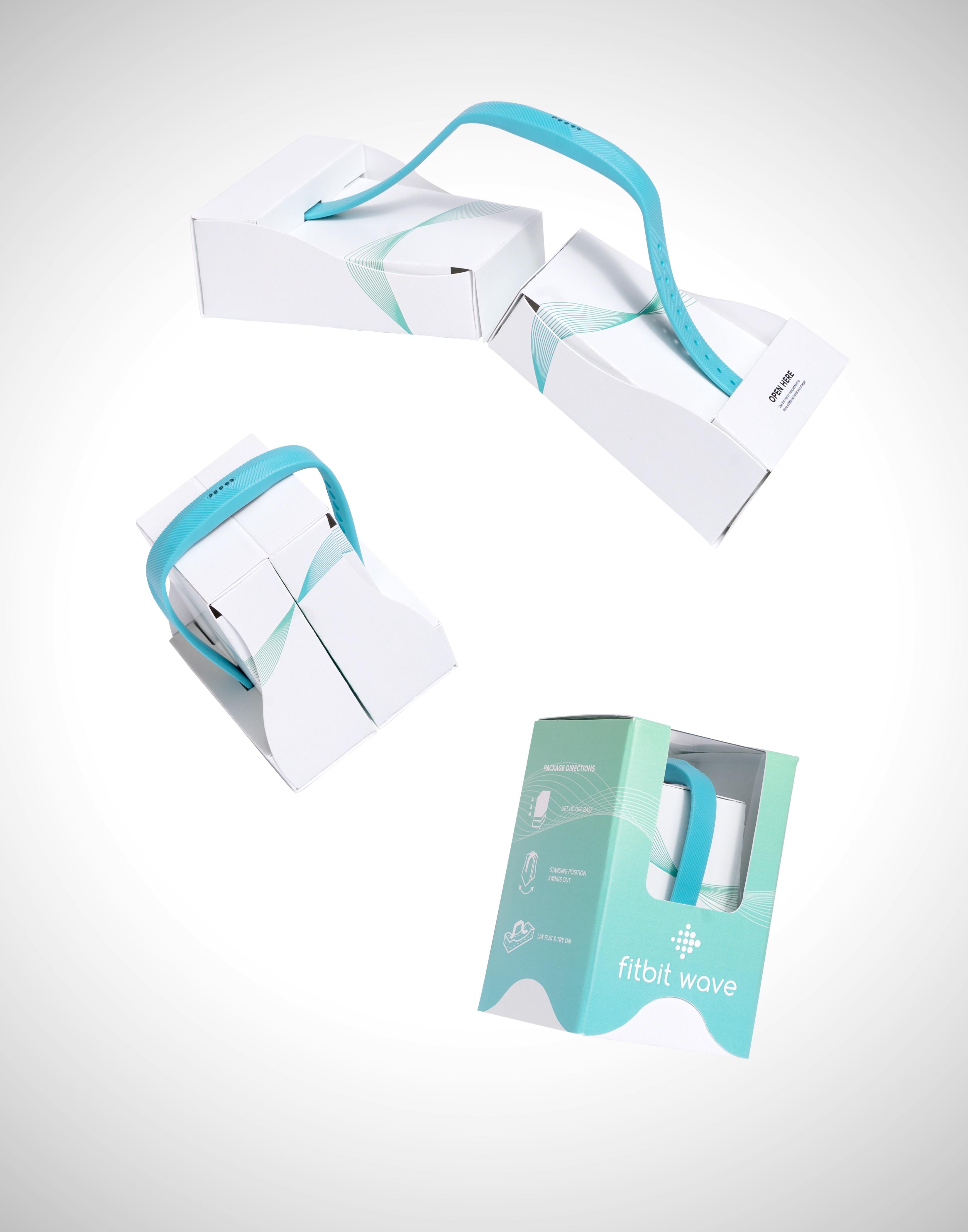
The challenge for the Paperboard Packaging Alliance 2017 Student Design Challenge was to create an interactive package for a fitness tracker to appeal to a millennial audience that would be used by the consumer in the store and kept with the tracker at home.
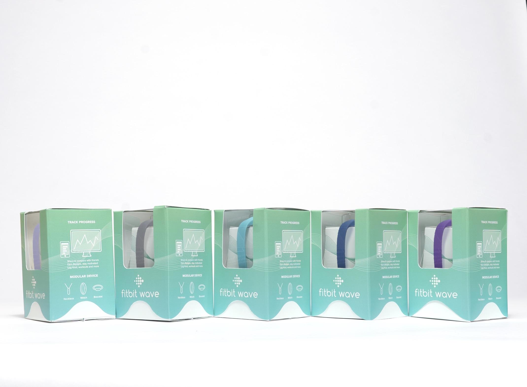
This solution utilizes a wave pattern to visually relate the concept of motion to the consumer. A billboard effect is created when a series of packages are placed on shelf.
This solution received Third Place Honors in the Challenge! Congratulations!
Misfit Wave
Graphic Design: Garrett Chase and Jessica Belcher
Industrial Design: Kaia Bolland
Packaging Science: Yunjing Jiao
The Wave package opened for consumers to try it on for size.
Misfit Wave
Graphic Design: Garrett Chase and Jessica Belcher
Industrial Design: Kaia Bolland
Packaging Science: Yunjing Jiao
The Misfit Wave package closed and open.
Misfit Wave
Graphic Design: Garrett Chase and Jessica Belcher
Industrial Design: Kaia Bolland
Packaging Science: Yunjing Jiao
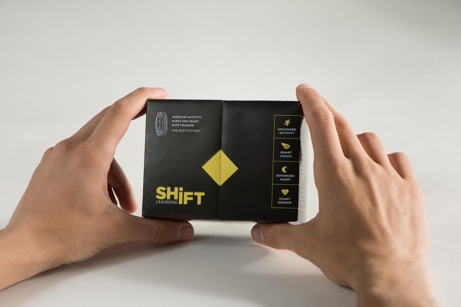
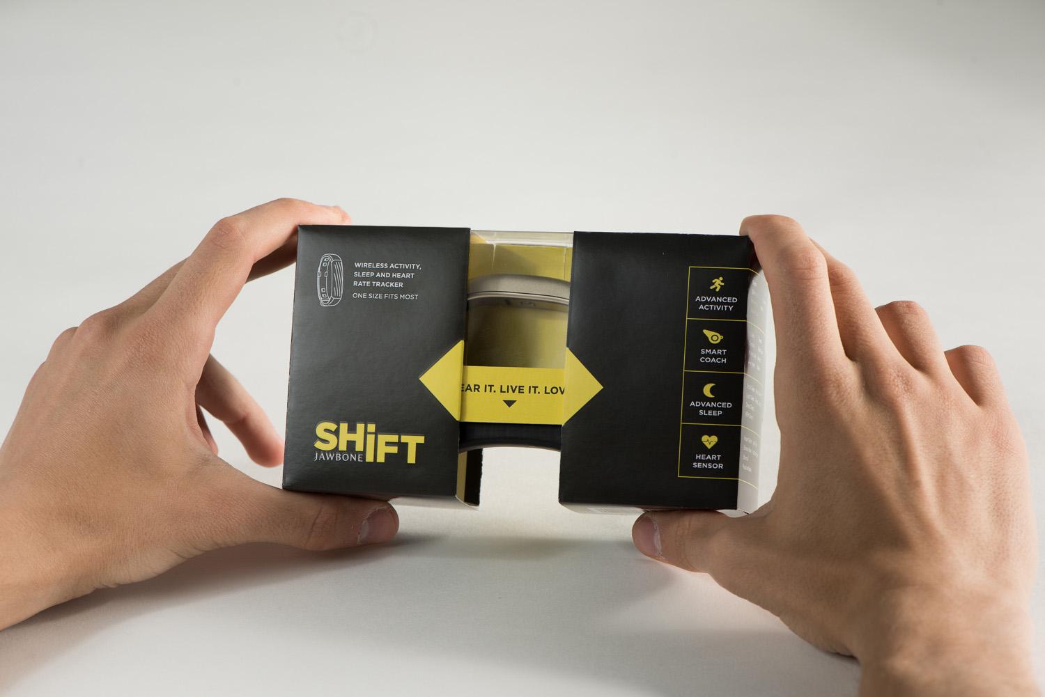
The challenge for the Paperboard Packaging Alliance 2017 Student Design Challenge was to create an interactive package for a fitness tracker to appeal to a millennial audience that would be used by the consumer in the store and kept with the tracker at home.
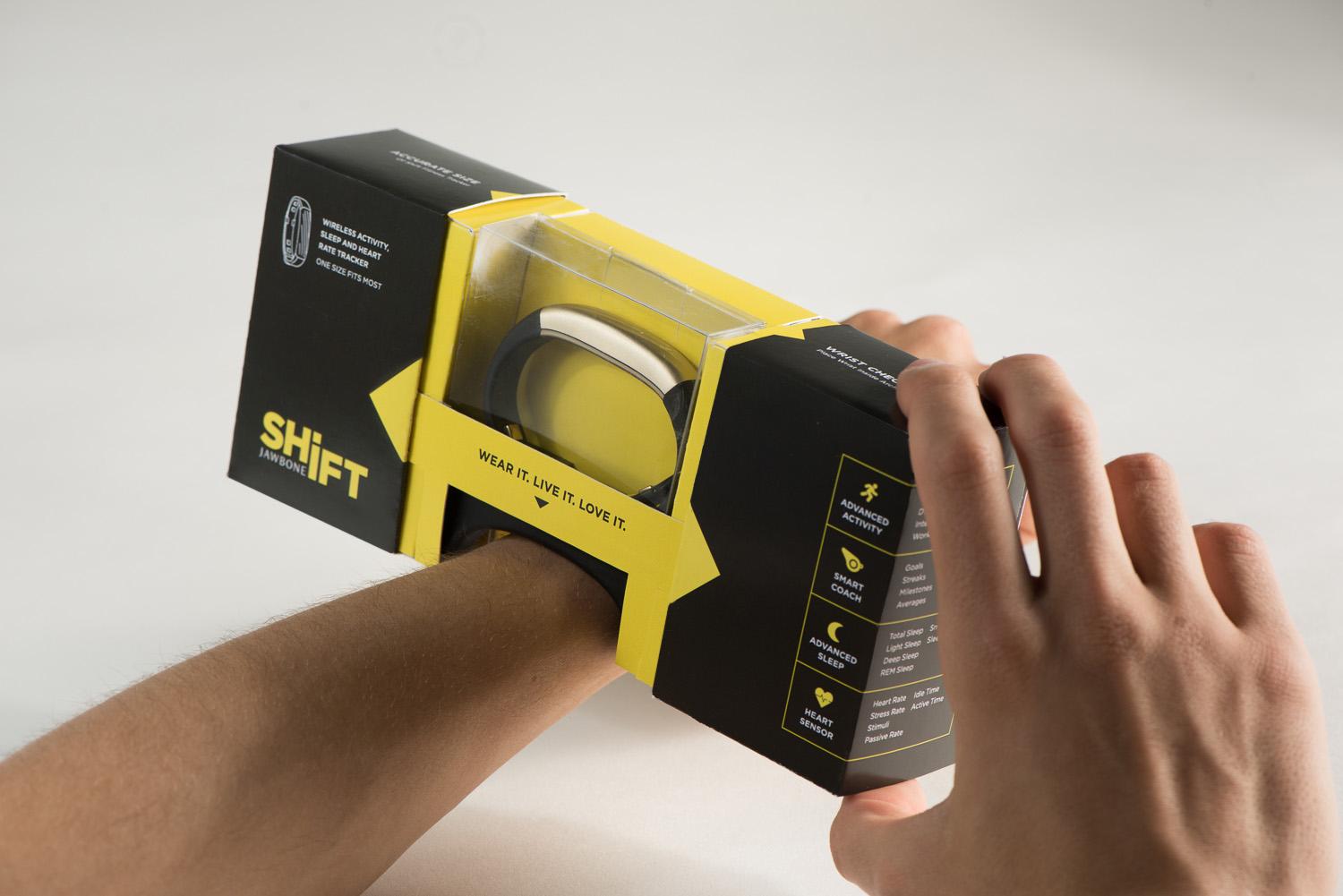
This concept is fun to open, and when open, provides the consumer with the opportunity to try the tracker on his or her wrist. The package provides a great home for the device after the sale.
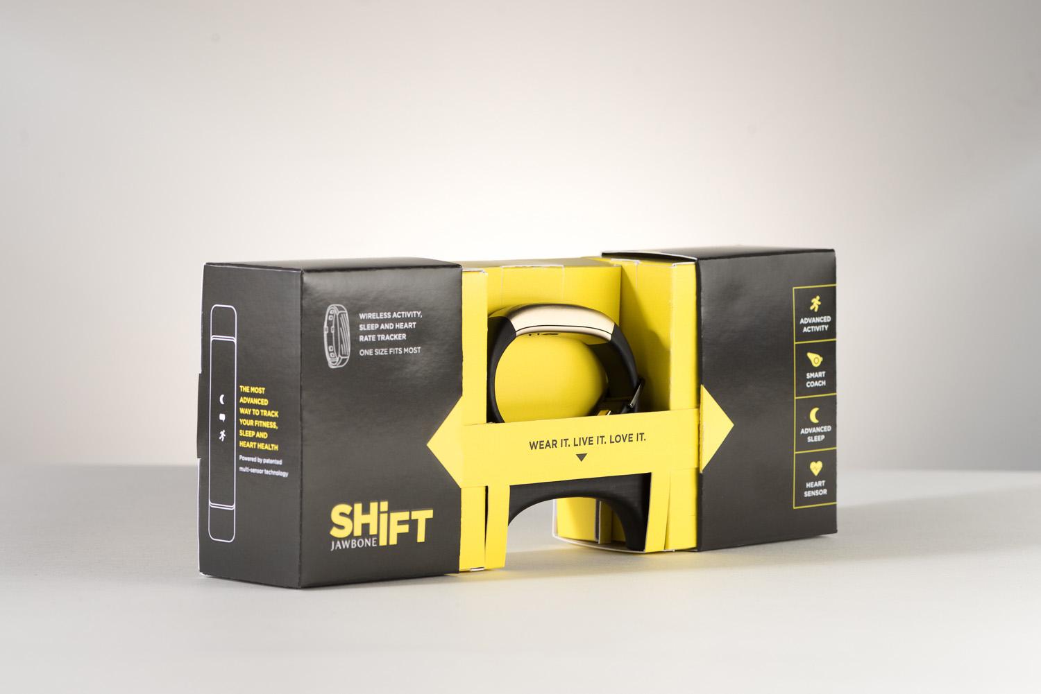
This solution has been recognized by the Paperboard Packaging Alliance with a "Shout-out".
Jawbone SHIFT
Graphic Design: Dennae Makel and Lauren Mays
Industrial Design: Brian Cusack
Packaging Science: Sydney Ryan
The SHIFT package opening....fun graphics and the motion of opening make this a great experience.
Jawbone SHIFT
Graphic Design: Dennae Makel and Lauren Mays
Industrial Design: Brian Cusack
Packaging Science: Sydney Ryan
The SHIFT package fully opened for maximum impact.
Jawbone SHIFT
Graphic Design: Dennae Makel and Lauren Mays
Industrial Design: Brian Cusack
Packaging Science: Sydney Ryan
The SHIFT package in action; helping the buyer make an informed decision regarding size.
Jawbone SHIFT
Graphic Design: Dennae Makel and Lauren Mays
Industrial Design: Brian Cusack
Packaging Science: Sydney Ryan
The challenge for the Paperboard Packaging Alliance 2017 Student Design Challenge was to create an interactive package for a fitness tracker to appeal to a millennial audience that would be used by the consumer in the store and kept with the tracker at home.
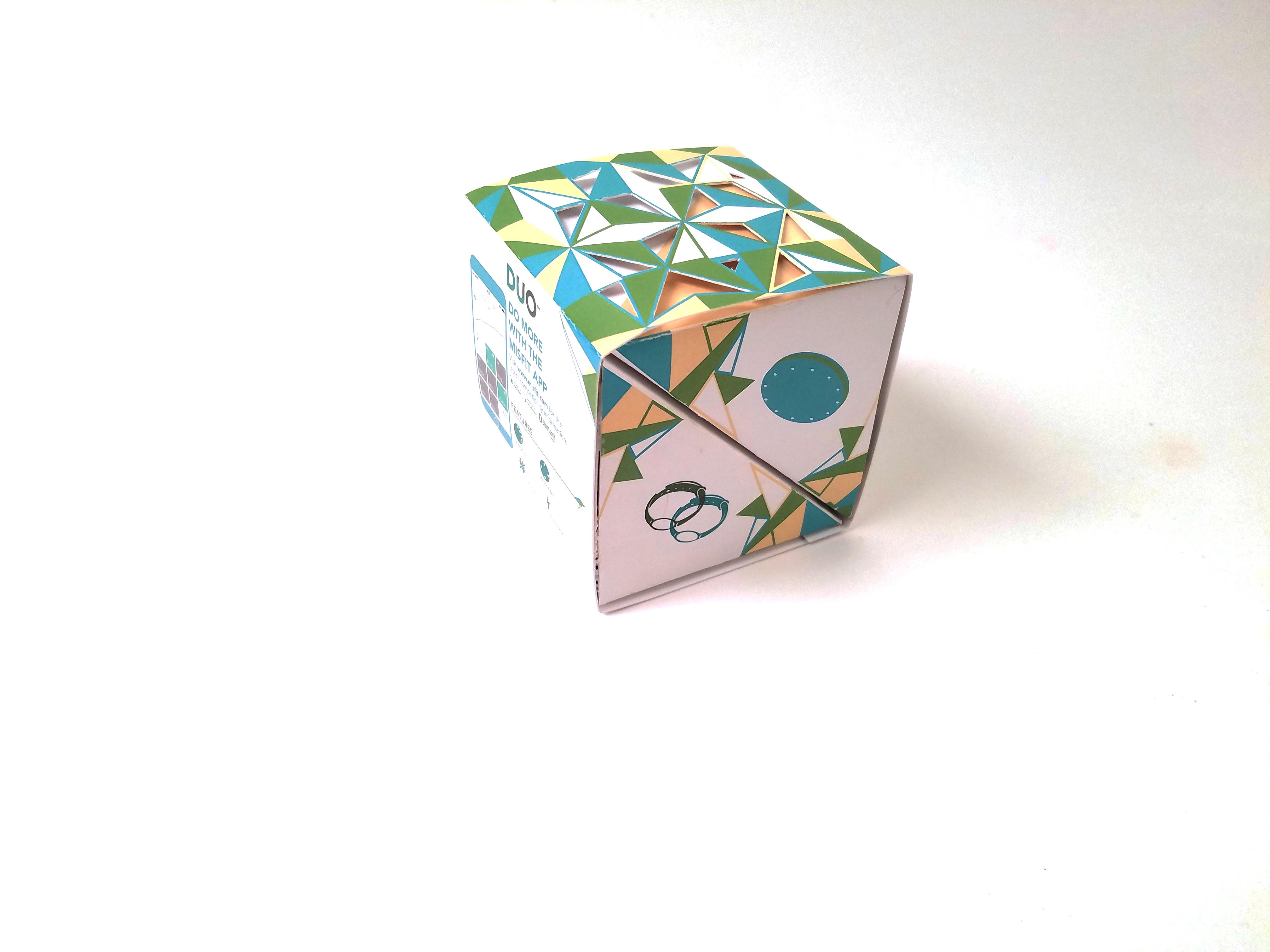
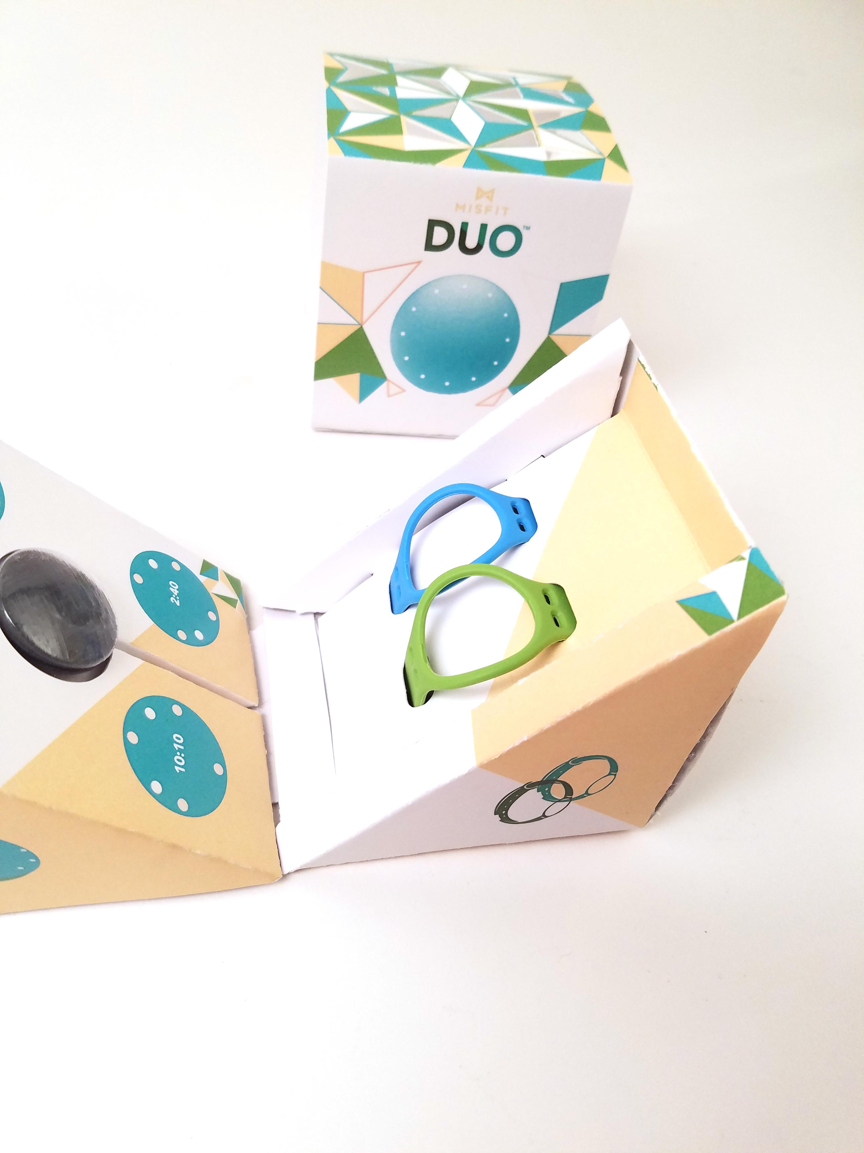
This concept is two-sided, hence the name DUO. One side contains bands and the other contains
the tracker ring.
This solution has been recognized by the Paperboard Packaging Alliance with a "Shout-out".
Misfit DUO
Graphic Design: Voltaire Hardy and David Hampton
Industrial Design: Zoe Gomer
Packaging Science: Tsz Yan Yencer
Misfit DUO displayed open.
Graphic Design: Voltaire Hardy and David Hampton
Industrial Design: Zoe Gomer
Packaging Science: Tsz Yan Yencer
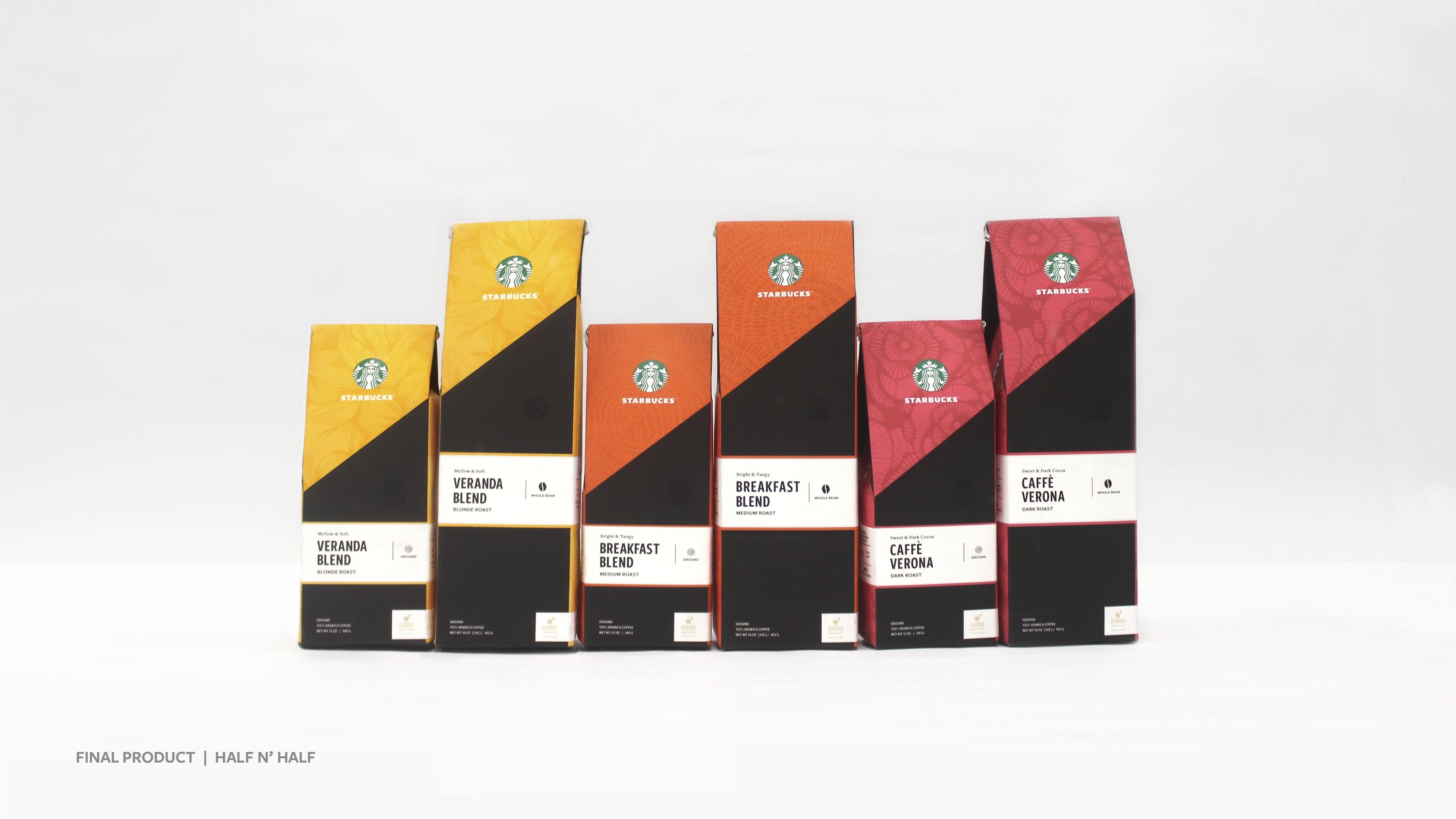
Chase Design proposed the problem of presenting Starbucks premium roast coffees in both Starbucks locations and other retail outlets for maximum appeal and distinction on shelves.
This concept focused on color coding for the varieties, and a distinctive pouring spout for ease
of use and storage freshness.
Team Half n Half
Graphic Design: Dennae Makel, David Hampton, and Rebecca Wolinski
Industrial Design: Brian Cusack and Stacey Yip
This was the winning solution for this competition.
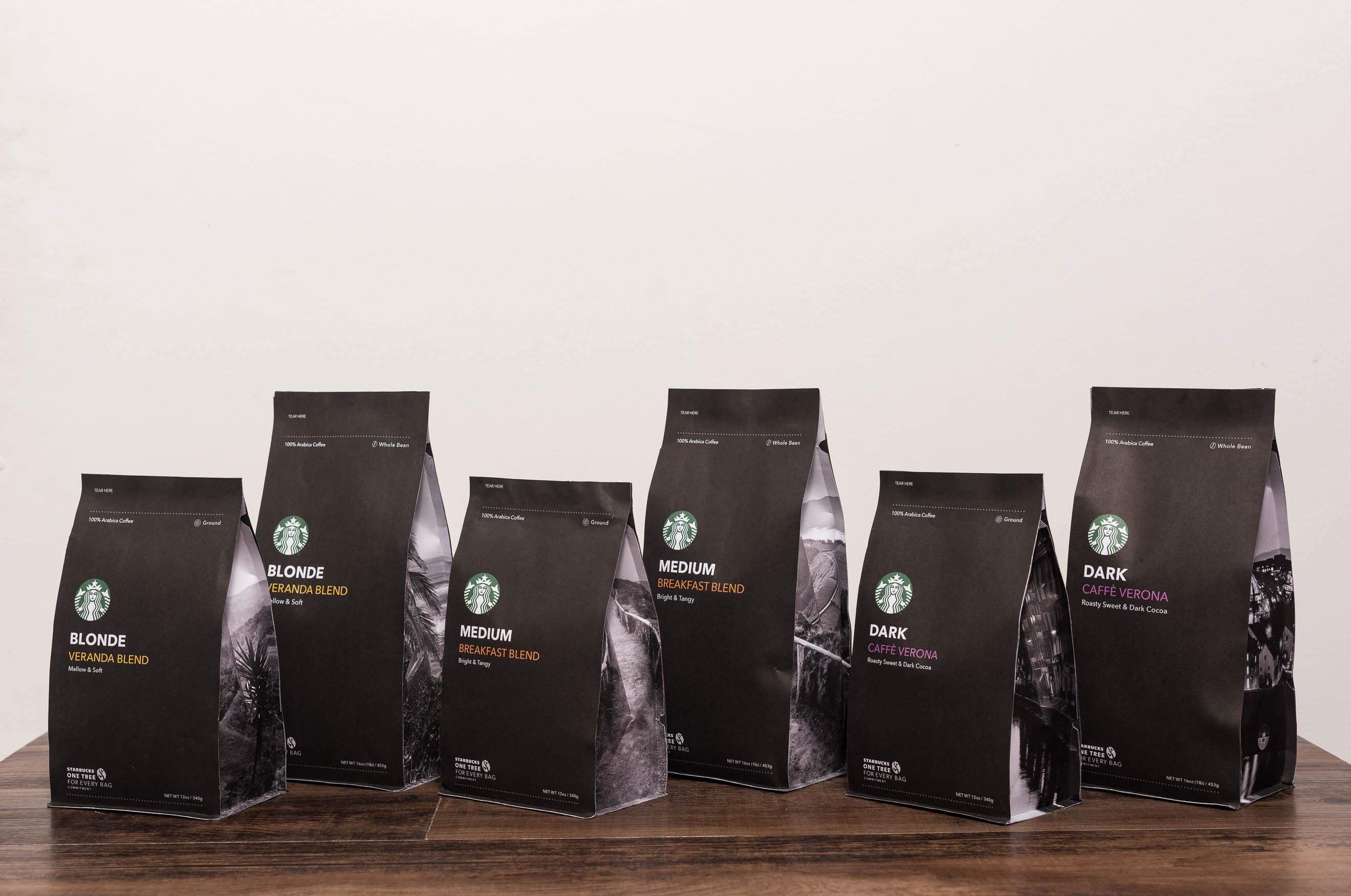
Chase Design proposed the problem of presenting Starbucks premium roast coffees in both Starbucks locations and other retail outlets for maximum appeal and distinction on shelves.
This concept focused on simplicity, elegance, and striking imagery on the sides of the bags
that relate to the origin of the coffee within the bag.
The Breakfast Club Team
Graphic Design: Garrett Chase, Mimi Ace, Shea Oleksa, and Hayley Cromwell
Industrial Design: Analia Briceno
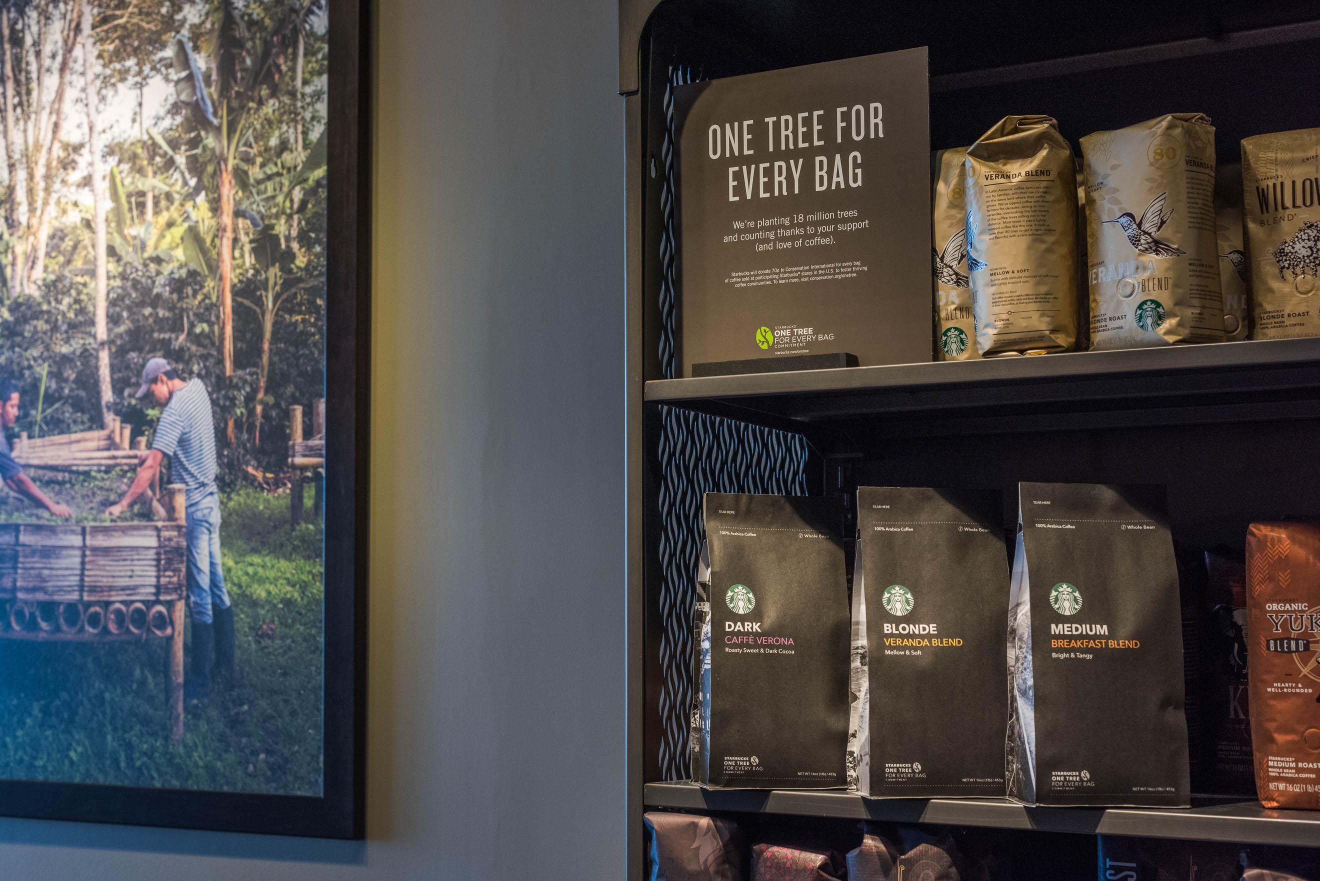
The Breakfast Club bags on retail shelves in Starbucks.
The Breakfast Club Team
Graphic Design: Garrett Chase, Mimi Ace, Shea Oleksa, and Hayley Cromwell
Industrial Design: Analia Briceno
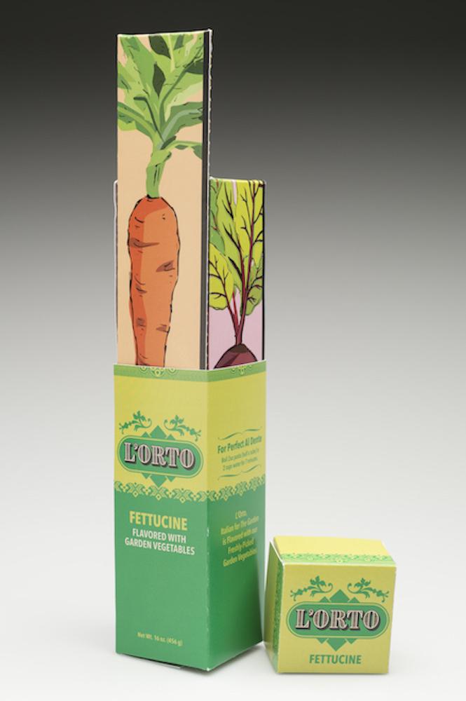
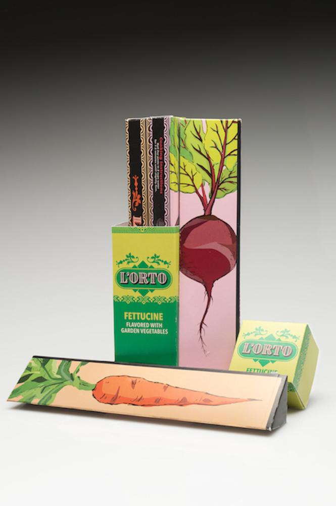
L'Orto Organic Pasta with a variety of garden ingredients.
This design was awarded Second Place in the 2016 Paperboard Packaging Alliance Student Design Challenge. Awards were announced at PACKEXPO in Chicago.
Congratulations to the team!
Graphic Design: Nathan Gamson and Wentian Chen
Packaging Science: Grace Milton and Marina Solis
The portion-controlled,root-vegetable-flavored pastas are hand "picked" from the main container.
Consumers can mix and match the flavors as desired.
Graphic Design: Nathan Gamson and Wentian Chen
Packaging Science: Grace Milton and Marina Solis
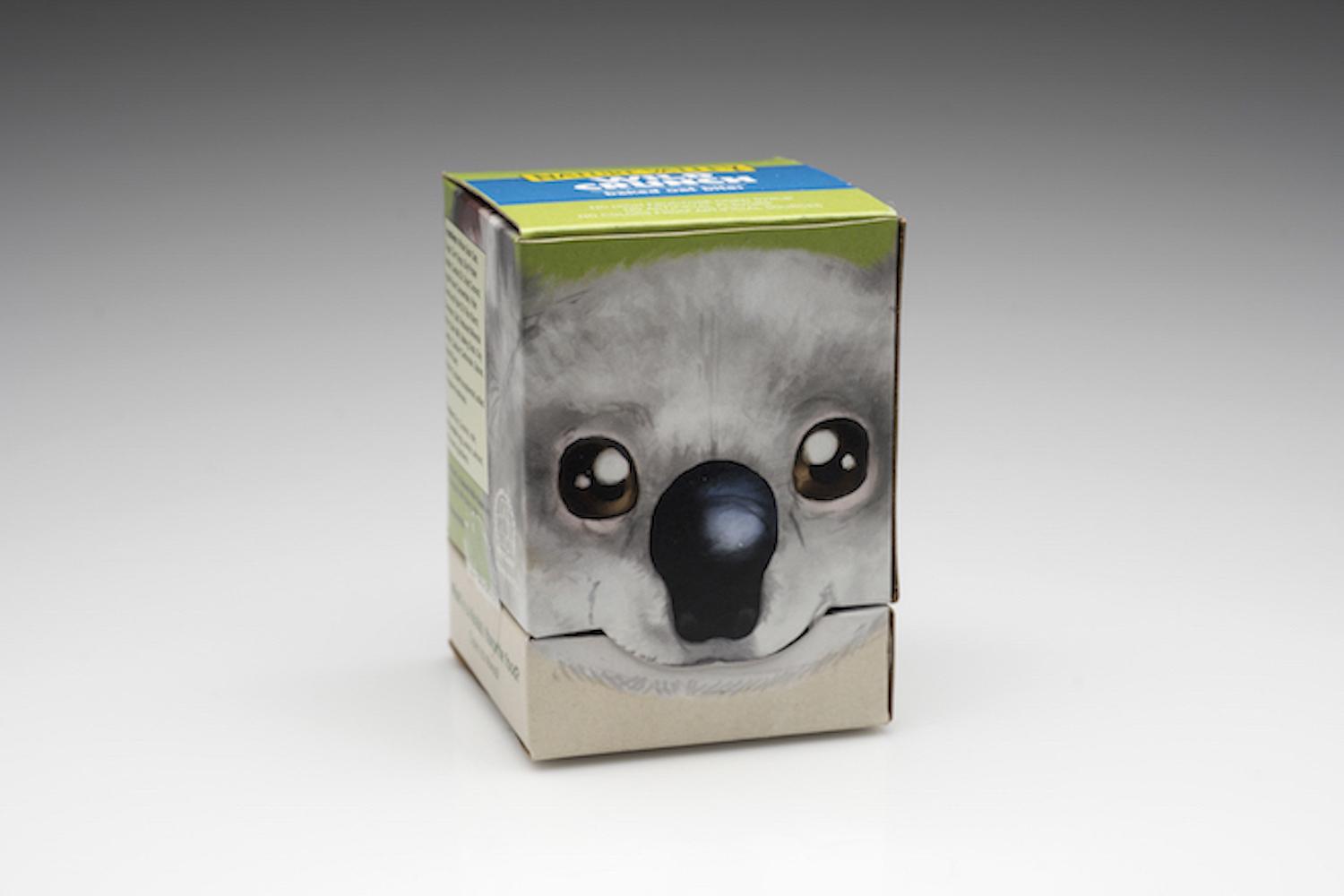
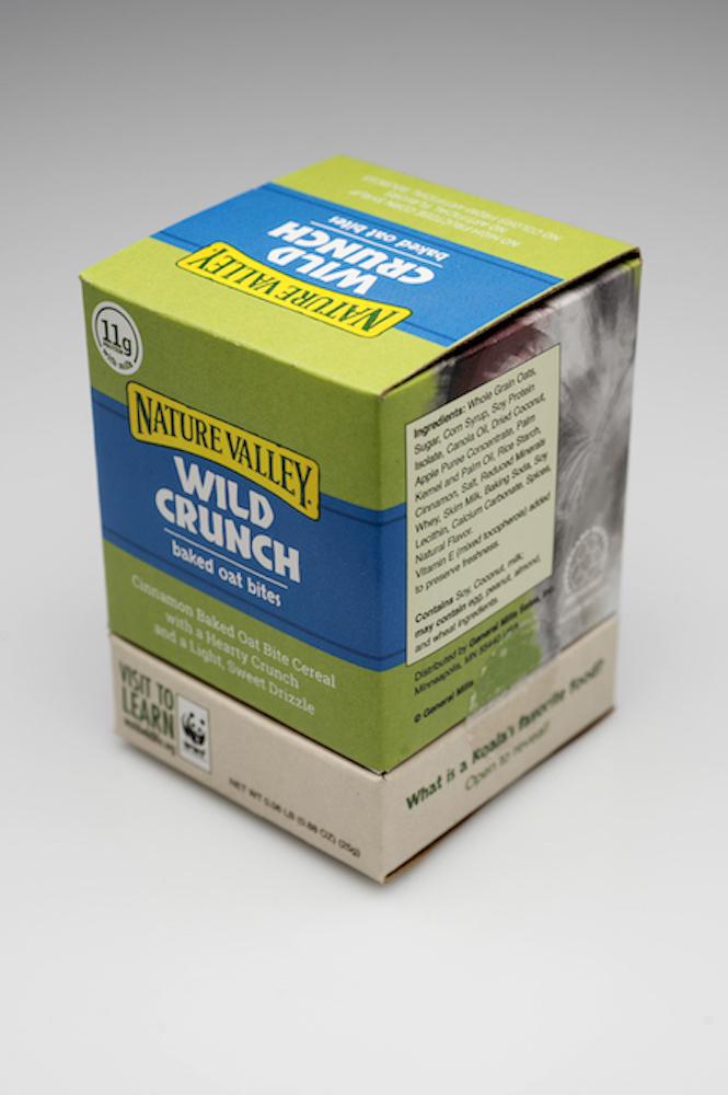
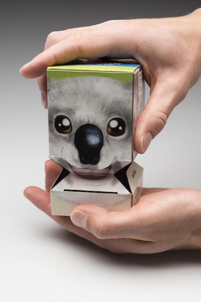
Koala Nature Valley Wild Crunch Cereal Package for the 2016 Paperboard Packaging Alliance Student Design Challenge. The Koala's name is EEGR. (for EAGER using the initials of all team members)
This package received the Runner-up Award from the competition. The awards were announced at PACKEXPO in Chicago.
Graphic Design: Brandon Edquist and Lindsay Ernst
Industrial Design: Dan Grinthal
Packaging Science: Ben Robbins
Front of the Koala Nature Valley Wild Crunch Cereal Package. The box is snack-sized to appeal to children.
Graphic Design: Brandon Edquist and Lindsay Ernst
Industrial Design: Dan Grinthal
Packaging Science: Ben Robbins
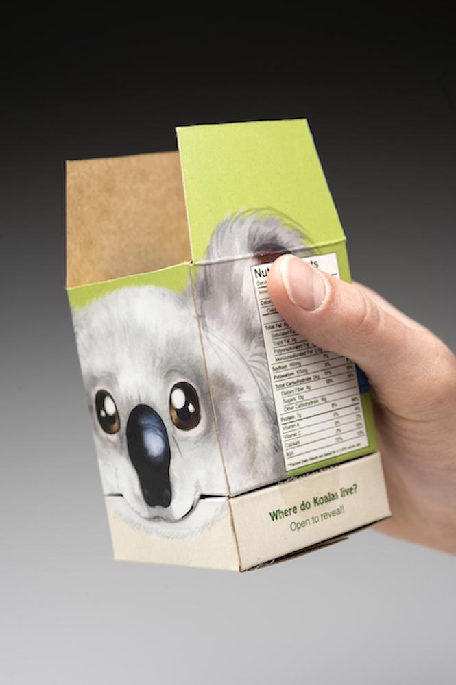
View of the Koala's ears when package is opened.
Graphic Design: Brandon Edquist and Lindsay Ernst
Industrial Design: Dan Grinthal
Packaging Science: Ben Robbins
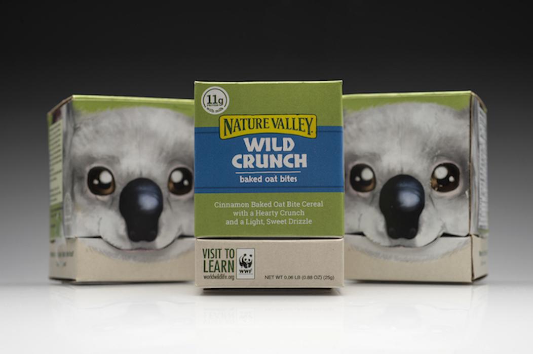
Views of fronts and backs of the packages.
Graphic Design: Brandon Edquist and Lindsay Ernst
Industrial Design: Dan Grinthal
Packaging Science: Ben Robbins
EEGR the Koala in action!
Graphic Design: Brandon Edquist and Lindsay Ernst
Industrial Design: Dan Grinthal
Packaging Science: Ben Robbins
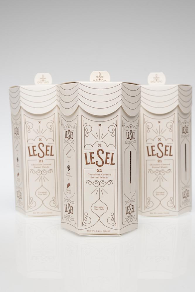
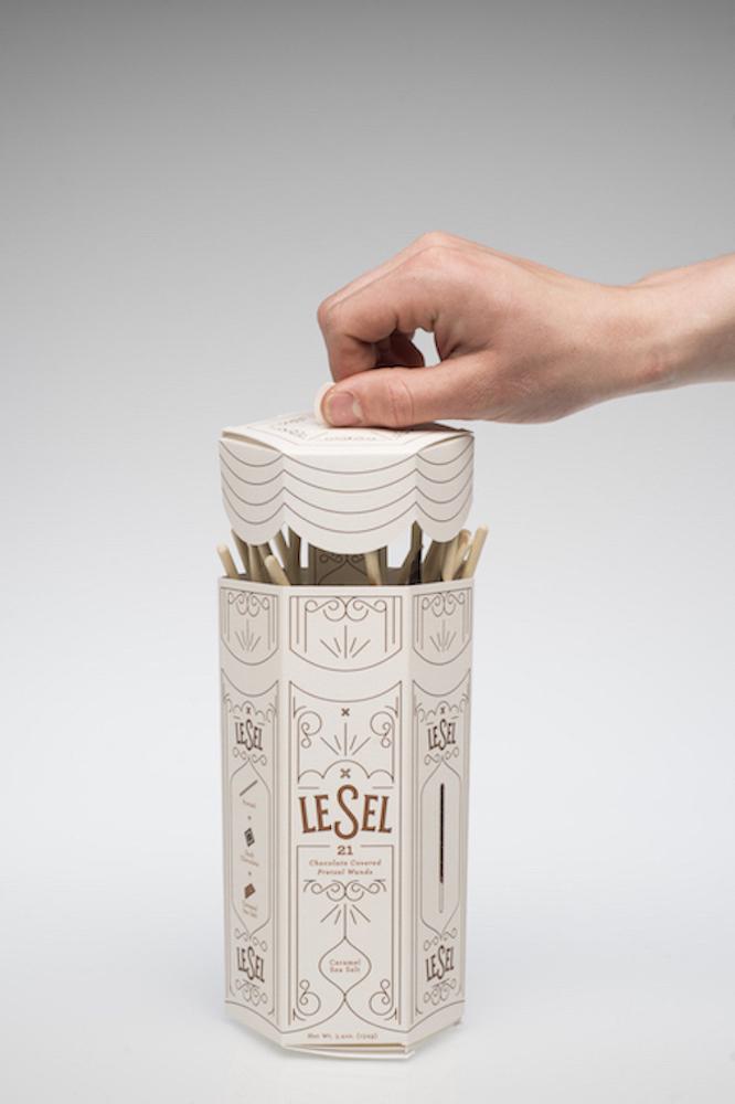
LeSel French-inspired Chocolate-covered Pretzel Wand packaging system.
This package was recognized with a "shout-out" for innovation by the 2016 Paperboard Packaging
Alliance Student Design Challenge. Awards were announced at PACKEXPO in Chicago.
Graphic Design: Joe Hodapp, Samantha Watson and Annie Wong
Packaging Science: Sydney Ryan
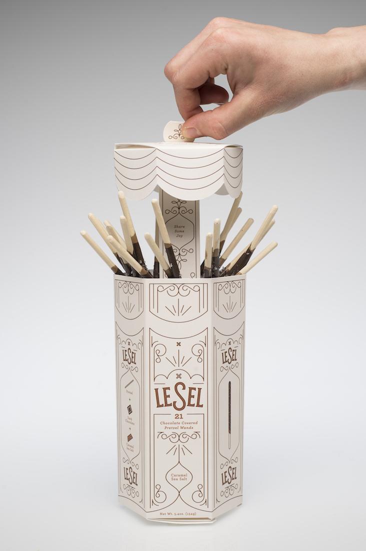
The package was inspired by straw dispensers with a central core to dispense the wands.
Graphic Design: Joe Hodapp, Samantha Watson and Annie Wong
Packaging Science: Sydney Ryan
Voila! Caramel Sea Salt Pretzel Wands for everyone!
Graphic Design: Joe Hodapp, Samantha Watson and Annie Wong
Packaging Science: Sydney Ryan
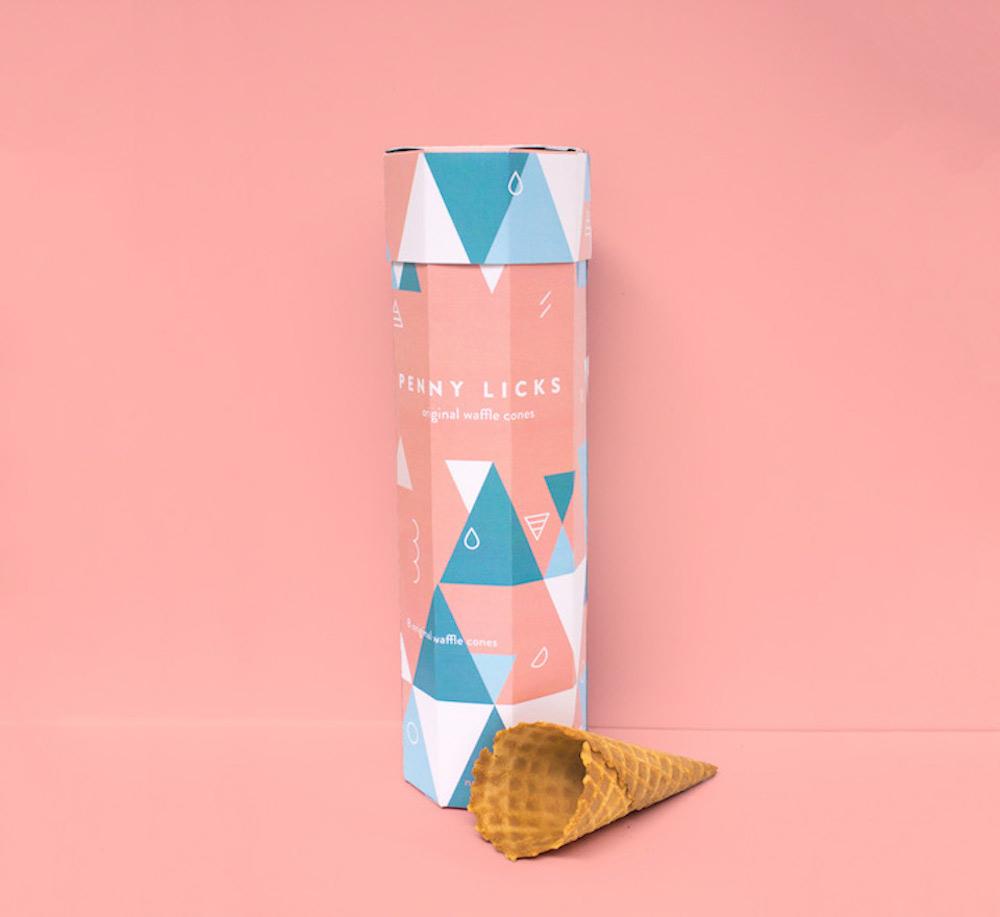
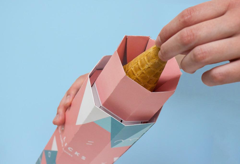
Penny Licks waffle cone package/dispenser. The name Penny Licks is derived from the name given to ice cream dishes in the Chicago World Exposition, where customers paid a penny for the ice cream and licked the dishes clean. Luckily, a vendor nearby was selling waffles and the waffle cone was born!
Graphic Design: Jay Fleckenstein and Laura Hoerner
Packaging Science: Emma Conrick and Garrett Parlo
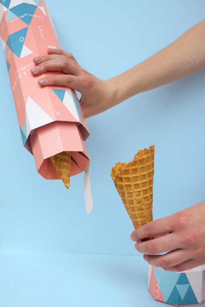
The team focused on solving the problems of cone dispensing, breakage, waste and sustainable material selection.
Graphic Design: Jay Fleckenstein and Laura Hoerner
Packaging Science: Emma Conrick and Garrett Parlo
A view showing the dispensing mechanism.
Graphic Design: Jay Fleckenstein and Laura Hoerner
Packaging Science: Emma Conrick and Garrett Parlo
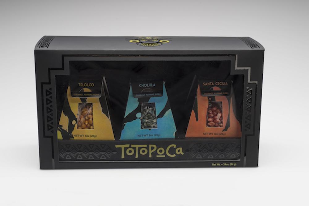
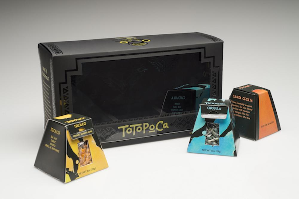
Totopoca Mayan-inspired Exotic Popcorn Package.
Graphic Design: Tyler Mowbray, Josh Saeli and Michael Smith
Packaging Science: Jonathan Martin
Mayan architecture inspired the shapes of the portion-controlled flavor packages.
Graphic Design: Tyler Mowbray, Josh Saeli and Michael Smith
Packaging Science: Jonathan Martin
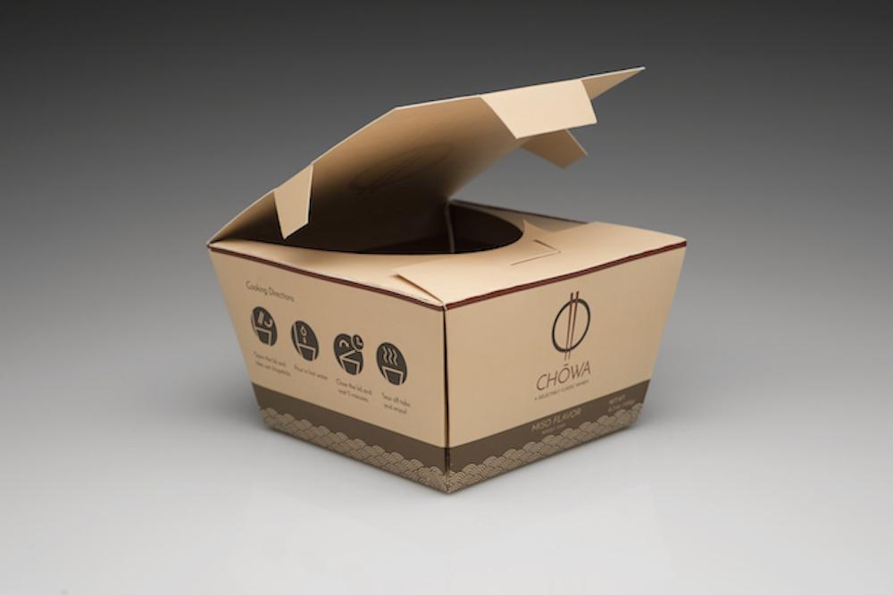
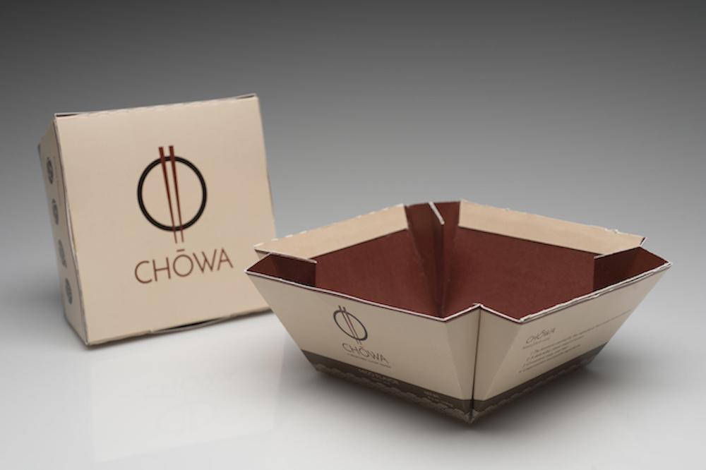
This is a new, healthy, high end Japanese ramen noodle product called Chowa. Enclosed is a set of chopsticks so the consumer can eat on the run!
Graphic Design: Aline Brantis and Eve Qiao
Packaging Science: Marc Entenberg and Meghan Schmauder
The box unfolds to become the bowl. YUM!
Graphic Design: Aline Brantis and Eve Qiao
Packaging Science: Marc Entenberg and Meghan Schmauder
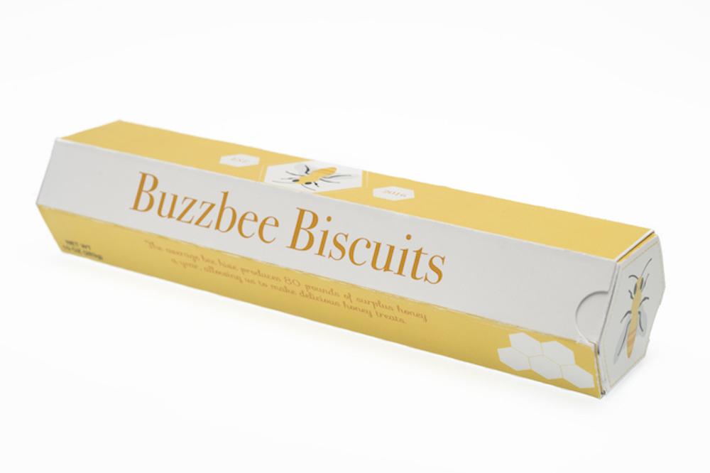
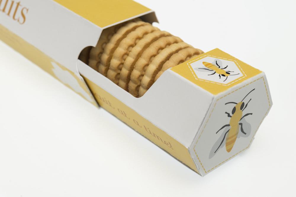
Biscuits with a twist ...Buzzbee Biscuits help bees by donating a portion of sales revenue to organizations
who are researching current problems with the decline of the bee population.
Graphic Design: Sierra DeVine and Greg Okolowicz
Packaging Science: Brooke Sinatra and Yunling Jiai
The package opened to reveal the honey flavored biscuits.
Graphic Design: Sierra DeVine and Greg Okolowicz
Packaging Science: Brooke Sinatra and Yunling Jiai
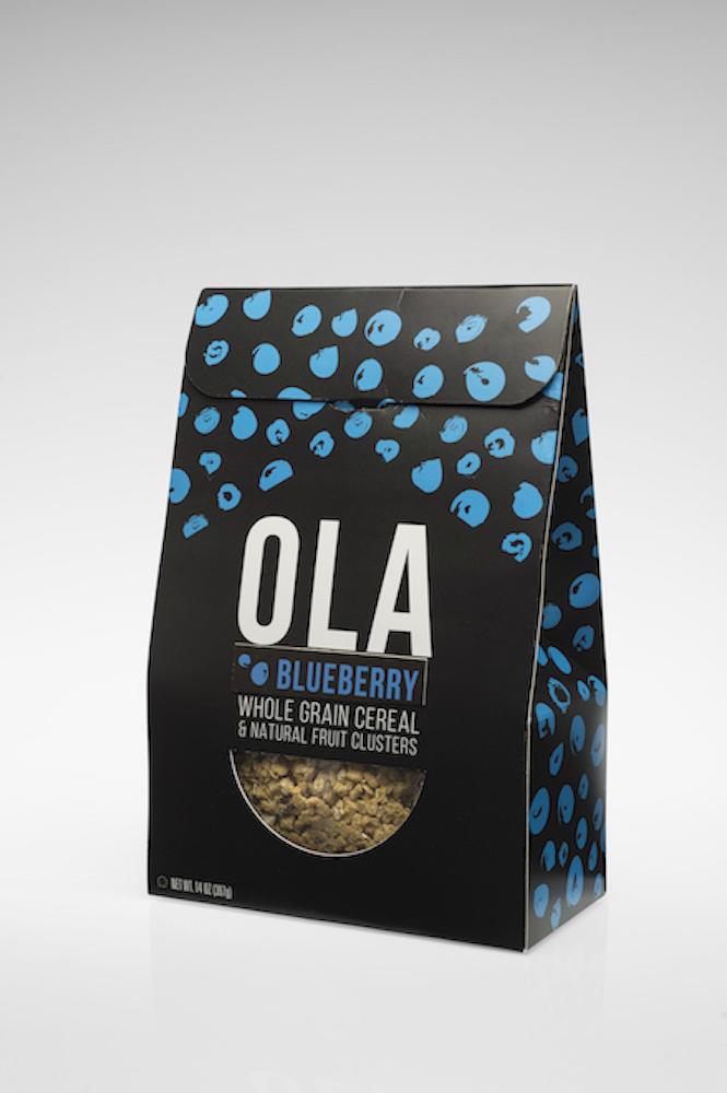
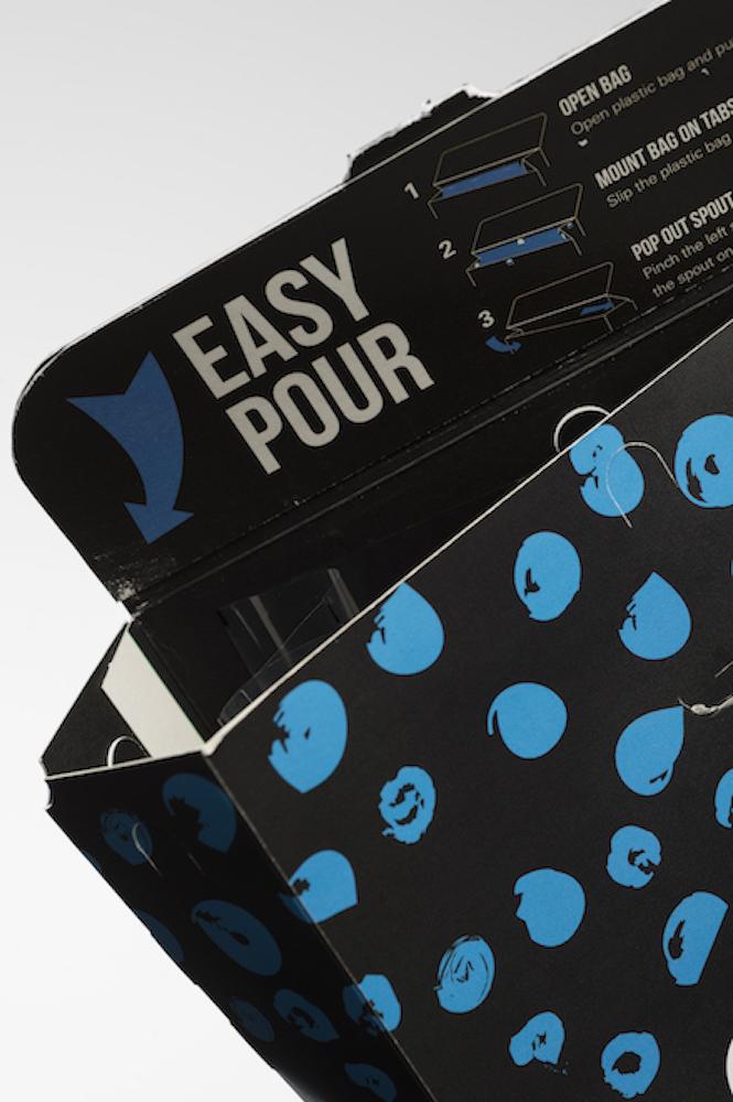
Ola granola cereal in a variety of fruit and grain combinations.
Graphic Design: Jenna Hebeler, Elizabeth McGrail and Cody Schuster
Packaging Science: Diana Elias and Philip Spiridigloizzi
