Pakalimu - Motion Graphics/Identity Design
Pakalimu - identity and motion design for Taiwanese Aborigines' Millet Wine
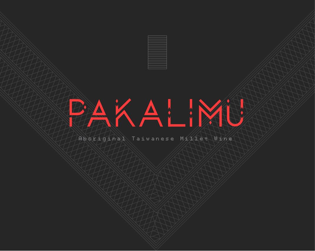
This pattern is derived from traditional Atayal clothing. The horizontal lines represent the rainbow bridge which leads the dead to where the ancestors’ spirits live. Argyles, on the other hand, represent ancestors’ eyes protecting the Atayal. The traditional Atayal pattern on a dark background is used as the paper wrapper for packaging and is introduced with a motion piece.
The logotype came from the geometric patterns that appear in many Taiwanese aborigine tribes’ clothing. The diamond shape symbolizes the eyes of Atayal’s ancestral spirits protecting the Atayal throughout their whole life. The stylized A represents the mountains most aboriginals live in. The tag line is made entirely with diamond shapes which also resembles the traditional Atayal weaving patterns.


