Typography II | Quarter 401
Rachel Nicholson
Cleveland, Ohio
USA
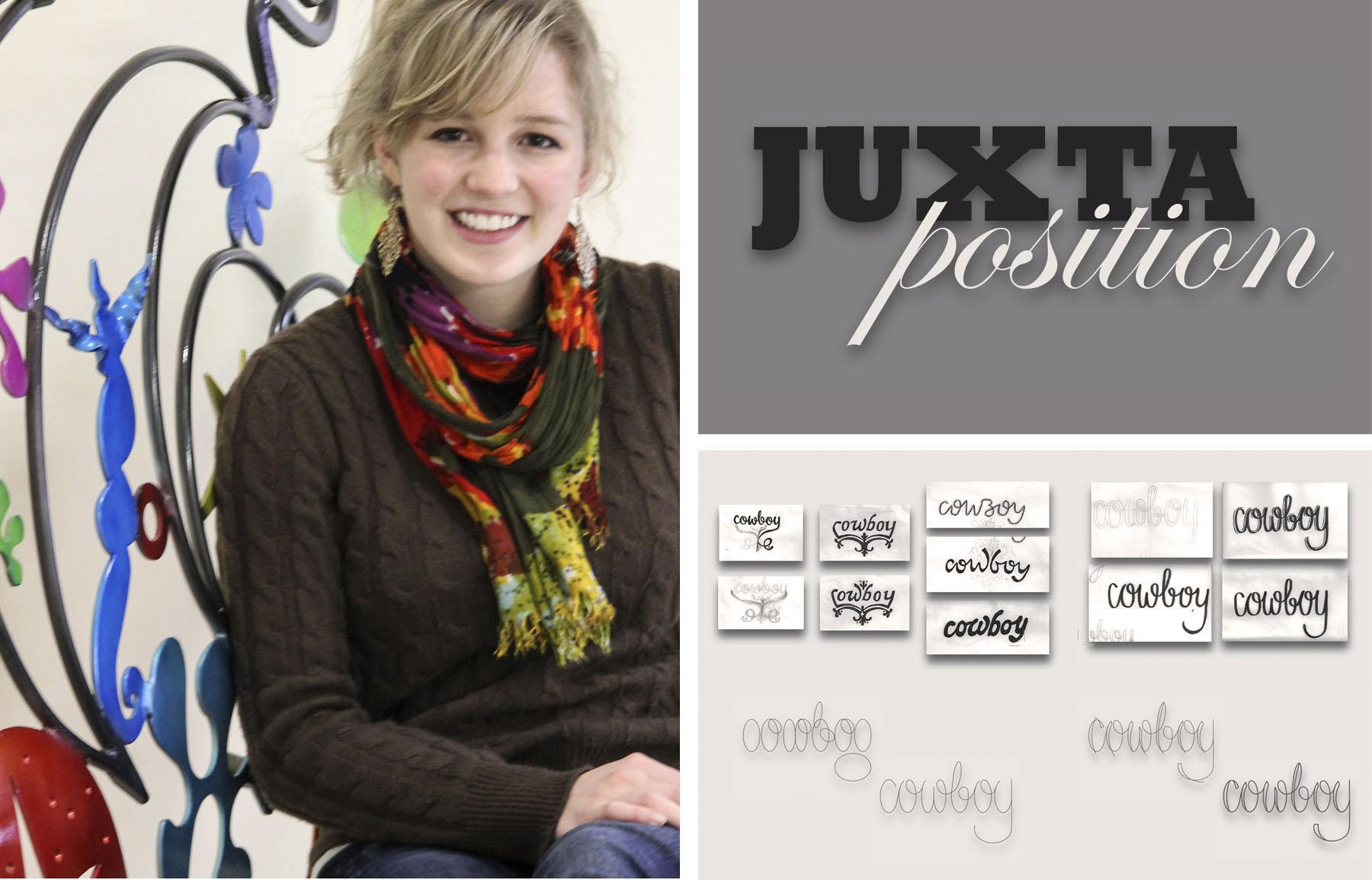
Rachel is very direct and honest in critiques and has a strong eye for design. She is always willing to put the extra time in to get her projects exactly the way she wants them to be. For this project, Rachel designed a lovely 28 page book featuring the custom word “princess” (taking inspiration from a slab serif) and the custom word “cowboy” (taking inspiration from a script). She titled her book, Juxtaposition.
Q: Why graphic design?
A: Once I realized that I was crazy for colors, shapes, organization, drawing and letters, I dove head first into graphic design and I never looked back.
Q: Thoughts on RIT and the community here?
A: I chose to attend RIT because I believe that the design community fosters inspiration, innovation, education, teamwork, and friendship in a comprehensive, yet intimate, environment. RIT has allowed me to refine my design skills, but also broaden my horizons to encompass the worlds of illustration, painting, collage, hand lettering, and other fields that spark creativity. In addition to chillin' with my friends, Skyping my family, participating in campus activities, and indulging myself into my design projects, I enjoy drawing and crafting, eating ice cream, painting my nails, and rooting for the Buffalo Sabres and the Cleveland Indians #letsgobuffalo #tribepride.
Sarah Jane Casale
Newtown, PA
USA
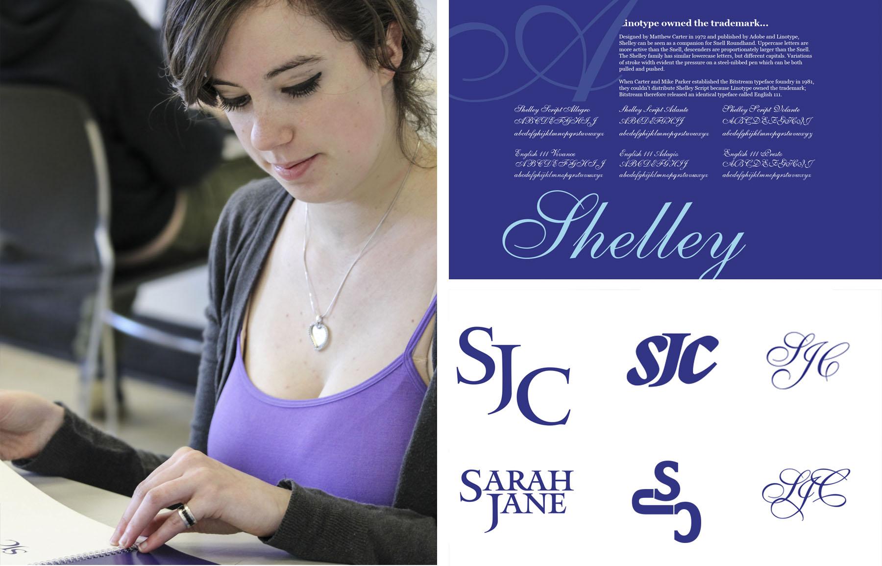
Sarah is kind, honest and generous to her peers in critique and for class discussions. She is open to try new and different things and believes she can achieve anything (and does). Sarah designed a 29 page book that included 28 combinations of her monogram using Matthew Carter’s type.
Q: Why did you choose graphic design and RIT?
A: I did not discover my love of design until my Sophomore year of high school when I stumbled upon a graphic design class. I found myself enjoying my schoolwork more than ever before, helping me realize that this was what I wanted to do with my life. I was a bit apprehensive when applying to schools, but the moment I stepped onto RIT's campus I was overwhelmed with a feeling telling me that this was the place I needed to be. Being a designer at RIT is so rewarding due to the diversity of majors and minds. I continuously seek and receive critique from non-artists, which I find invaluable.
Q: What did you hope to get out of this project?
A: For this project, I aimed to step out of my comfort zone. I really lacked the typographic knowledge that I desired, so Carol suggested looking at Matthew Carter because of his wide range of work. Not only were his typefaces elegant and beautiful, but they possessed great disparity amongst them, making my experience diverse and informative. I strive to make my designs the best they can be. Not because I am motivated by letter-grades, but because I adore the fulfillment of finishing a project. I love seeing ideas grow. At the end of the day, I can't see myself doing anything else.
Philip Czapla
East Aurora NY
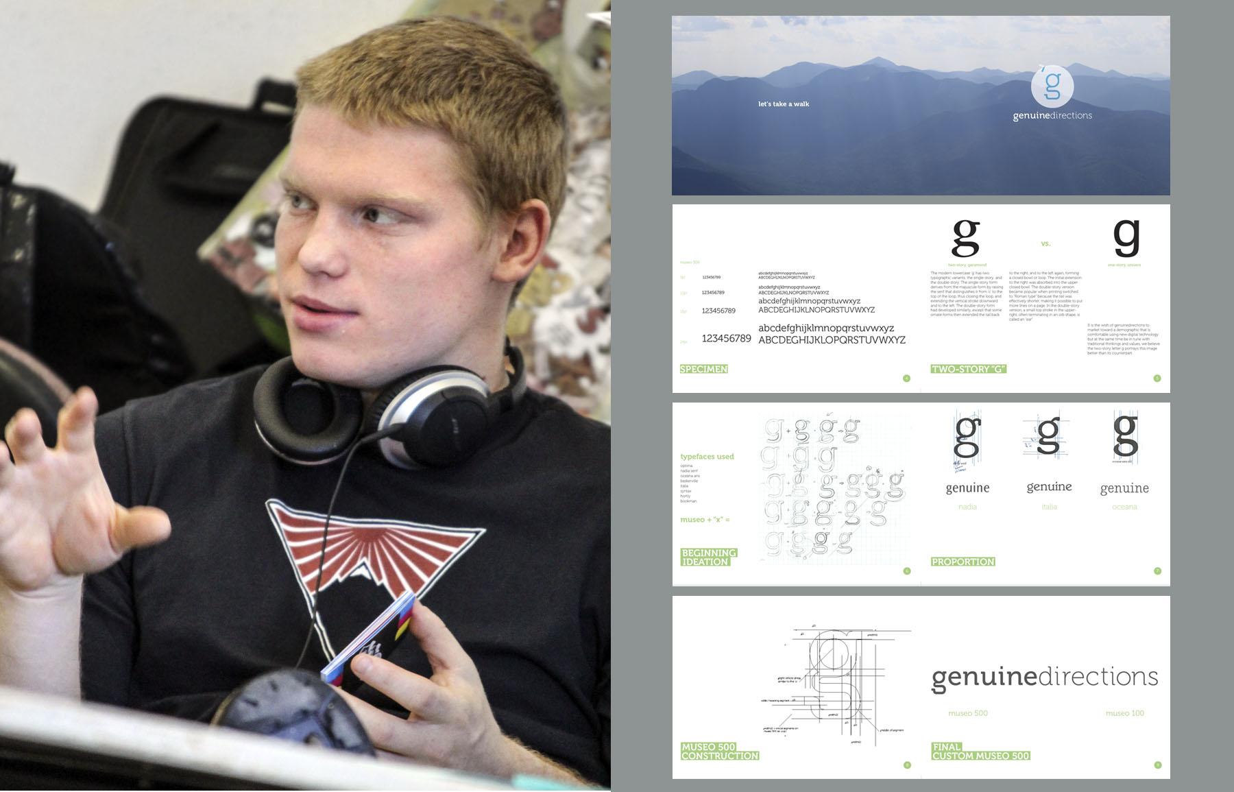
I have always been impressed with Philip’s wide range of interests and abilities. He is a pleasure to have in class and is a valuable asset to his peers. With this project, he designed a logotype with custom letters and a 28 page beautifully designed book.
Q: Why graphic design?
A: I think there is unlimited potential in fostering peoples ideas through visual language. People have such great ideas and innovations and too many times they don't succeed because of a lack of direction and image. My goal with design and my reason for going into the field is to not let that happen
Q: What has been your experience so far?
A: I enjoy every minute of every project but more than that, I have loved the opportunity to be wrong. In the RIT environment I have learned the process and the importance of how to go about answering a question rather than what the correct answer is.
Q: What are you really passionate about, what about this project that I am featuring?
A: I'm passionate about helping people grow their ideas, for this latest project I went through a branding process and really worked on how to show what my brother wanted his company image to convey.The more important and exciting feature of this last project was the initial idea and I think showcasing the content and reasons based of the content is more important than the design alone. This was the main main dilemma I was faced with but this kind of work really excites me and I would love to continue branding work as well as work in the outdoor industry.
Danielle Suzanne Smith
Burke, VA
USA
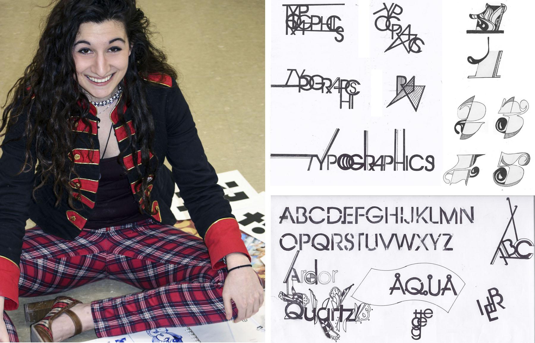
Danielle is a pleasure to have in class as you never know what may happen next. She is full life, she is kind and she always has good ideas to share with her peers. For this project, Danielle features her many explorations that were inspired by Herb Lubalin’s portfolio in her 28 page book. Her sketchbook is a work of art— some of her sketches are featured above from this project.
Q: What do you like about graphic design?
A: I love graphic design as a major. The ability to merge creative vision with a product, message or idea makes communication practical and challenging. Combining technology with hand-drawn methods is especially important to my work, as I seek to preserve the old with the new.
Q: Thoughts on your project?
A: Typographic ingenuity springs from exploration, from the curious re-imagining of foundations and emulation. I have delved deeply into Lubalin’s portfolio and work, riffing off towards my own designs, expanding the line of inspiration into creation.
Felicia Baa-Adomako
Philadelphia PA
USA
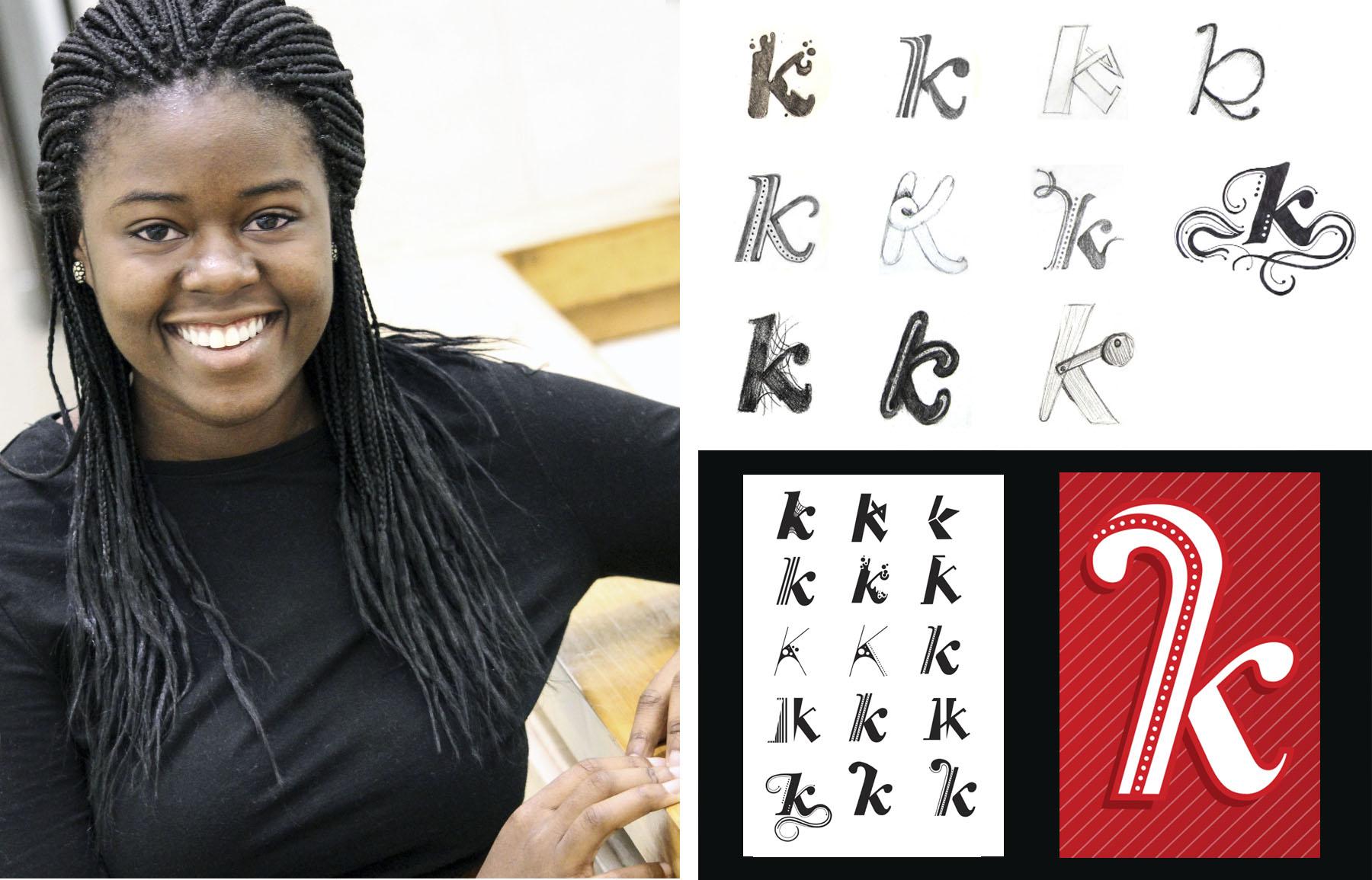
Felicia has wonderful sketches, loves to draw and has terrific control when using the pen tool. With this project, she designed MANY different letters (with just a sample above) as she studied the relationships in the letter forms of Centennial 96 Black Italic and produced a beautifully designed 38 page book.
Q: What do you like best about graphic design?
A: What I enjoy most about graphic design is the creative process. I like working from rough sketches and developing them into final designs.
Q: What did you want to explore with this project?
A: For this project I chose to work with Centennial 96 Black Italic because the thin and thick lines allowed to me explore different combinations. The Centennial 96 Black Italic was created in 1986 and designed by Adrian Frutiger. I chose to work with the lowercase versions of “f i j k l t” set of letters because they all have straight stems and well-rounded descenders. I wanted to explore the relationship of the line weights. I based my preliminary sketches around what I thought was the most difficult letter of the set — the letter K.
Carly Rumpf
Downingtown, PA
USA
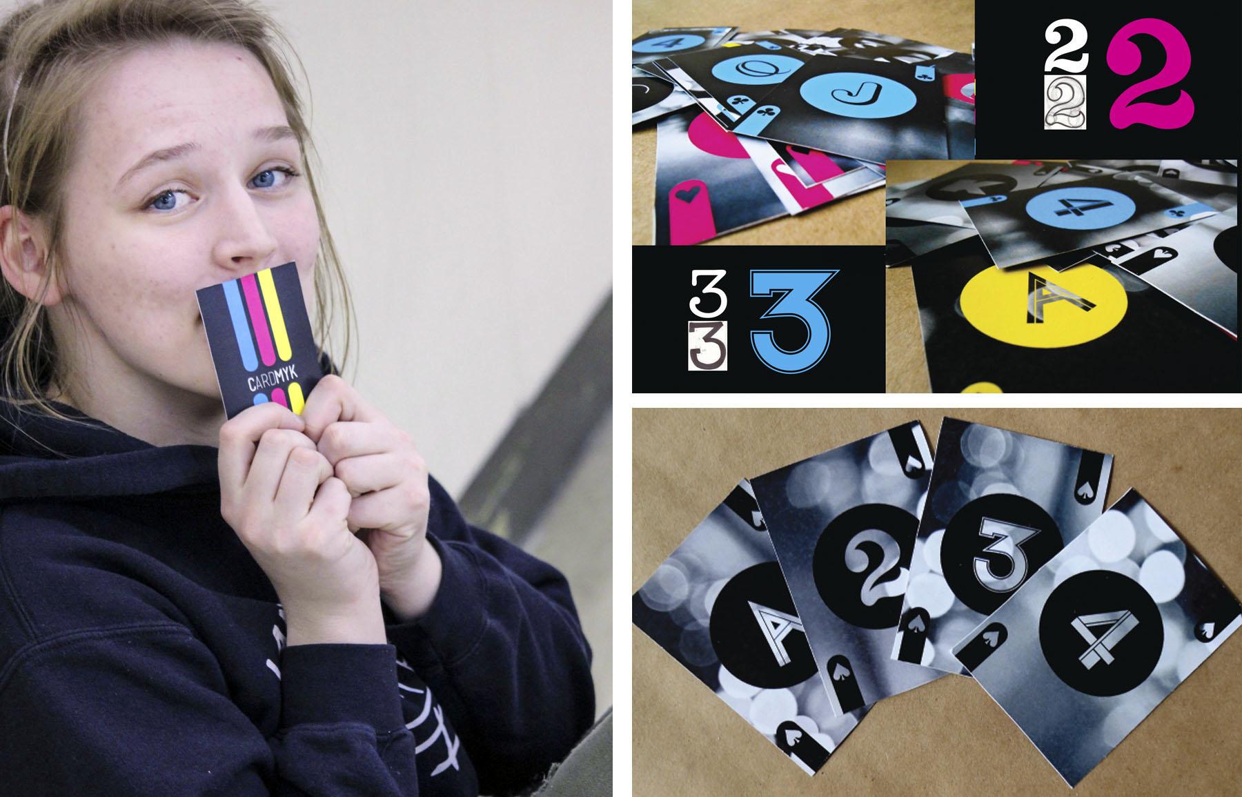
Carly always works diligently on all her projects from start to finish as she continues to develop a fine sense for design. With this project, Carly designed 13 numbers and letters, a full deck of cards with a box and a 38 page book.
Q: Are you happy you chose graphic design and what are your hopes for the future?
A: I am so glad I choose graphic design as my major because I’m absolutely in love with it. Every project that I am assigned, isn't work to me, it’s play! I love dreaming up awesome concepts, and once I get the ball rolling on a project, I become so wrapped up into it, that I want everything to be perfect! My hopes are to pursue design in the music industry since music and the culture surrounding it is my passion. I also love exploring packaging design as well as sustainability and environmental design.
Q: What was your initial concept with this project?
A: Every letter, word, and number has personality. Uppercase E’s are definitely a little on the mean side while lowercase e’s are soft and innocent babies. With this project, I wanted to explore the personalities and characteristics of many different characters.
Carlos Cidrini
Rio de Janeiro
Brazil
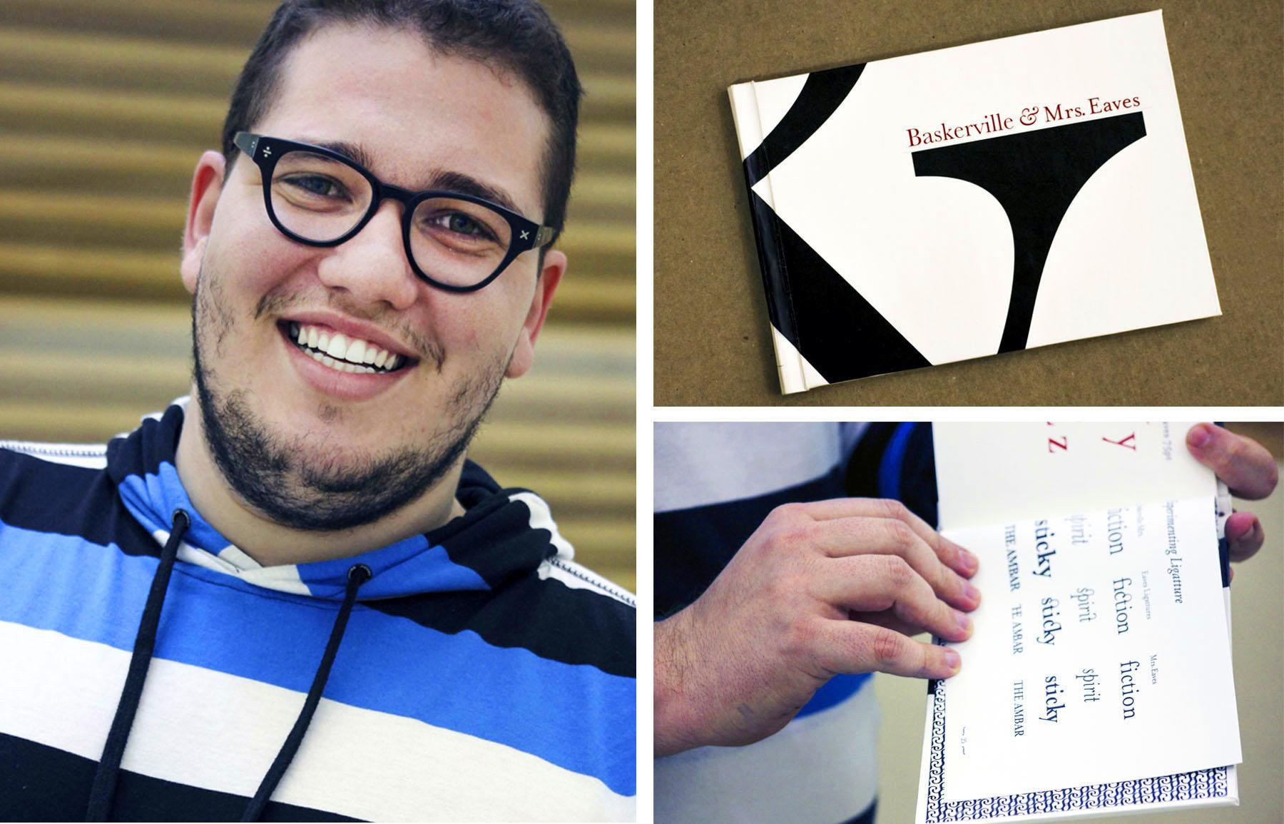
Carlos is very meticulous with his craft skills and is very passionate about design. He has been such a great addition this year. With this project, Carlos produced a beautifully designed and bound 28 page book.
Q: Why RIT all the way from Brazil?
A: I’m at RIT as part of a scholarship program by the Brazilian government. I asked to go to a place where I would have the opportunity to learn about the relationship between design and print media and they chose RIT for me. I chose Graphic Design because it gives shape, meaning and color to your ideas. It’s amazing how a simple thought can be turned into a book, a poster, a magazine or whatever by your own hands?
Q: What do you think about your final project?
A: The “Baskerville & Mrs. Eaves” book is one of my favorite works because it shows how a type designed so long ago can be reinterpreted and adapted for our contemporary use. It also let me show how letter shapes are beautiful and gave me the chance to exercise two of my passions: publication design and bookbinding.
Halli Rosin
Merrick, NY
USA
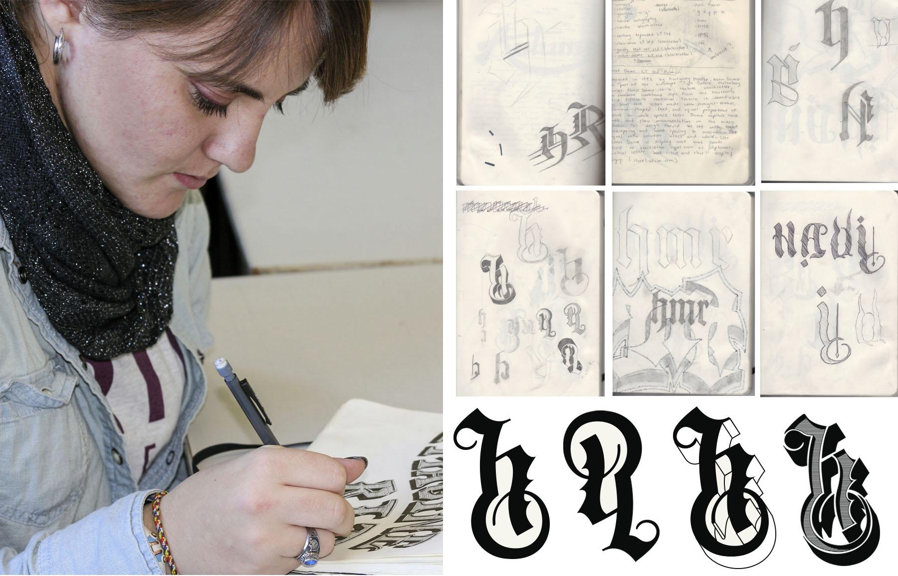
Halli loves to draw letters in all shapes and sizes— her sketchbook is filled with them. She is very passionate about design and it shows in her work in and out of class.
Q: Why is graphic design your major?
A: I chose graphic design because there are so many different ways that you can apply it to the real world. When I found out that there was something that combined my passion for art and my love of technology, I knew that it was right for me!
Q: What are your experiences so far?
A: I chose RIT because I thought the design department was impressive. I was also impressed with how high the graphic design department was ranked nationally (#12!!), and it was the only school I applied to that had special interest housing (shout out to Art House!). I've had a great experience so far because the professors are so helpful and the people in my classes give such great critiques that keep driving me forward.
Q: Thoughts on this project?
A: This last project was great because I love hand lettering and I was able to push that even farther by applying it to an exploration through self-branding. Now I have a sweet set of business cards!

