Typography & Imagery | GRDE 206
This 2nd year course builds upon the content taught in the Typography and Design Imagery courses. Its content expands upon the principles of grid theory, text and display typography, sequence, page layout, and type and image integration as they relate to a range of design applications. Various relationships between type and image interaction are explored to expand students’ range of techniques in solving visual problems. Concept development, visual organization, and message communication are stressed. Appropriate layout and software skills are integrated.
Projects:
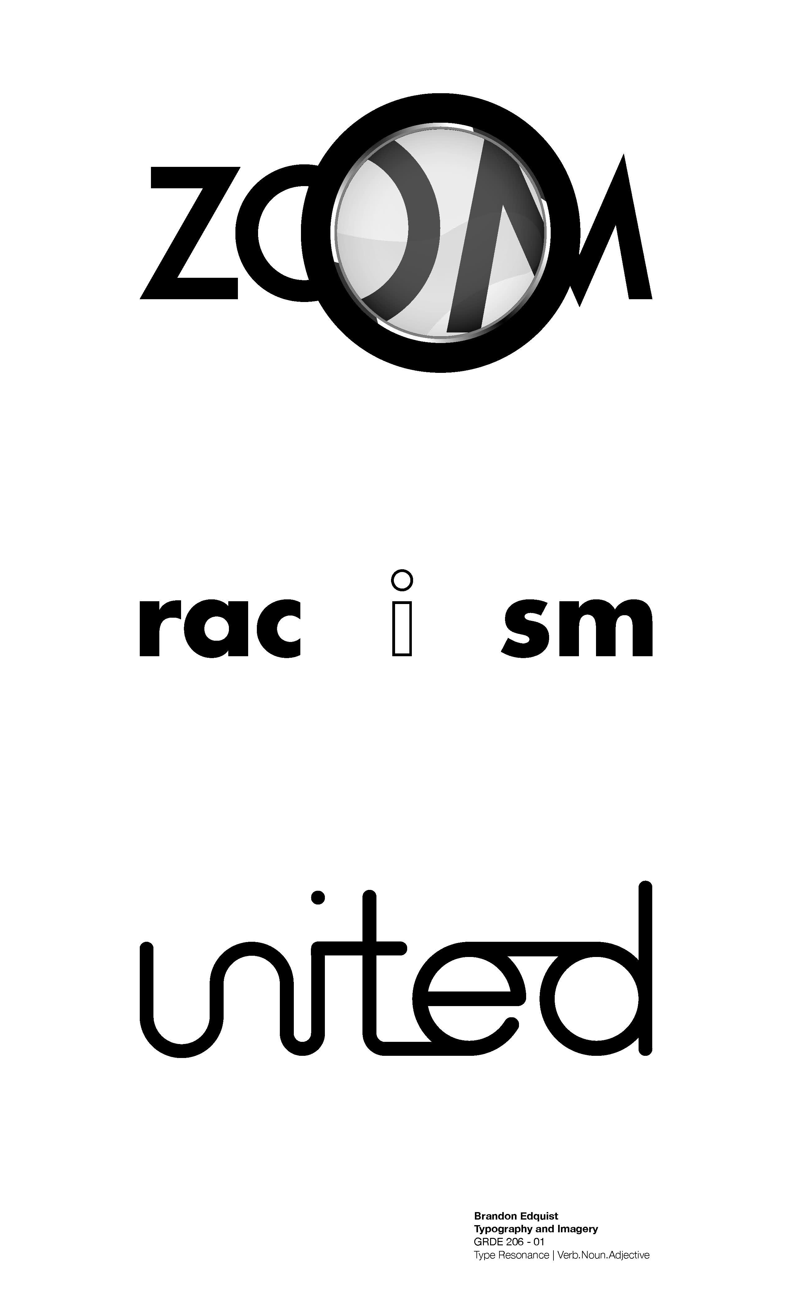
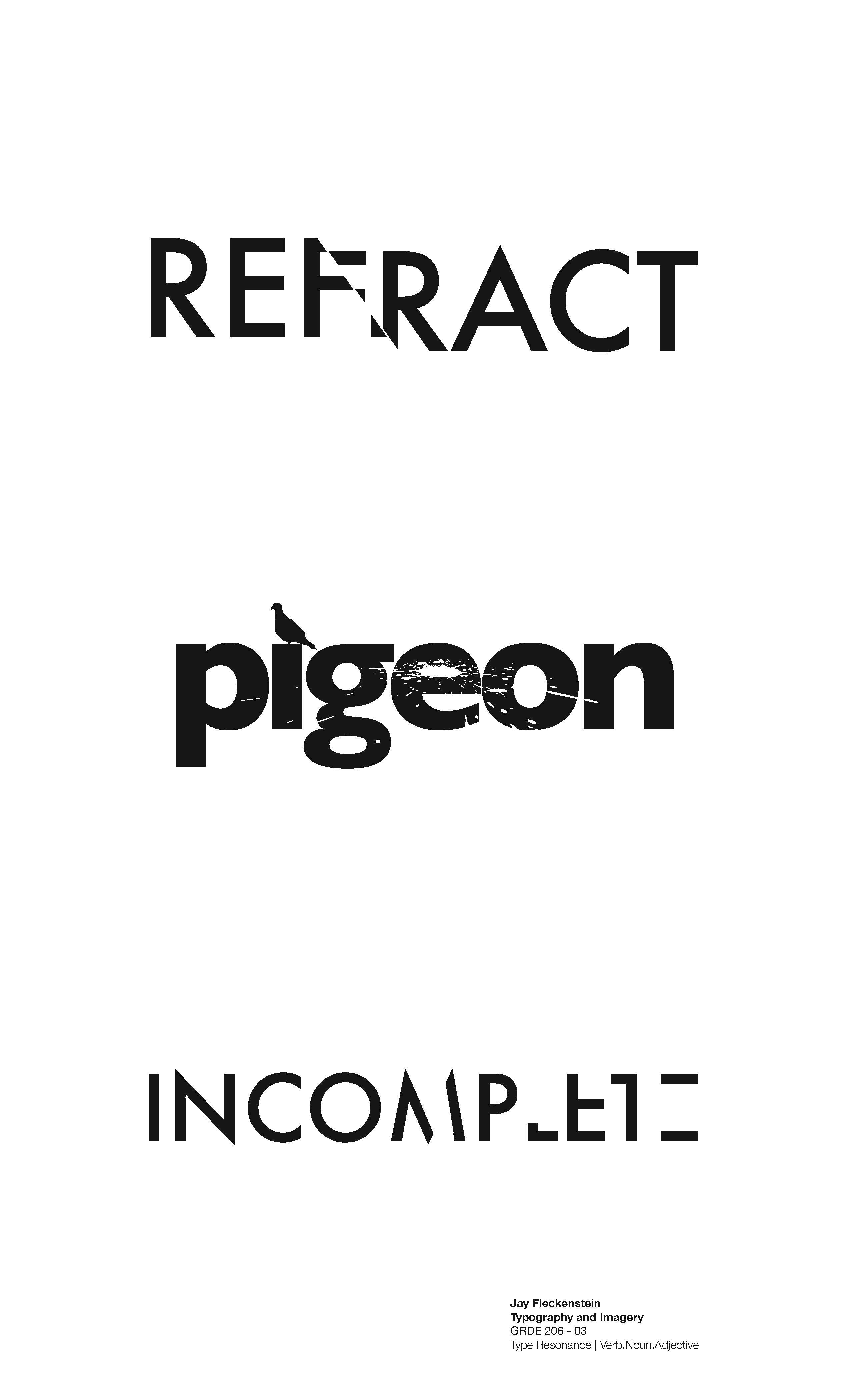
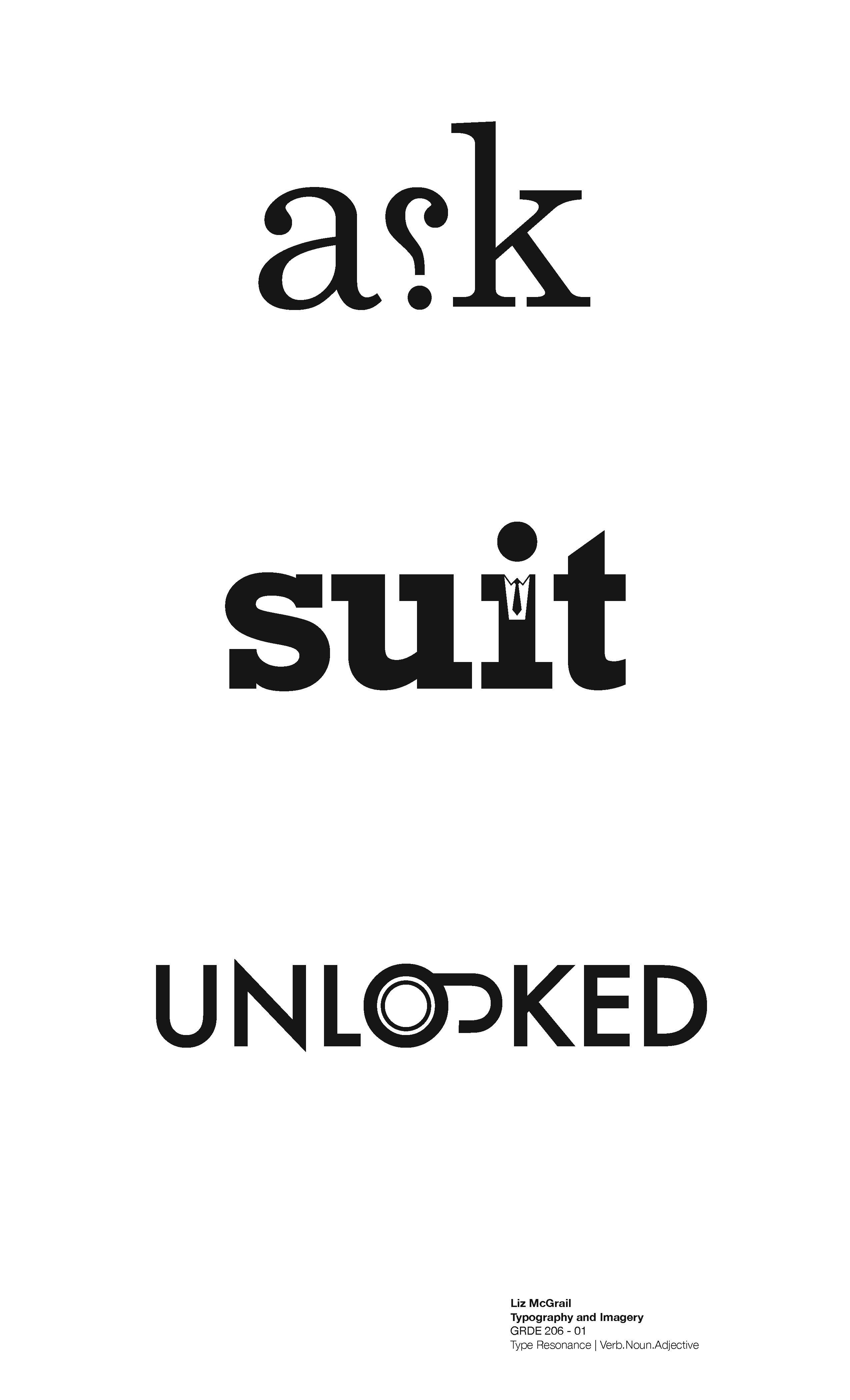
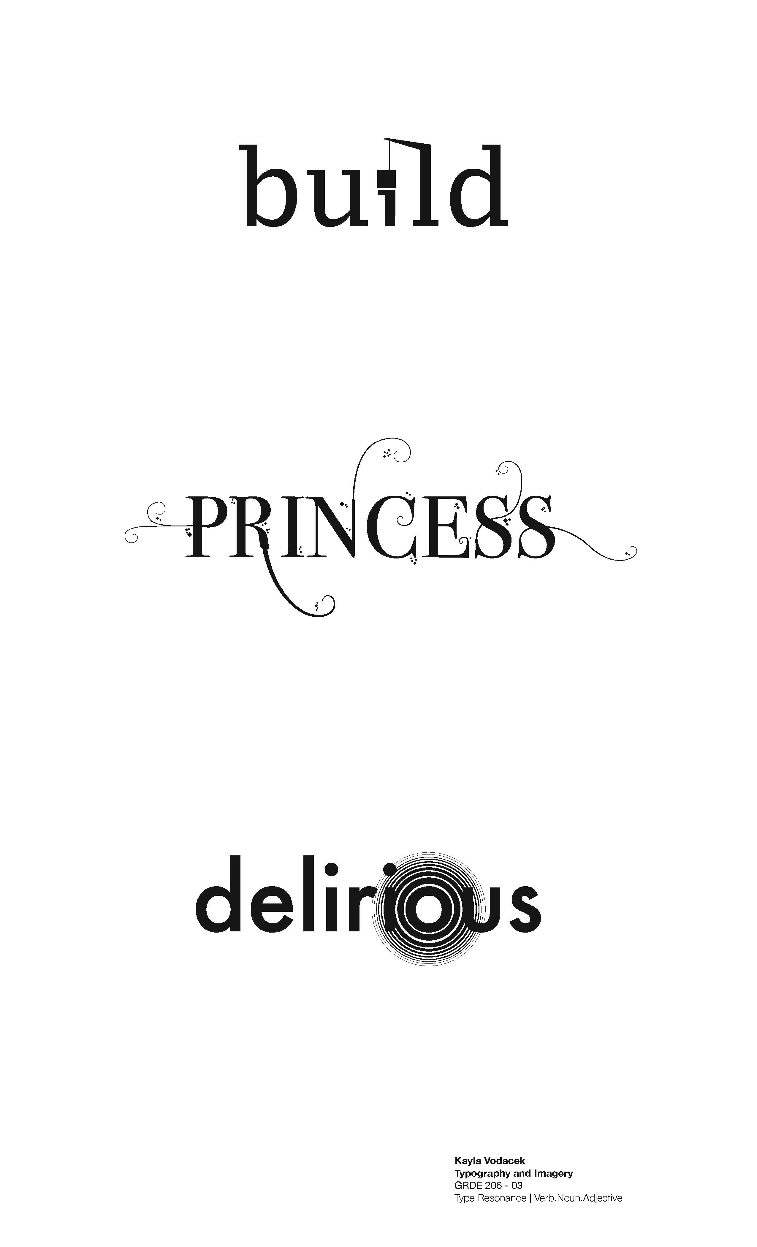
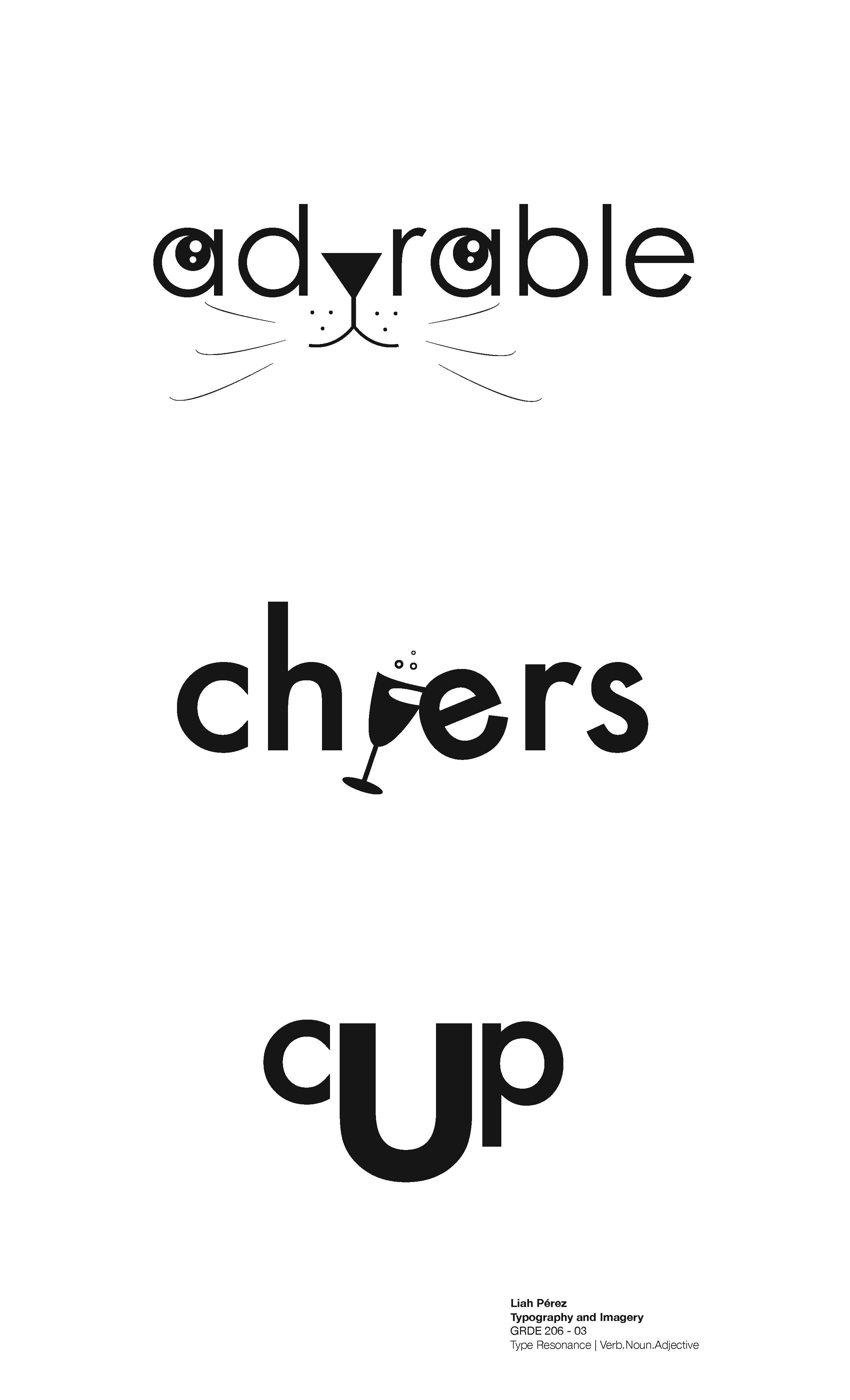
Type Resonance Project
The relationship between typeface form and semantic content can be expressively illustrated through creative typeface selection combined with compositional elements that provide meaning and context. Illustrate/design a series of words using the principle of typographic resonance through the careful selection of typeface combined with the creative use of composition to semantically and visually relate its meaning.
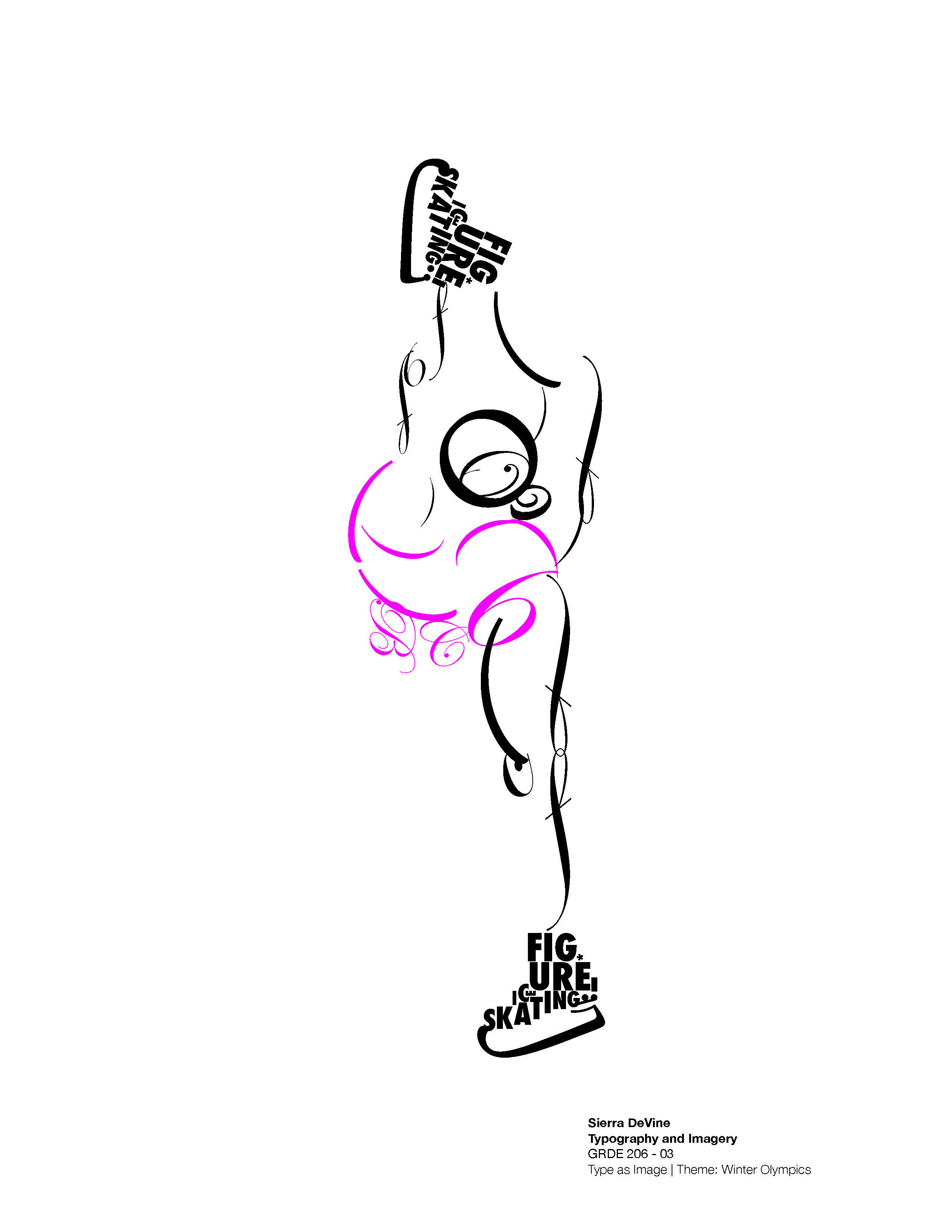
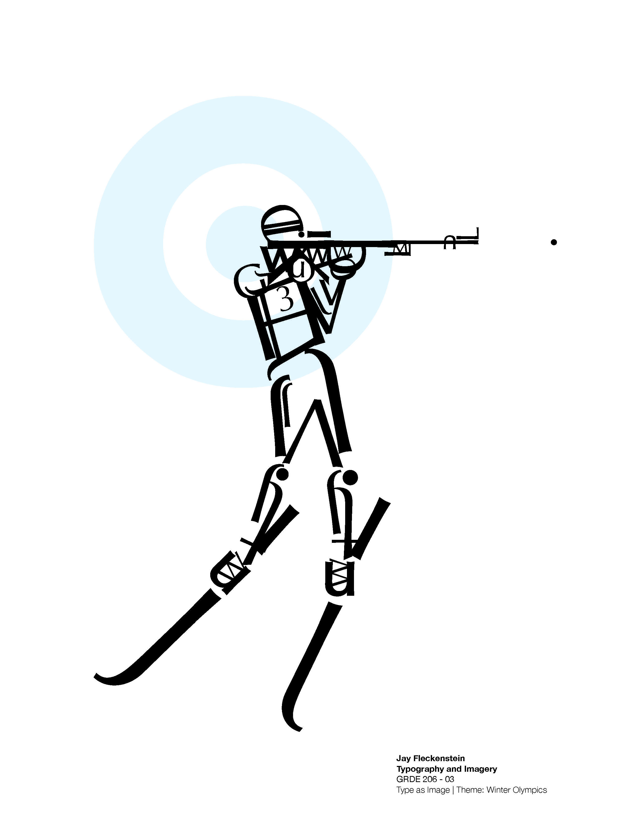
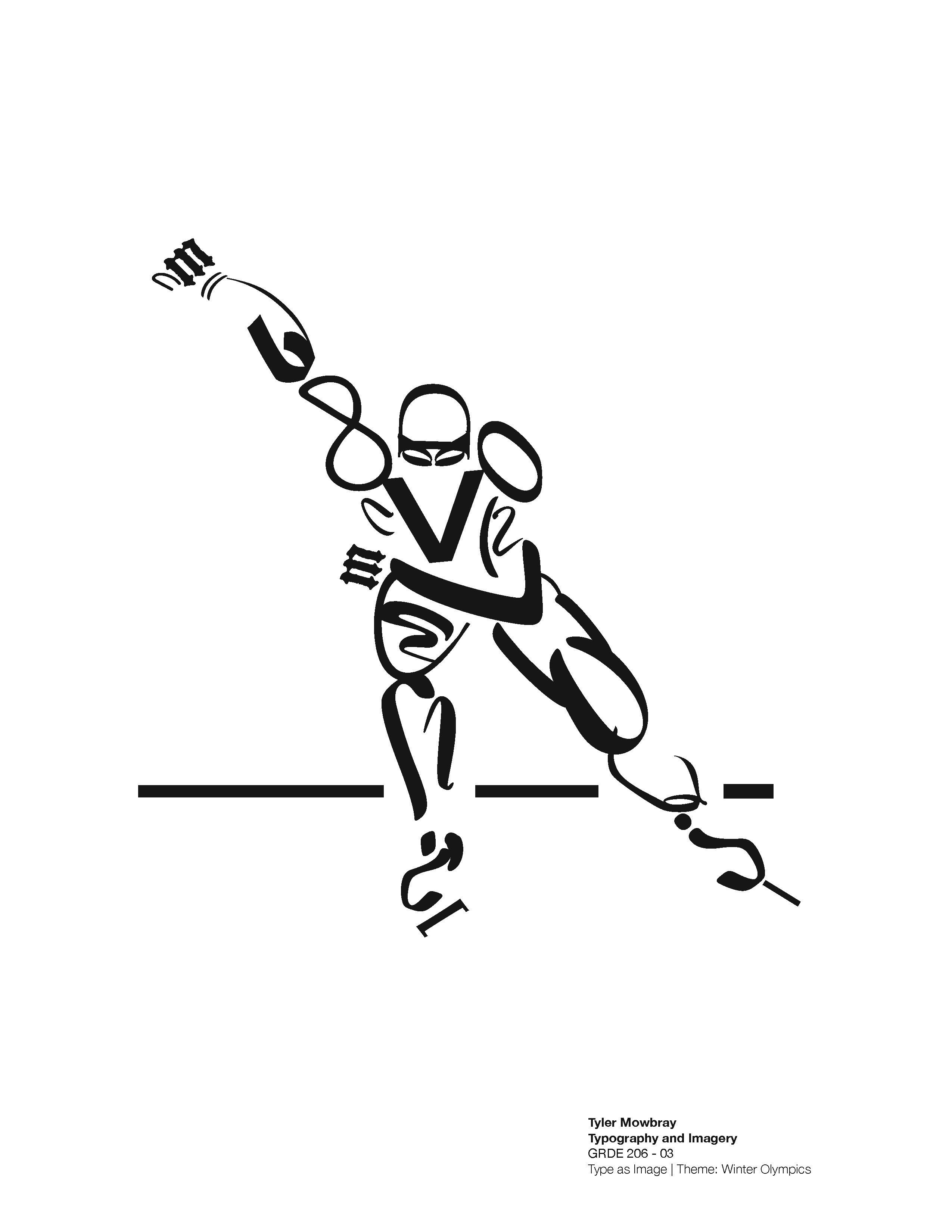
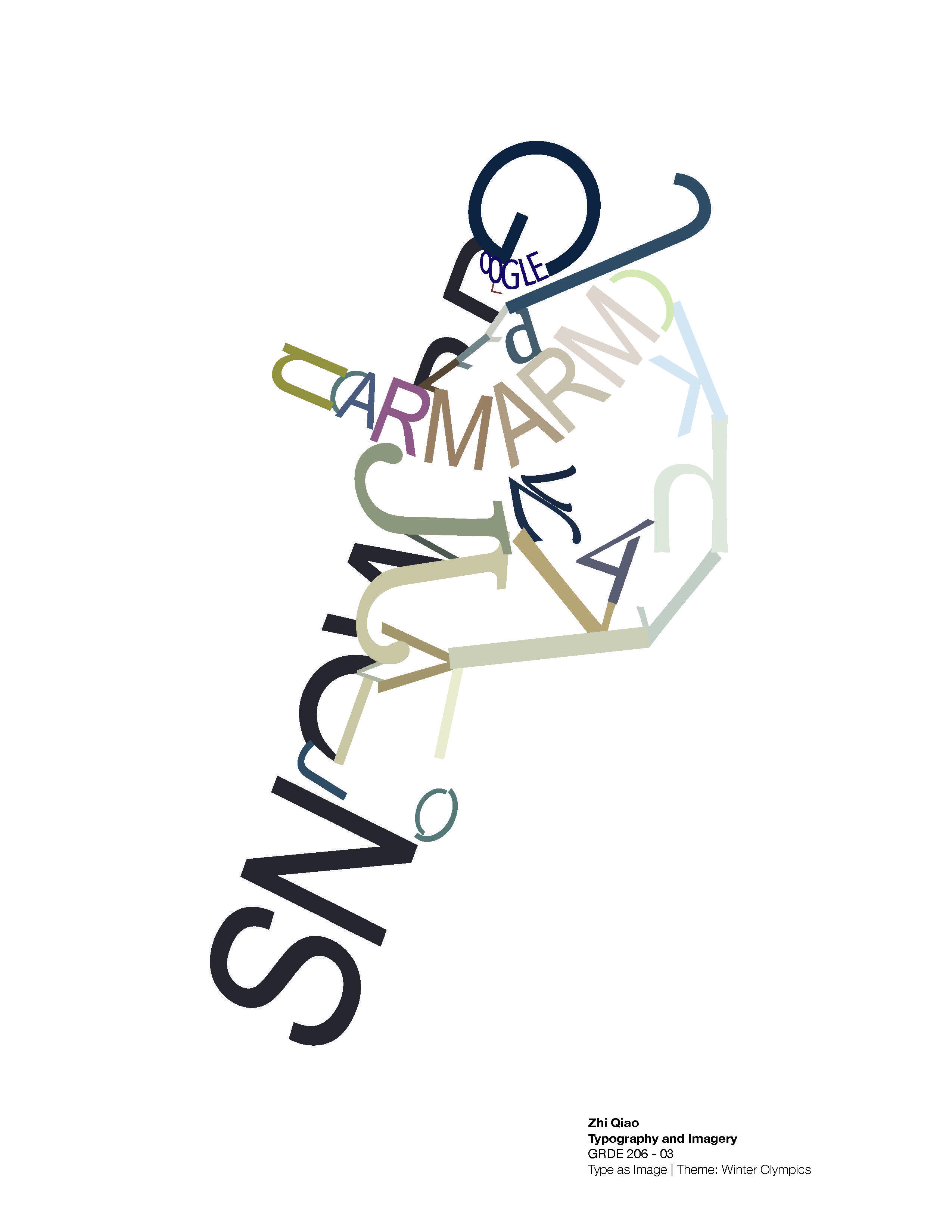
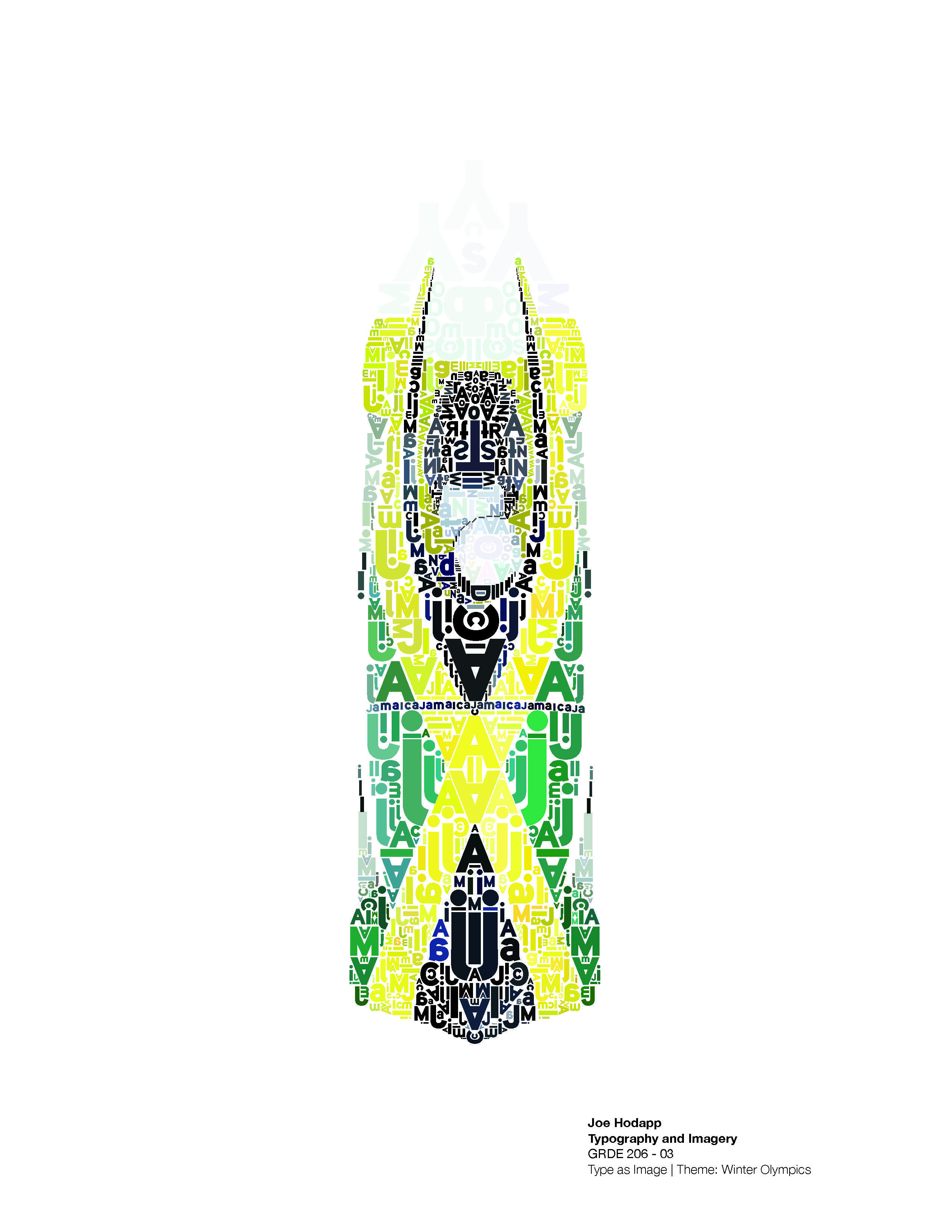
Type as Image Project
When text is interpreted as an image, it becomes understood quickly and easily. Letterforms or sections of text may be used as objects/images in their own right or may form part of an image. These devices are often used to reinforce a message. Design an object using only typographic forms to delineate shape and convey meaning. You may use individual letters or entire words, but there should be a clear relationship between linguistic form and semantic meaning. The theme for this project is the Winter Olympics. Choose an Olympic sport (such as figure skating, skiing, ice hockey, etc.), and using reference photos, design a figure using typographic elements, performing that sport.
The Grid & Layout
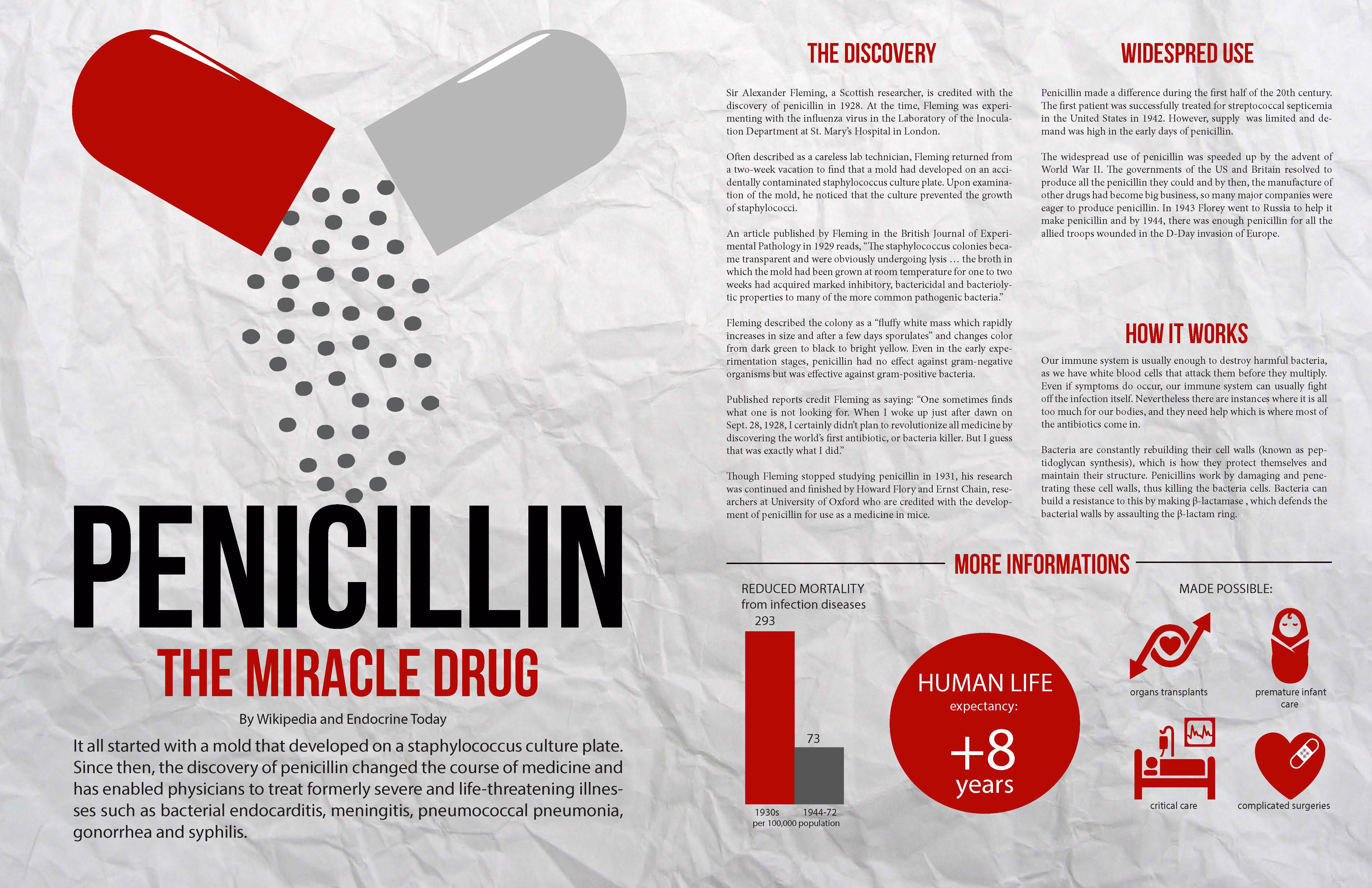
The grid serves as a framework for the organization of graphic elements in a rational, structured, and easily understood
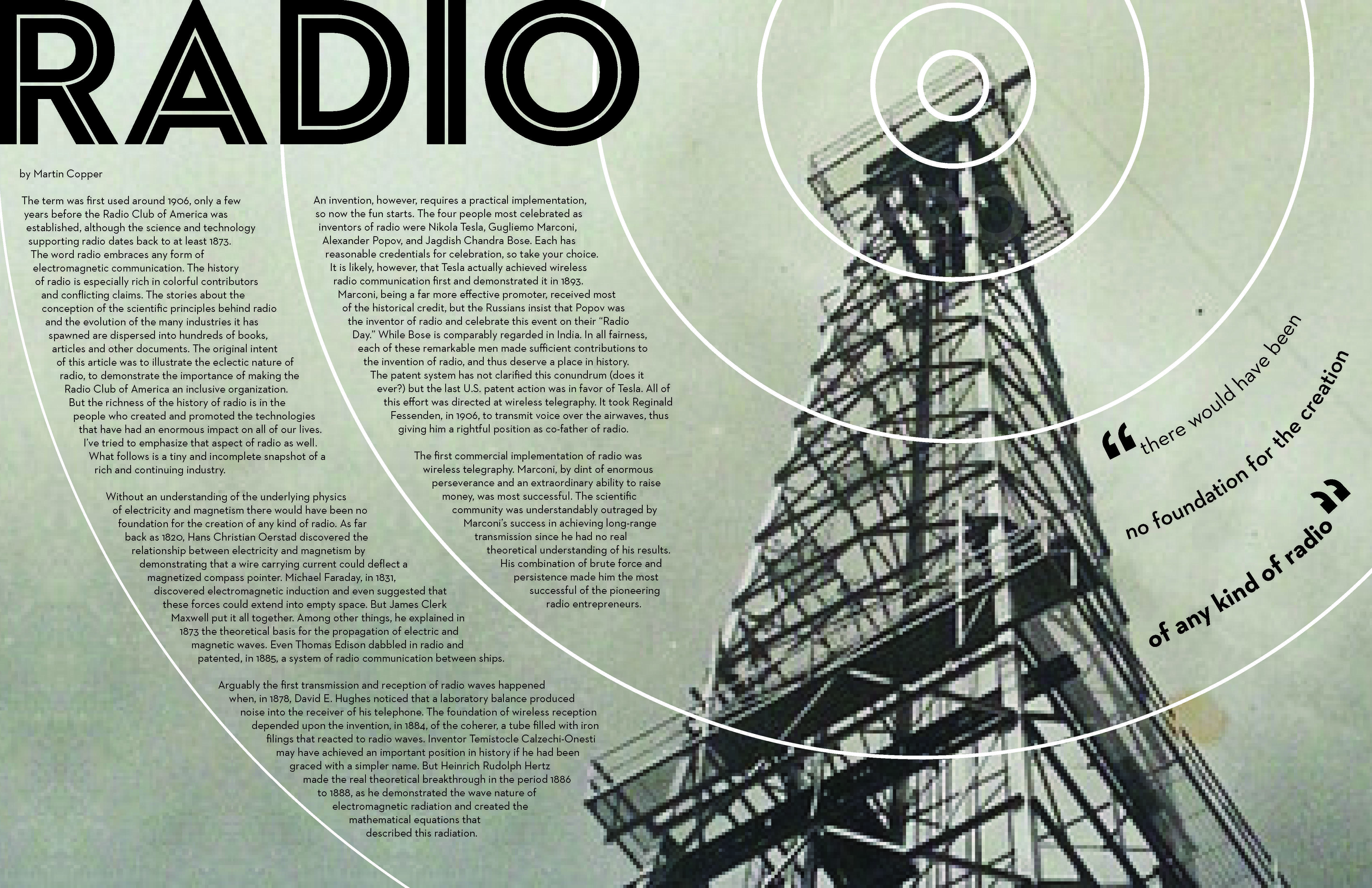
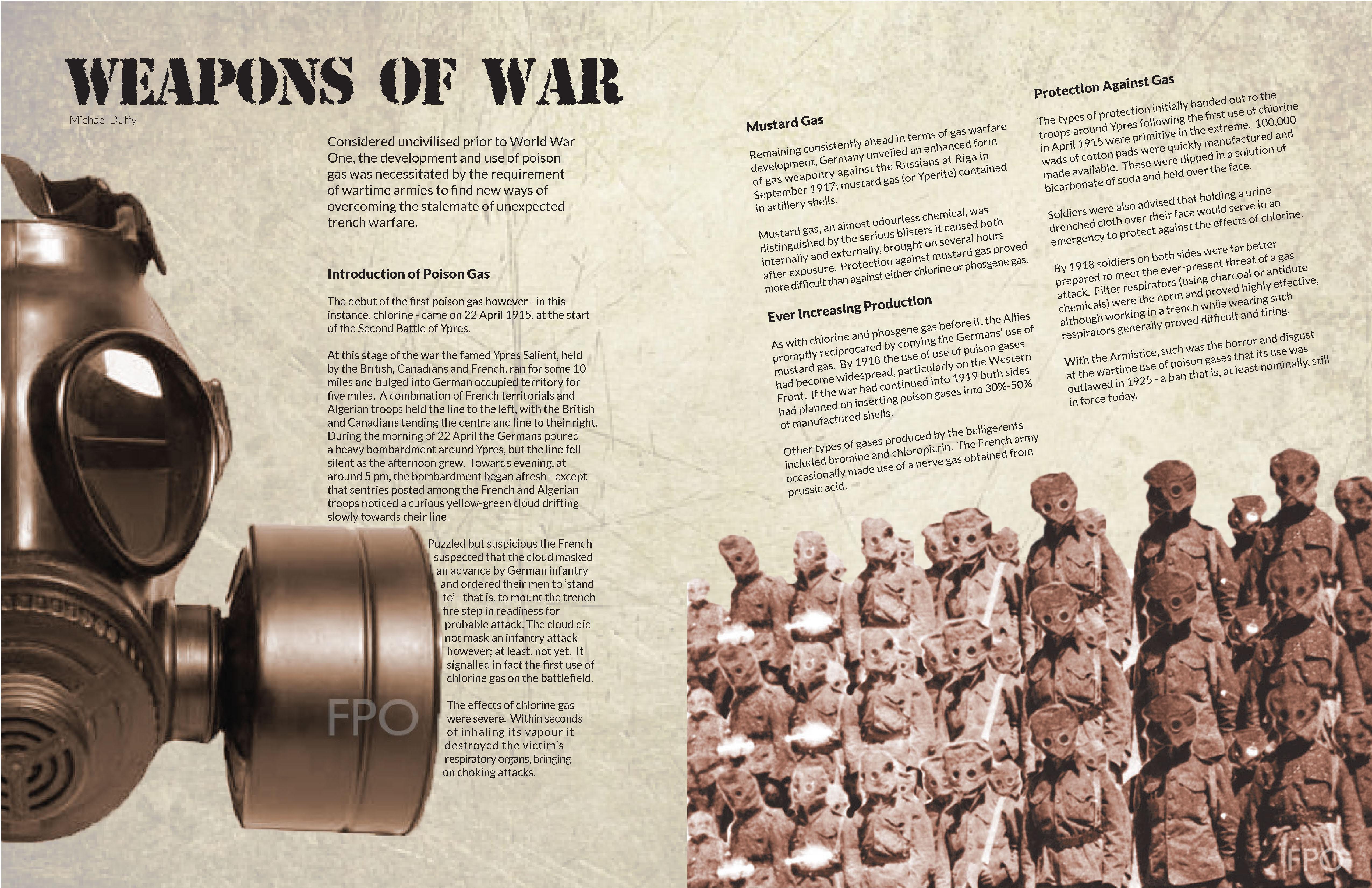
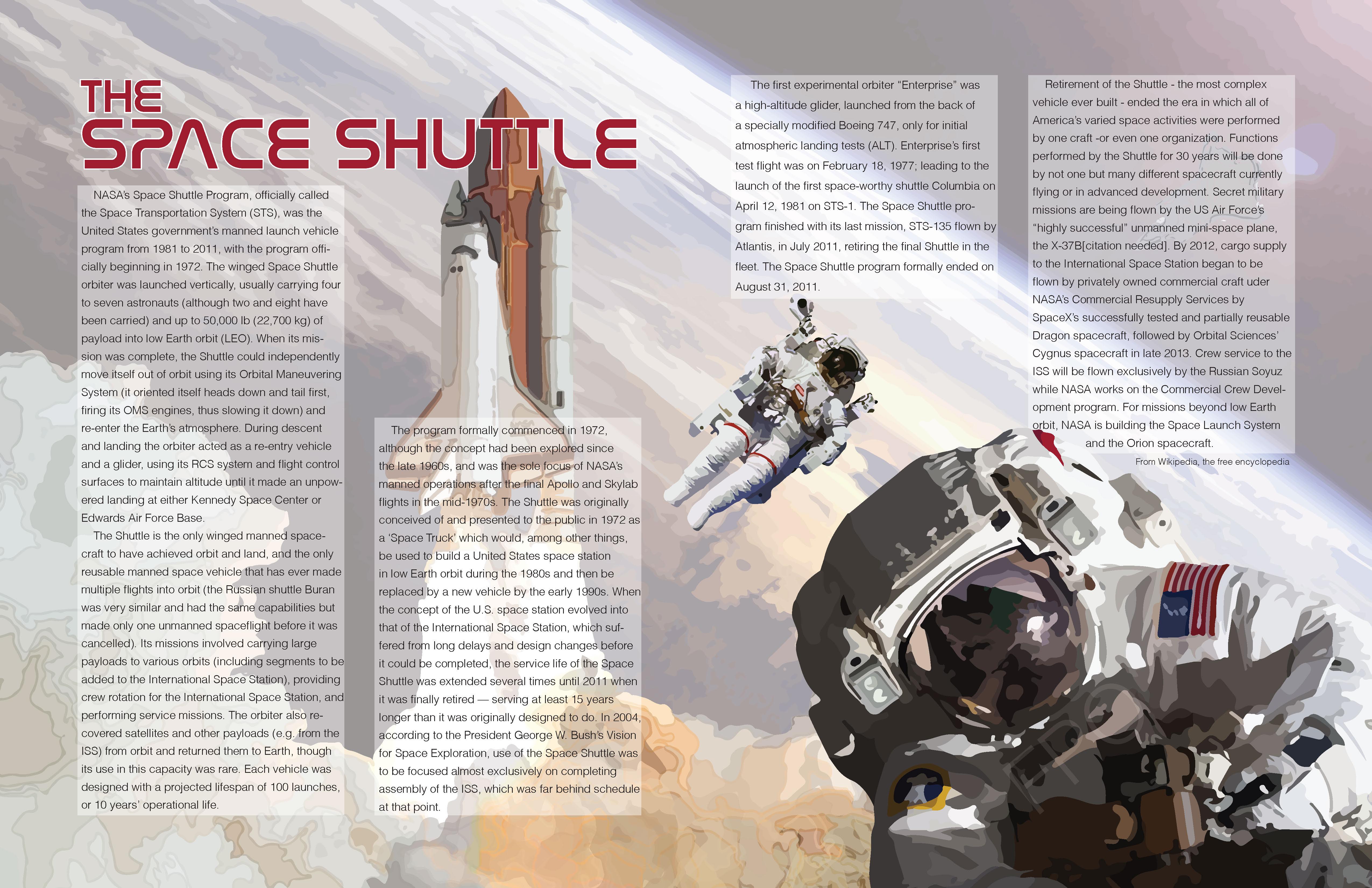
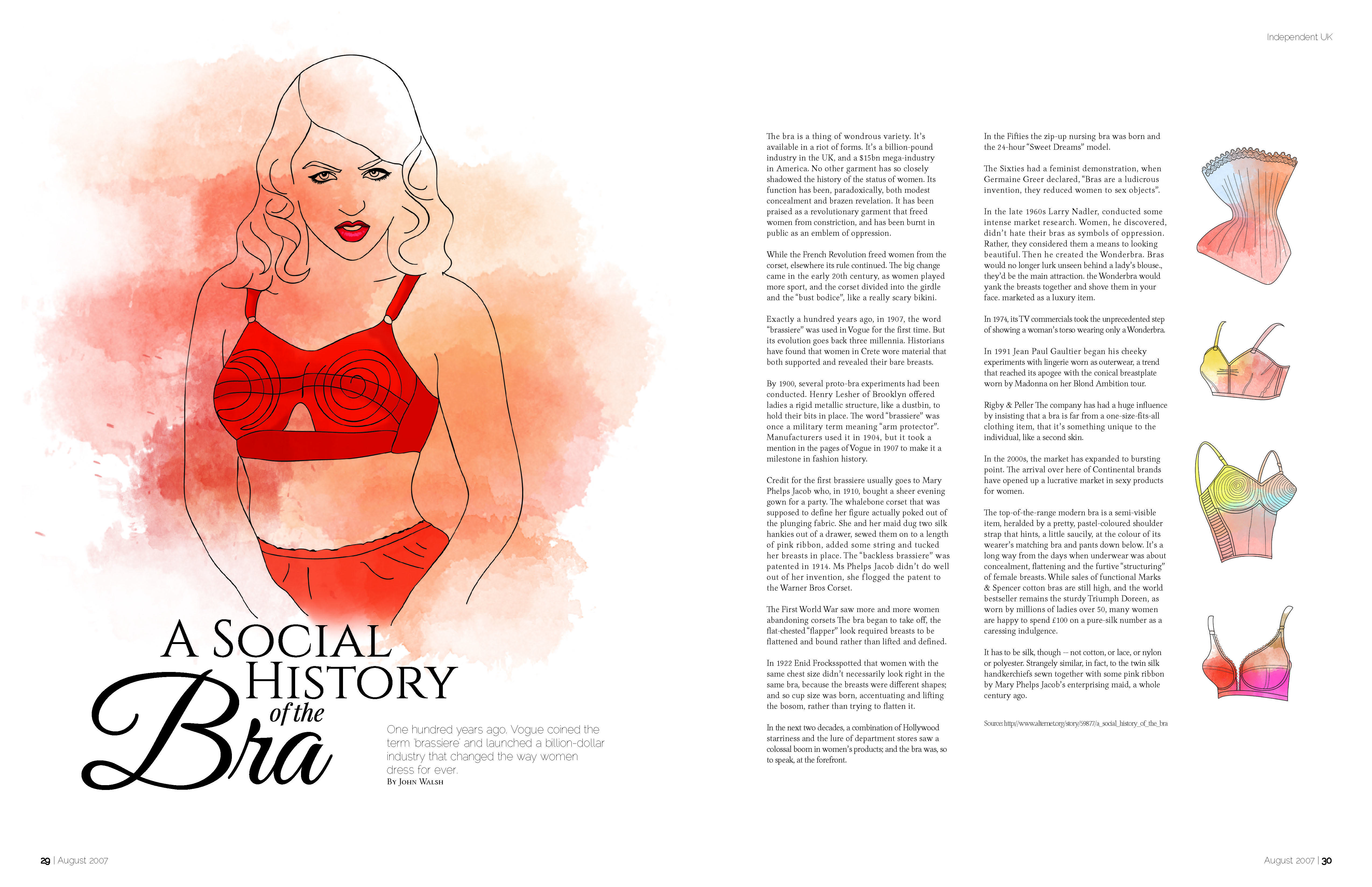
manner. It can be used to organize graphic elements in relation to a page, or in relation to other graphic elements. Design a double-page spread layout utilizing one of the grid structures discussed in the presentation. Proper use of all typographic rules is mandatory! Consider typographic elements such as scale, hierarchies, and appropriate fonts; and layout elements such as margin/gutter space, and type and image relationships. THEME: Inventions of the 20th Century
Type/Image Relationships
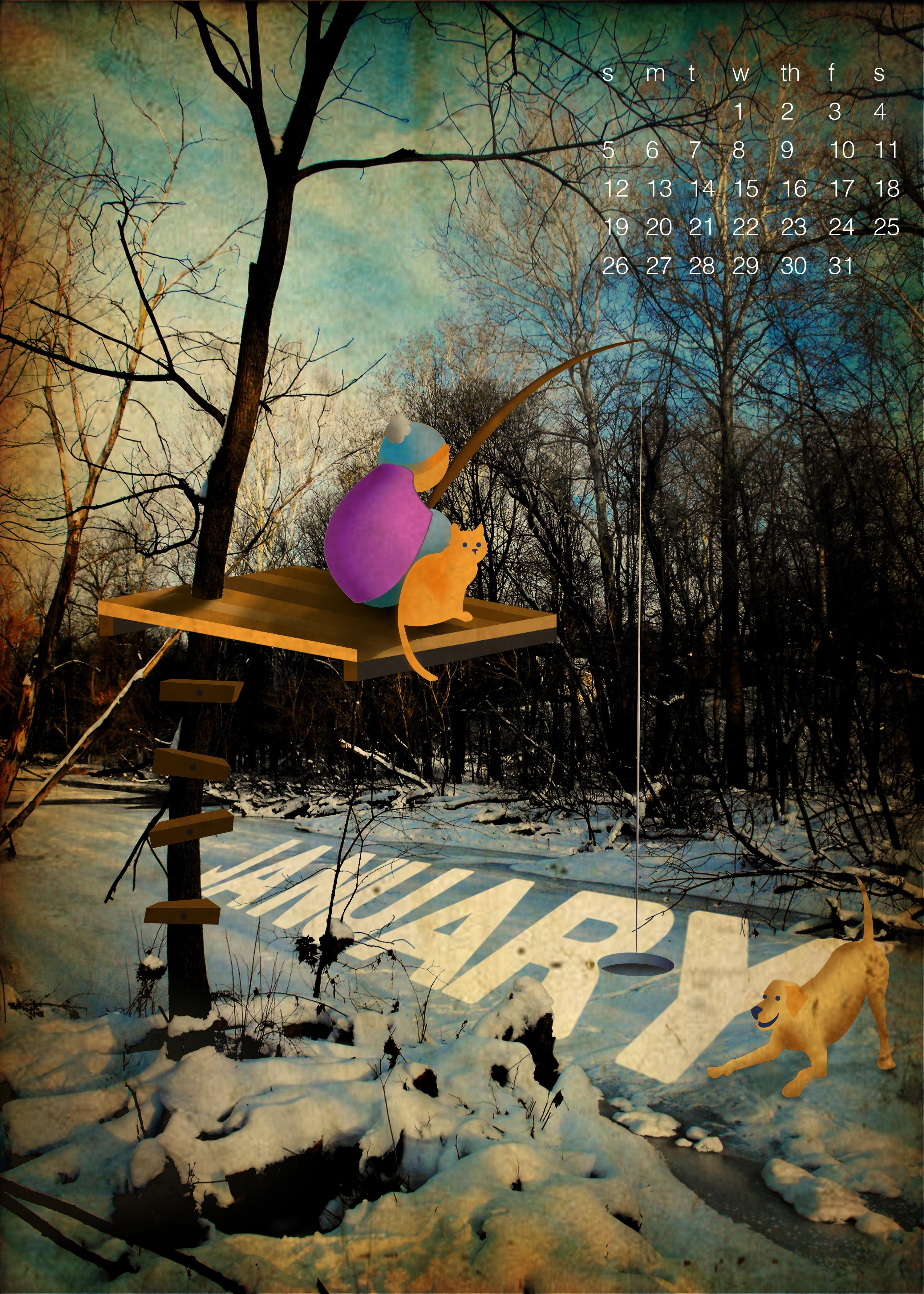
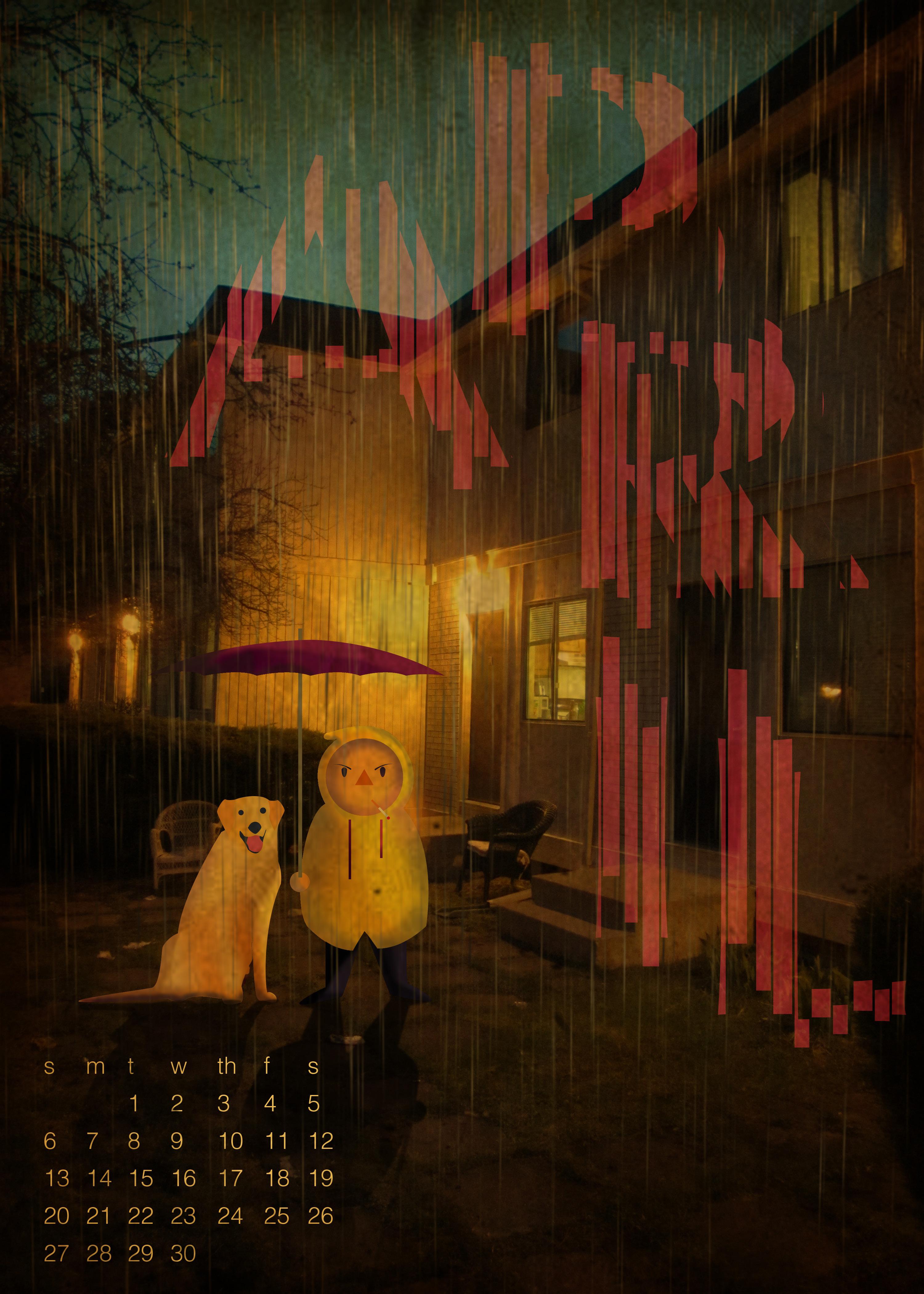
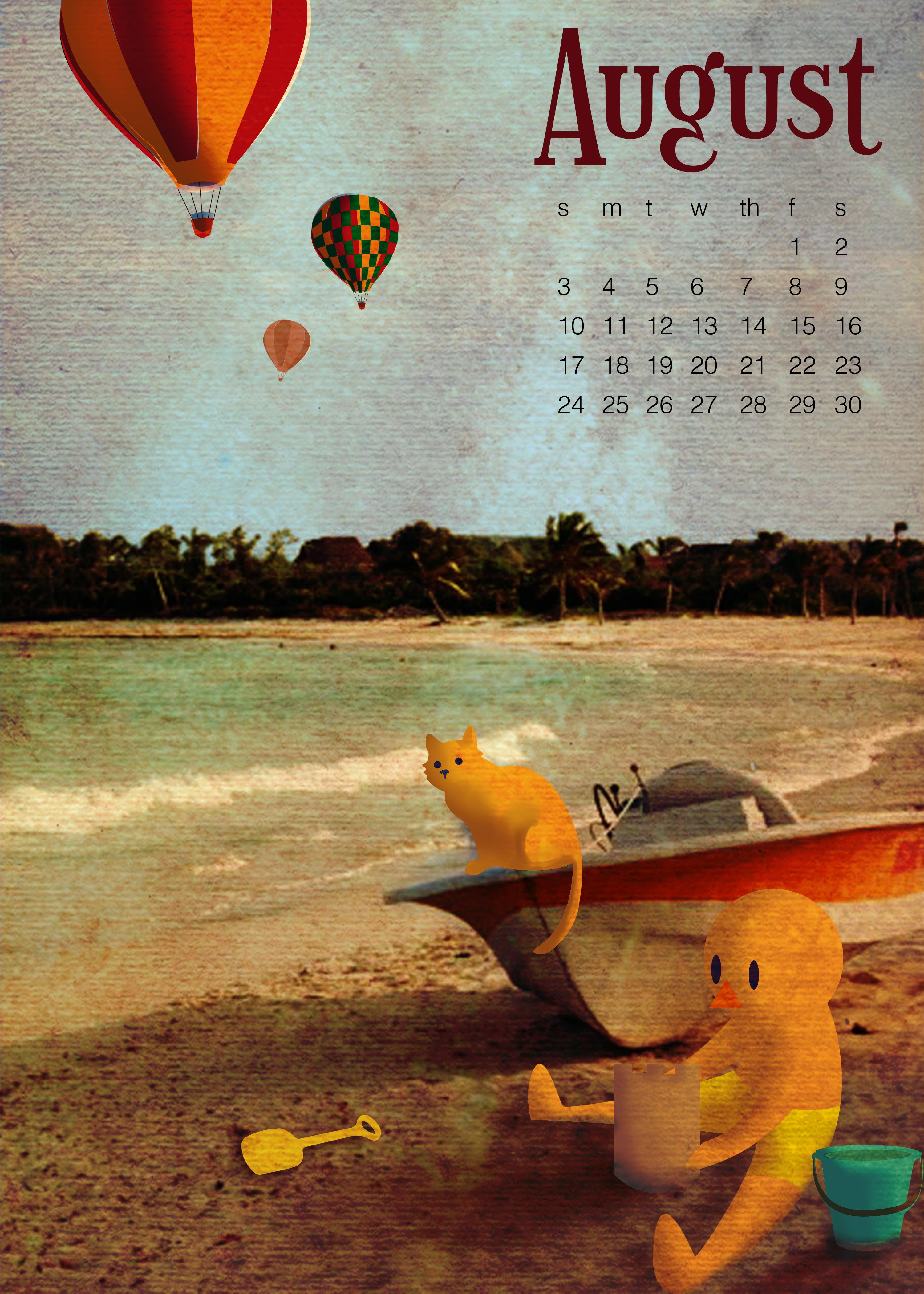
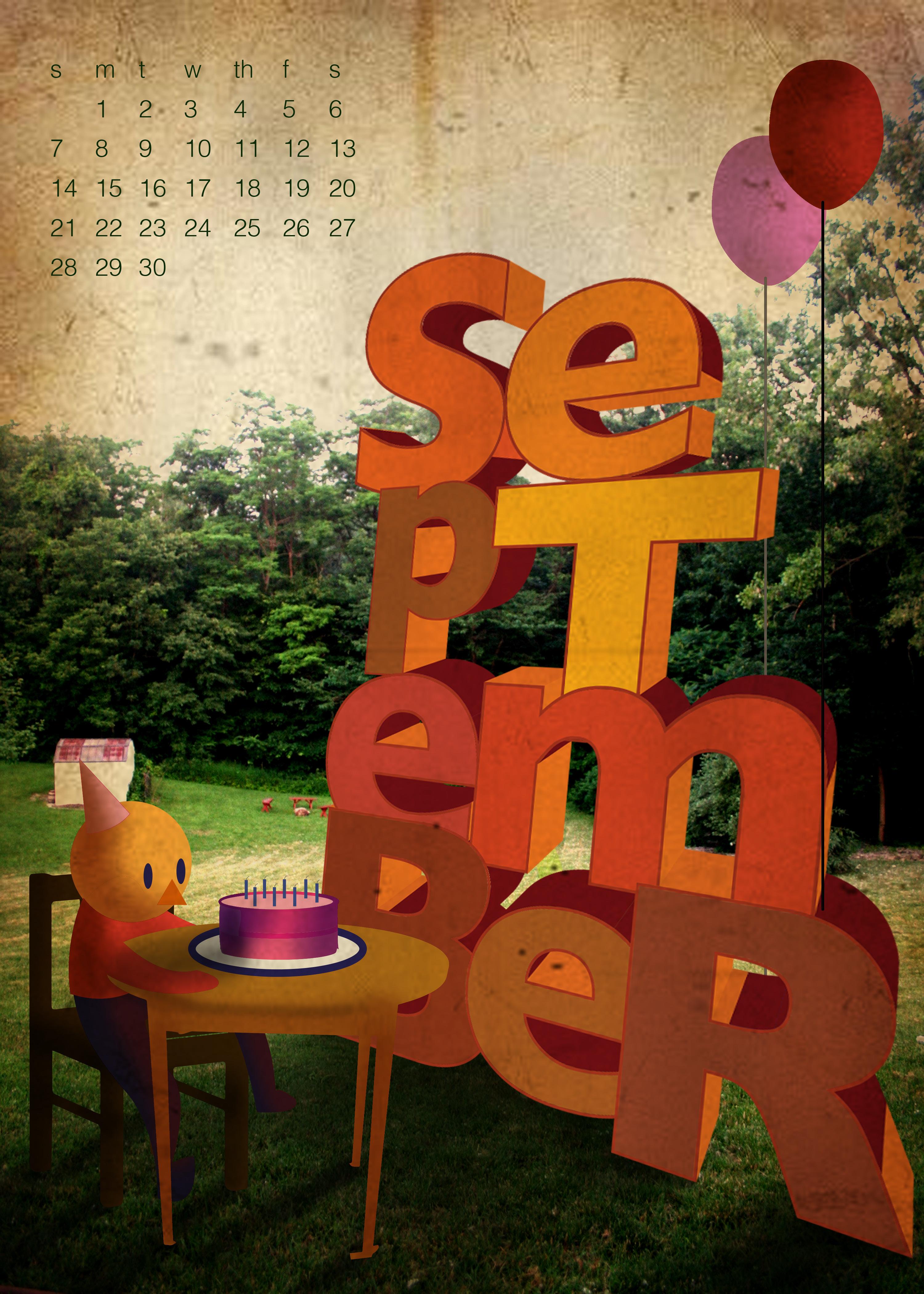
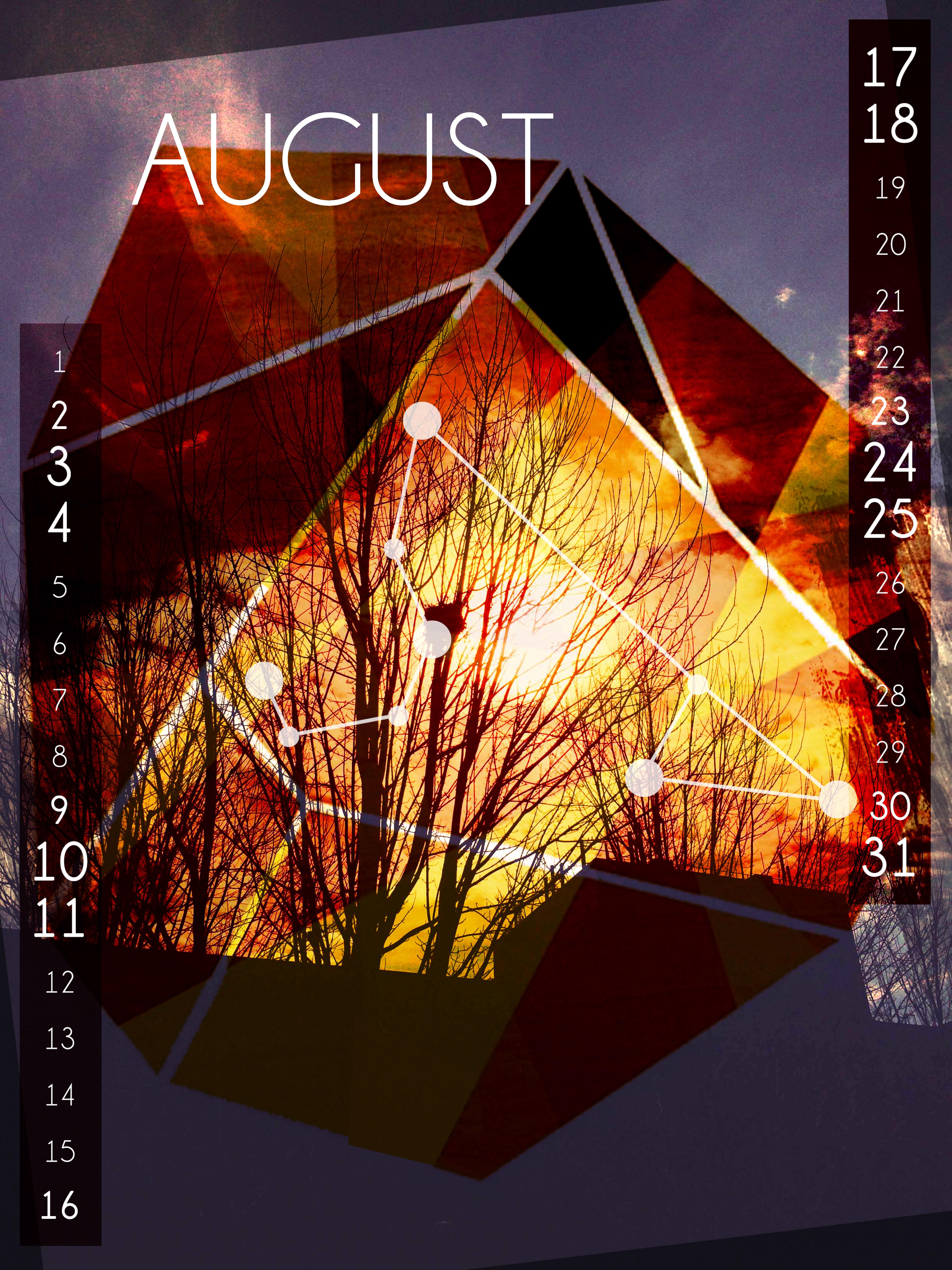
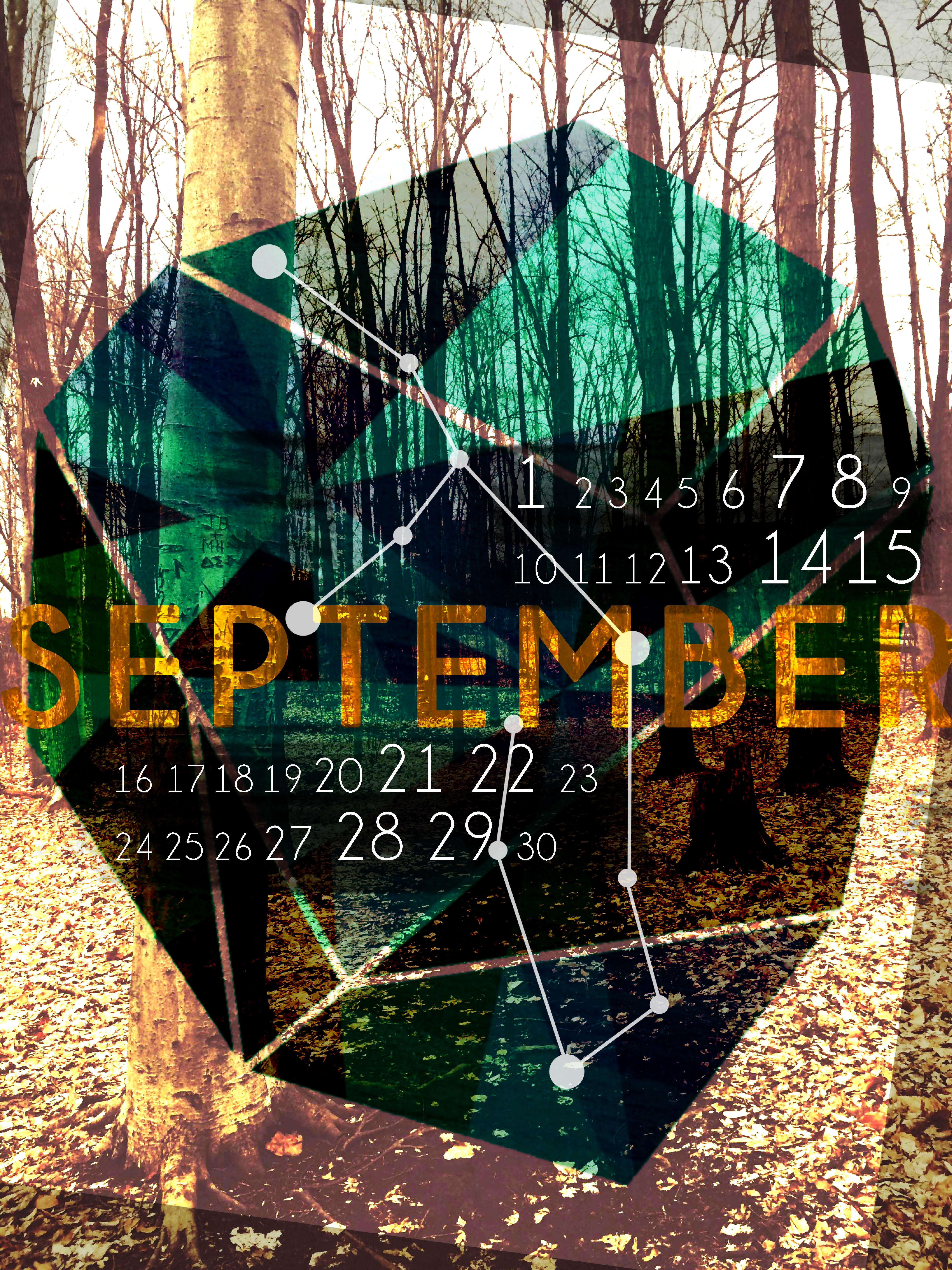
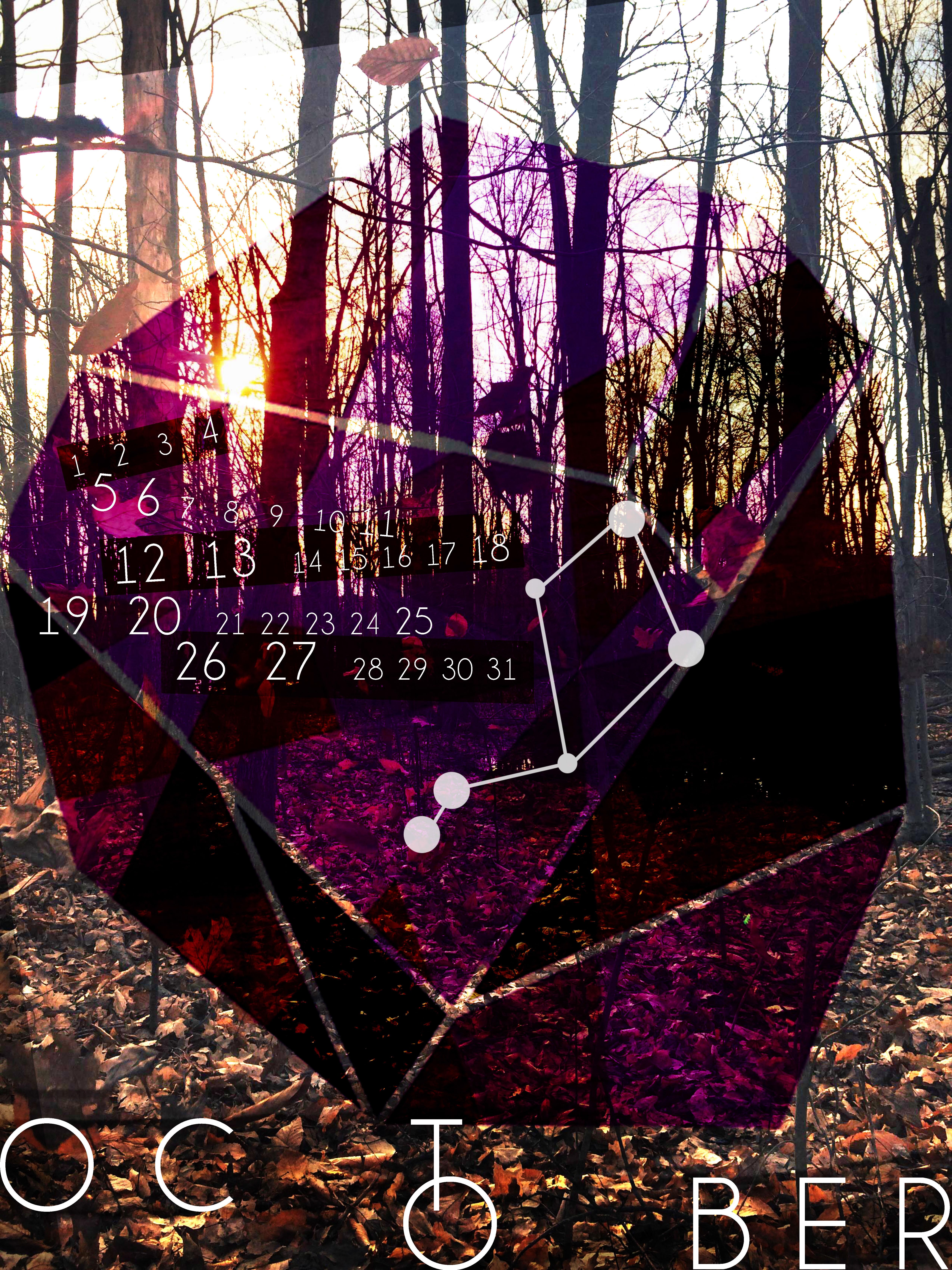
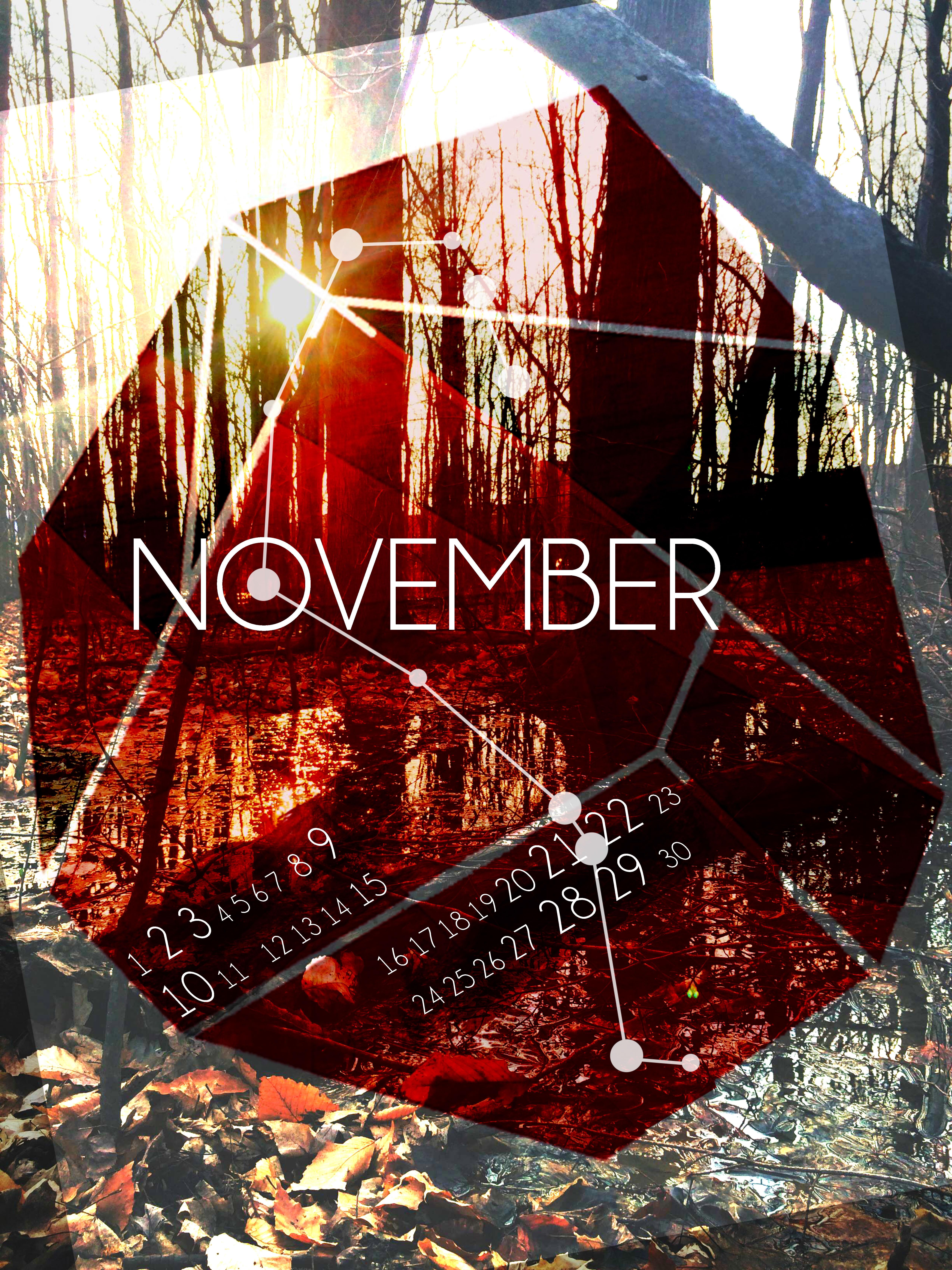
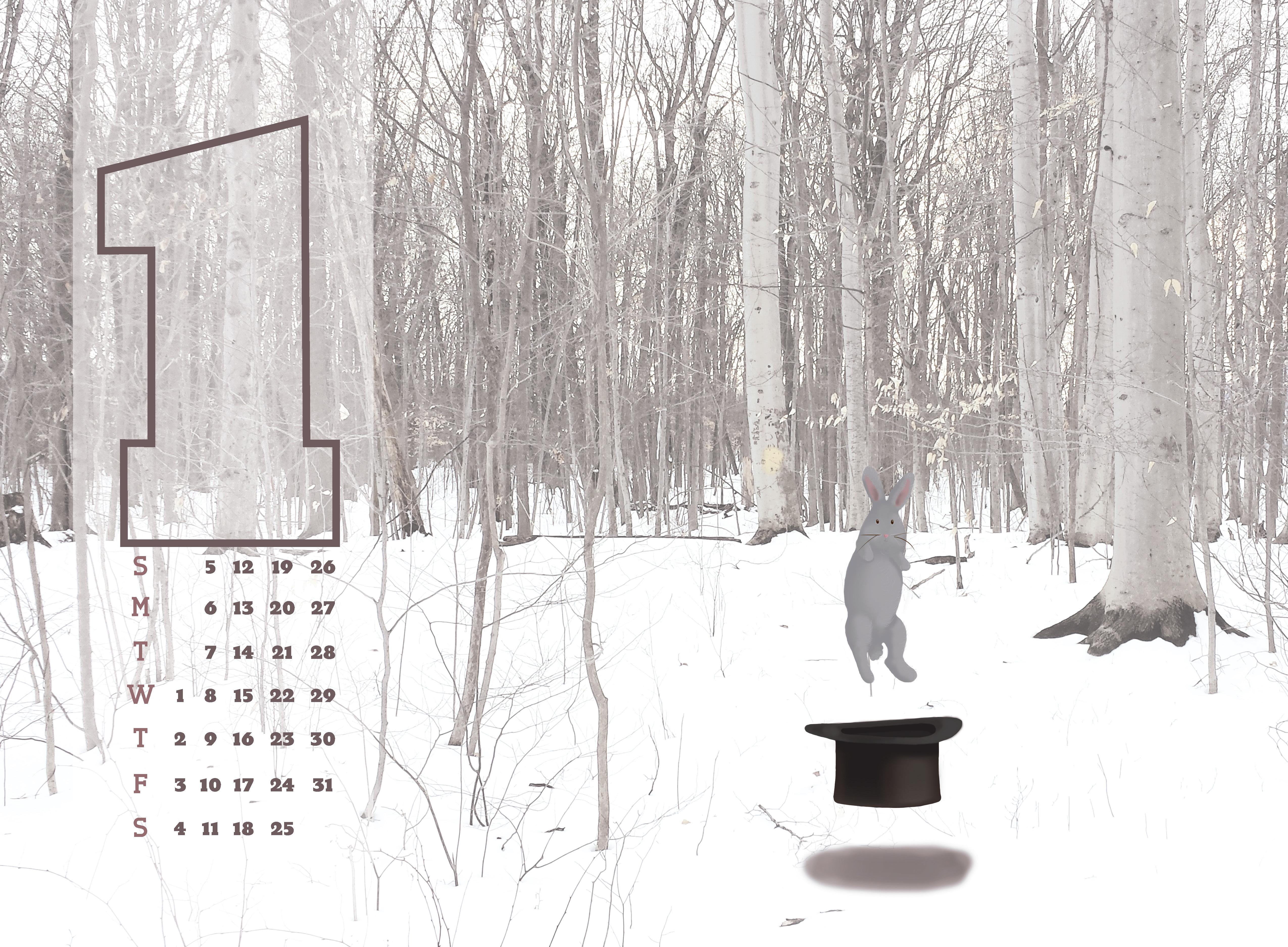
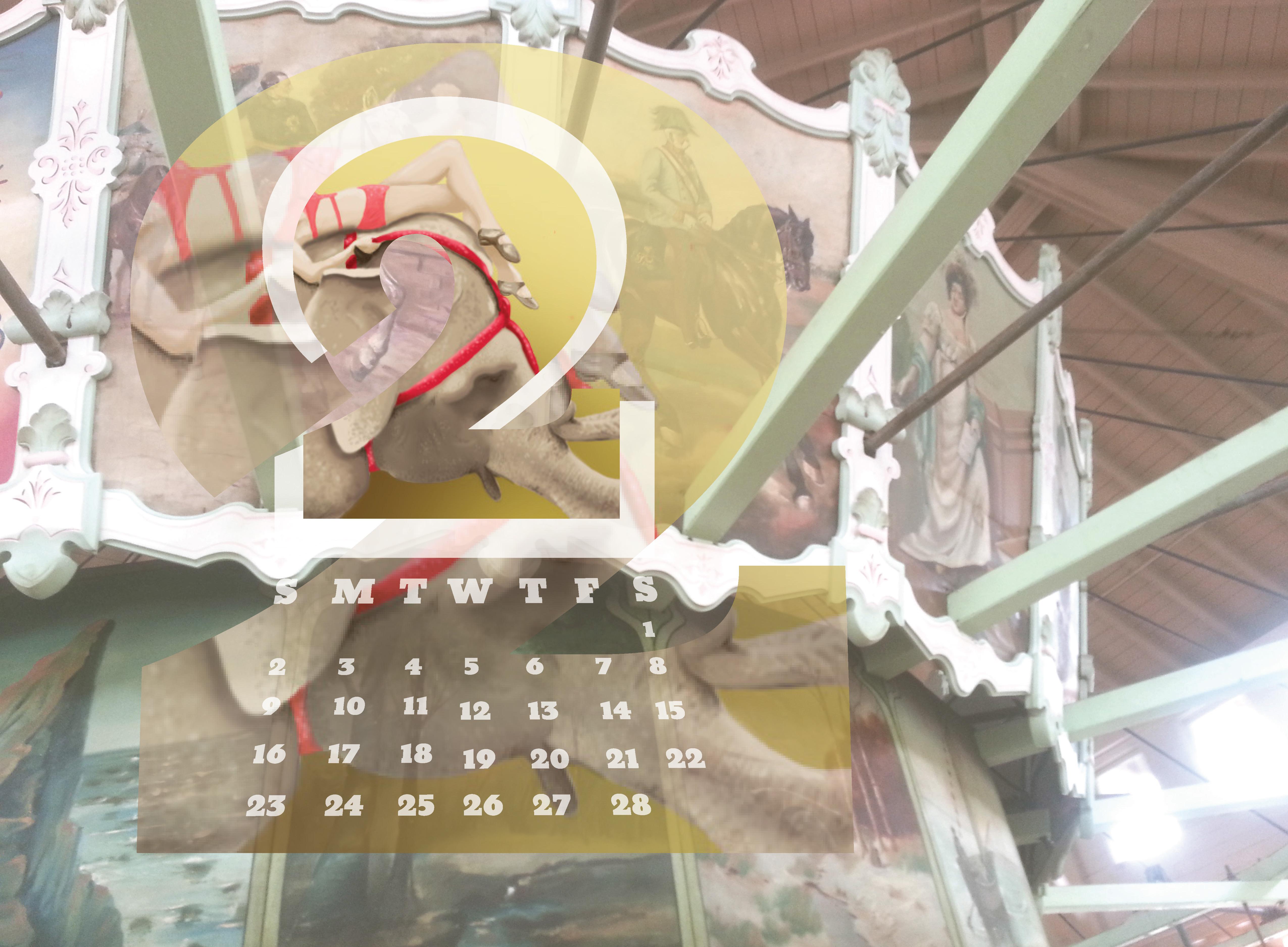
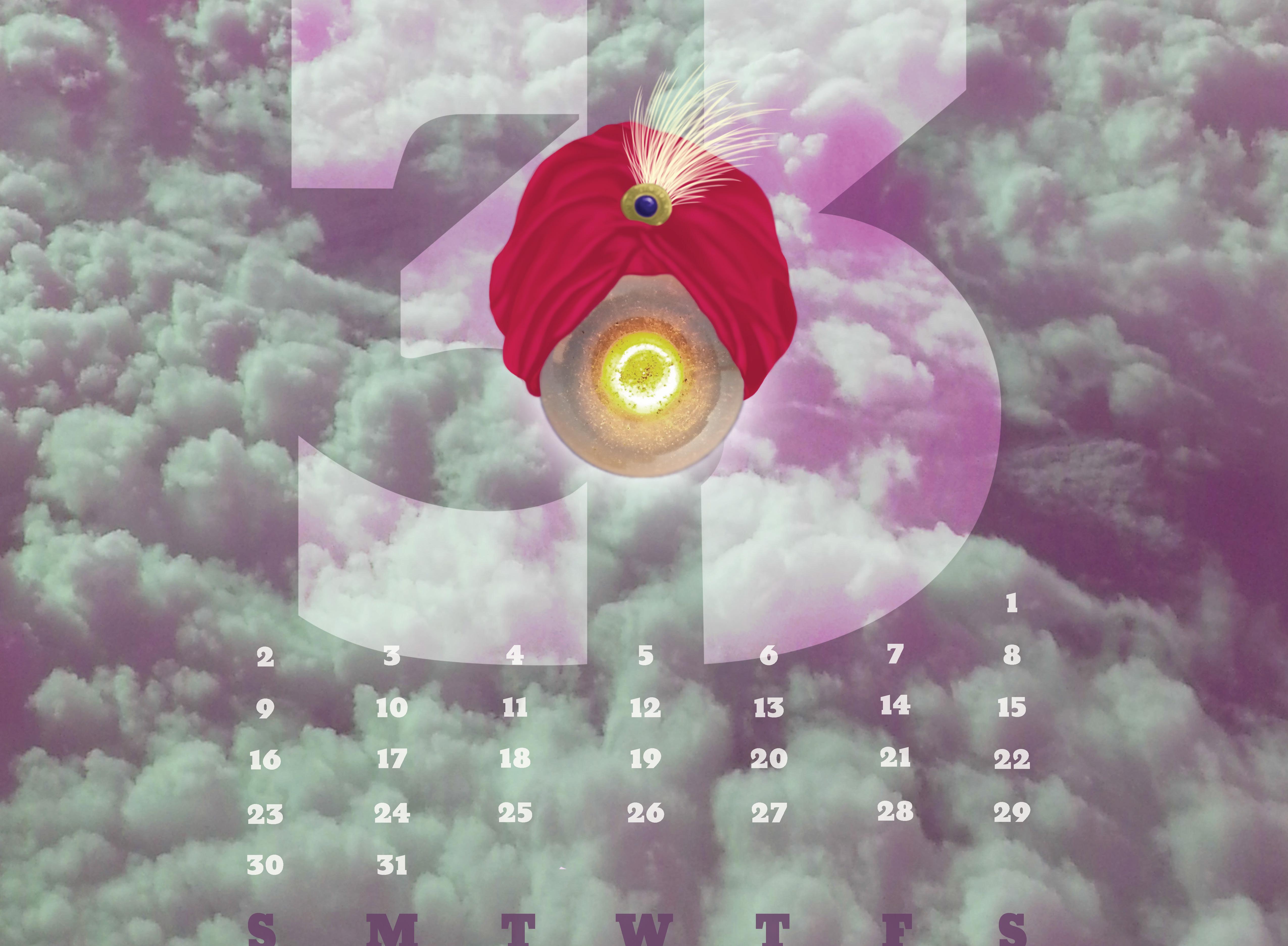
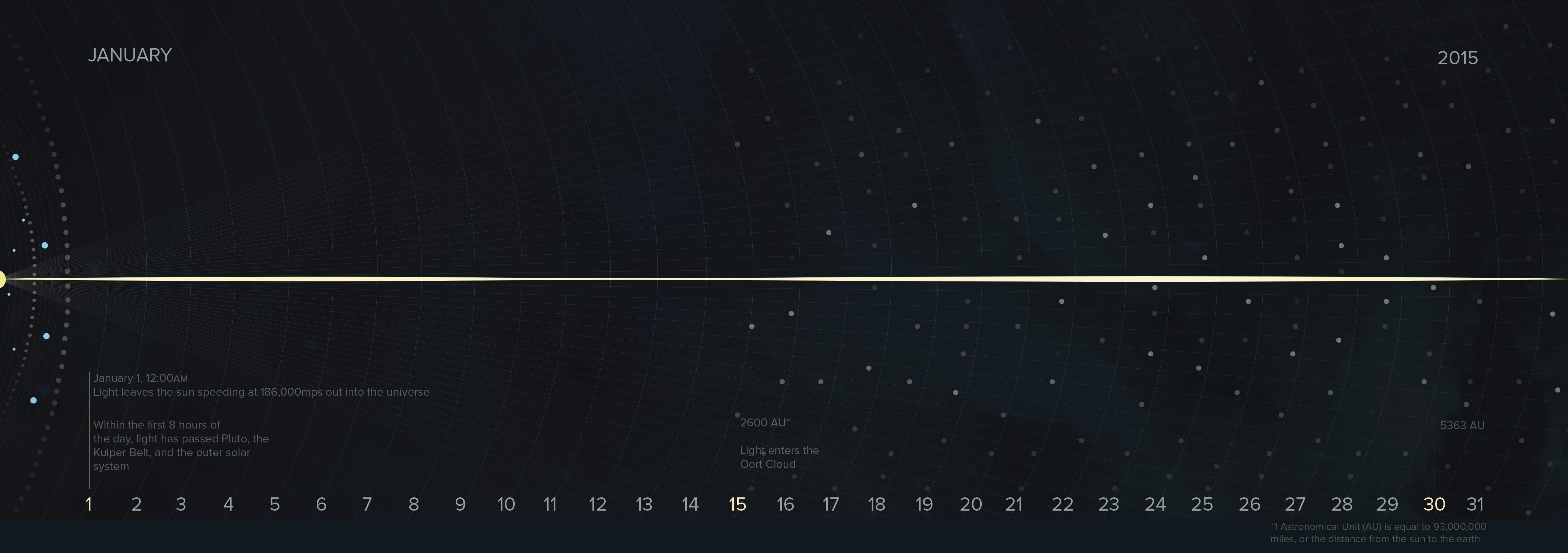
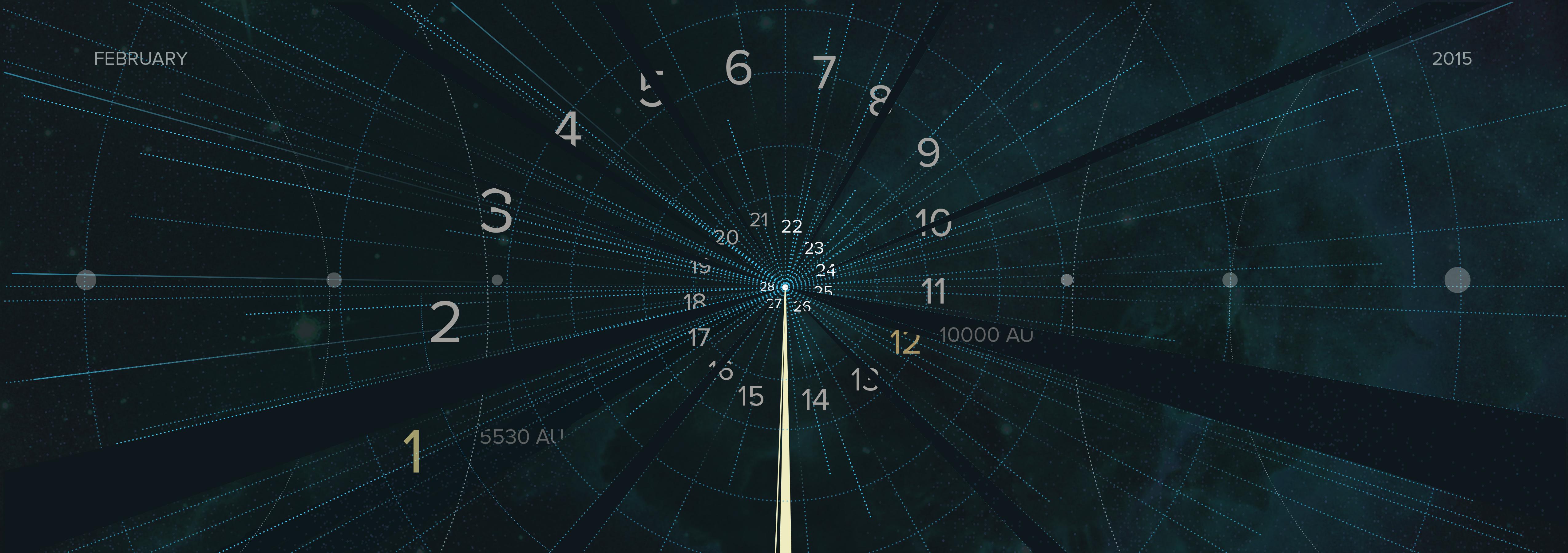
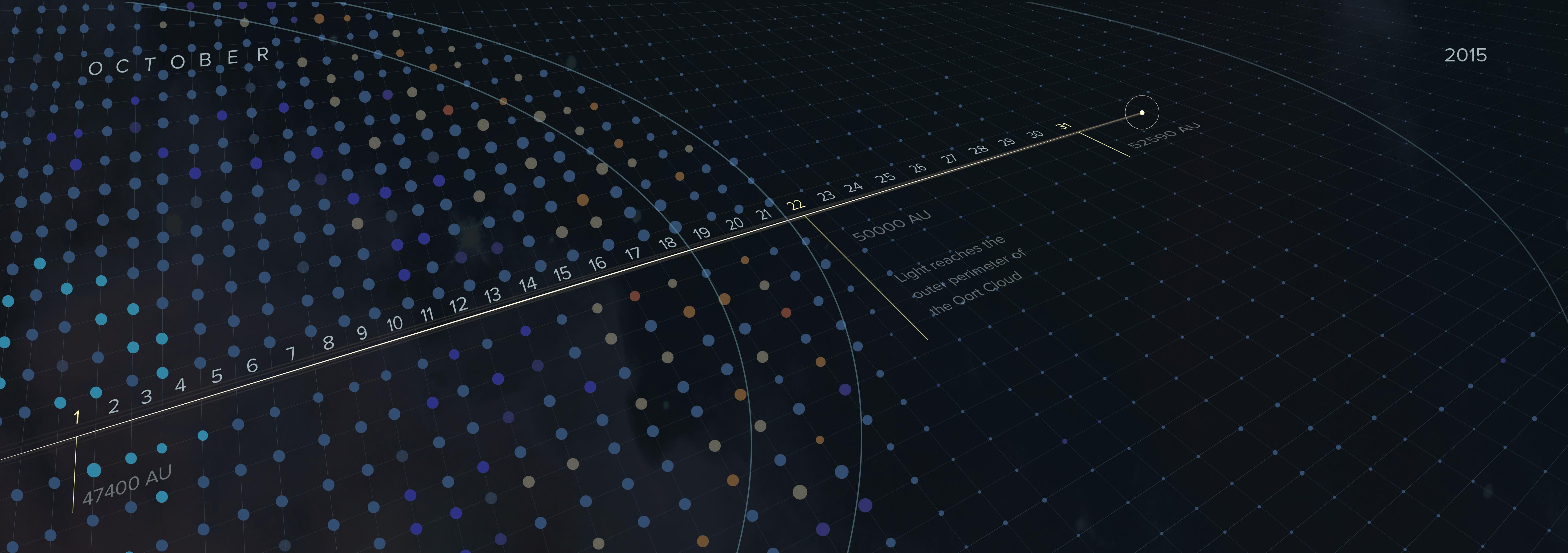
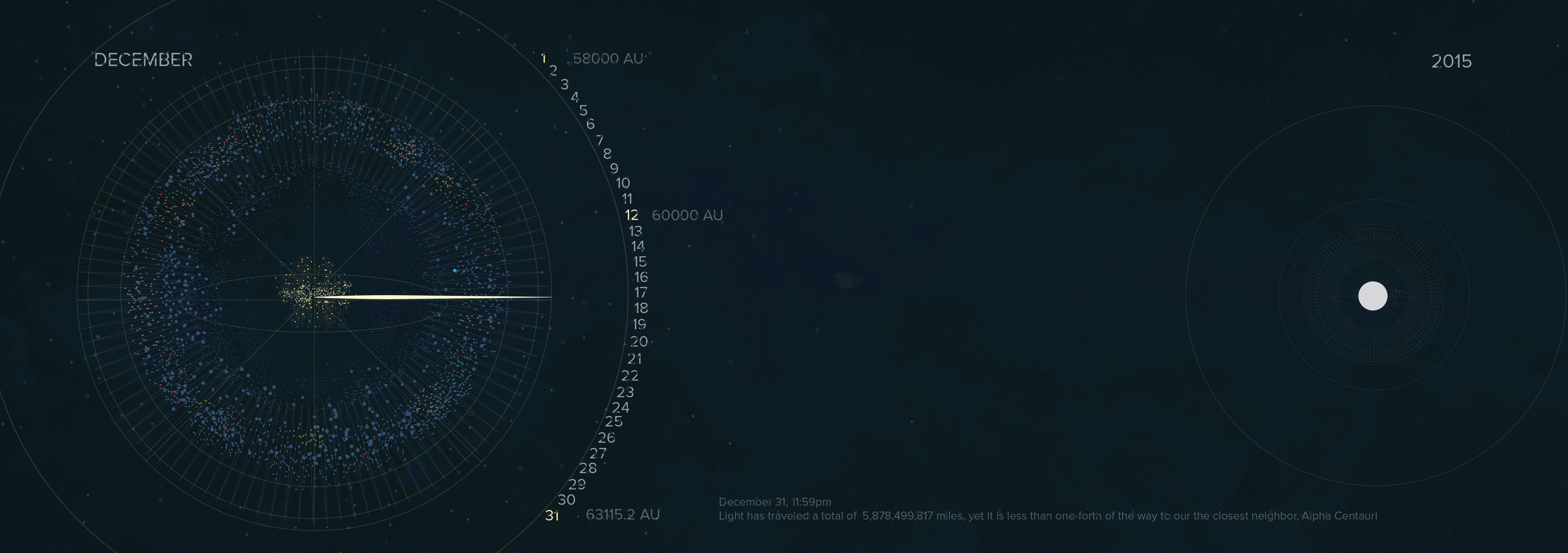
When type and image coexist, each remains a distinguishable entity, occupying its own space and time, while still interacting with each other in innumerable ways. Several principles can be employed to delineate a range of visual effects. Design 4 calendar pages (2014), using each of the four visual interactions described by Skolos and Wedell – separation, fusion, fragmentation, and inversion to effectively represent each month’s image, type, and message. All images must be original.
Dimensional Design
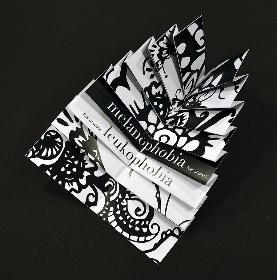
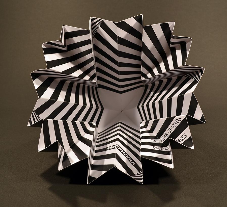
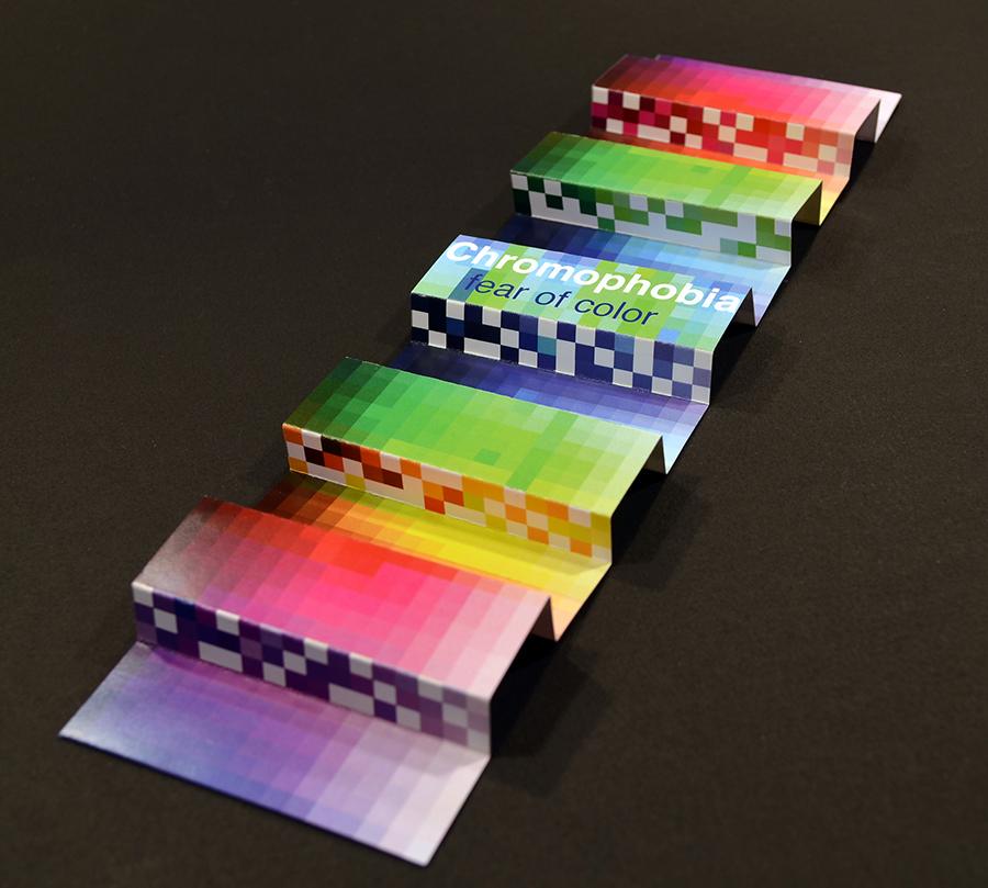
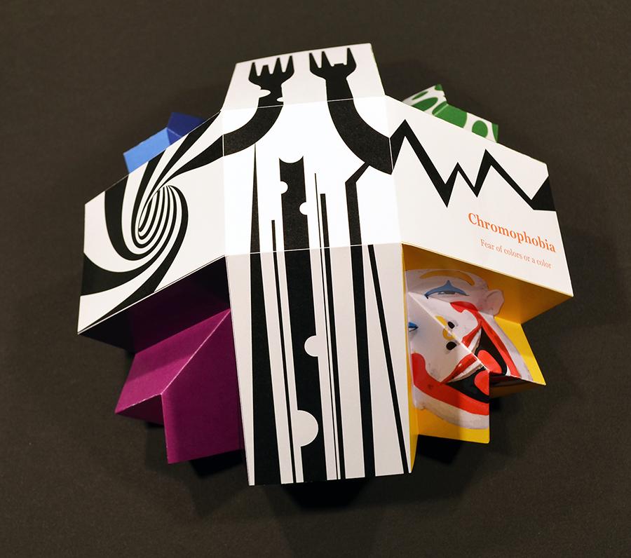
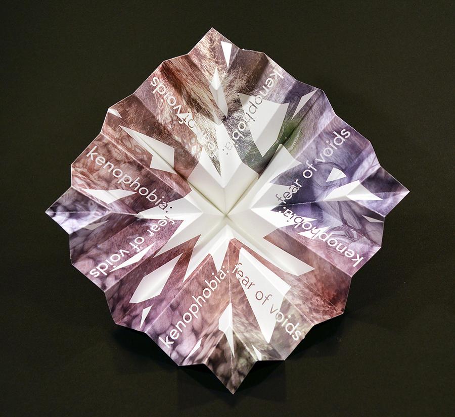
We live in a three-dimensional world. What we see in front of us is not a flat picture with length and breadth only, but an expanse with physical depth – the third dimension. Any object that is small, lightweight, and close to us can be picked up and turned around in our hands. Each movement of the object displays a different shape because the relationship between the object and our eyes has changed. Topic: “Making fear beautiful. ”
