Wedding Luncheon branding
June 21, 2017
Lorrie Frear
I was honored to be asked to create signage for the wedding luncheon for my niece, Grace Heusner.
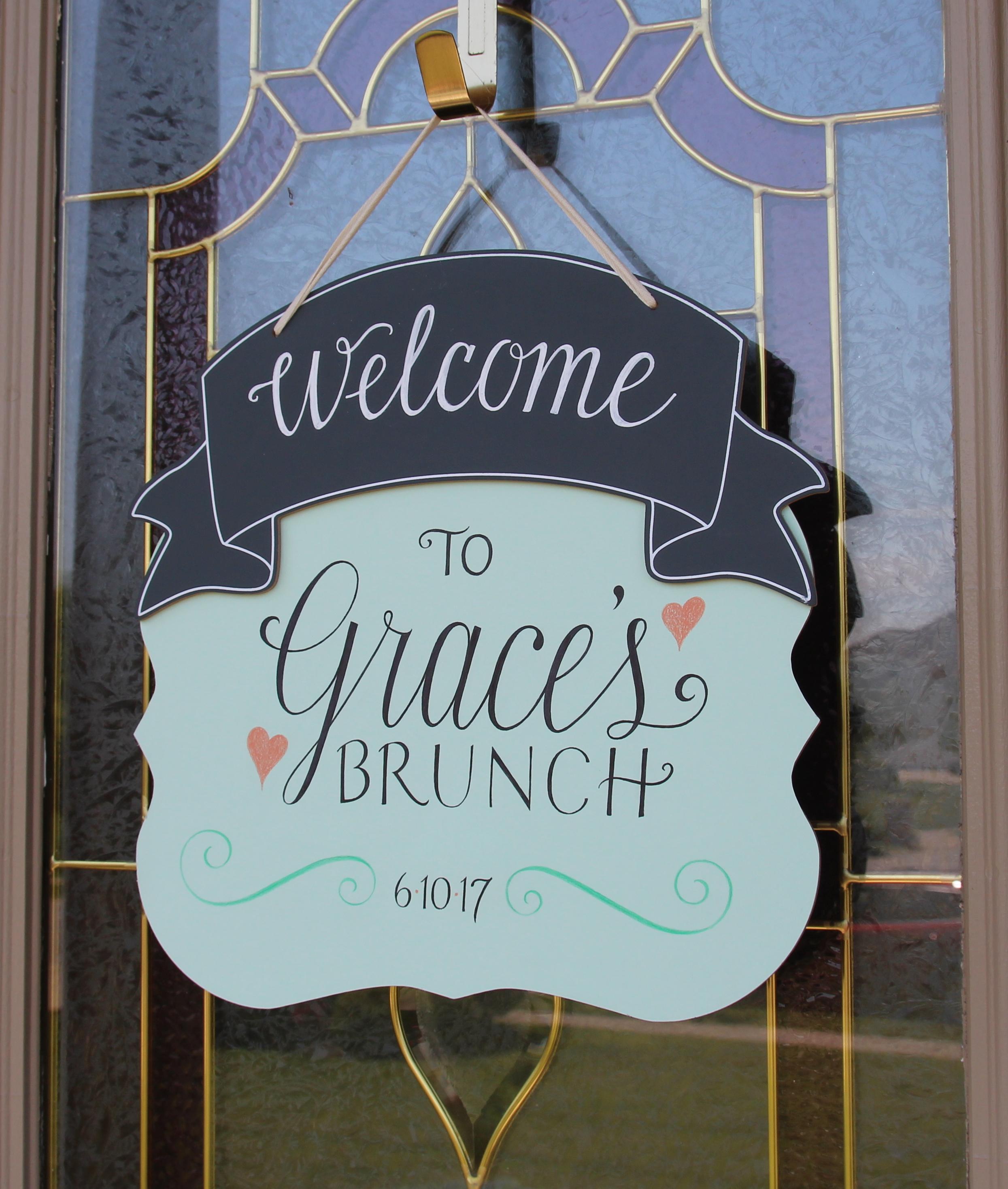
The color palette for this event was peach and mint green, which I incorporated in the signage.
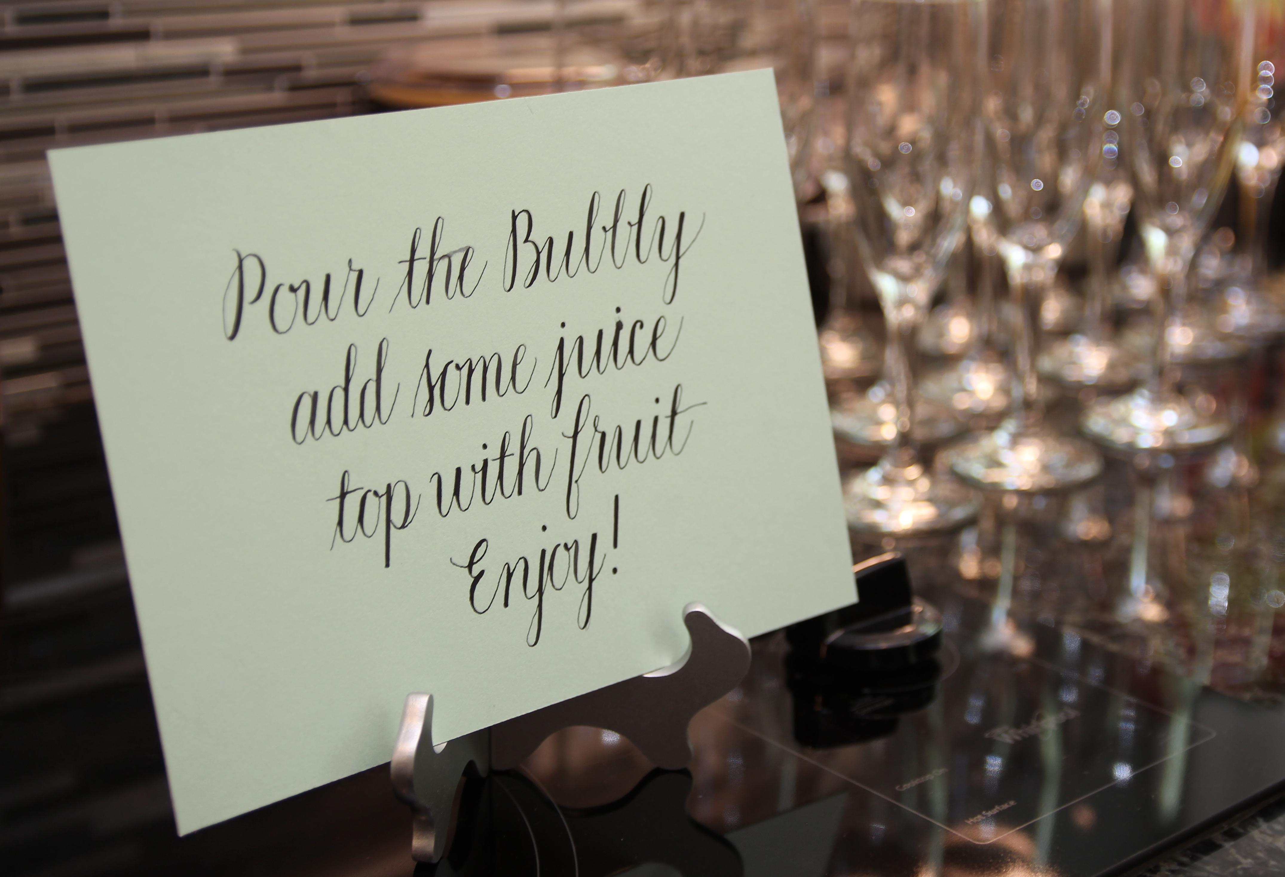
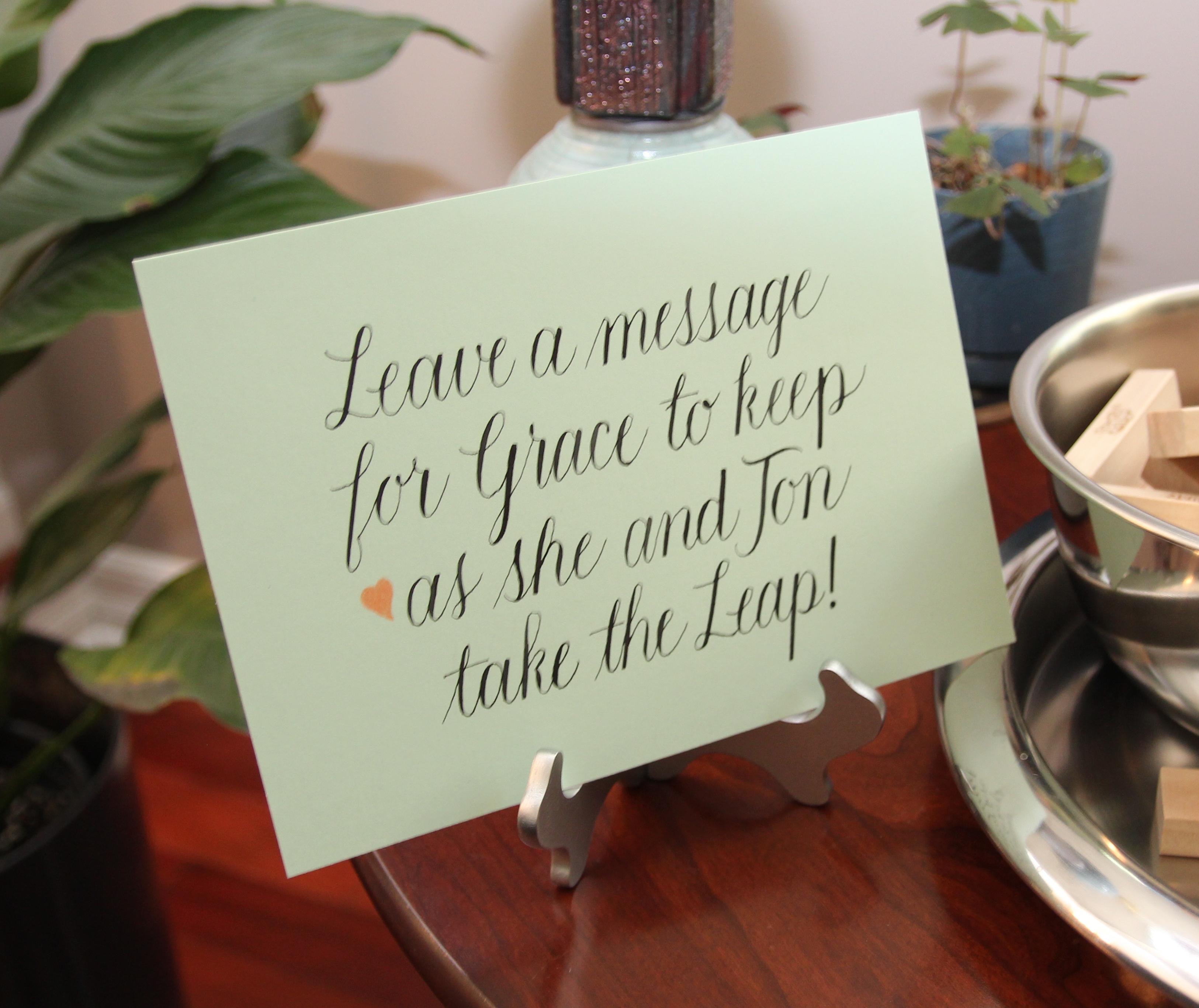
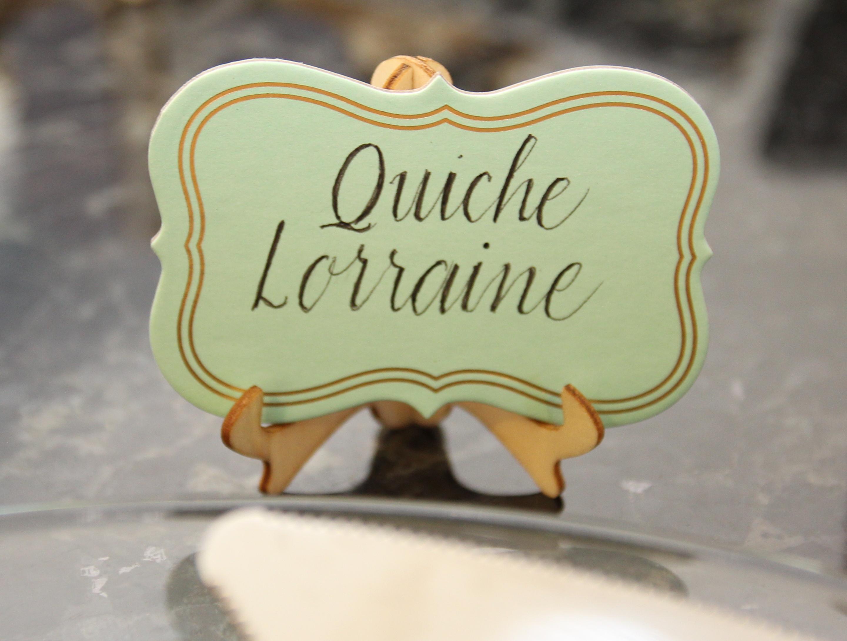
Copperplate lettering for the signs was done with a variety of tools because of the range of scale.
Brush marker and micron pen were used for the door sign; pointed pen and ink were used for the instructional signs, and micron pens were used for the food indicators.
This little sign was placed by Jenga game pieces for guests to leave messages for the couple.
Photography: Kimberly Sass
